

YA covers span more emotional and visual ground than almost any other genre. Whether they show a girl with light burning between her hands, two kids sprinting from something supernatural, or a sun-drenched summer house with the door thrown open — the goal is always the same: make a teen reader feel like this story was made specifically for them.
What makes a great YA cover?
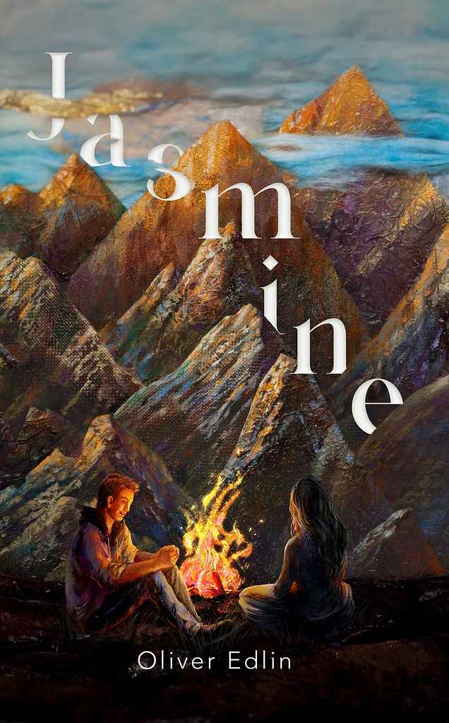
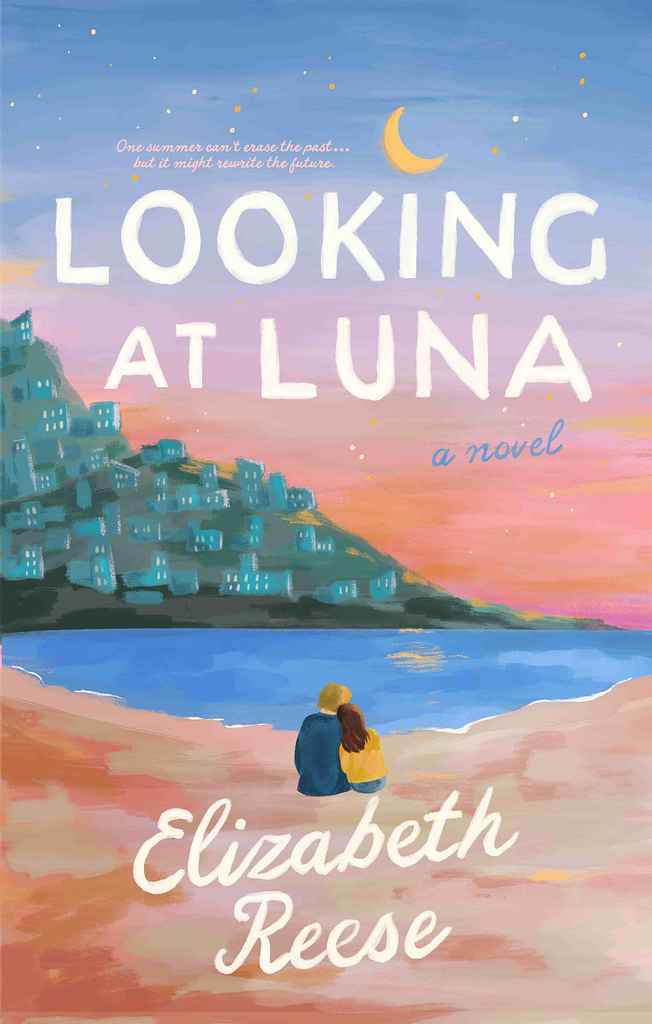
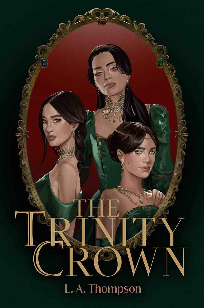
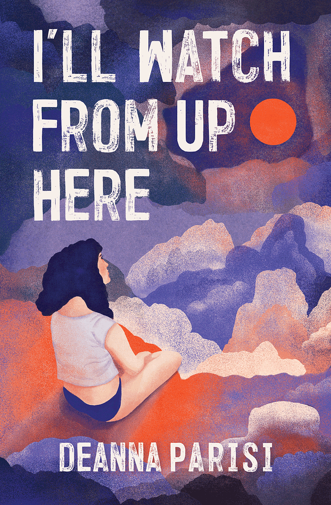
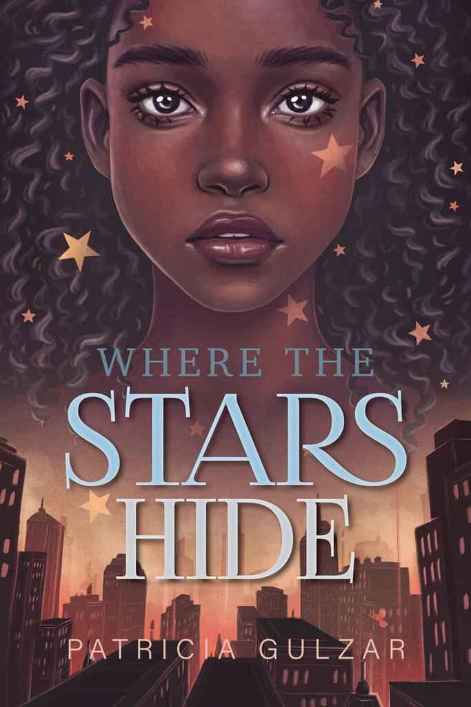
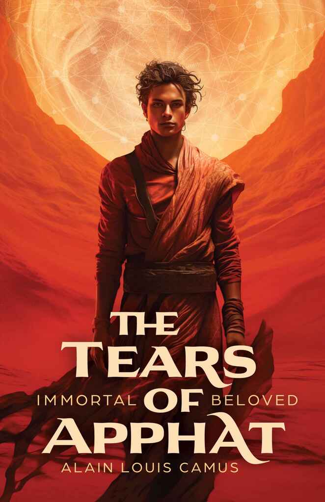
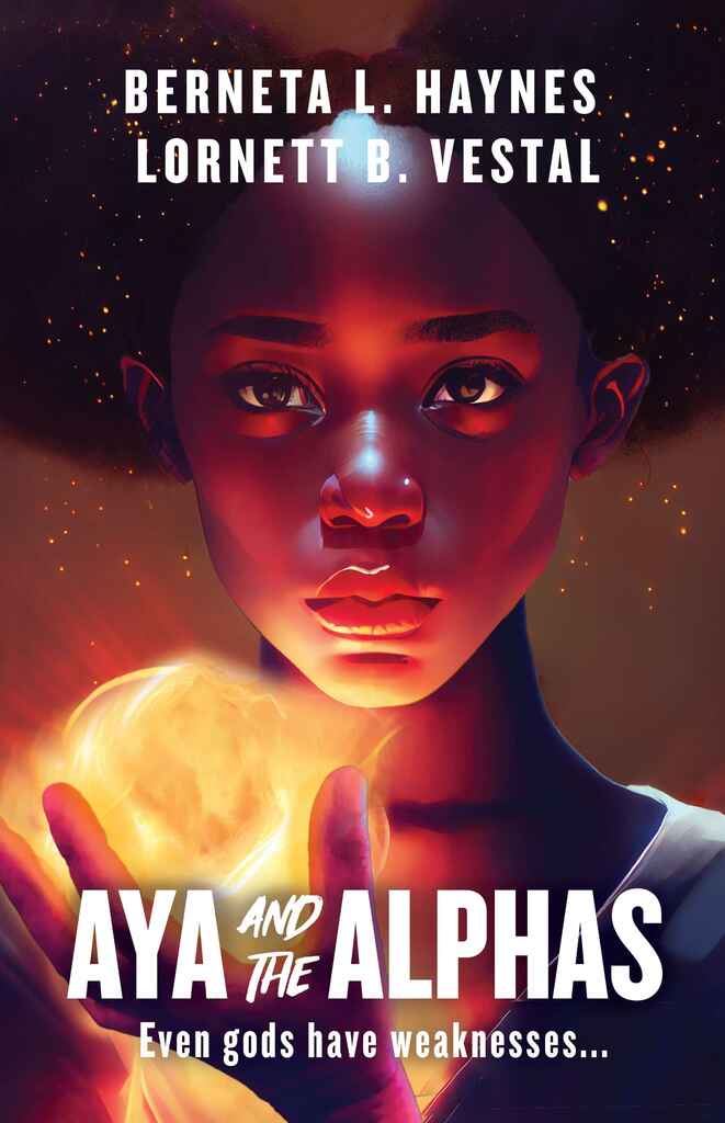
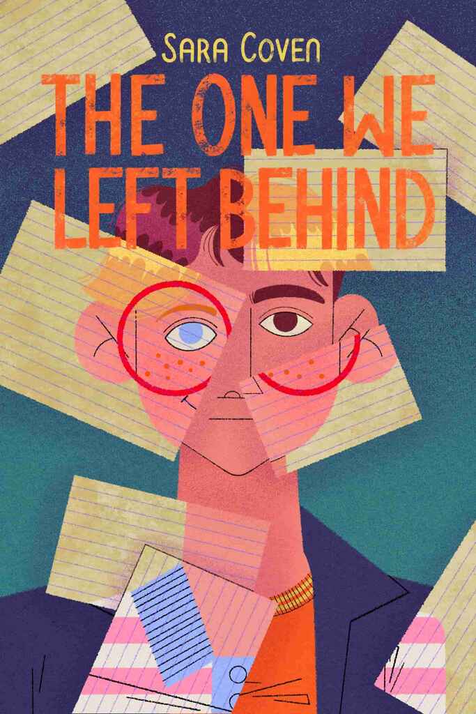
The category has moved almost entirely to illustration. A photographic or stock-image cover now reads as a category mismatch to readers and booksellers who know the genre — illustrated character art, whether rendered in a painterly style or flat graphic, is the expected visual language.
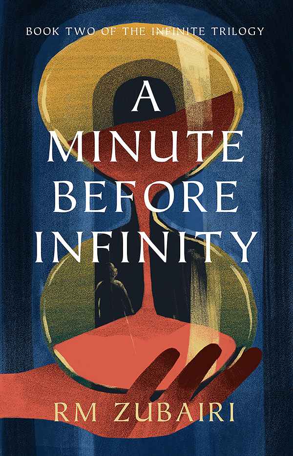
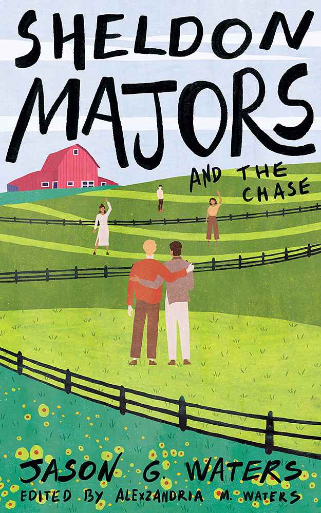
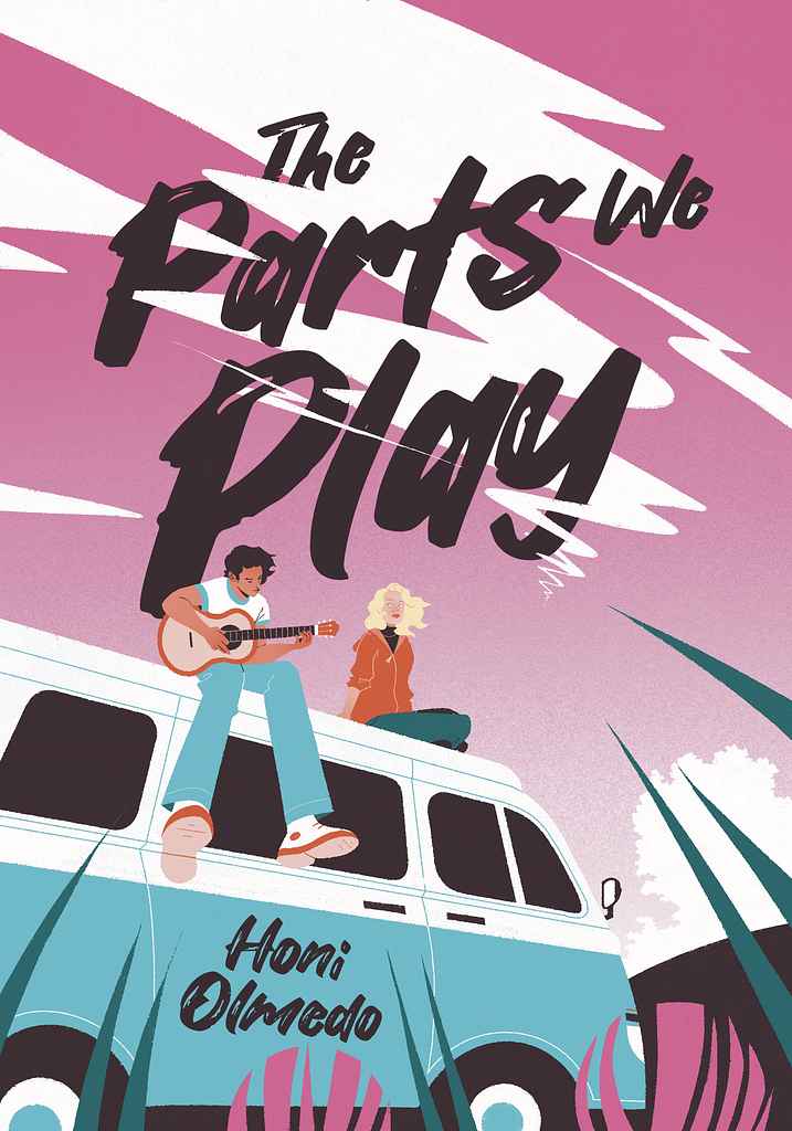
Typography is the second defining element, and YA splits into two distinct camps. One is hand-lettered and flowing: loose script that feels personal and emotional, designed to match warm contemporary or romantic registers. The other is bold and architectural: stacked display type with sharp geometry, often used in dark fantasy, horror-adjacent, and adventure-driven covers. Neither approach works in the other's territory.
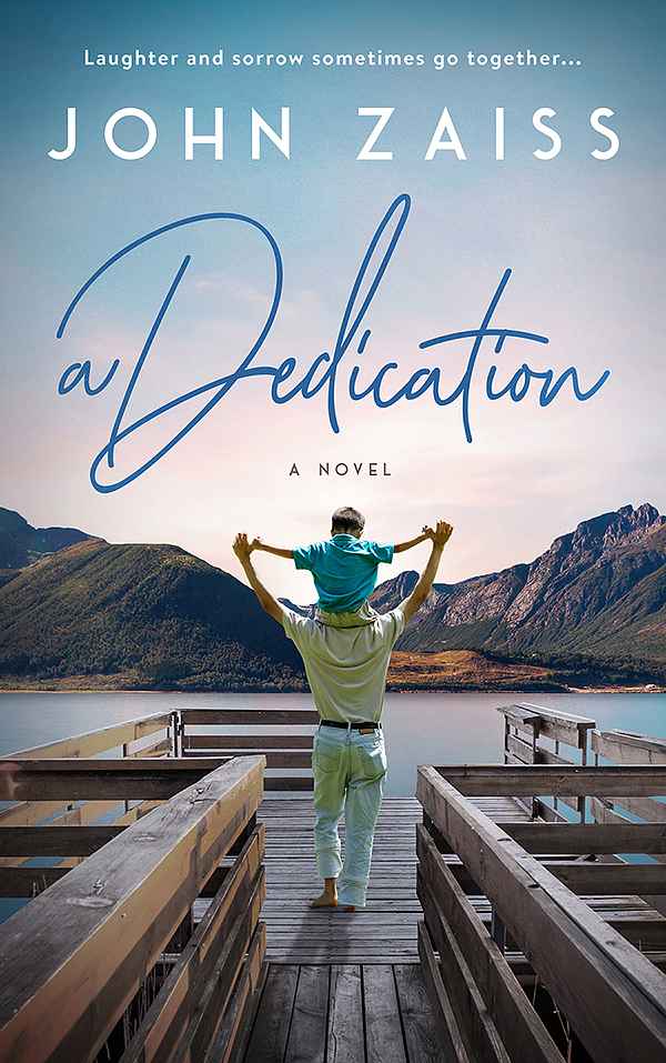
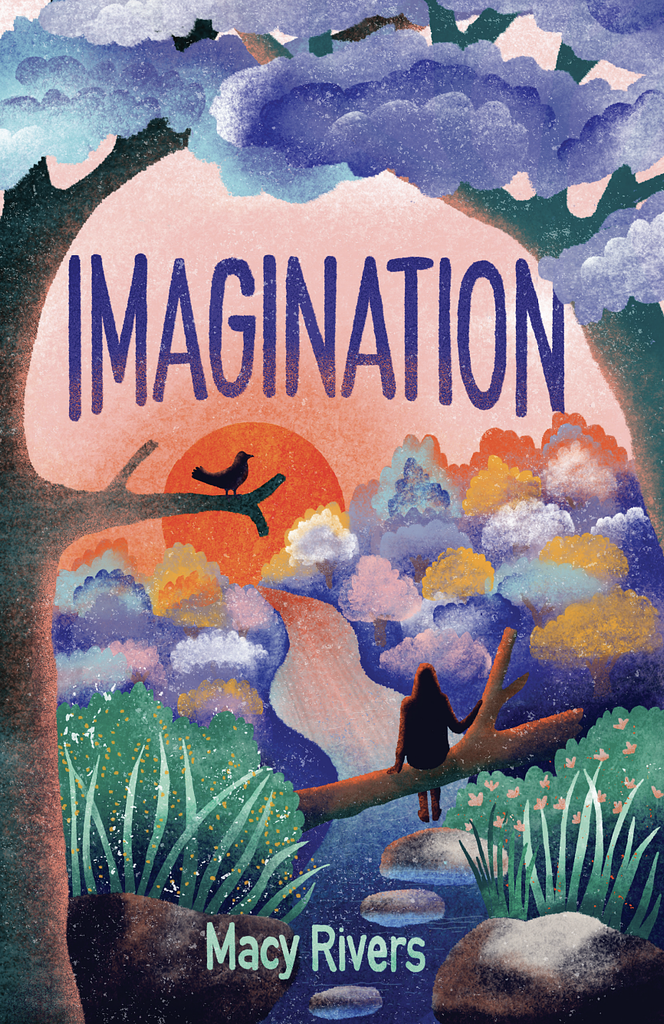
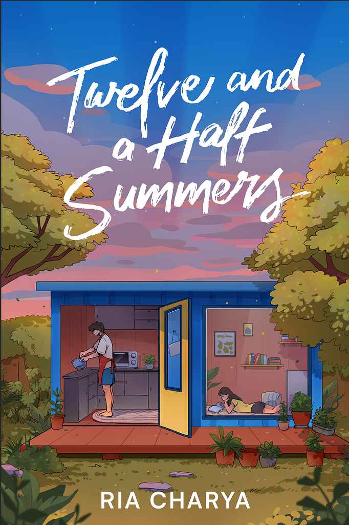
Palettes follow subgenre closely. Contemporary and romantic YA runs warm — burnt orange, candy pink, golden hour amber. Fantasy and dark YA goes deep: jewel tones, cold blues, near-black with a single glowing accent. What almost all YA covers share is saturation and intentionality: muted or murky palettes read as adult literary, not YA.
The genre sweet spot is sophisticated but accessible. Too cartoonish reads as middle grade; too dark and adult loses both readers and the gatekeepers — parents, teachers, librarians — who place books in their hands.
What are the most common YA cover tropes?
-
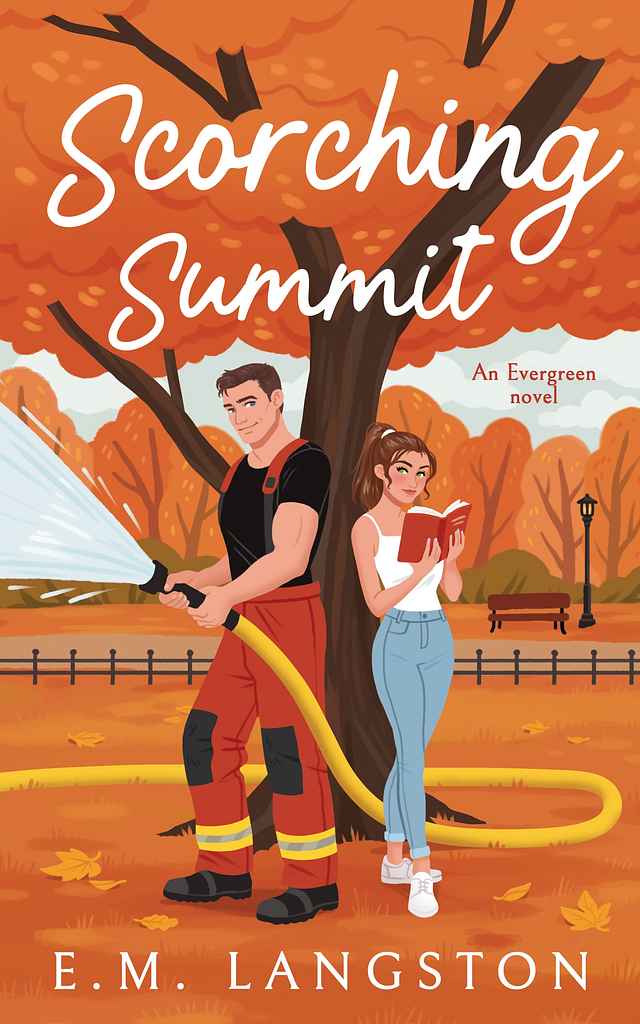
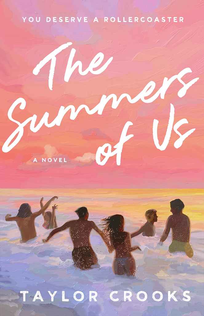
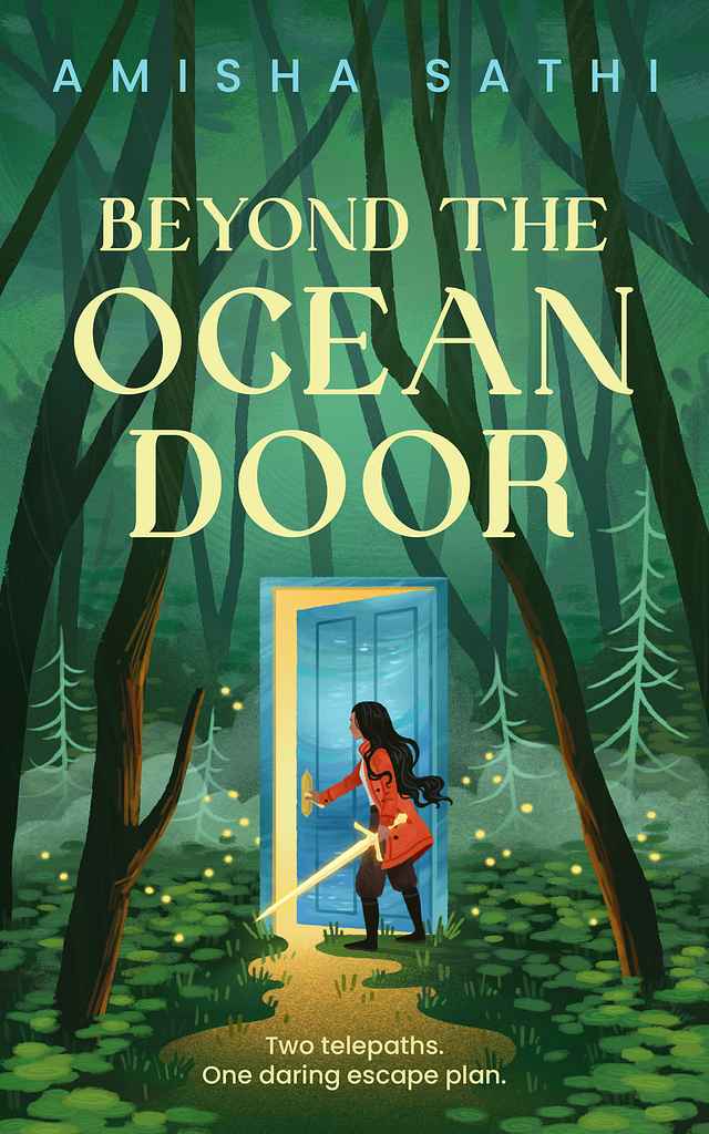
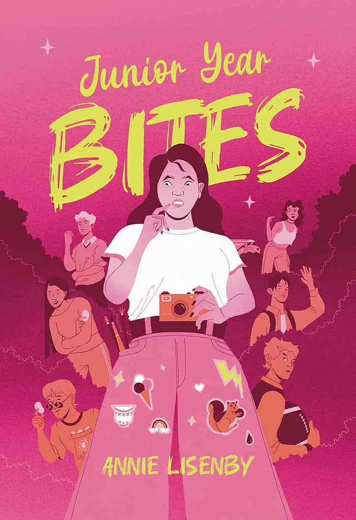
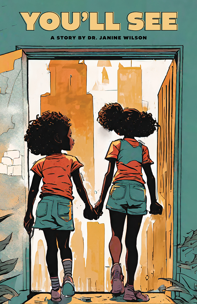
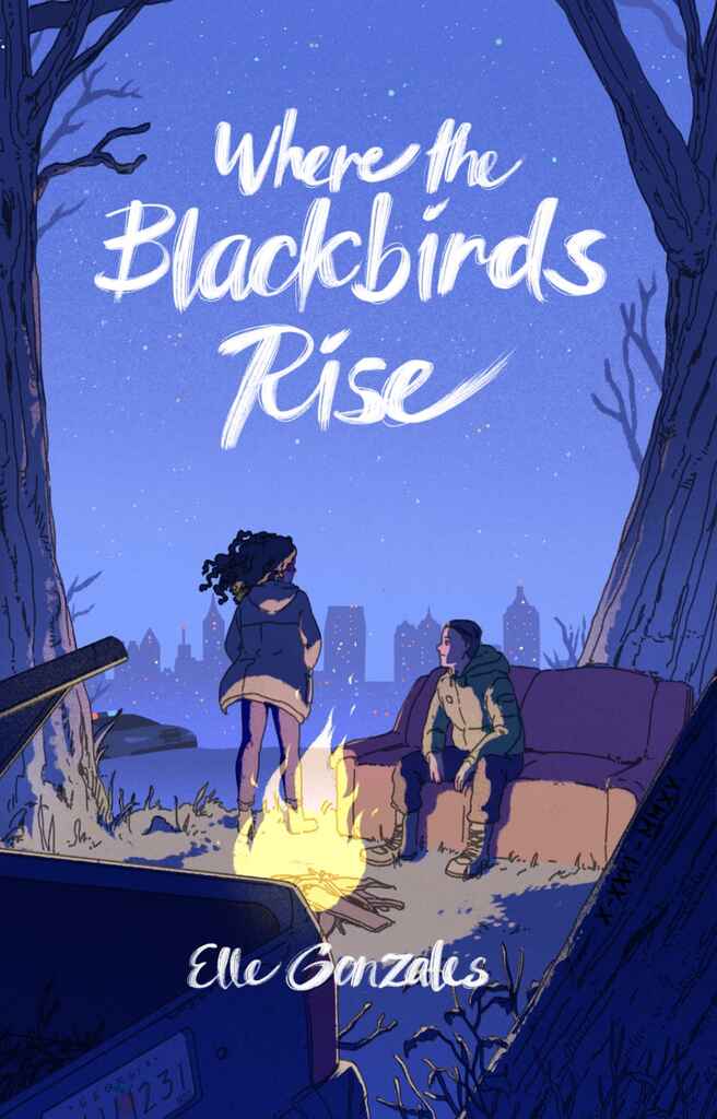
Contemporary/slice-of-life YA: warm illustrated scene or character pair, hand-lettered script title, golden or sun-baked palette — emotionally immediate and inviting
-
YA romance: illustrated couple or single expressive figure, flowing script typography, high-warmth color
-
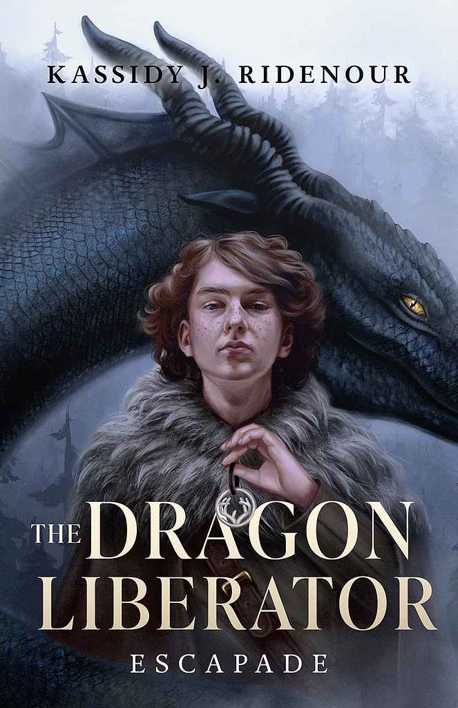
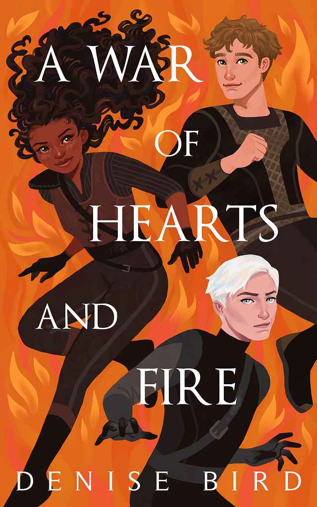
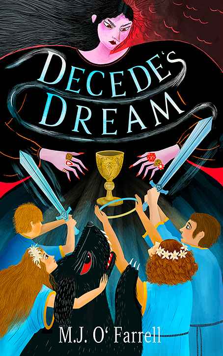
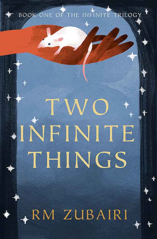
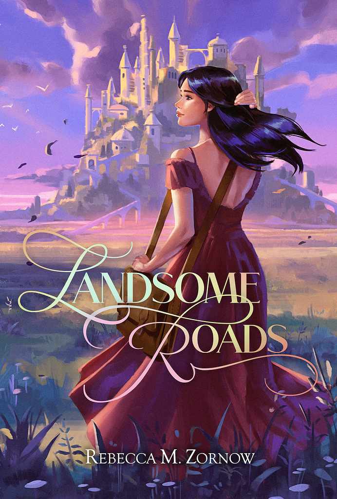
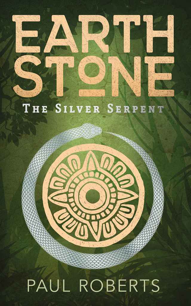
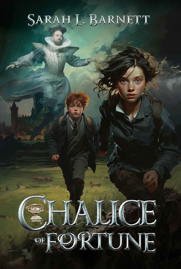
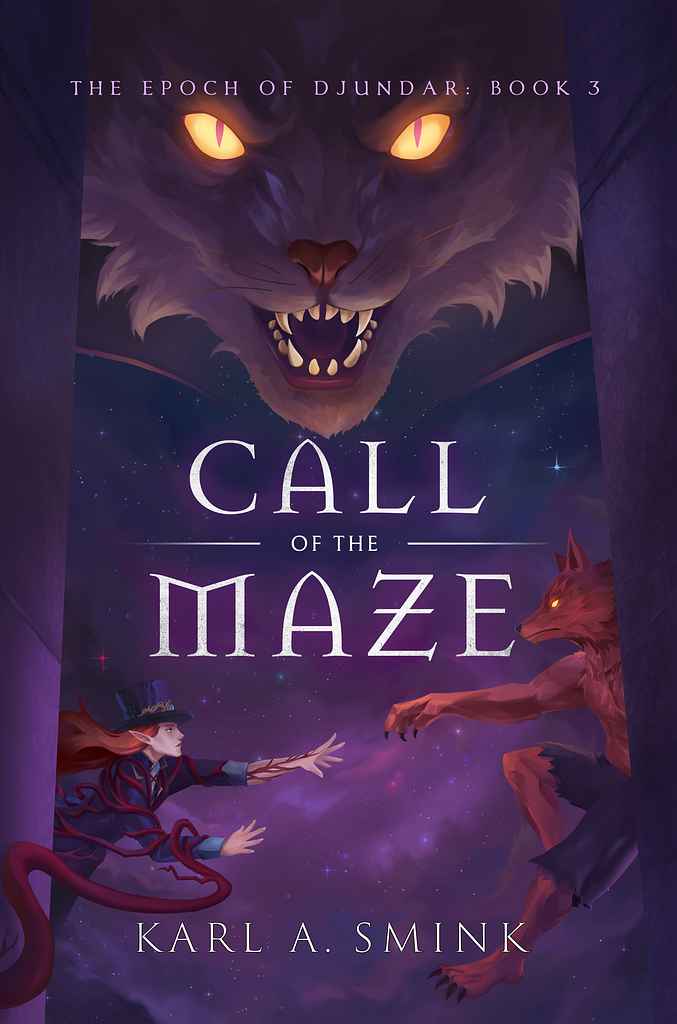
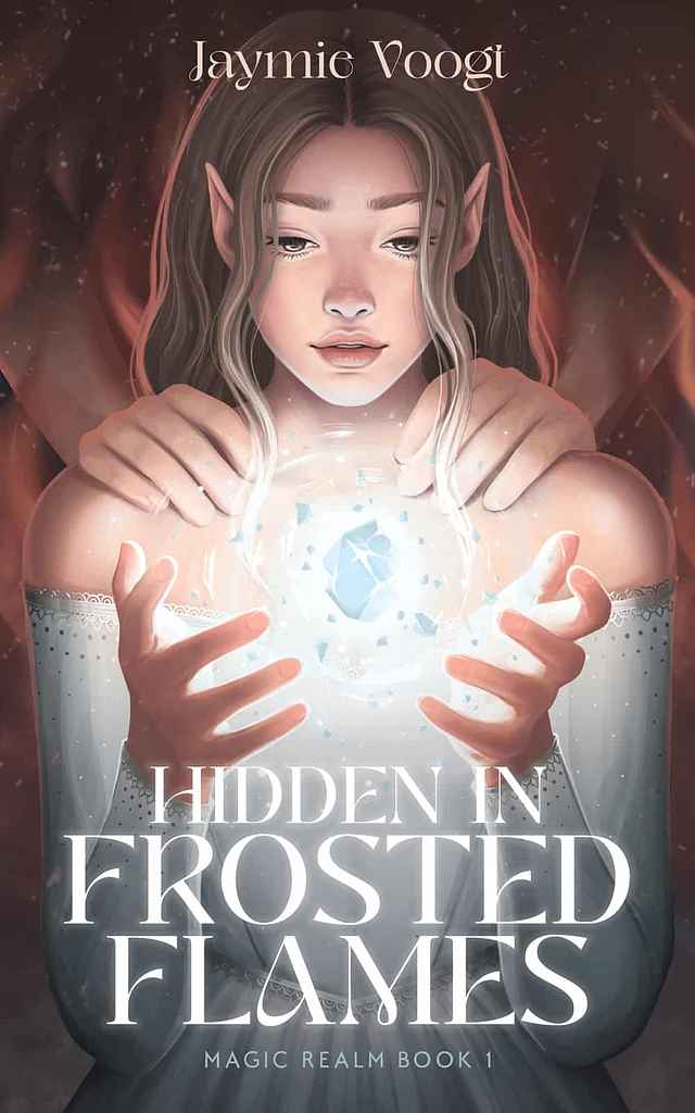
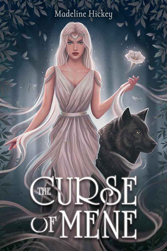
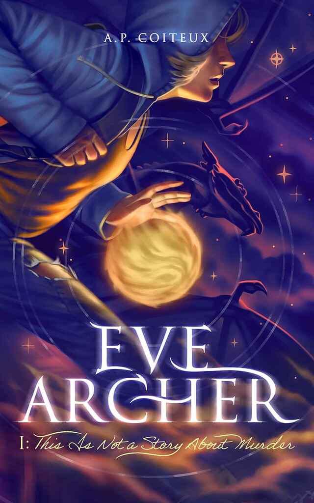
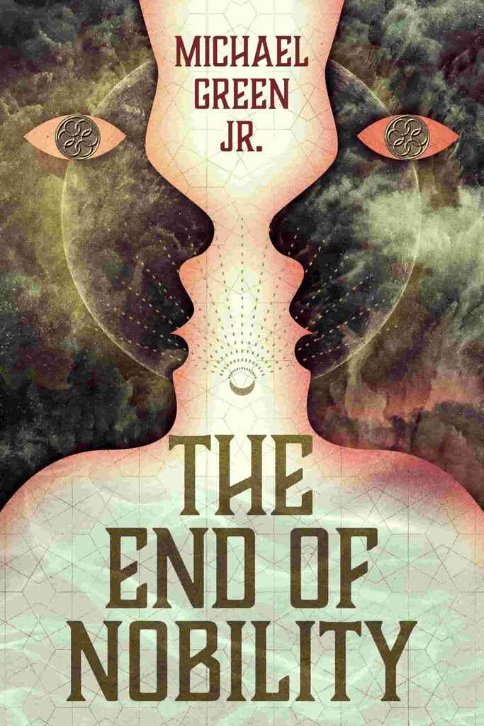
YA fantasy/adventure: semi-realistic character portrait or action scene, ornate or bold display type, jewel tones, a central magical element or landscape
-
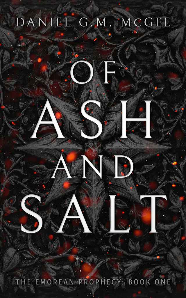
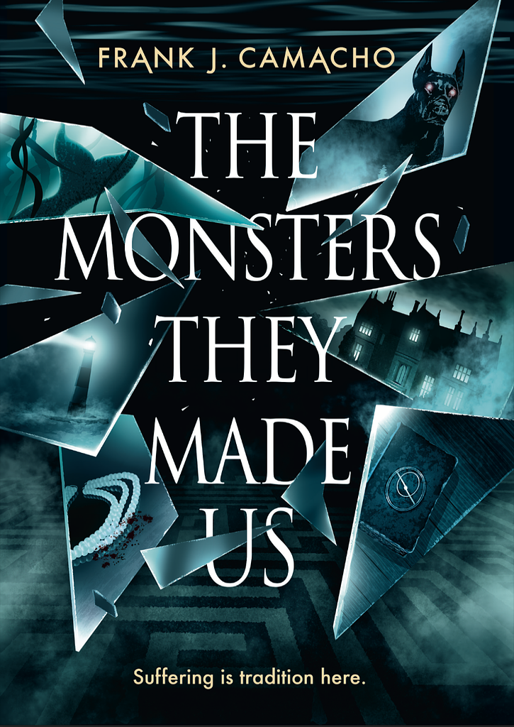
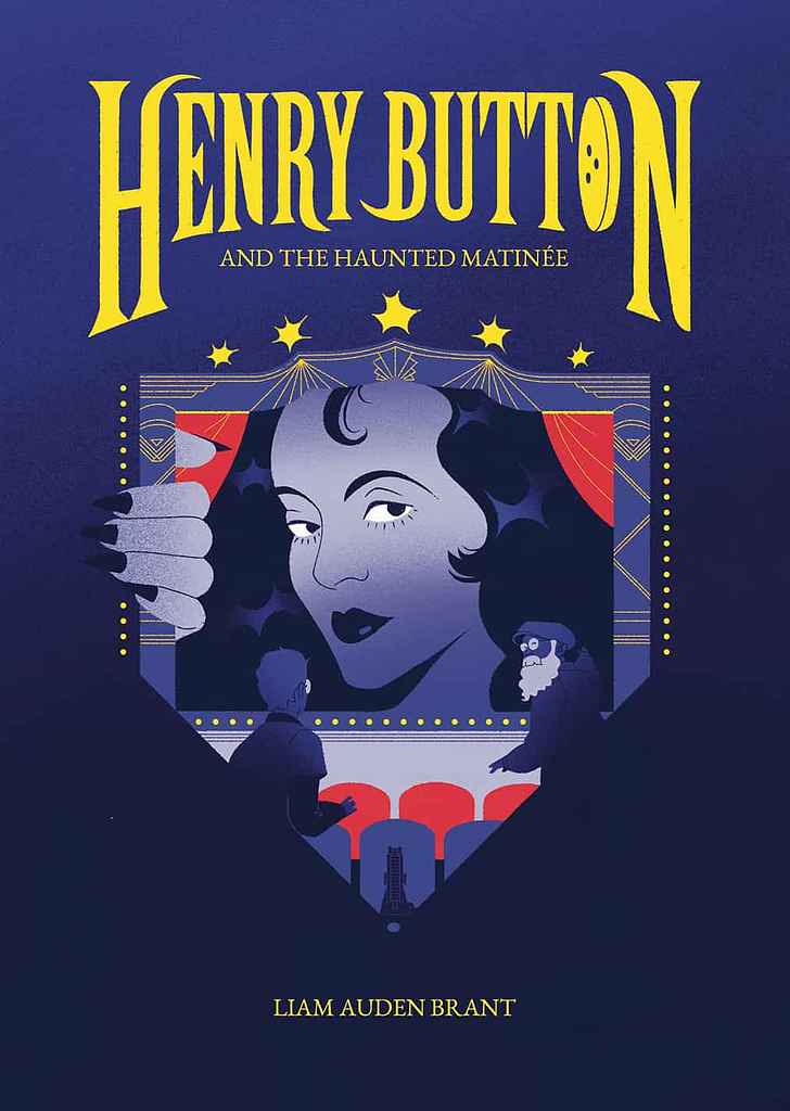
Dark YA/horror-adjacent: near-black backgrounds, creature or threat imagery, cold or bruise-toned palette, sharp stacked typography with a single vivid accent
How much does a YA book cover cost?
YA is one of Reedsy's higher-priced categories, with a median of $900 and averages above $1,500. Most successful YA covers involve bespoke character work — a protagonist rendered with specific features, in a specific setting, in a style that fits the exact subgenre. That means hiring an illustrator, not just a designer, and the pricing reflects it.
How do I find the right YA cover designer?
Filter by genre on Reedsy Marketplace and look for portfolios that match your specific register — the illustrator who excels at warm contemporary YA is solving a very different brief from one who works in dark fantasy or creature-driven horror. Share two or three comp titles and describe the emotional tone of your book. Typography is often the make-or-break element in YA, so include your thoughts on the lettering style from the start: hand-drawn script versus bold display will shape the designer you need.
Browse Reedsy's hand-picked community of YA cover designers and request free quotes today.
Further readings:
