


Self-help covers work by making a promise visible. Whether they show a single pizza slice divided into financial slices, a sunburst radiating from a bold yellow background, a cracked peach on hot pink, a bull standing on a dark navy field, or just three words in the biggest type that will fit on the page — the goal is always the same: convince a reader in one glance that this book has something specific for them.
What makes a great self-help cover?
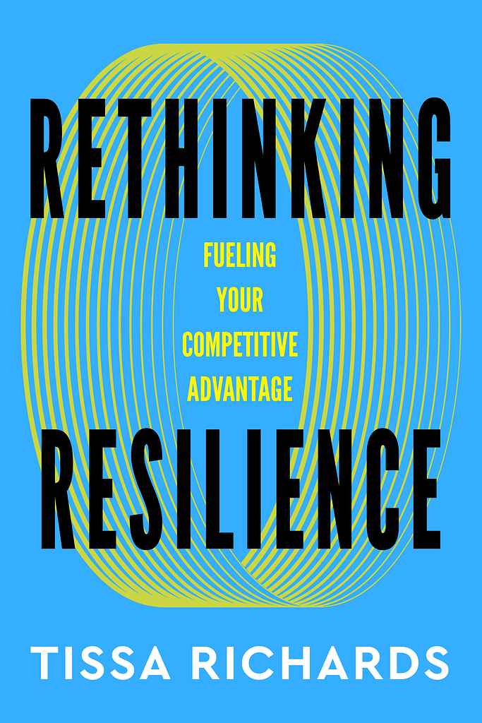
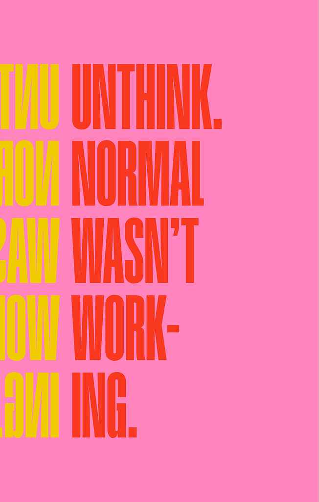
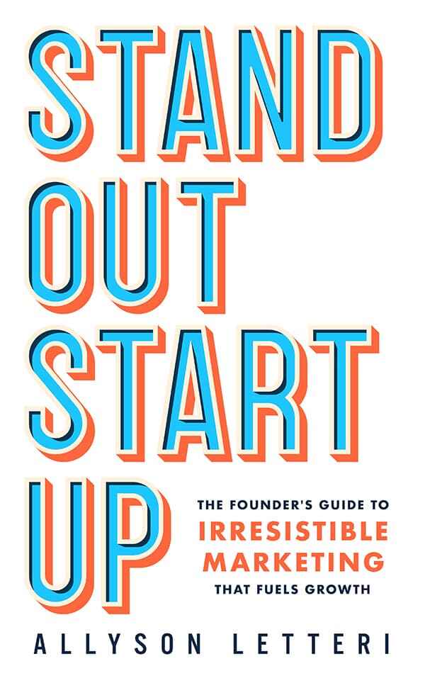
The strongest self-help covers are built around a single clear idea — and that idea is almost always expressed typographically. A dominant background color, a title that fills the available space, and either no imagery or one symbolic graphic element that reinforces the concept. The cover reads like a billboard: instantly legible, immediately understood.
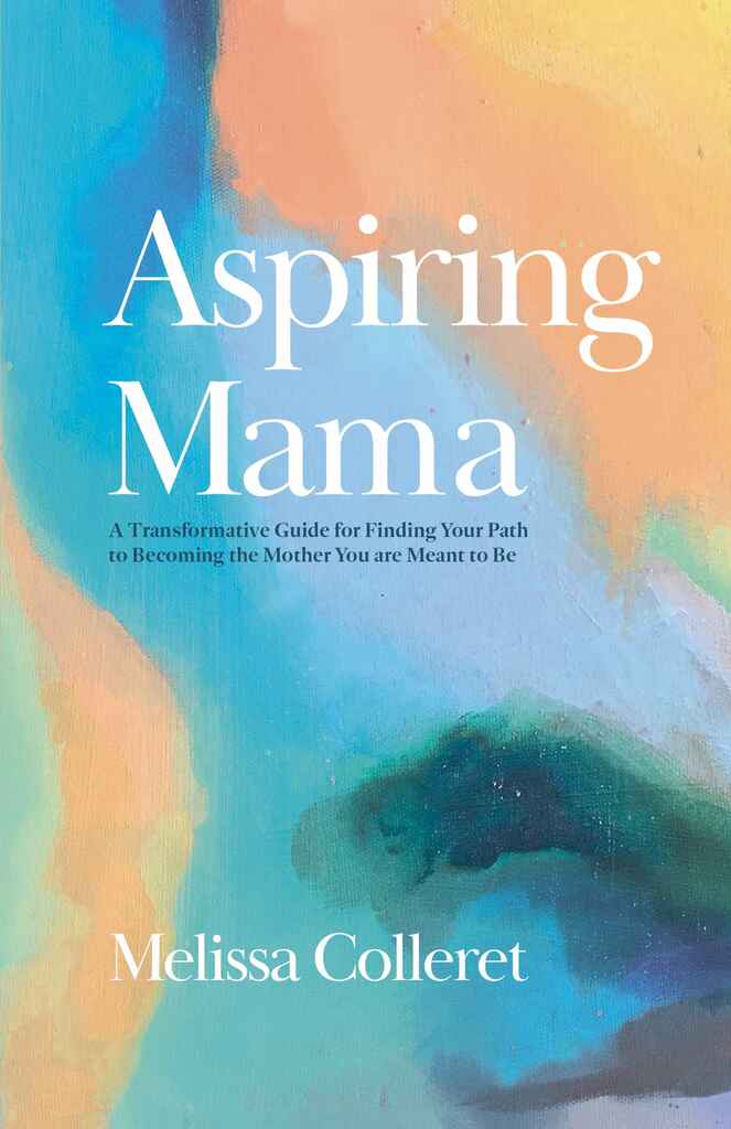
But self-help is a wide category, and the billboard model only covers part of it. Wellness, spirituality, grief, and recovery titles often work through warmth and softness rather than impact — watercolor textures, gentle palettes, painterly illustration, hand-lettered or script typography. These covers make a different kind of promise: not a system or a method, but a companion.
Across both registers, the subtitle carries enormous weight. Readers are purchasing a specific transformation, and the cover is where that transformation gets named. A vague subtitle is the single most common reason self-help covers underperform — the design can only do so much if the promise isn't clear.
What are the most common self-help cover tropes?
-
Bold typographic: one dominant color, oversized title in a clean sans-serif, minimal or no imagery — the cover is the message
-
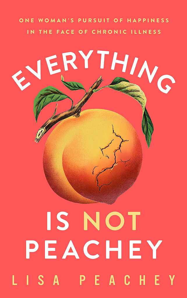
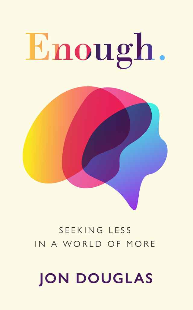
Icon/symbol-led: a single bold graphic (a wrench, a sunburst, a bull, a pizza slice) centered on a solid background — the image is the concept, not decoration
-
Warm/wellness: soft watercolor or painterly backgrounds, script or elegant serif typography, botanical or abstract accents — common in recovery, spirituality, and women's self-help
-
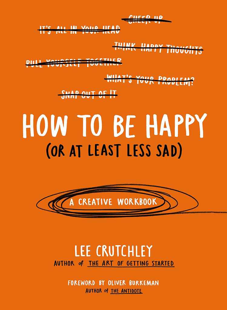
Playful/witty: illustrated or hand-drawn elements, bright or unexpected color combinations, typographic devices like strikethroughs or doodles — signals a lighter, more conversational voice
-
Author-as-brand: the author's portrait dominates, name larger than the title, energetic accent color — works when the author's face and platform are already the selling point
How much does a self-help cover cost?
Self-help covers have a median cost of $800 on Reedsy. Lower-cost designs rely on strong typography and a bold color choice; higher-end covers invest in custom typography and brand identity work that distinguishes an author platform rather than just a single book. If you're building a series or long-term author brand, investing generously at book one pays compounding dividends.
How do I find the right self-help cover designer?
Filter by genre on Reedsy Marketplace and look for portfolios that match your specific register — a designer who excels at bold typographic business books is solving a very different brief from one who works in soft, illustrated wellness covers. Share your subtitle before anything else: the clearer and more specific it is, the better your designer can build around it. Include any credibility signals you want on the front — endorsements, credentials, and bestseller badges belong there, not on the back.
Browse Reedsy's hand-picked community of self-help cover designers and request free quotes today.
Further readings:
