


Historical fiction covers have one core job: make a specific past feel like somewhere a reader wants to spend 400 pages. The best ones signal era in the first half-second — through palette, typography, or a single compositional cue — without tipping into period costume. That's a harder brief than it looks.
What makes a great historical fiction cover?
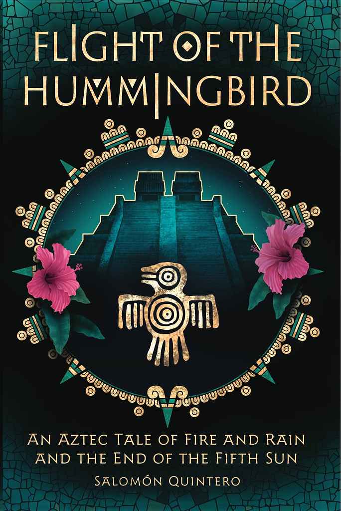
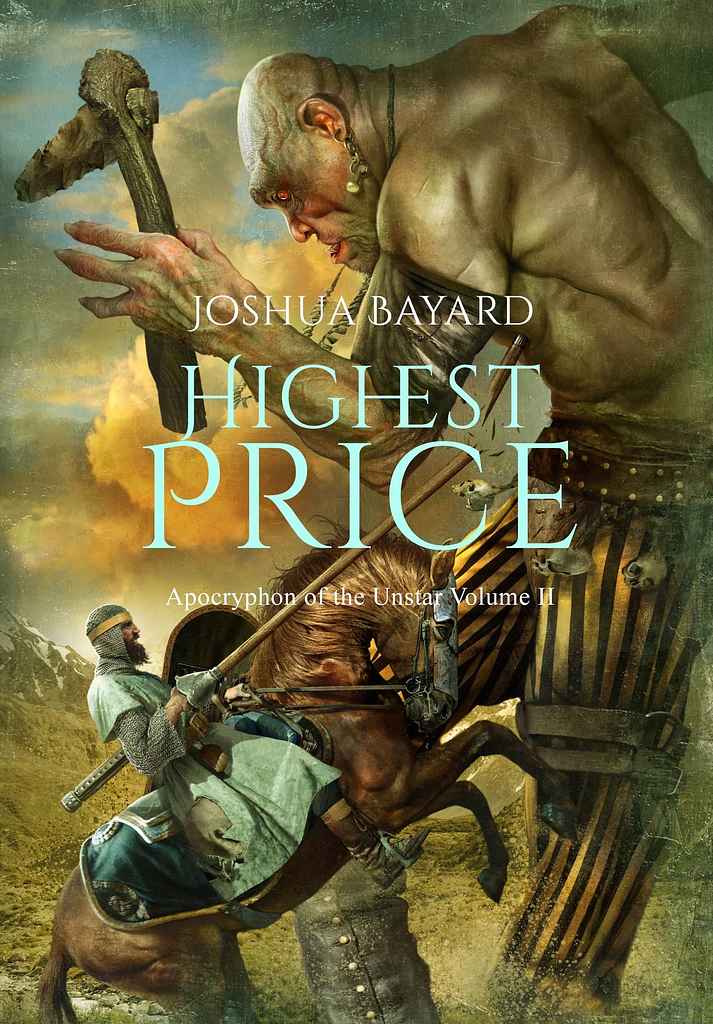
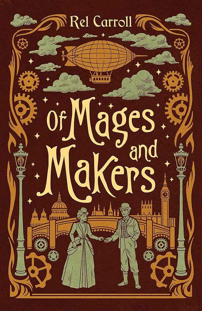
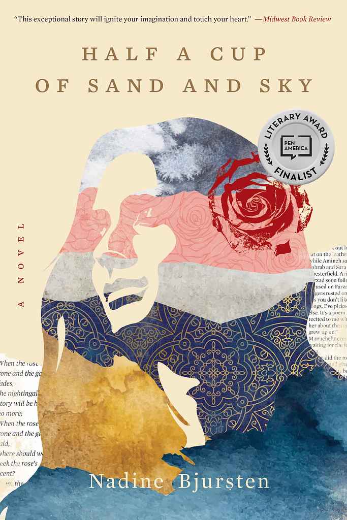
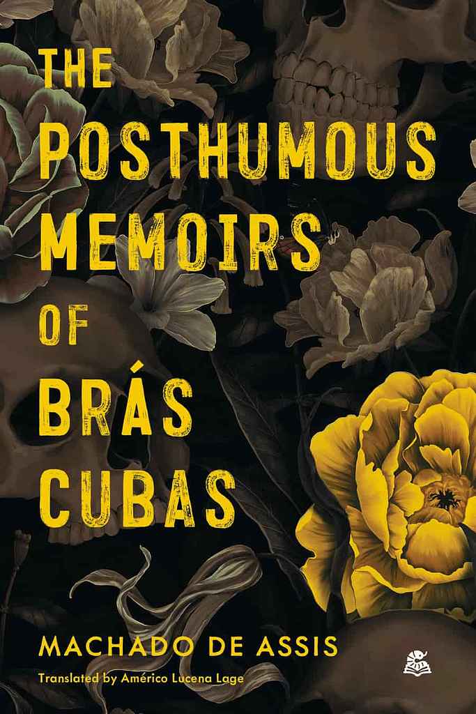
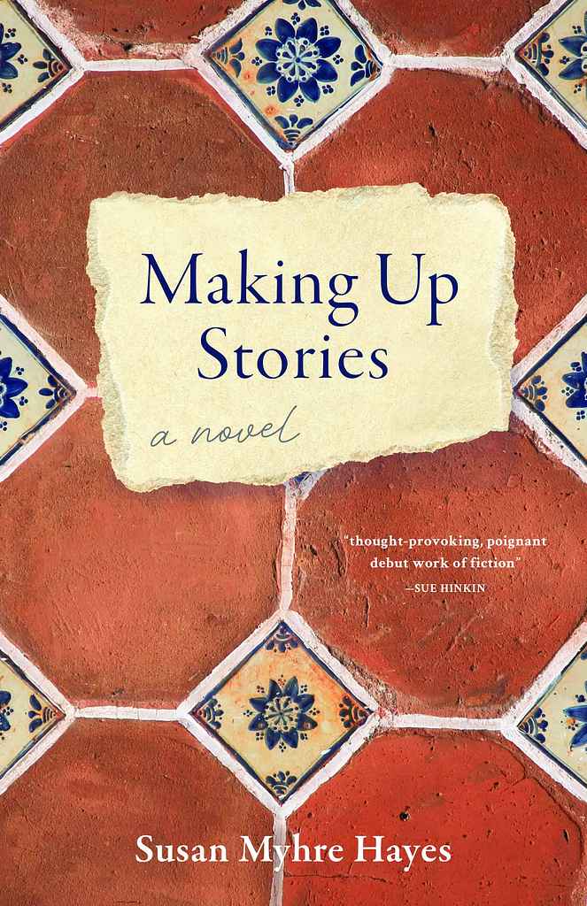
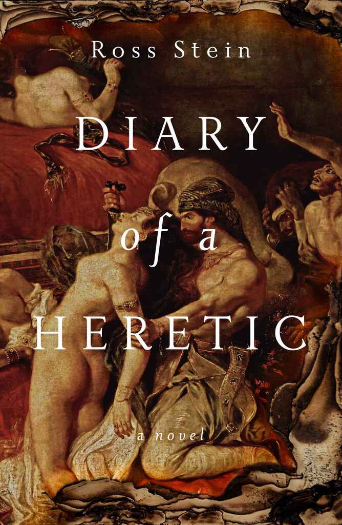
The strongest designs know which register of the genre they're speaking to. Epic and saga-scale fiction tends toward rich illustration — battle scenes, sweeping landscapes, figures dwarfed by the scale of history — with ornate metallic serifs and jewel-deep palettes. Literary historical fiction often works through restraint: muted tones, a single symbolic image, typography doing more of the heavy lifting.
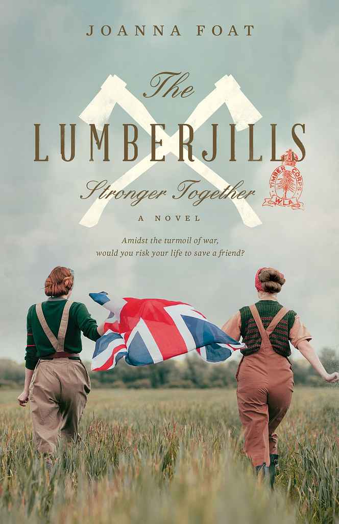
Somewhere in between sits a wide middle ground — art deco graphic work for interwar fiction, warm ochres and turned faces for Asian or Middle Eastern settings, duotone photography and field-scale compositions for WWII. What almost all historical fiction covers share is a palette that feels earned by time: dusty gold, faded rose, aged cream, deep tobacco brown. Colors that read as period rather than vintage.
Typography matters as much as imagery. Period-evocative serifs are the default, but the genre has room for bolder choices — stacked display type, illustrated lettering, even near-graphic cover concepts — when the book's register calls for it.
What are the most common historical fiction cover tropes?
-
Epic/saga: large-scale illustration or landscape, figures set against the sweep of an era, ornate metallic serifs, rich jewel palettes
-
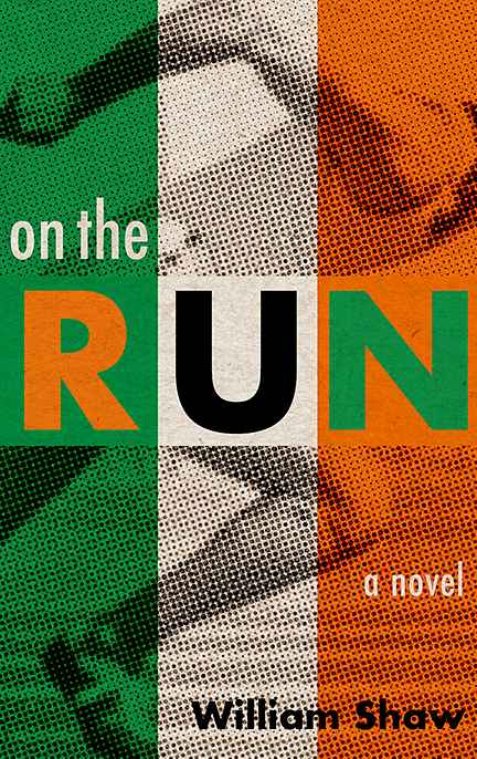
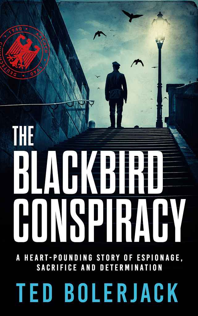
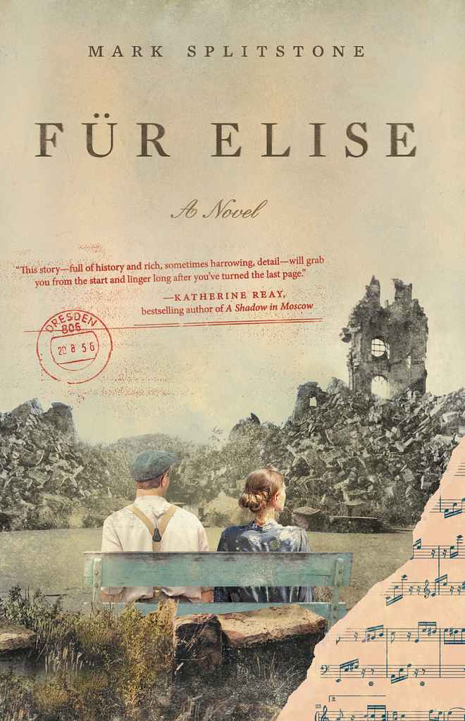
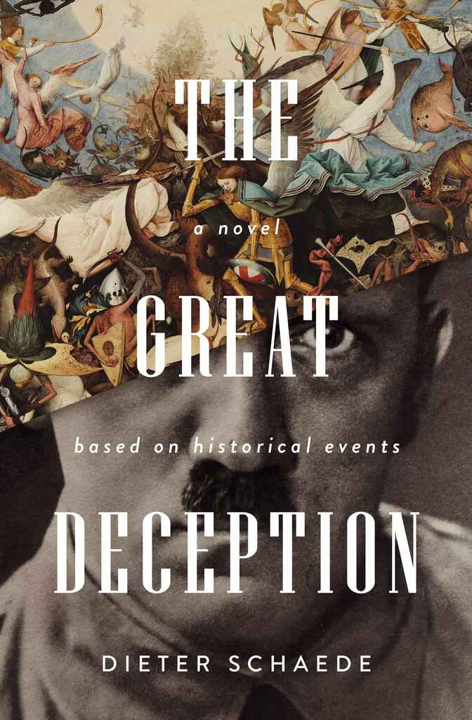
Wartime fiction: duotone or sepia photography, field or countryside settings, serif titles with a single color accent, sometimes a split-screen dual-timeline composition
-
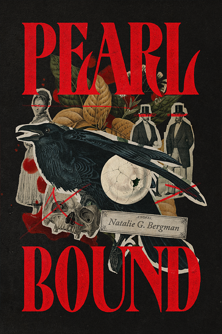
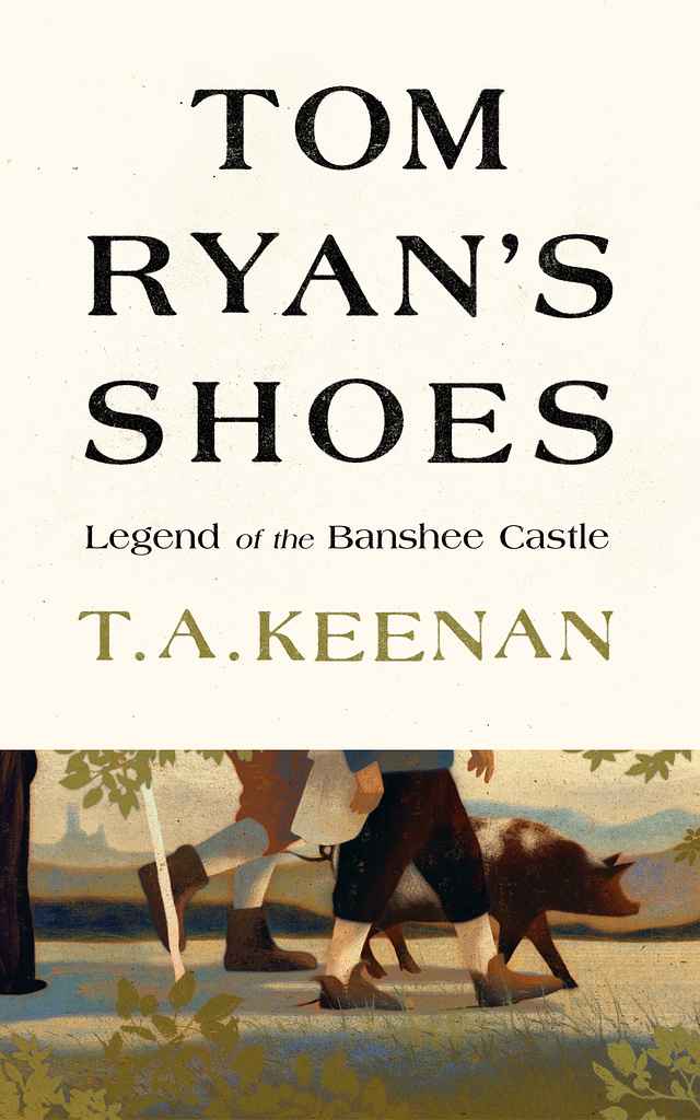
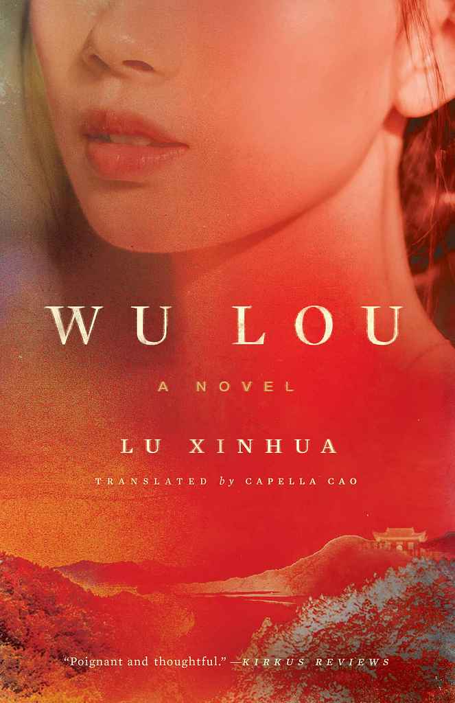
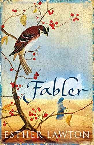
Literary historical: painterly or fine-art backgrounds, quieter palettes, design-led typography — sometimes a single symbolic object or abstract image
-
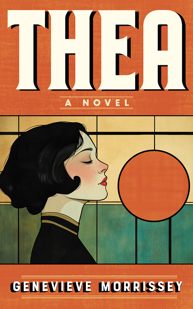
Interwar/art deco: graphic illustration, bold silhouette, high-contrast palette, period-lettered display type
-
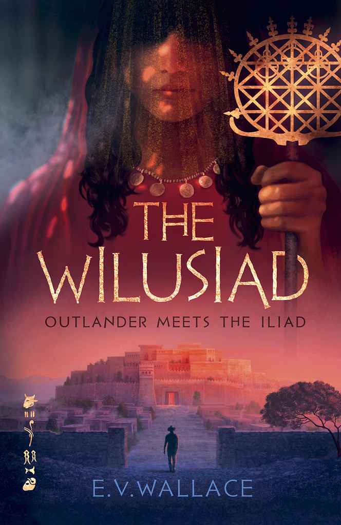
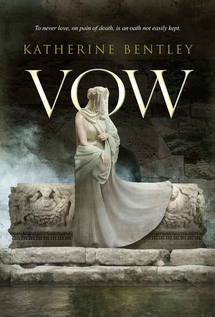
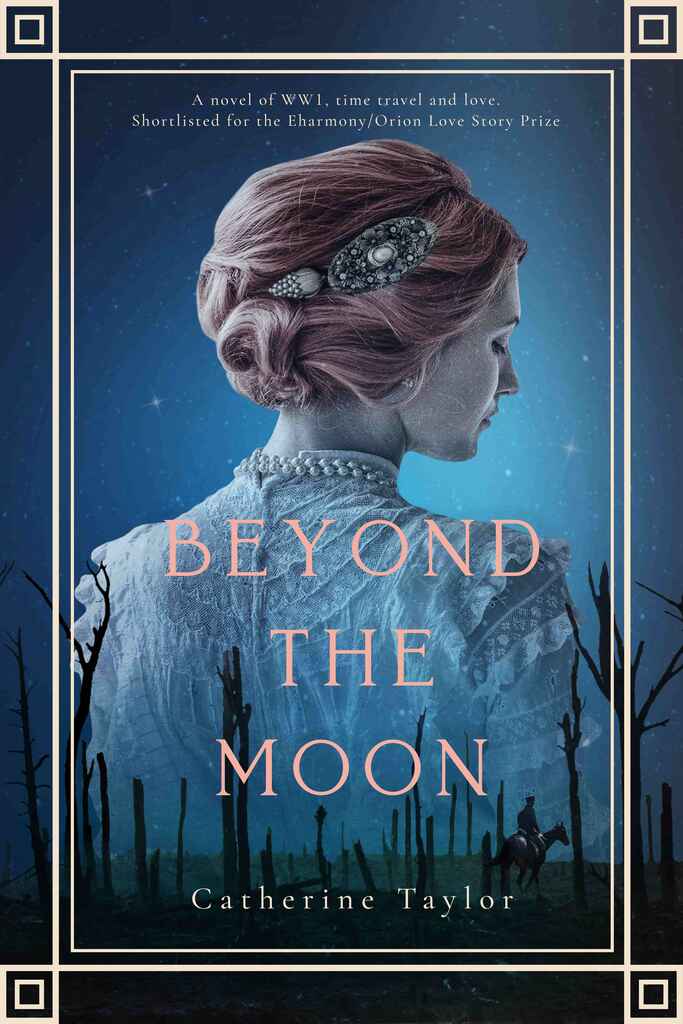
"Figure from behind" convention: period-dressed protagonist, face obscured or turned, muted tones — dominant in women's historical fiction from Tudor to Regency to WWII
-
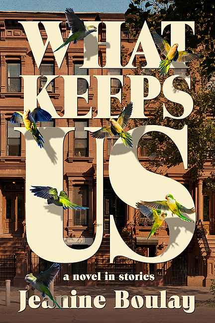
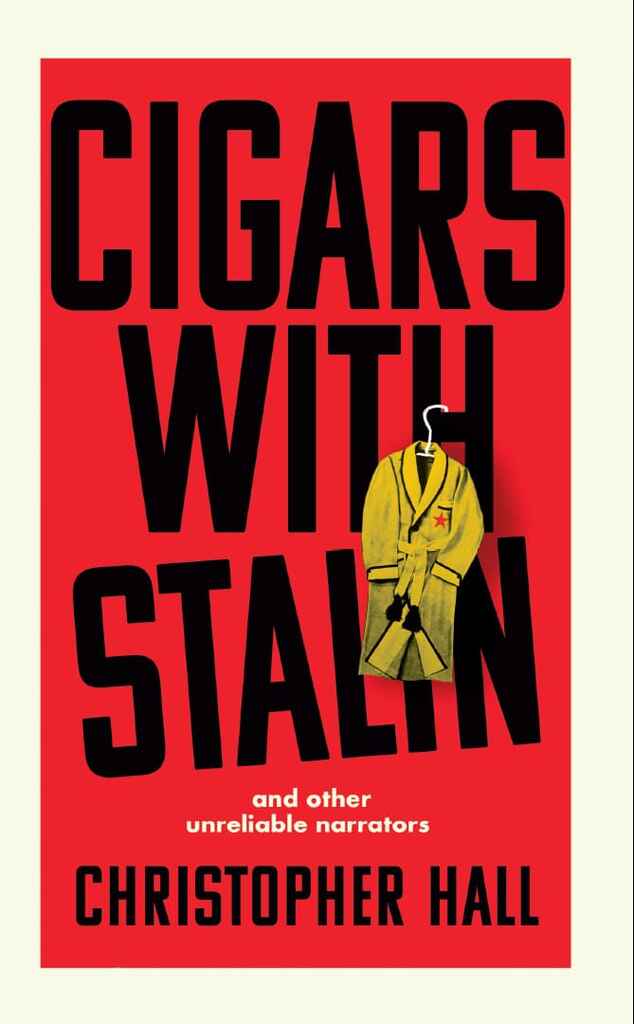
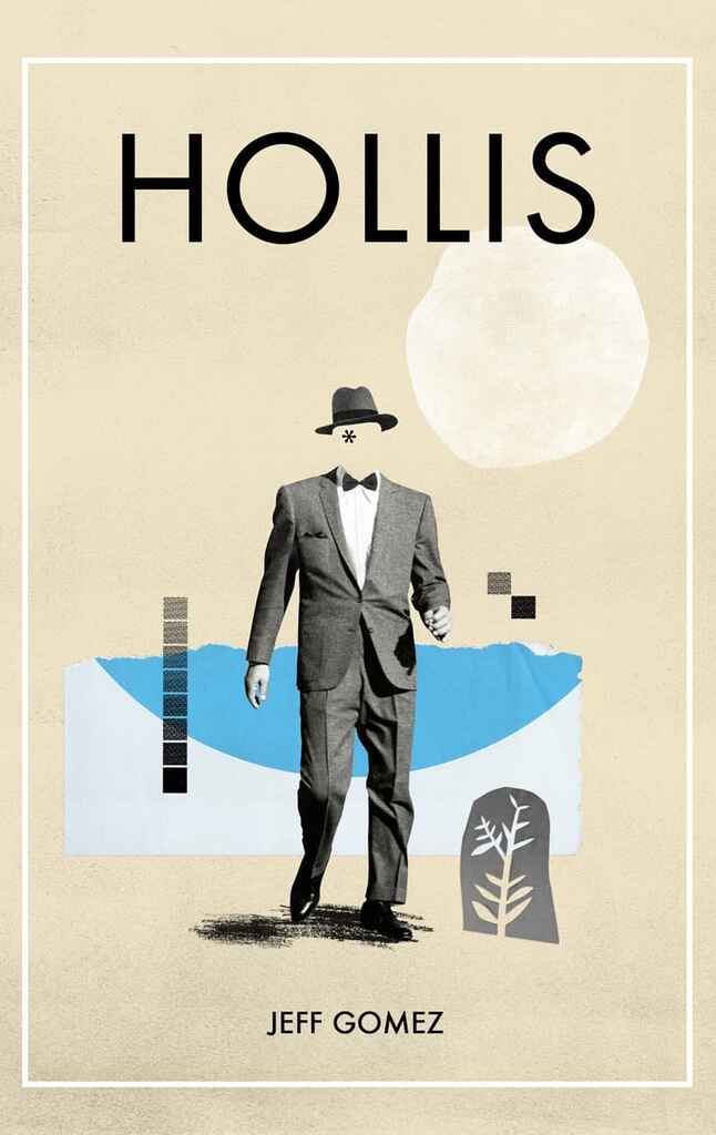
Typographic/concept-driven: bold stacked type, a single strong visual idea, flat color — less common but growing in literary and translated historical fiction
How much does a historical fiction book cover cost?
Historical fiction covers have a median cost of $750 on Reedsy, with averages around $860. The main cost driver is sourcing: period-accurate stock imagery is scarce, and designers frequently composite several images to build a convincing setting. If you're exploring stock before briefing, our guide to royalty-free stock sites is a good starting point. Costs rise for dual-timeline compositions, licensed fine-art imagery, or covers requiring custom illustration.
How do I find the right historical fiction cover designer?
Filter by genre on Reedsy Marketplace and look for portfolios in your specific register — a designer who excels at WWII photography composites is solving a different brief from one who works in graphic art deco or painted epic illustration. When writing your brief, be precise about era and geography: "1923 Shanghai" or "Tudor England, 1530s" will get you further than "historical." If you want a fully rendered period face, say so explicitly — it's one of the harder elements to composite convincingly and will affect both timeline and budget.
Browse Reedsy's hand-picked community of historical fiction cover designers and request free quotes today.
Further readings:
