































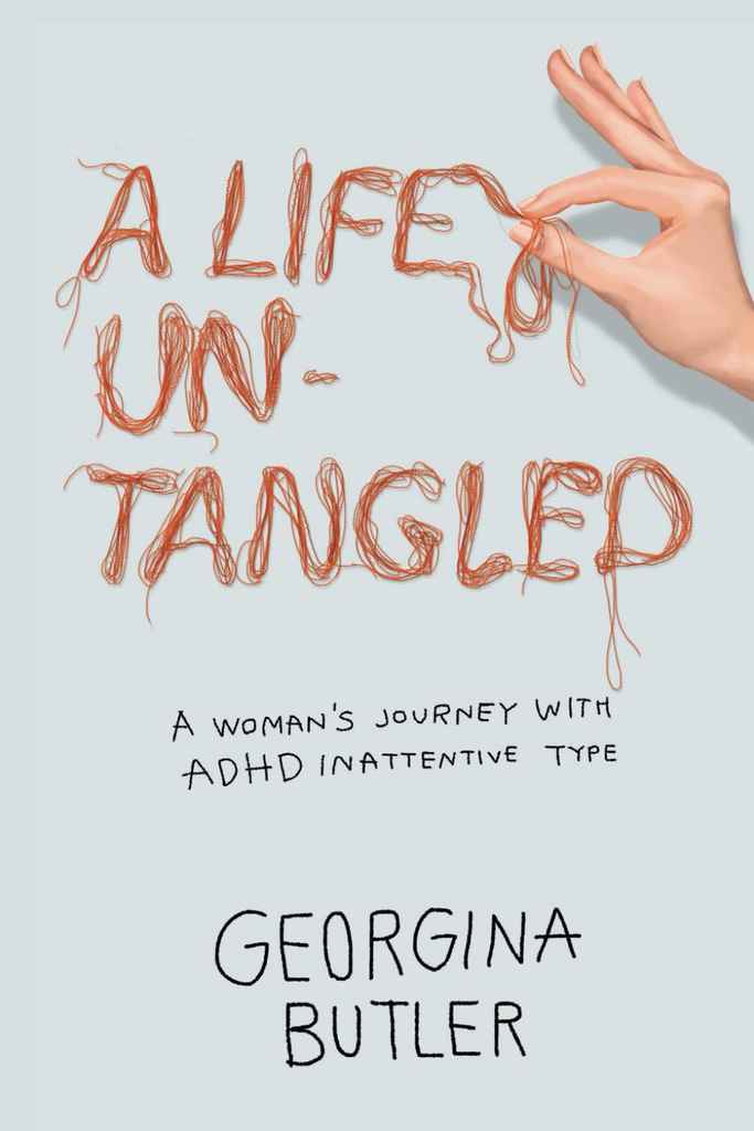



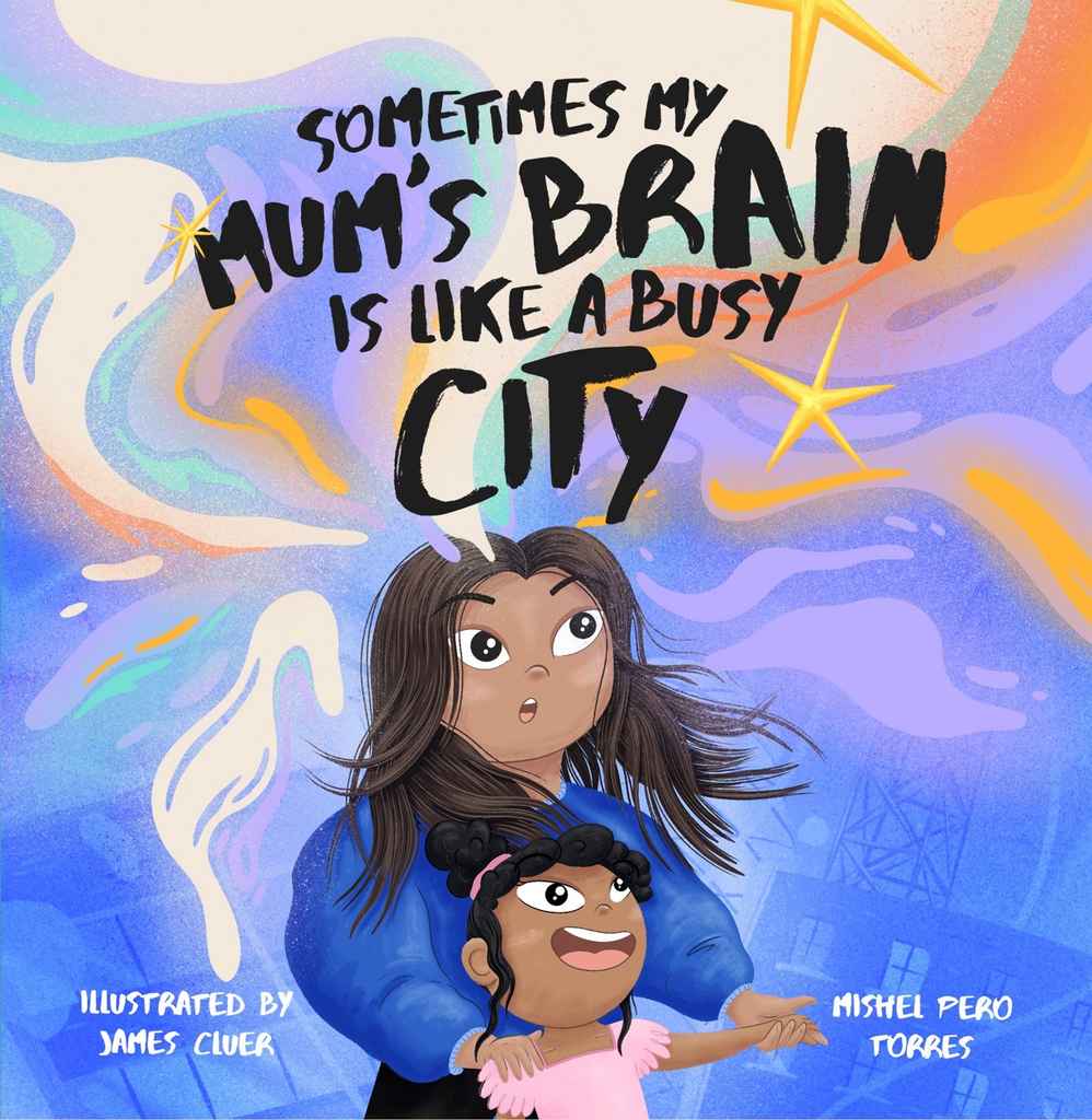


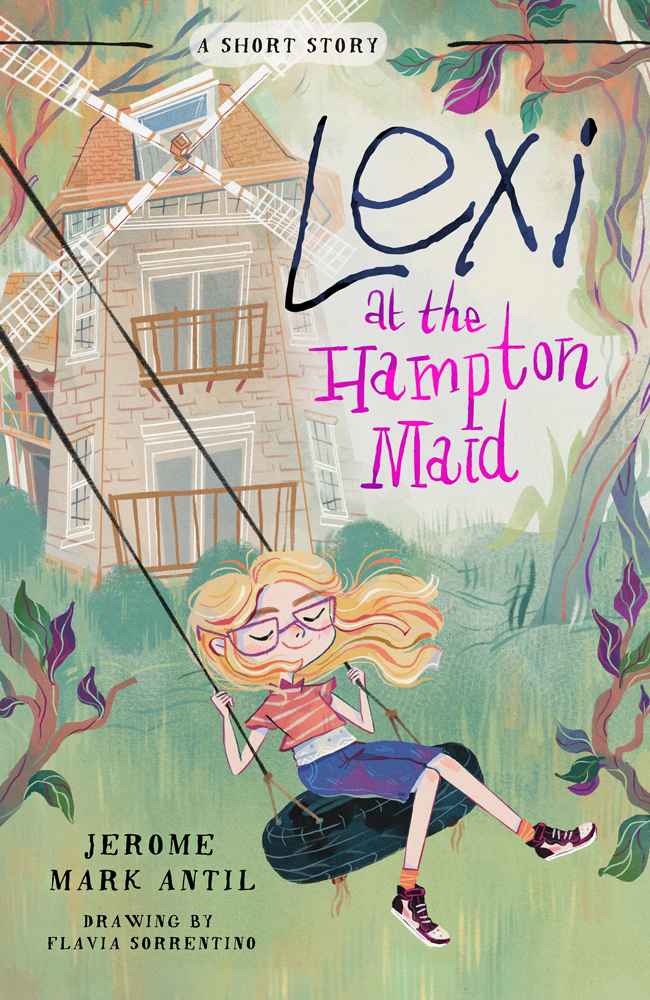





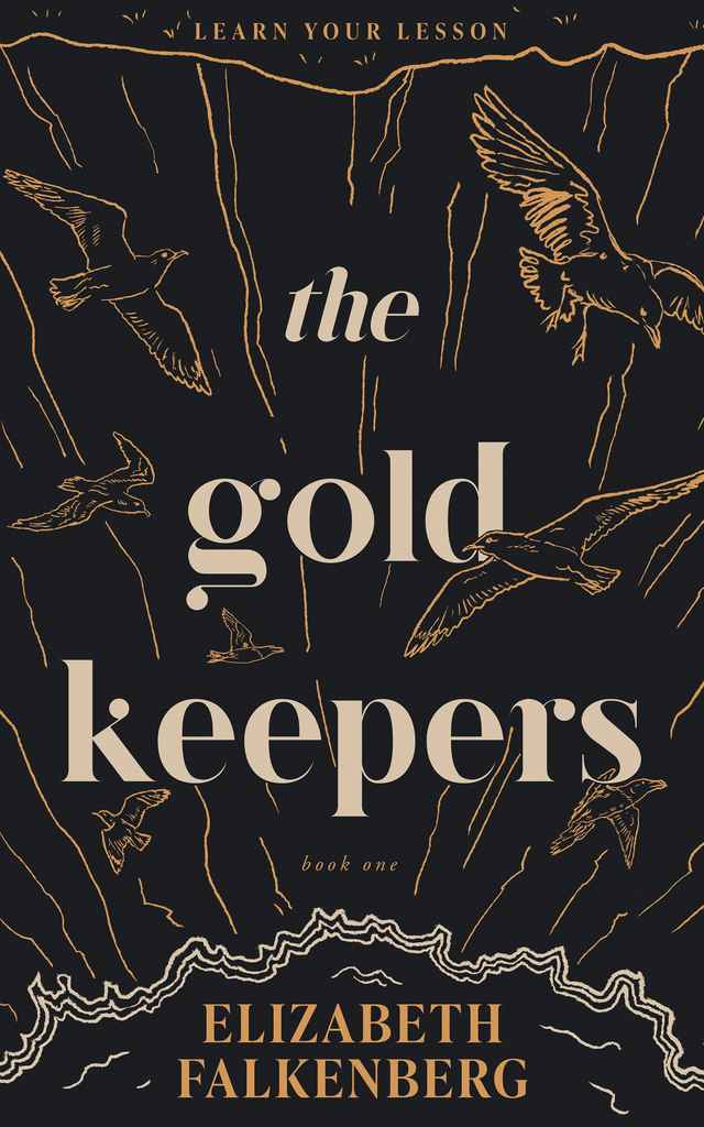




Why is a quality book cover so important?
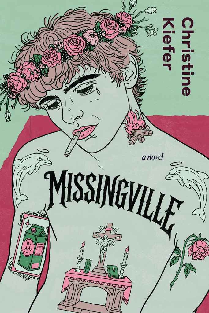
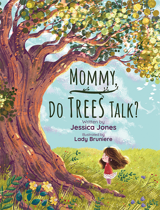
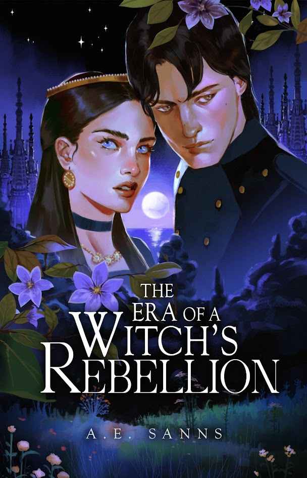
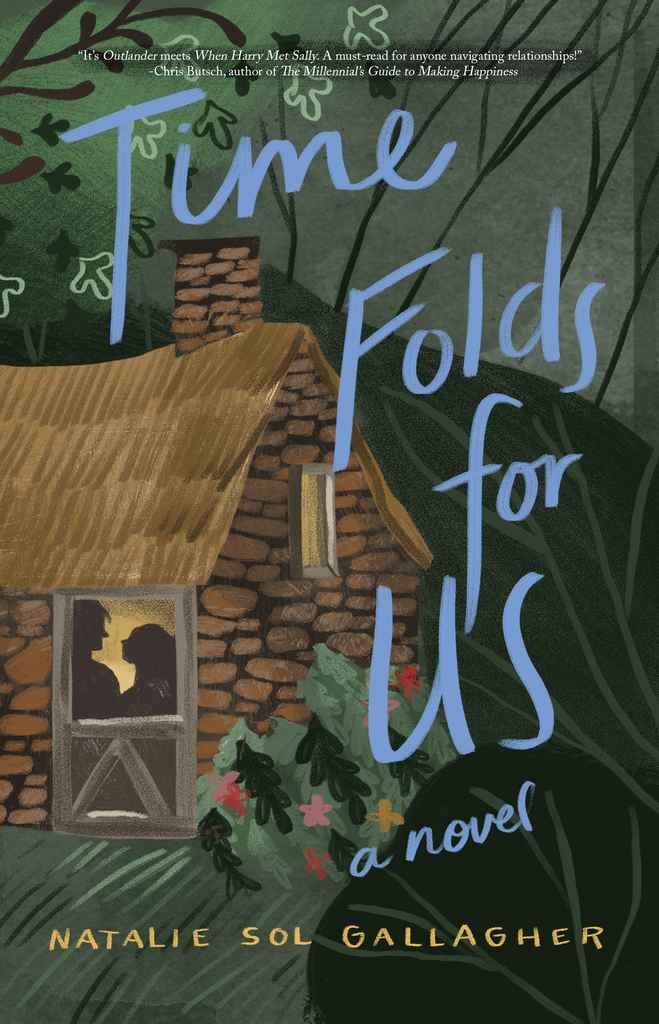
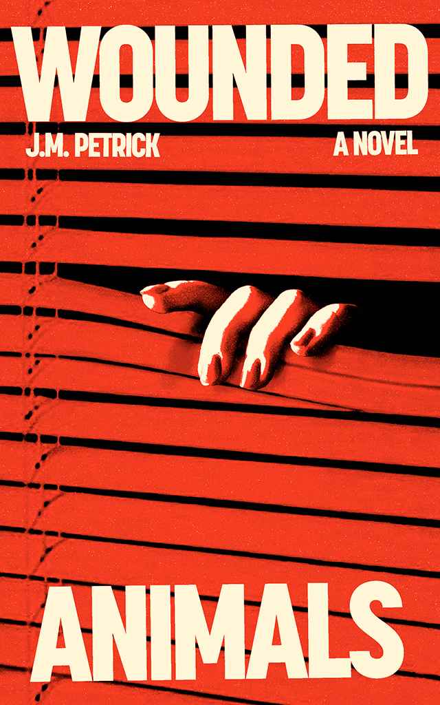
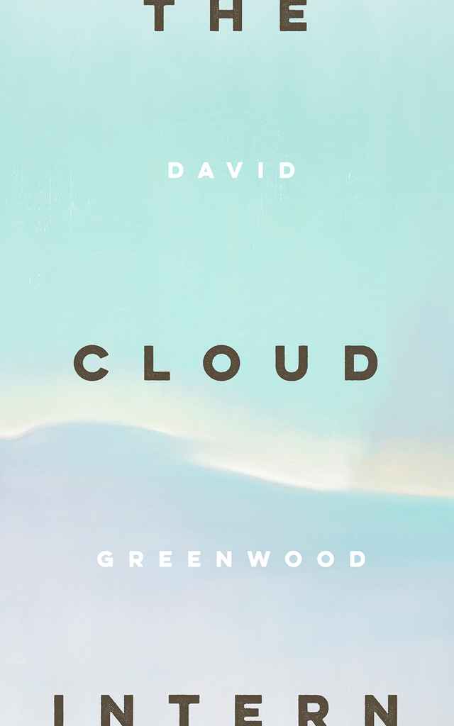
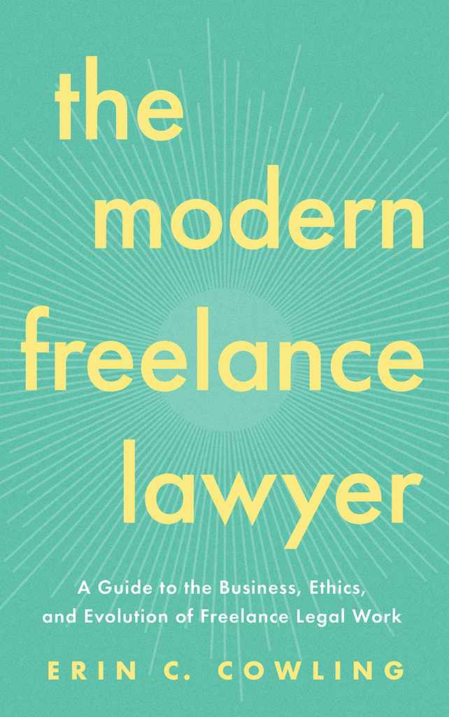
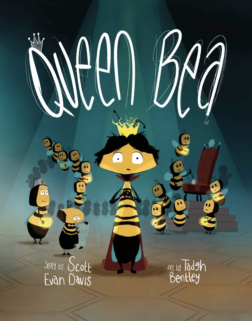
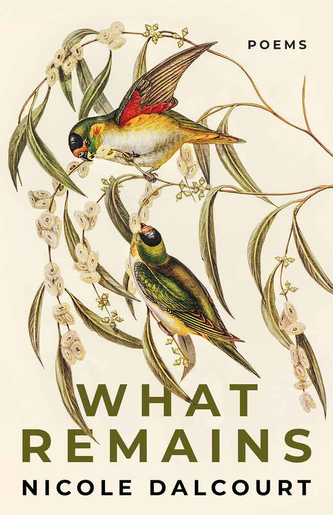
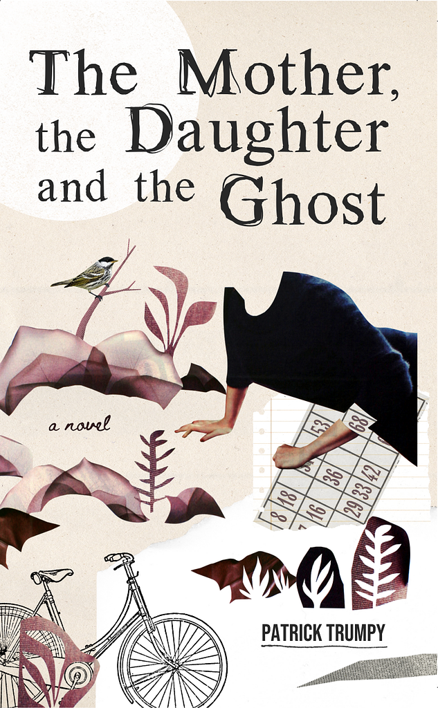
Beyond all the clichés, book covers play an increasingly vital role in modern-day bookselling. Since most readers now find their books online, any book’s cover must quickly attract their attention by standing out, communicating the book’s content and tone, and demonstrating its production quality.
This last point is especially important with independent publishing. Readers prefer to buy professionally made books, and a rough-around-the-edges cover design may suggest otherwise — even if your manuscript is compelling and incredibly well written. That’s why it’s important to have a cover that reflects the quality of your work.
What are the benefits of professionally designed book covers?
Getting a professional book designer to work on your cover design isn’t just about making it look nice. It’s also about making sure it’s fit for the market. The book designers on Reedsy have years of traditional publishing experience in their respective genres — they understand the prevailing trends and can help you create a book cover that signals the kind of book you’re publishing while also offering something new.
A professional cover will also boost your book’s salability. In a recent experiment, we asked our professional designers to rebrand existing indie books. Using A/B testing with Facebook ads, we pitted the new covers against the original non-professional ones and found that the new designs could attract over 50% more interest from readers.
How do I find the right designer for me?
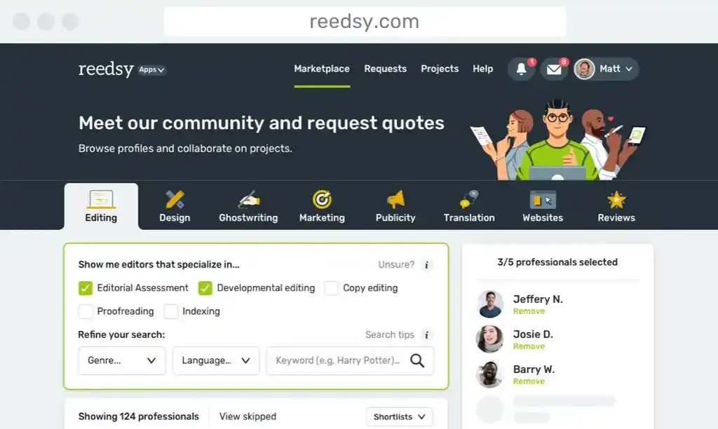
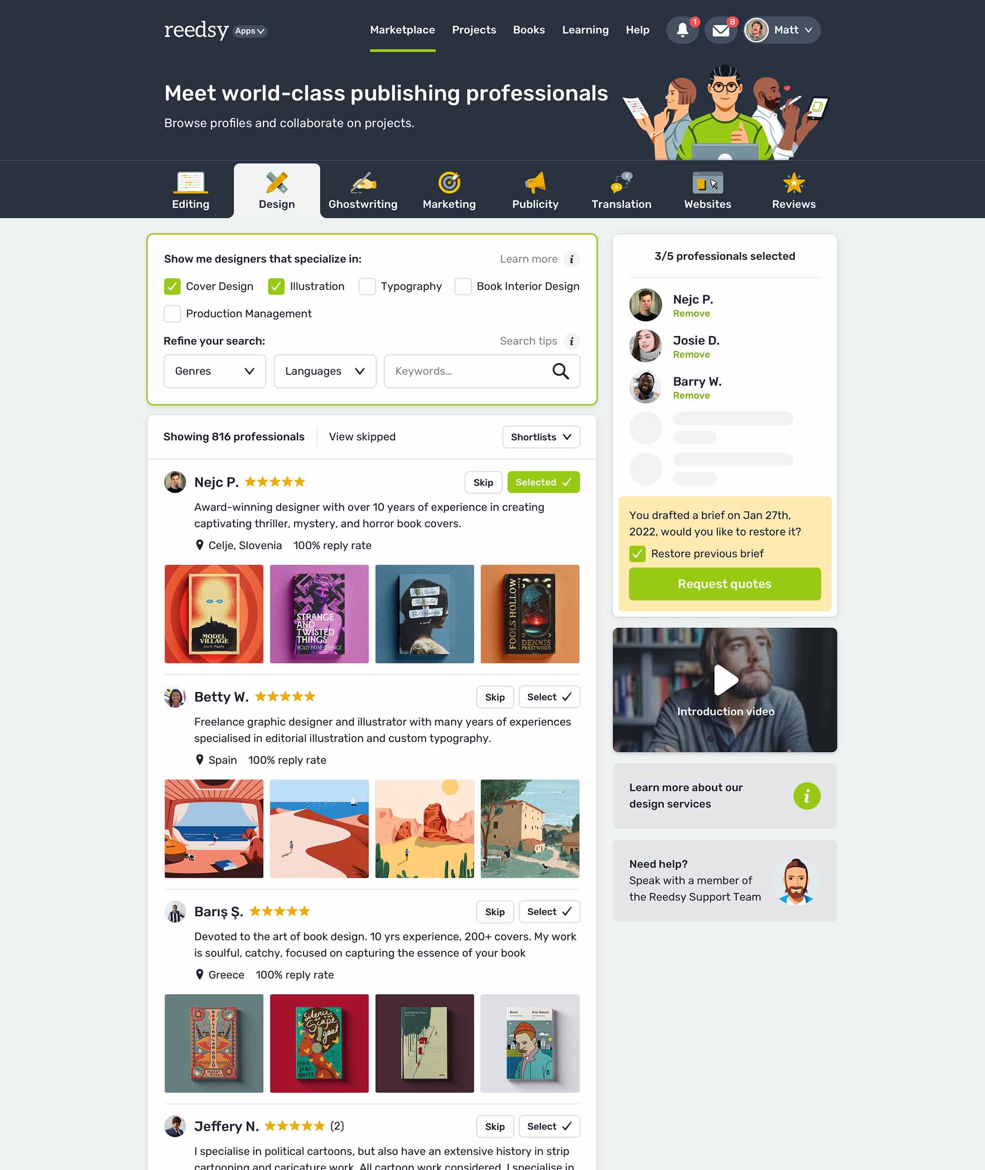
On Reedsy Marketplace, you can search for cover designers who specialize in your genre and niche. Review their galleries to gauge their style and compatibility with your work. Once you've identified a few designers who might be a good fit, send them your brief with your book details, design preferences, examples, budget, and timeline. For more tips on how to write an effective cover design brief, check out this post.
Once you receive some collaboration offers, choose the designer you feel most inspired and excited to work with. Remember to start your search and send briefs well in advance of publication, as designers' schedules fill up quickly. A proactive approach will ensure you have ample time for the design process.
Browse Reedsy’s hand-picked community of book cover designers and request a free quote today.
How much should I expect to pay?
When building your budget, consider the level of experience your designer brings to the table. The rule of thumb is that the more experienced your designer is (and the more prestigious authors they’ve worked with), the higher you can expect their quotes to be. To learn more about how much you can expect design services to cost, check out this post.
More FAQs
Q: What common amateur book cover mistakes do you spot immediately?
Suggested answer

There are a few things that tend to jump out immediately when a cover hasn’t had a professional eye on it.
The most common is weak hierarchy. Everything is given equal importance, so the title, subtitle and author name end up competing rather than working in a clear order. At thumbnail size especially, it just becomes noise rather than communication.
Another is overcomplication. It’s very easy to try and say too much in one cover, so, too much text, multiple ideas, multiple images, effects layered on effects. The result is usually that nothing is really landing properly. The strongest covers are usually the most disciplined ones: one idea, well executed, and left to breathe.
Typography is another immediate giveaway. Fonts that don’t suit the genre, awkward spacing, or over-stylised or the lack of effects can make even a strong concept feel unconvincing. Type should feel like it belongs in the same world as the imagery, not fighting against it.
And then there’s scale. A lot of covers are simply not tested properly at thumbnail size, which is how most readers will first see them. If it doesn’t read instantly when reduced, it’s not doing its job yet.
Ultimately, it nearly always comes down to restraint. The covers that work best tend to feel confident and clear, with every element earning its place rather than competing for attention.
Clare is available to hire on Reedsy
Q: How do you ensure a book cover is effective as a thumbnail for online stores like Amazon?
Suggested answer

Thumbnail performance is something I think about from the very first sketch. Covers go through so many formats — retailer pages, social media, email newsletters — that a design which only works at full size simply isn't finished.
The most reliable test I use is brutal: shrink the cover down to roughly 80/120px and ask yourself whether the title is still readable and whether the image creates any emotional response at all. If the answer to either is no, something needs to change — usually the type weight, the contrast, or how much is competing for attention.
One thing I'd add that hasn't been said: genre legibility matters as much as technical legibility. At thumbnail size, a reader should be able to feel in a split second whether a book is a thriller, a literary novel, or a romance — not just read the title. That's achieved through colour temperature, font personality, and the mood of the central image working together as a single, fast signal.
Cloe is available to hire on Reedsy

Making a book cover effective as a thumbnail is really the cornerstone to a quality illustration. There are a few very important keys to unlocking a great thumbnail. The absolute root of a good thumbnail is legibility. The goal is to guide someone's eye right to your cover and the best way to do that is to make something that is comprehensible in a small scale, and interesting to look at.
First, the design needs to have a hierarchy of shape language to preserve legibility and a solid composition to make the focal point read well. There needs to be a priority of legibility. If you have too many similar shapes, or objects that feel out of balance, the thumbnail will just look noisy. Some of the best covers end up be big, bold, dynamic shape designs because of this. My goal is to usually pick one focal point and have other details support that.
Adding onto the strong foundation, the values of the cover can greatly influence its readability. I'm referring to the dark and light areas of the cover. If you take a good image, and turn it black and white, it should still be completely organized and readable. Grouping values within the focal point so that certain areas are emphasized or minimized will allow the image to read at a distance. Other techniques like saving your brightest and darkest values for the focal point will help it stand out.
Lastly, color can play a crucial role in the initial read of a cover. With the shapes and values locked in, color can be the cherry on top. There are lots of ways to make an image stand out, but one of the strongest is balancing cold and warm colors. Imagine a cool blue image with a small bright pop of orange and yellow where you want the viewer to look. Color harmony can really drive the eye.
So, all of these things together can make a very strong illustration, and when used correctly, they can create a cover that stands out and looks amazing at a small or large scale. Organizing the chaos of an illustration can be the best way to stand out.
Matt is available to hire on Reedsy

While I wouldn’t recommend prioritising tiny, low-resolution thumbnails in an online store, it’s crucial that book covers are easily and quickly recognisable to potential buyers.
This can be achieved in several ways, but a good strategy is to
Simplify the design and prioritise key elements
Avoid overly complex visuals or intricate details that may become indistinguishable when scaled down. Focus on bold, clear imagery and use minimal design principles if possible. Highlight the most important details, such as the title and a central design element, while minimising unnecessary clutter. Choose a striking focal image or graphic that remains recognisable when reduced to thumbnail size.
Use readable typography and keep contrast high
Use large, legible fonts for the title and author name. Choose clean typefaces that remain clear even at small sizes. Incorporate strong contrast between text and background colours to make the cover stand out and ensure readability.
Jonathan is available to hire on Reedsy
Q: How does a professionally designed cover impact the success and sales of a self-published book?
Suggested answer

I think it determines in most cases whether or not the book gets sold. Either consciously or subconsciously. Part of my job as a designer is understanding marketing and trends. I look at book covers, LOTS of book covers. And take notes. Personally I don't think I'd buy a book with an unprofessional cover. If the author didn't take the cover seriously, then what's to say the story is any better? Is this project something they just typed up and published on a whim? Or is it something they really believe in and want to make the best product possible?
Michael is available to hire on Reedsy

A professional cover plays a huge role in the success of self-published books because it’s the first thing people notice. It gives your book credibility and helps it stand out, making it look just as polished as those from traditional publishers. A great cover not only grabs attention but also sets the tone for your story and appeals directly to your target audience. In a crowded market, it can be the difference between someone scrolling past or deciding to give your book a chance.
Robert is available to hire on Reedsy

It's an enormous impact. I would say it's the single biggest factor in whether your book sells. When I see a cover that looks amateurish, I subconsciously assume that the writing is probably going to be at an amateur level as well. It's as simple as that. I always judge a book by its cover. The book may be the greatest work of the new century but if it is packaged in a way that communicates carelessness or lack of attention, then that has huge repercussions for the reputation of the work and the respect that it needs in order to sell.
Just go into any book store. Look at the new released that are elegantly designed. You immediately assume that its worth reading because the author, the publishers, everyone deemed it worthwhile to invest time in producing. That assumption is critical in getting your work out to a new audience. Humans are visual creatures. Otherwise, art, advertising, TV, the internet, social media, none of that would need to exist.
Wayne is available to hire on Reedsy
Q: What software and tools are commonly used by book cover designers to create professional-quality designs?
Suggested answer

I use a mix of Adobe products (of course!).
Adobe Illustrator for any illustrative/drawn elements such as illustrations, graphics, special text treatments or icons etc.
Adobe Photoshop for the general background of the whole cover/jacket (so, usually front, back and spine … and flaps if needed) as one high resolution document (allowing for bleed and spine width changes!). More often than not photographic elements too. This is where I will import and blend the graphics from Illustrator with photography/stock images to become a bespoke/original image. Sometimes title work will be done in Photoshop if it needs to combine/blend with the image more (not just plonked on the image for instance). Larger amounts of text shouldn’t be done in Photoshop as it’s a ’raster-based’ or ‘pixel-based’ app – it will never be as sharp as InDesign or Illustrator (both vector based – or infinitely scalable).
I can also control ink densities in Adobe Photoshop to make sure that my rich blacks are not too rich! In other words; not too much ink in the dark areas in the finished print (printers don’t like that!)
Then the artwork (mechanicals) are always completed in Adobe InDesign – the Photoshop file(s) is/are imported into my artwork file which is a much more accurate setup with grids and guides to make everything just perfect. InDesign cannot be beaten for its layout and type handling capabilities – when used properly! So normally the titles, book blurb and subtitles etc are done inDesign. Also ISBN codes, prices and any other required text is added InDesign. The app itself is much quicker to use and navigate with imported graphics and images then trying to do the same work in an app like Illustrator. This is what InDesign was developed for.
Also, any special finishes such as spot varnish, Pantone colours, embossing, de-bossing or foil blocking etc can be set up in Indesign using layers – much easier to control in Indesign than any other app.
Adobe Bridge can be used to produce colour profiles that could be synchronised over all the Adobe apps. So it’s easier to control your colour workflow across all the software apps.
Finally, print ready PDFs can be exported directly from InDesign including any layered special finishes. In my experience, PDFx4a files are the most stable and reliable PDFs to export.
I know all this text is a bit waffly, but it gives you an idea of how I go about my work.
Hit me up if you need a pro! (Haha!)
Nathan is available to hire on Reedsy

I use Adobe Illustrator to create the design of the cover, including the custom illustration. The advantage of working in Illustrator is that it allows me to work on both typography and illustration at the same time. It also allows for different artboards with variations of the cover design next to each other, making it a good tool for comparing different elements and aspects of the design.
To make a print-ready file, I sometimes use Adobe InDesign.
For the cover illustrations I also reach out to various drawing software apps on the iPad such as Procreate and Adobe Fresco that I then import into Illustrator.
Hester is available to hire on Reedsy

I use Adobe products like InDesign, Photoshop and/or Illustrator.
Photoshop and Illustrator for the images creation, manipulation and composition. Then I use InDesign for layout and typesetting.
Veronica is available to hire on Reedsy
Q: As a standard, how many concepts and rounds of revisions do designers offer in their quotes?
Suggested answer

As a standard, my process includes three main stages, each with clear steps and opportunities for feedback and revisions to ensure the final design meets the client’s expectations.
For concepts, I offer three black-and-white thumbnail sketches in the first round. These serve as the foundation for the design, allowing him to select one concept to move forward with. If necessary, he can request revisions during this stage, with up to three revision rounds included. Additional rounds are available for a fee, though most clients are satisfied with the initial sketches.
Once a concept is chosen, we move to the Detailed Sketch Round, where I refine the selected design, adding more clarity and, if relevant, suggesting a color scheme. The client is entitled to two revision rounds at this stage, with extra revisions available for an additional fee. Revisions during this phase should be smaller and align with what was approved in the previous round to avoid production delays.
Finally, during the Final Cover Round, I produce the polished, final version of the design. One last minor revision round is included to ensure all details are perfect.
This structured process allows for clear communication, minimizes unexpected delays, and ensures both the client and I are happy with the final product.
Carl is available to hire on Reedsy

I provide a minimum of three distinct initial concepts, each showcasing a unique design approach. This variety allows the author to explore different creative directions. Occasionally, if inspiration strikes, I may offer additional concepts, but three original designs are always guaranteed to start the process. Once the author selects their preferred concept, we refine it through up to three rounds of revisions, though many projects require only one or two rounds to achieve the final design. If multiple initial concepts resonate, we combine elements—such as typography, color palettes, or layouts—from several designs to create a cohesive and tailored final cover.
Rachel is available to hire on Reedsy
I supply a minimum of 3 different concepts but I often give a few more if the books subject has inspired me or I've come up with more valid designs than the standard 3.
I carry out 3 rounds of revisions to the client's chosen preferred front cover option. Another 3 rounds for the combined back cover and spine. And if I'm commissioned to design the interior, 3 rounds to revise that too.
Wayne is available to hire on Reedsy
Q: What's your process when collaborating with authors to refine cover concepts?
Suggested answer

My collaboration process begins with a detailed creative brief that draws on my experience as both an author and illustrator. I understand the deep personal investment authors have in their work, having published five books myself, so I approach each project with empathy and professional insight. The process starts with thorough discussions about the book's themes, target audience, and the author's vision.
I provide multiple initial concepts, usually 2-3 distinct directions, each accompanied by detailed explanations of the design choices and their marketing implications. My two free revision policy ensures authors feel confident in the process, knowing they have room to refine the chosen concept. During revisions, I encourage specific feedback and maintain clear communication about how each change serves the book's goals.
Throughout the collaboration, I share progress updates and explain my design decisions from both an artistic and marketing perspective. This transparent approach, combined with my understanding of storytelling, helps build trust and results in covers that authors are proud to represent their work.
Sergey is available to hire on Reedsy

Open communication is key. I’m very open to feedback for my designs and it’s essential to create the best possible cover artwork!
Tommy is available to hire on Reedsy

When collaborating with authors, my process to refine cover concepts starts with the brief. It needs to have a very detailed description of what the author needs for the cover. I also like reading the book, in order to get a better sense of the characters, the topic and the atmosphere.
I write down all the ideas, descriptions and elements, before making a mood board of my own. Then I sketch down all the cover ideas that come to mind, in thumbnails.
Next stage is refining the ideas, only keeping the strongest concepts. Those are submitted to the author. When he makes a choice, it will be fully developed into the final cover format. Small adjustments and color corrections can be made before finalizing the design.
Maite is available to hire on Reedsy
Q: How do you best work with clients to capture their vision for their book cover?
Suggested answer
Working at Penguin Random House means the conversation around a cover rarely involves just one person. There's the author, the editor, the sales team, the marketing team — everyone has a stake, and they don't always agree. Learning to work in that environment has taught me something useful for any client relationship: the brief people give you and the cover they'll actually love are often two different things.
So my starting point is always to ask what the book needs to do commercially, not just what it should look like. Who is buying it, where, and why? That shapes every creative decision before a single element goes on the page.
From there I try to show directions rather than options — not three versions of the same idea, but three genuinely different creative territories. It gives clients something to react to — and from there, the vision tends to find itself.
The vision is rarely fully formed in the client's head. Part of the job is helping them discover it.
Cloe is available to hire on Reedsy
Firstly, always listen to what the client is saying and - read between the lines - what do they really want. Read the brief. Then read it again. I don't just slavishly give the client exactly what they ask for. They are paying me for my expertise. So I will consider what they want to achieve (which is usually different than what they initially want to see). Then I will come back with ideas that will achieve their aims. Its a bit of back-and-forth between me and the client until we align on the final cover. Clients tell me all the time, they could never have expected the final cover to look how it does, and how thrilled they are with the result. Sometimes a client will come with a firm idea or element. If that serves the book then great, I will incorporate it in a way that optimises what the cover needs to communicate. Its ultimately about communicating clearly with the client.
Wayne is available to hire on Reedsy
The best way to capture a client’s vision is to start by asking lots of questions. I like to find out not just about the story, but also about any concerns or fears they might have, what they do and don’t like, and how they want the book to feel on the shelf. Sometimes a video chat helps enormously to get a sense of their taste and personality.
If a client has a specific idea, I always do my best to use that and make it look professional. If I think the project could benefit from a different approach, I will suggest alternatives, but always as part of a collaborative discussion.
Stage one of my process is research and idea generation. I play around, try out unusual or even odd concepts, and see what comes from that experimentation. With every idea I present, I include variations in colour, composition, or typography so the client can see the possibilities.
Many authors actually do not know exactly what they want, and that is great too. In those cases, I cast my visual net wider, presenting lots of ideas and styles to see what resonates with the book. Once we have settled on a direction, the refining and to-and-fro can take several stages to resolve. Getting every detail right on the spine and back cover is equally important. From there, we work together to shape a cover that is both creatively exciting and commercially strong.
Clare is available to hire on Reedsy
Further reading
-
🎨 Book Design: What Goes Into Making a Stunning Book? (Click here)
-
🖼️ The Elements of a Book Cover: A Deeper Dive (Click here)
-
🖌️ 30 Amazing Children's Book Illustrators (and How to Hire Them) (Click here)
-
🐲 Book Illustration: 25 Beautiful Examples (Click here)
-
🔠 10 Brilliant Fonts for Your Book Layout (Click here)
-
📸 20 Royalty-Free Stock Image Sites to Source a Book Cover Picture (Click here)
-
📏 Book Cover Sizes: What are the Right Dimensions for Your Design? (Click here)
-
📖 How to Build a Book Back Cover in 5 Simple Steps (Click here)
-
💻 Book Cover Design Software: The Best Paid and Free DIY Apps (Click here)