
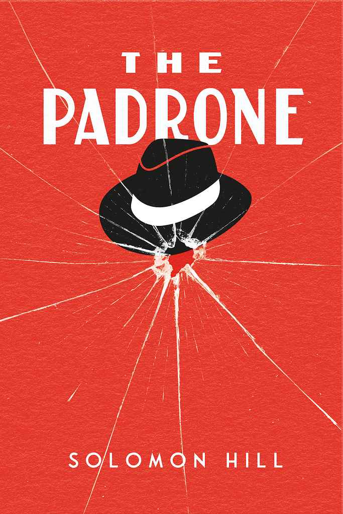
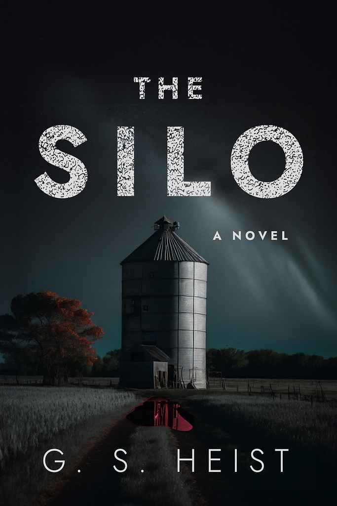
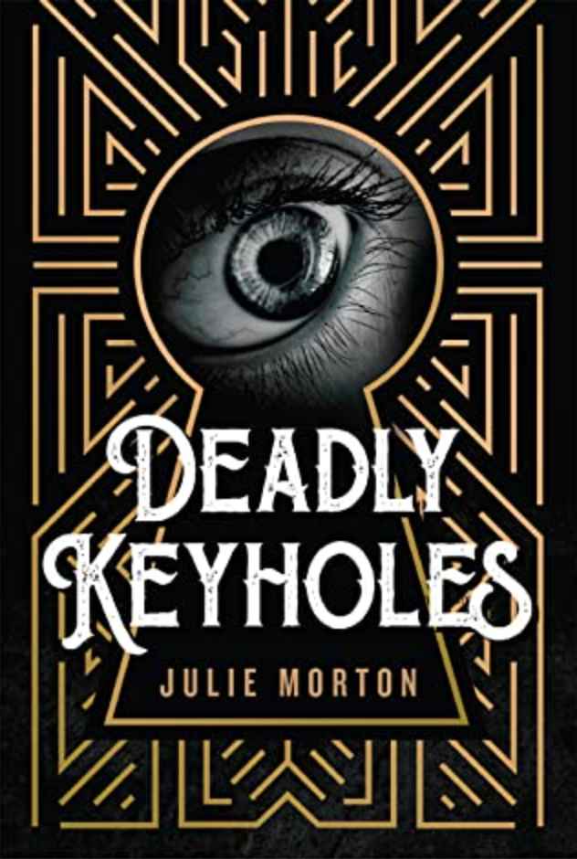


Crime covers work by making you feel something went wrong before you've read a word. Whether they show a masked figure lit in cold neon, a mafia hat pinned to a shattered spider's web, an art deco eye staring through a keyhole, or a lone house beneath a canopy of pines that seems far too quiet — the goal is the same: create unease, and make the reader need to know what happened.
What makes a great crime cover?
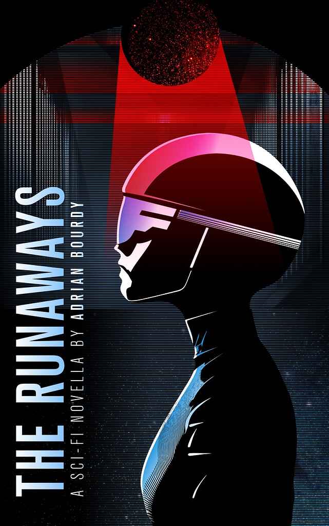
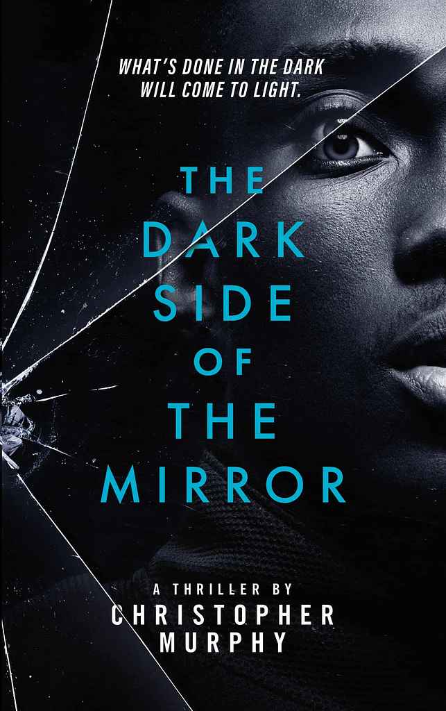
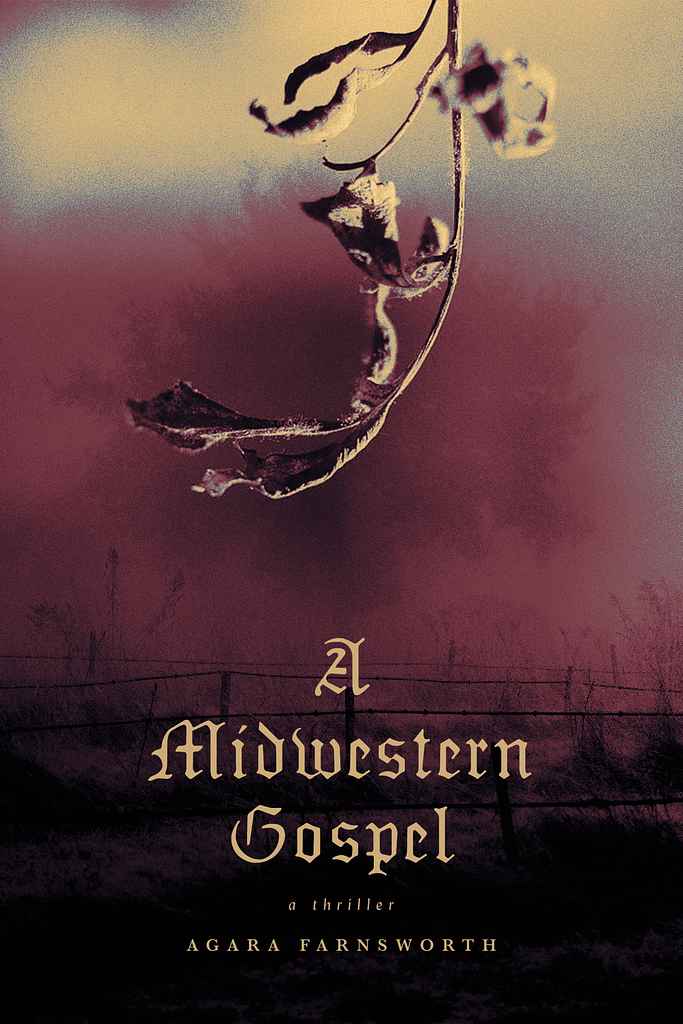
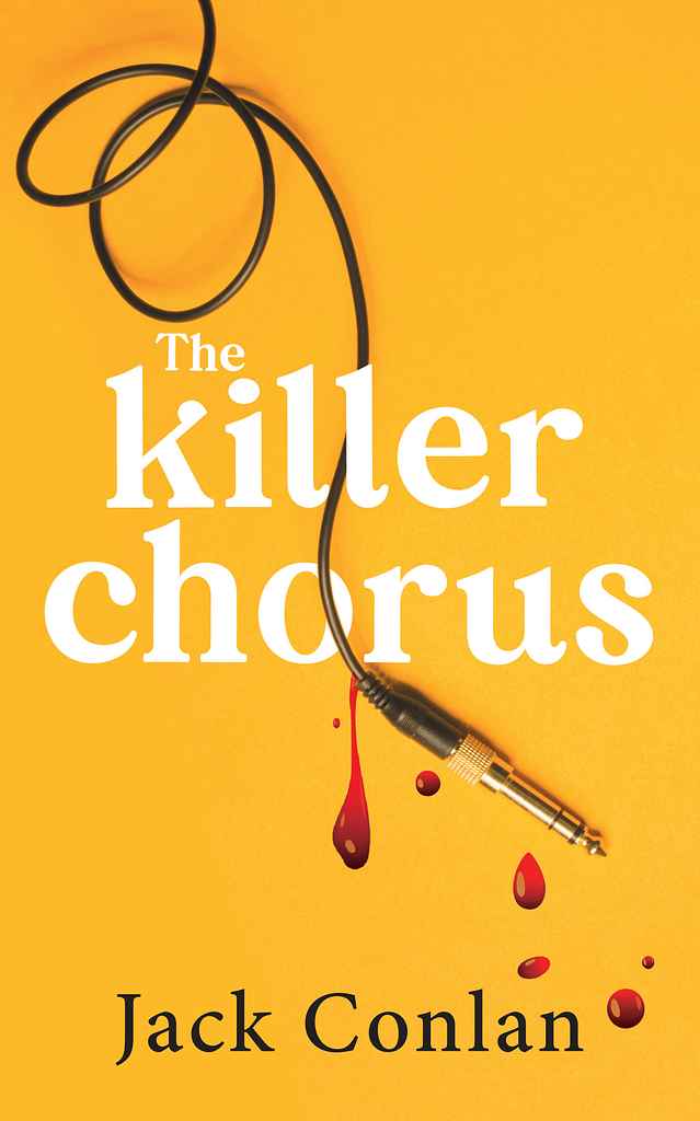
Crime is one of the most visually diverse genre categories, and the strongest covers know exactly which register they're in. Dark noir and procedural covers work through restraint — near-black palettes, a single hard accent color, imagery that implies aftermath rather than action. The best of these contain fewer elements than you'd expect: a silhouette, a shadow, a detail that shouldn't be there.
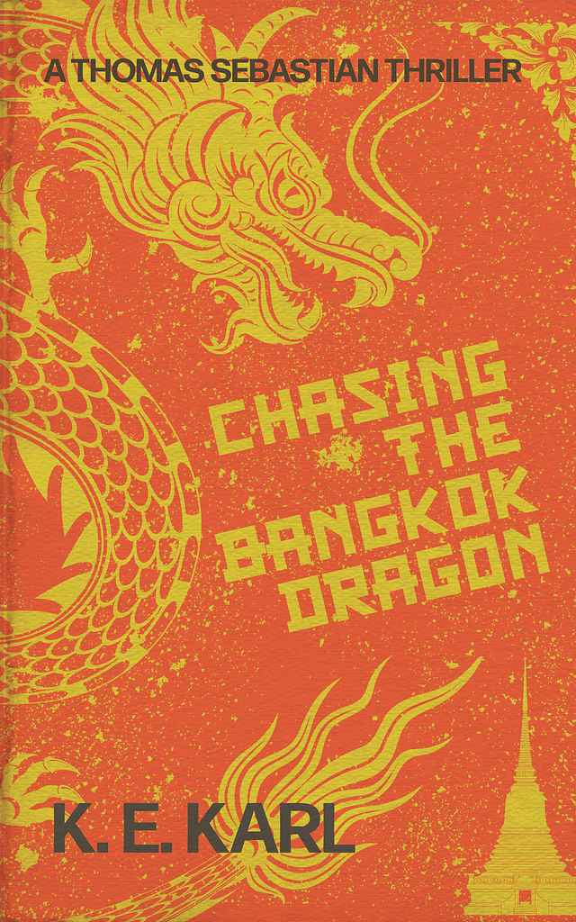
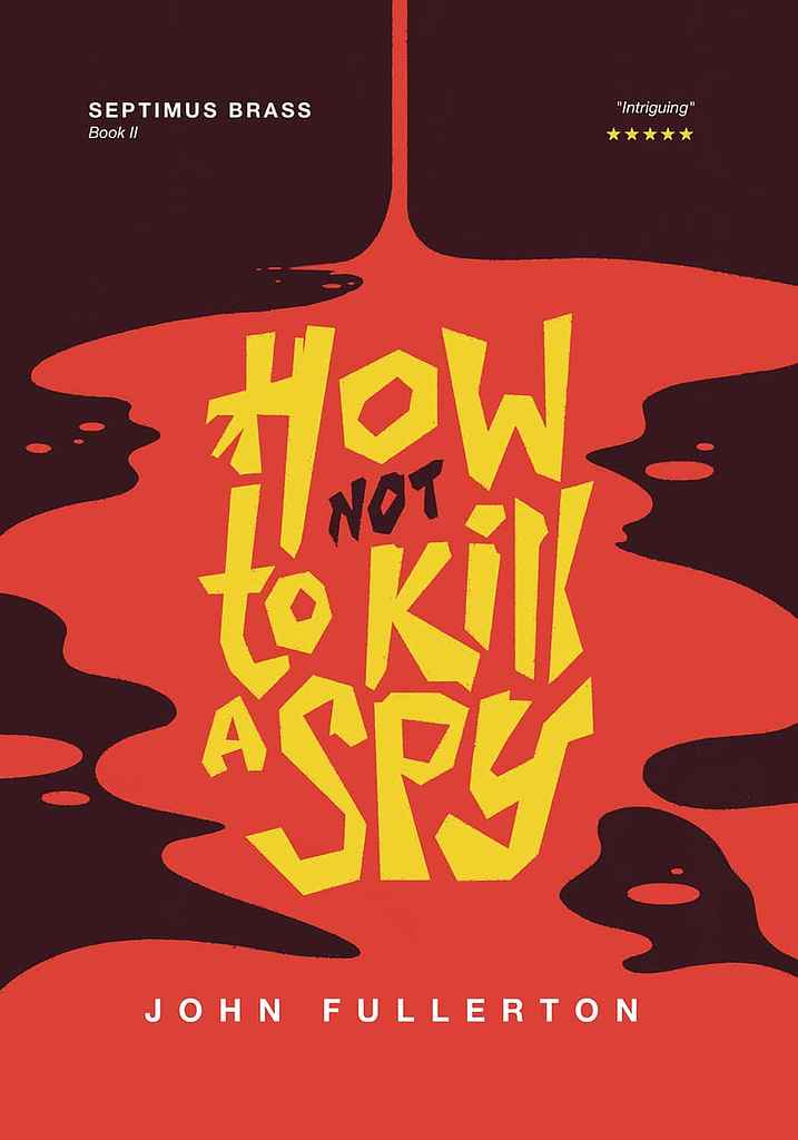
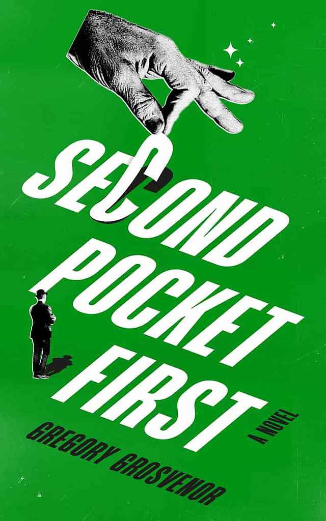
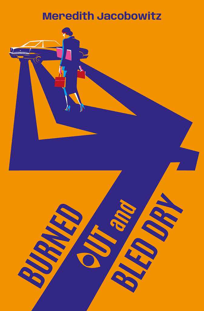
But crime also has a bold, graphic tradition that runs in the opposite direction. Vivid red, flat yellow, high-contrast black-and-white — these covers use color as aggression, not atmosphere. Typography here is large, heavy, and architectural: the title occupies a third of the cover and reads like a warning sign.
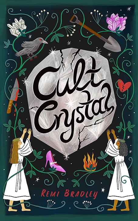
Then there's the cozy end of the spectrum: illustrated scenes, warm or playful palettes, hand-lettered or decorative type — covers that signal puzzle-solving pleasure rather than menace. Getting the register right matters more in crime than almost any other genre, because readers are loyal to their corner of it and will ignore a cover that signals the wrong one.
What are the most common crime cover tropes?
-
Noir/hard-boiled: dark backgrounds, lone figure or silhouette, film-poster lighting, duotone or near-monochrome palette with a single vivid accent
-
Bold graphic/typographic: high-contrast color (red, yellow, black), heavy condensed display type as the primary visual, minimal imagery — the design carries the menace
-
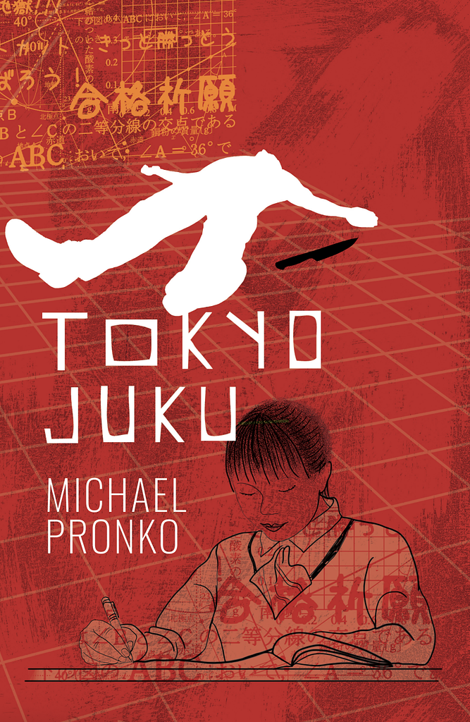
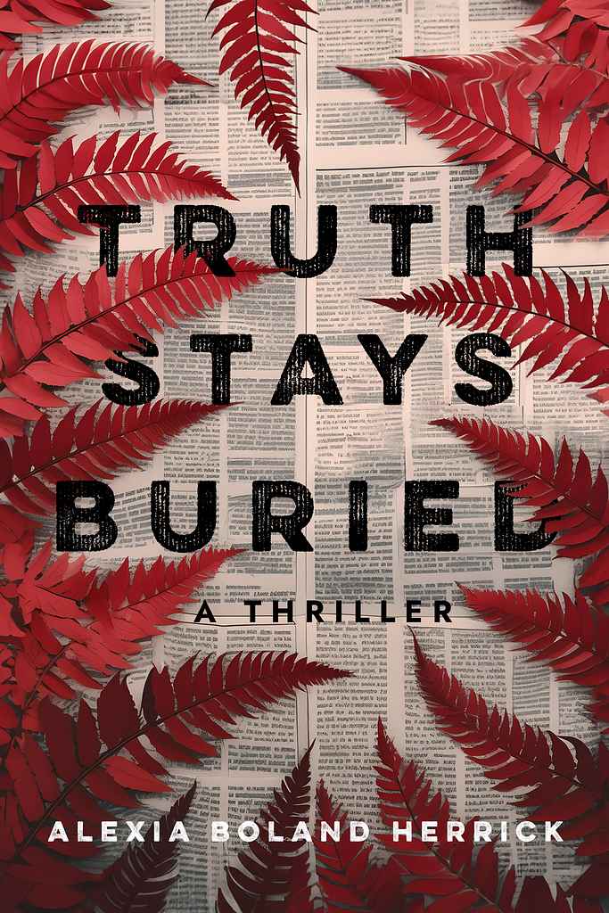
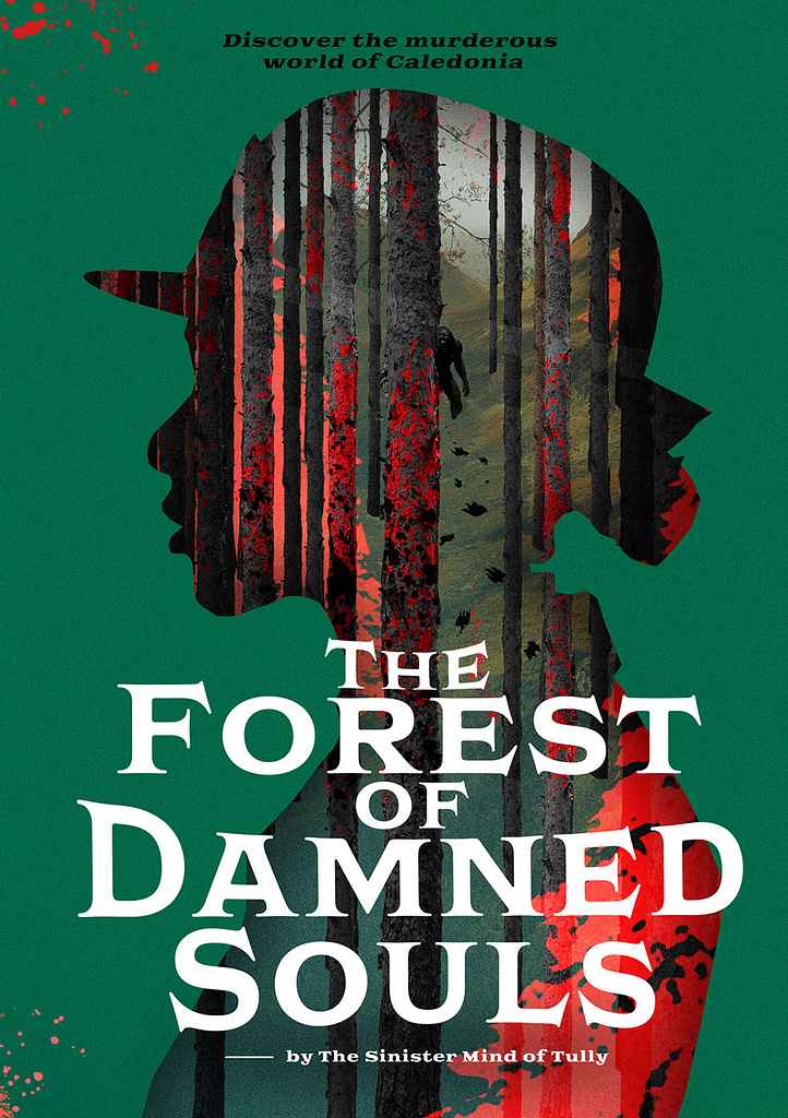
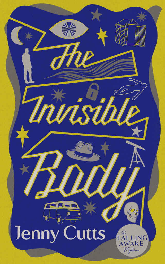
Illustrated/graphic crime: a strong central image rendered in a graphic or stylized style — a symbolic object, a scene, a motif — rather than photography or photographic composite
-
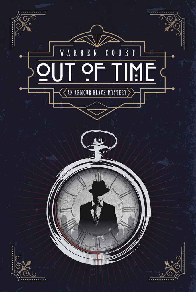
Art deco/period crime: ornate lettering, decorative borders, vintage color palette — common in historical mysteries and classic whodunits
-
Cozy mystery: illustrated scene or character, warm or pastel palette, playful or hand-lettered typography — signals wit and puzzle over darkness
-
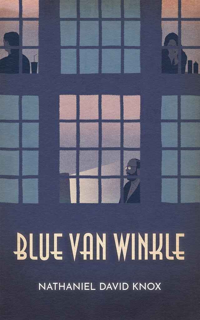
Domestic noir/thriller-adjacent: cold blues and grays, isolated setting, restrained typography — where crime overlaps with psychological thriller
How much does a crime book cover cost?
Crime covers share pricing with thriller and mystery on Reedsy, with a median around $700. The genre's range works in your favor at the accessible end — a dark background, bold type, one accent color, and a well-chosen stock image can produce a professional result without custom illustration. Costs rise for complex composites, period-accurate scenes, or covers requiring original graphic illustration.
How do I find the right crime cover designer?
Filter by genre on Reedsy Marketplace and look for portfolios that match your specific register — a designer who excels at bold graphic crime covers is solving a very different brief from one who specializes in cozy mysteries or dark noir composites. Brief around the emotional weight of the story: cold, pulpy, procedural, playful, menacing. A comp title or two will do more to orient your designer than a plot summary.
Browse Reedsy's hand-picked community of crime cover designers and request free quotes today.
