
Thriller covers have one job: make a reader feel something is wrong before they've read a single word. Whether you're writing domestic suspense, psychological thriller, or action-driven fiction, your cover needs to trigger cinematic unease the moment it loads in a search grid.
What makes a great thriller cover?
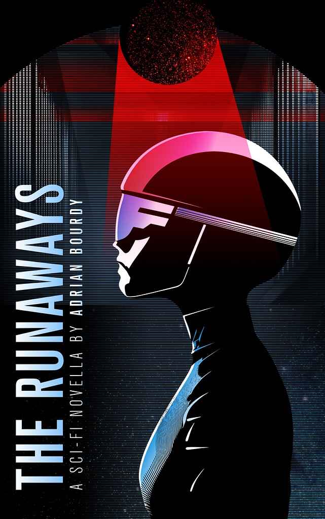
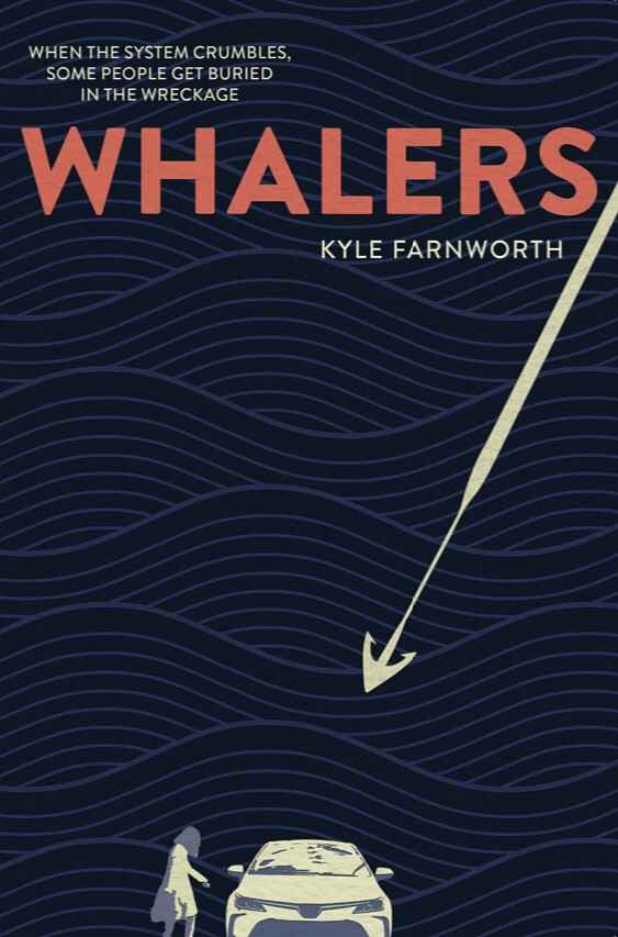
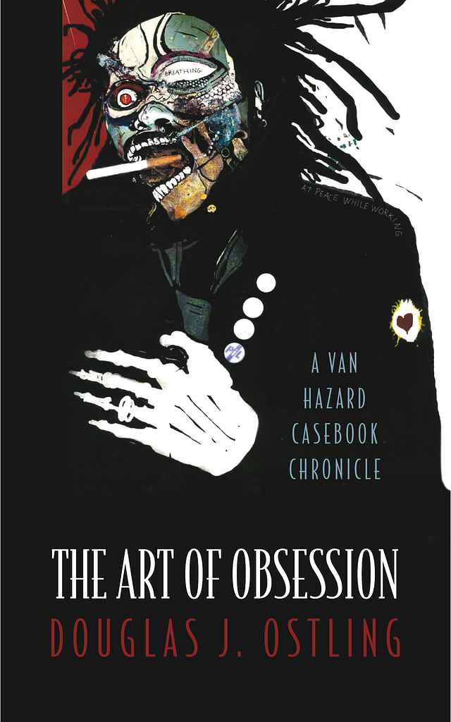
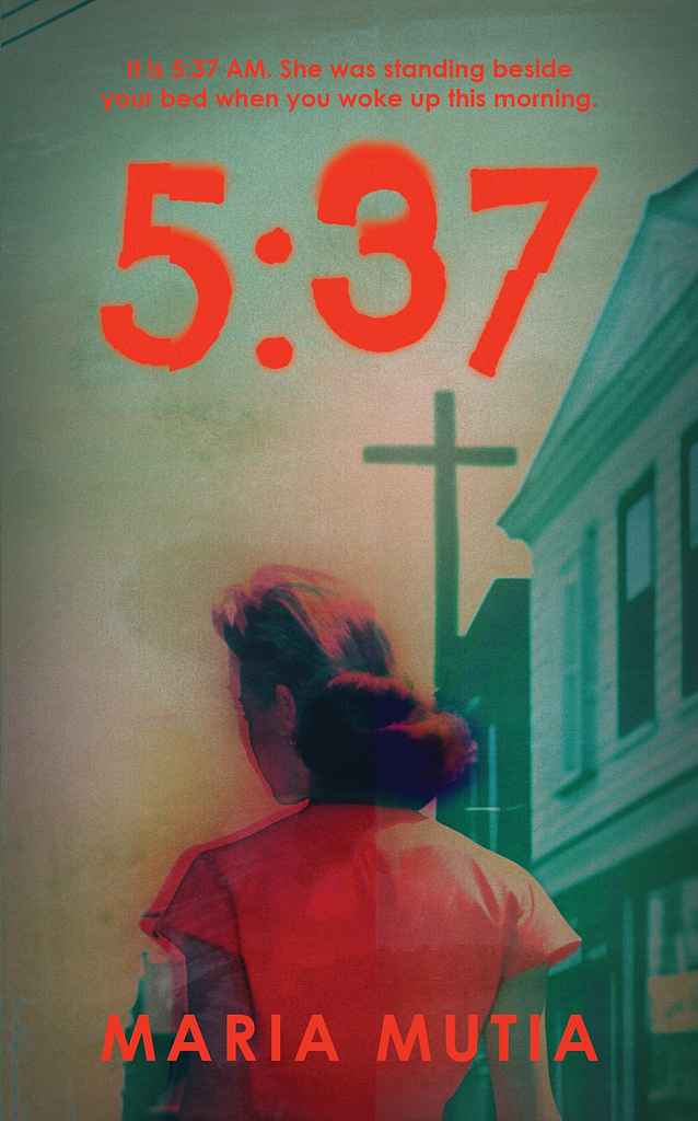
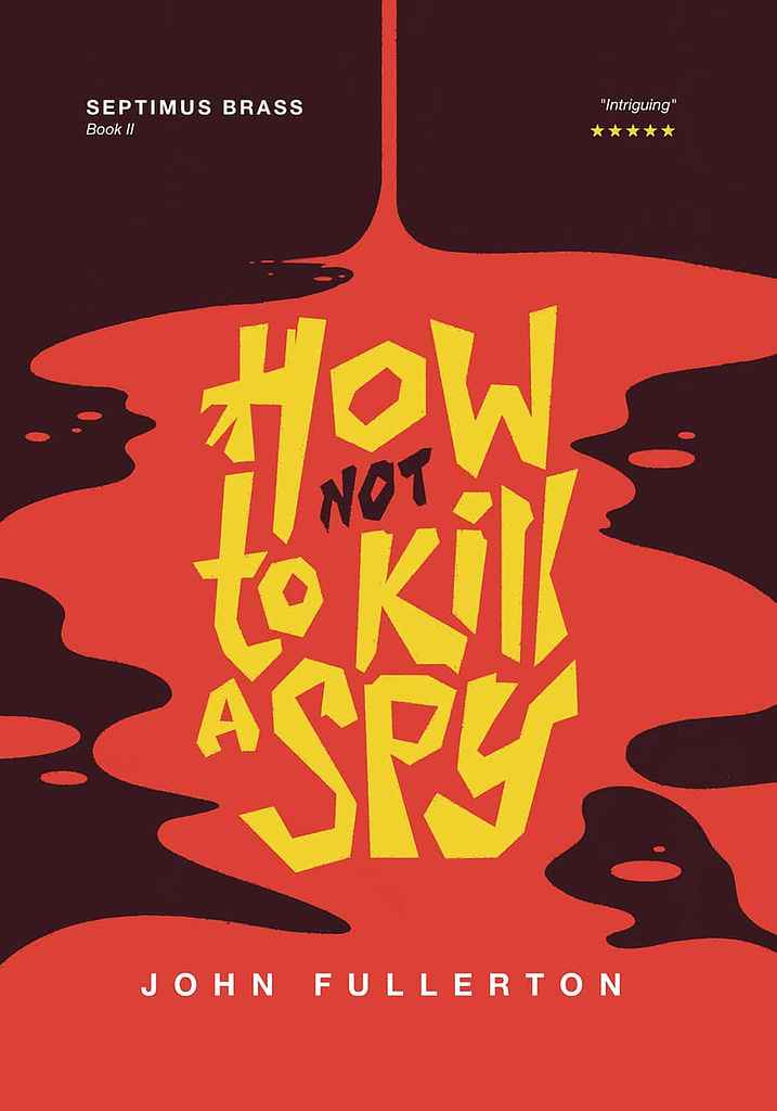
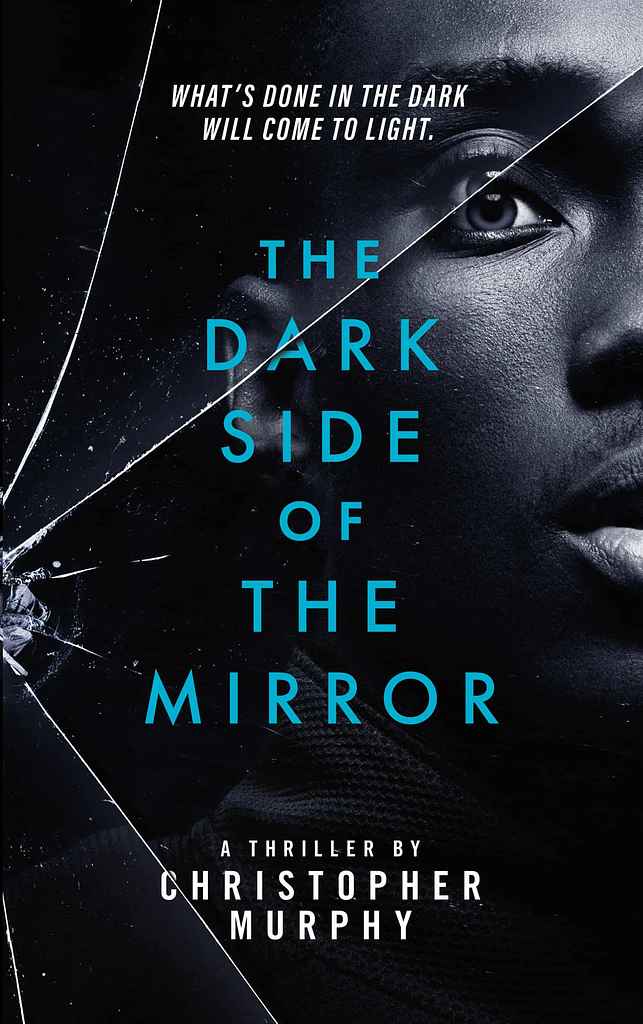
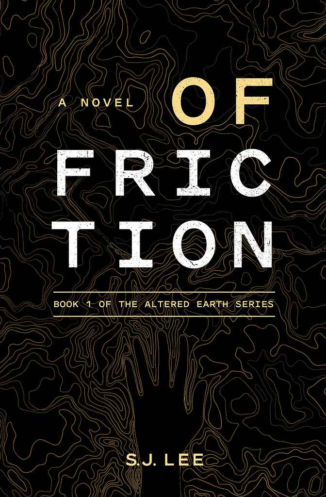
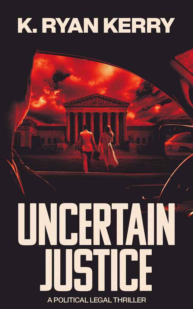
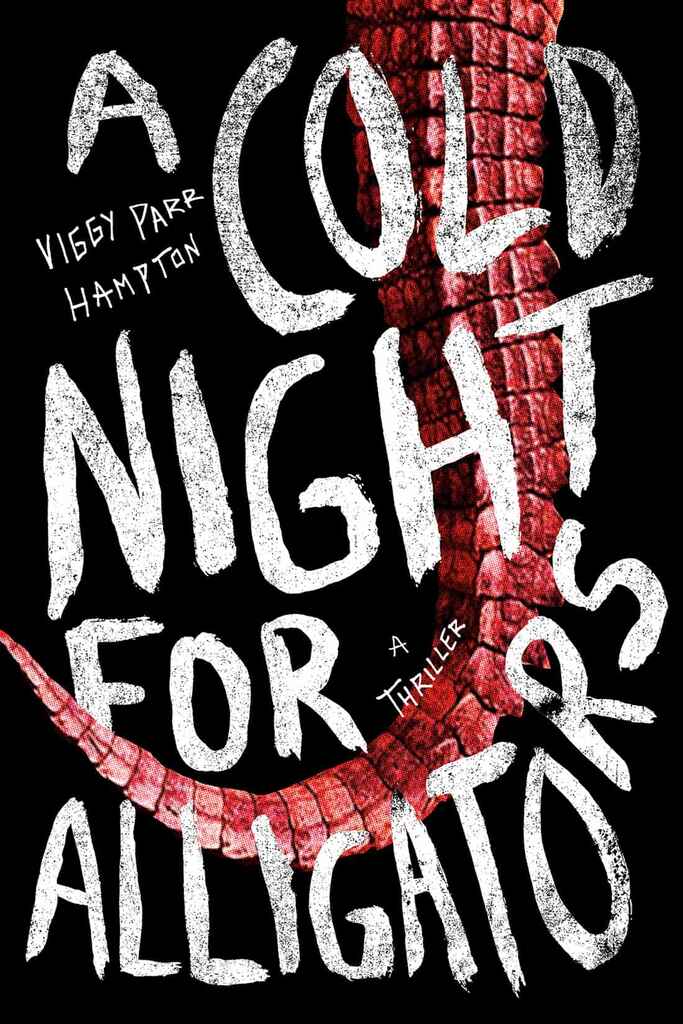
Great thriller covers are built on darkness, restraint, and one sharp accent. The palette starts from black, charcoal, or navy — then a single alarming color (blood red, warning yellow, acid green) is used surgically. Too much color kills the tension.
Typography carries the genre signal: tall, condensed sans-serifs like Bebas Neue or Trade Gothic fill 30–50% of the cover, and increasingly the title itself becomes the design, with atmospheric texture doing the work behind it. Imagery works through implication — an obscured face, a window lit from inside, a shadow with the wrong silhouette. What you withhold is as important as what you show.
What are the most common thriller cover tropes?
-
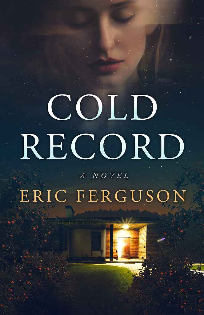
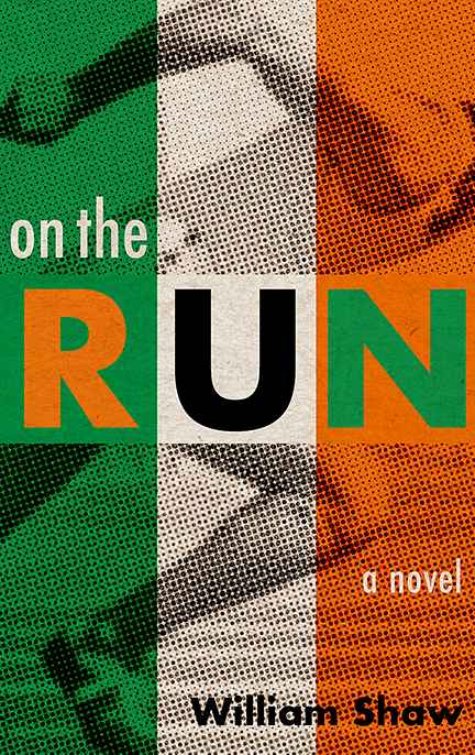
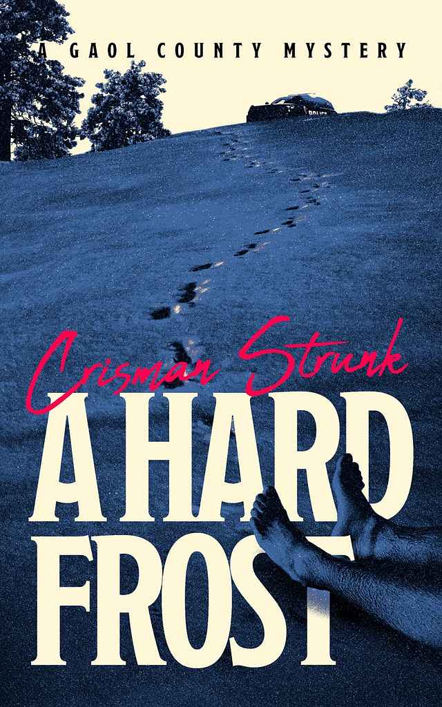
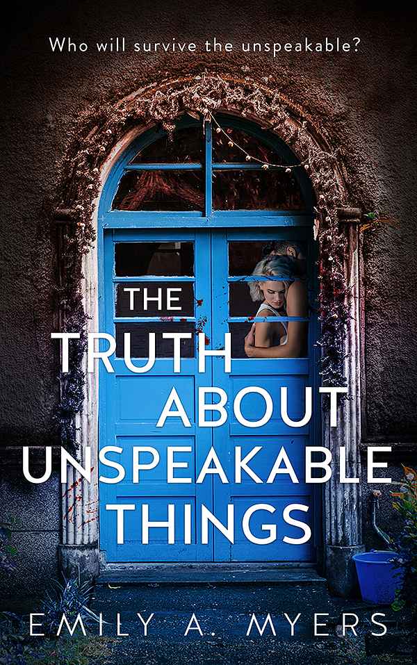
Domestic thriller/psychological suspense: a house at night, a woman walking away, navy and gray palettes, restrained condensed typography.
-
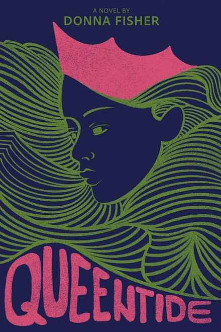
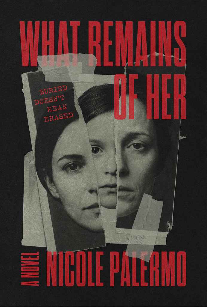
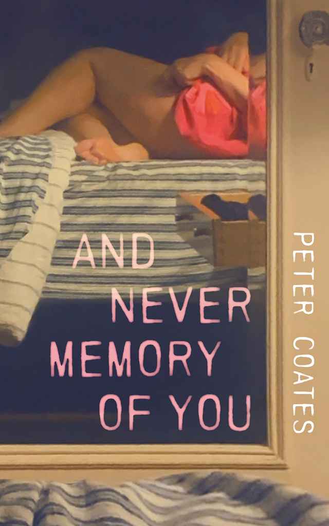
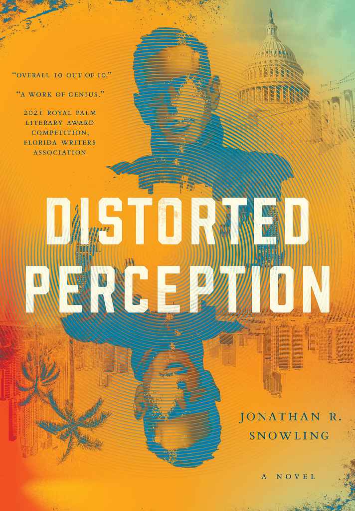
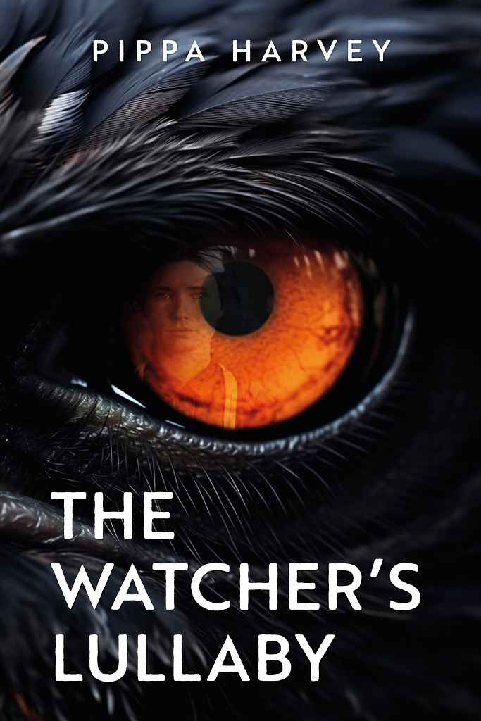
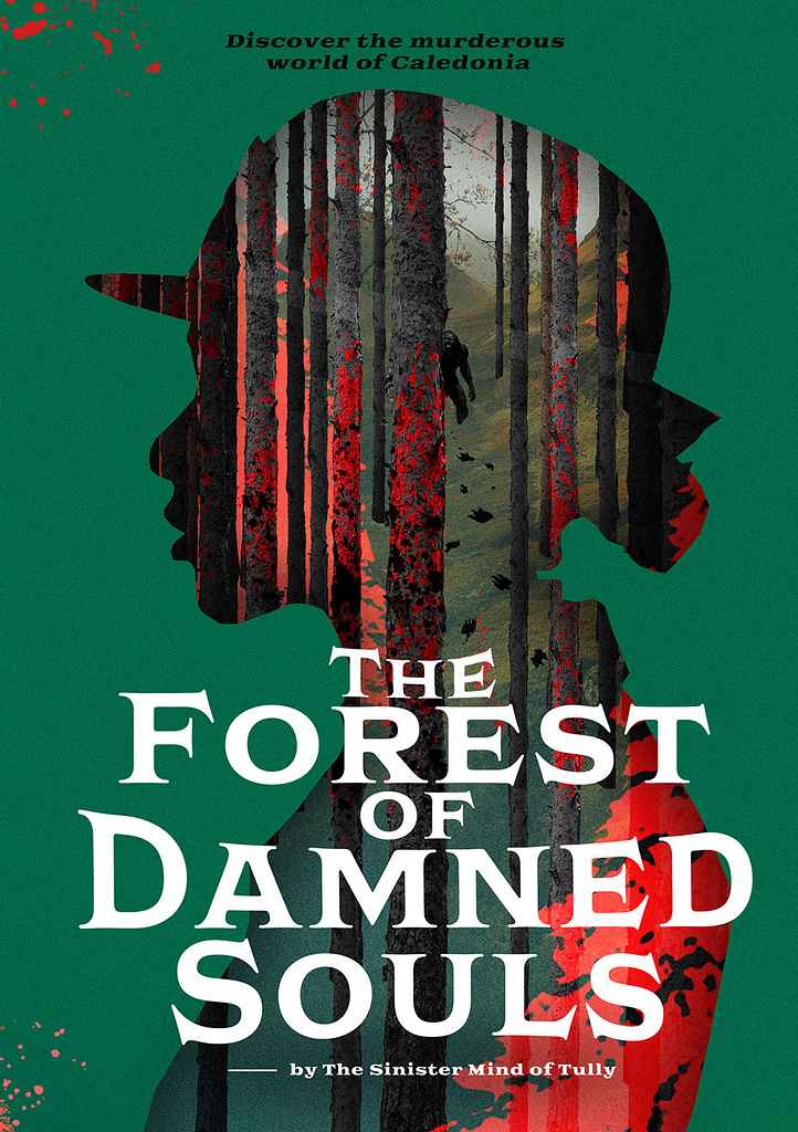
Psychological thriller: fractured or distorted visuals — mirrored faces, double exposures — with blood-red or acid accents.
-
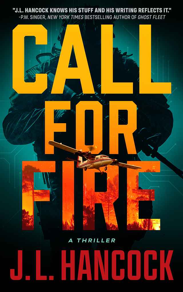
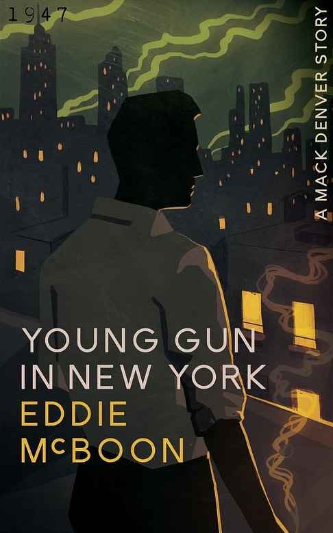
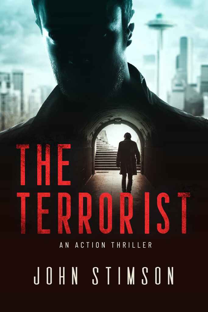
Action/police procedural: urban silhouettes, cinematic rim lighting, bold condensed type, one danger-color accent.
-
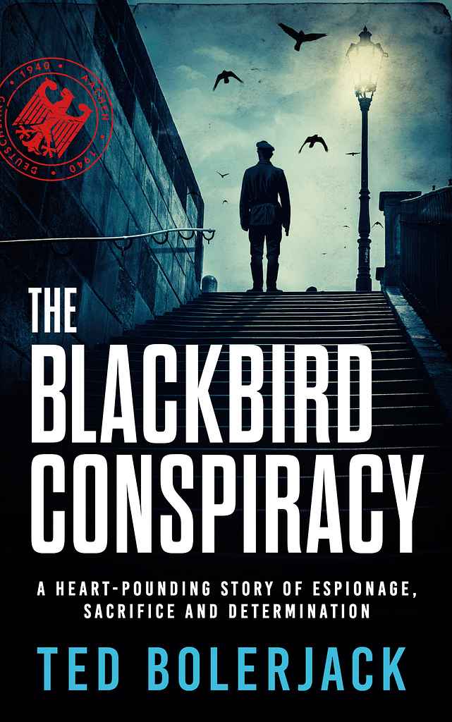
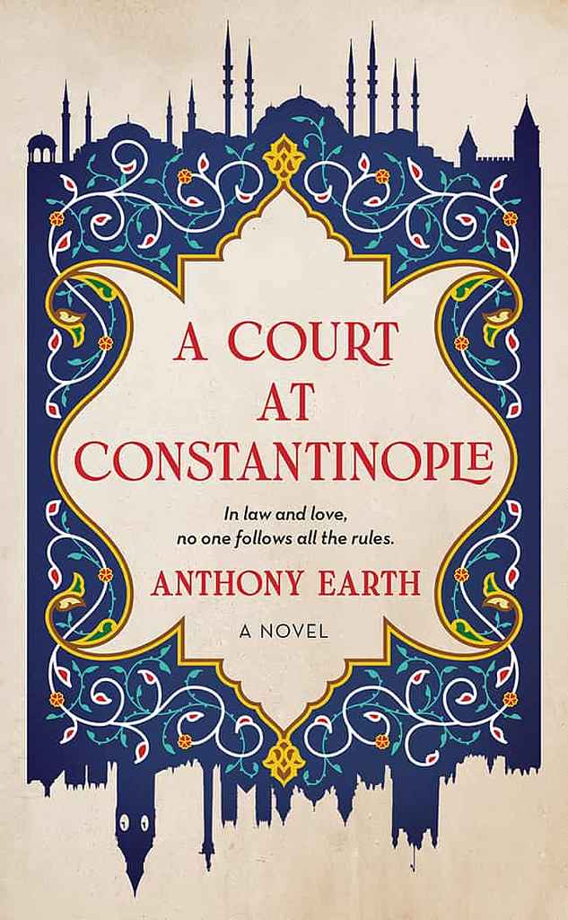
Spy/political thriller: a cinematic single-figure or landmark photograph, serious serif title, classical desaturated palette.
How much does a thriller book cover cost?
A thriller cover on Reedsy has a median cost of $700 — one of the more accessible figures in fiction. The genre rewards restraint: a dark background, one accent color, strong condensed type, and one well-chosen stock image can produce a professional result without custom illustration.
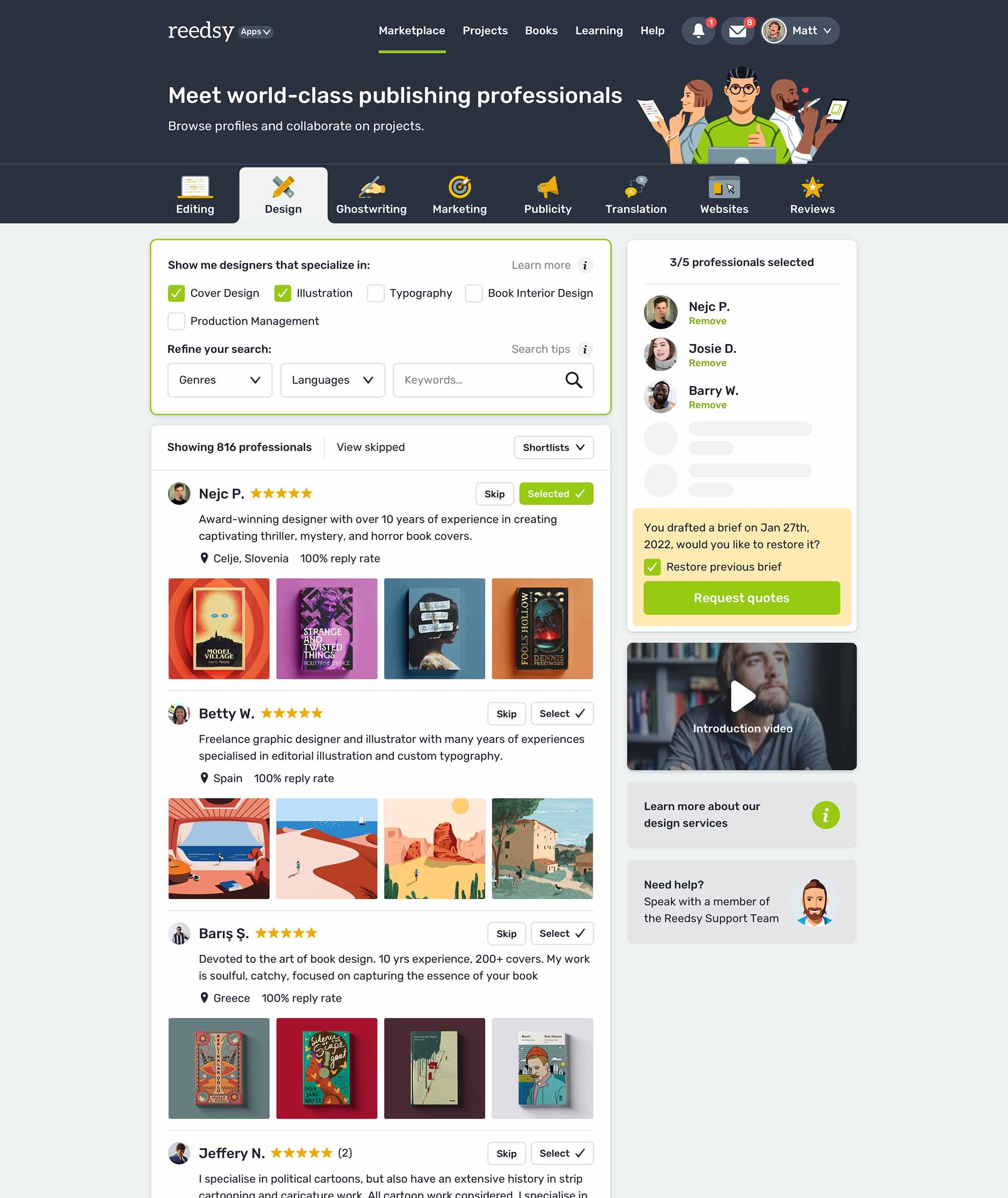
How do I find the right thriller cover designer?
On Reedsy Marketplace, filter by genre and browse thriller portfolios before sending a brief. Look for a designer whose samples match your specific subgenre — domestic suspense looks almost nothing like action thriller. Share one or two comp titles, name your subgenre, and frame the brief around the feeling you want: paranoia, dread, urgency. That single emotional cue guides designers far better than a plot description.
Browse Reedsy's hand-picked community of thriller cover designers and request free quotes today.
More FAQs
Q: How do designers create tension without overusing blood, weapons, or silhouettes?
Suggested answer
![]()
Blood, weapons, and shadowy figures are certainly one way to signal danger, but they're far from the only tools available to a designer. In fact, some of the most effective covers create tension by suggesting unease rather than showing its source directly.
Colour is one of the strongest tools we have. Unexpected colour combinations, limited palettes, or colours that feel slightly "off" can create a sense of discomfort before the reader has consciously registered why. Composition is equally powerful. An image that feels unbalanced, isolated, or slightly disorientating can generate tension without depicting anything overtly threatening. The iconic poster for Vertigo is a masterclass in this approach. Through scale, movement, colour, and a spiralling composition, it evokes unease and psychological tension without relying on violence or explicit danger.
I also like to play with scale. A tiny figure overwhelmed by a vast landscape, an oversized object looming where it shouldn't be, or a detail shown much larger than expected can all make a reader feel that something isn't quite right. Our brains are very good at noticing when visual relationships are out of balance, and that instinctive reaction can be more unsettling than any amount of gore.
Often, what is omitted is just as important as what is shown. A partially opened door, an empty chair, a trail that disappears into darkness, or a space where the reader feels something should be present can invite questions and create anticipation. The imagination is often more effective than explicit imagery.
Ultimately, tension comes from uncertainty. A cover doesn't need to reveal the threat; it only needs to persuade the reader that there is one. The most memorable designs leave just enough unanswered for the reader to want to open the book and discover the truth for themselves.
Patricia is available to hire on Reedsy
Further readings:
