Menu
There are currently 1,000+ designers available on Reedsy, come meet them.
Find the perfect designer for your next book
1 million authors trust the professionals on Reedsy. Come meet them.
There are currently 1,000+ designers available on Reedsy, come meet them.
Find the perfect designer for your next book
1 million authors trust the professionals on Reedsy. Come meet them.
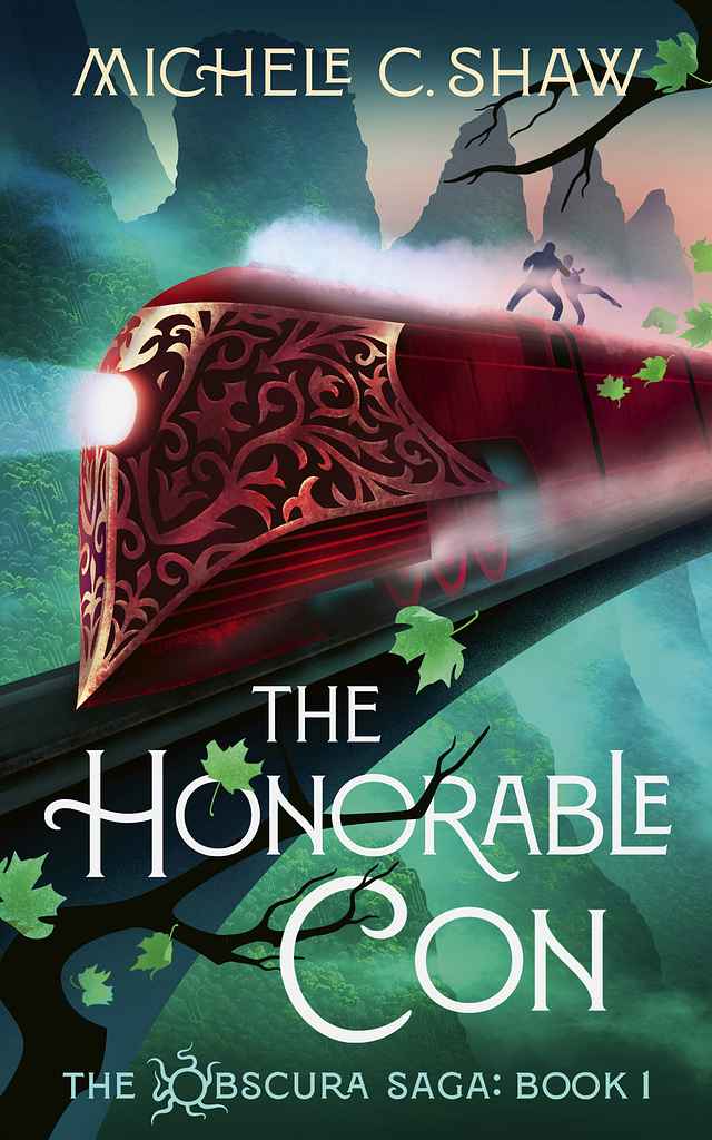
Designer: Tim B.
Designed by Tim B.
Available to hire ⏺“With this cover — the first in a fast-paced fantasy series — I aimed to capture a cinematic sense of motion and adventure aboard a high-speed train cutting through the mountains. The sweeping composition and wind-blown leaves reinforce the energy, pace, and momentum at the heart of the story.”
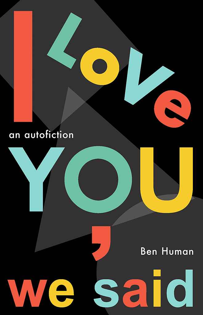
Designer: Peter S.
Designed by Peter S.
Available to hire ⏺"For Ben Human’s autobiographical novel about an American writer newly expatriated to London, I aimed to evoke the city’s atmosphere and the book’s avant-garde spirit. Inspired by the iconic Tube map, I ultimately kept only its P22 Johnston Underground font, overlaying bright colors on a dark, shadowy background — a nod to the tension beneath Swinging London’s surface."
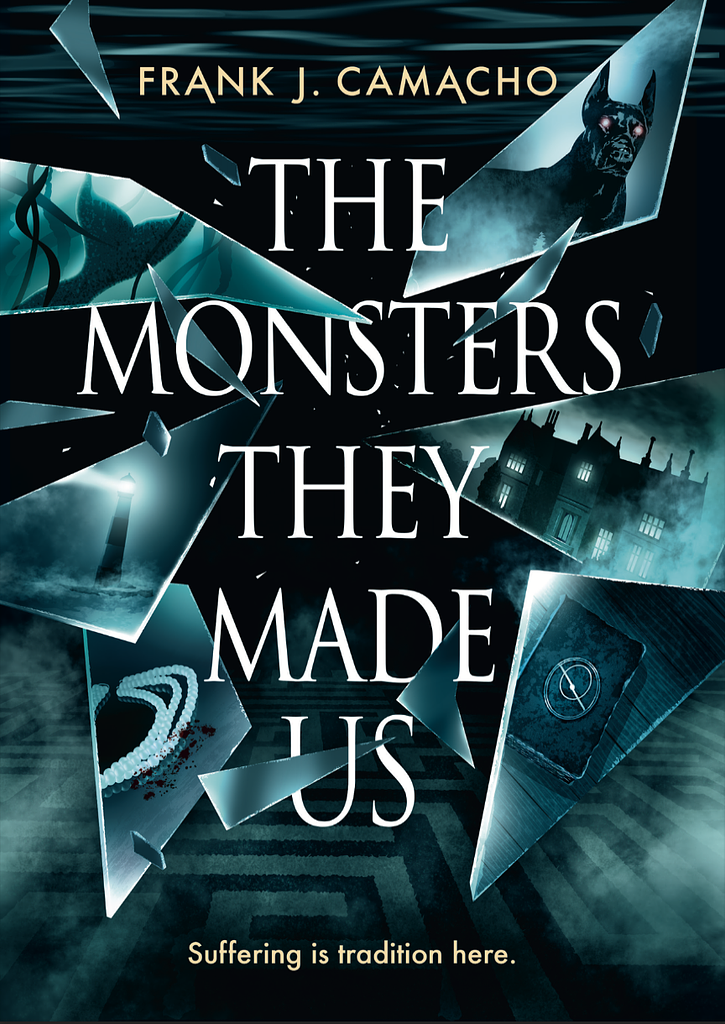
Designer: Tim B.
Designed by Tim B.
Available to hire ⏺“In this YA novel, four main characters grapple with the weight of their family legacies. I designed the cover so that each shard reflects an aspect of their stories, interacting with the title to add depth and drama. The blue-green palette evokes the ever-present water and the mysterious coastal town of Driftmore.”
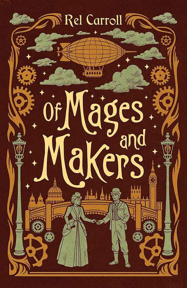
Designer: My Lan K.
Designed by My Lan K.
Available to hire ⏺"For this cosy gaslamp adventure romance, I combined different elements of the story in the cover using a style that recalls old adventure novels. The title is playful, hand-drawn to show the lightheartedness of the story. The background and decorative elements show a steampunk London. The MMC is offering his hand to the FMC, who accepts it, which is a hint to how he is the one introducing her to a world of adventure and magic."
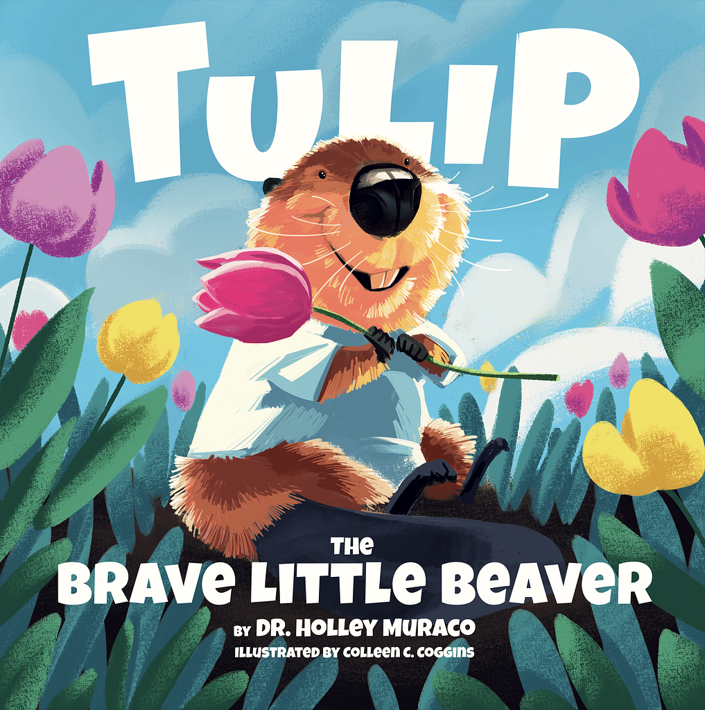
Designer: Colleen C.
Designed by Colleen C.
Available to hire ⏺“The book follows the unbelievable journey of Tulip, a lovable and playful little character. To reflect her hopeful story, we chose bright primary colors and a clean, distraction-free background that lets her joyful spirit take center stage.”
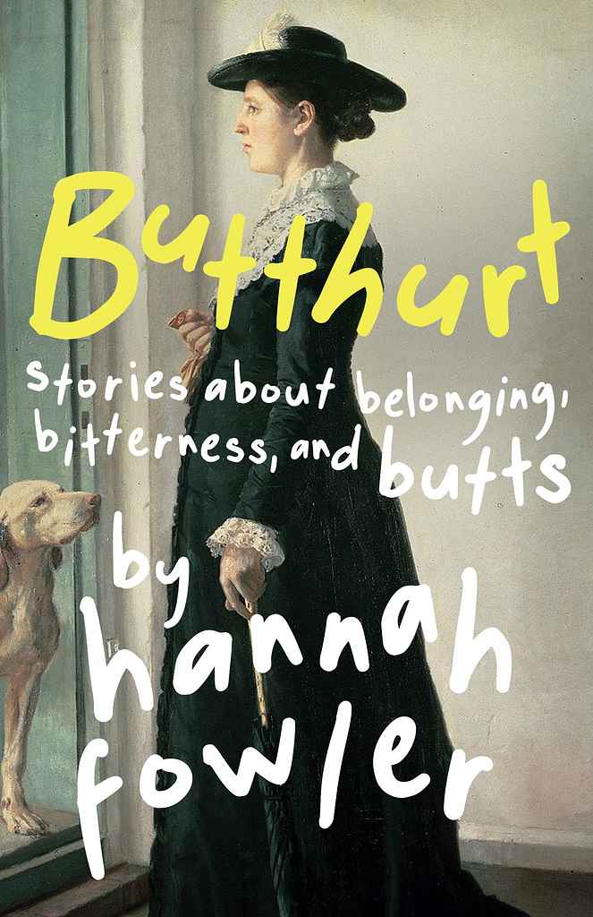
Designer: Ashley S.
Hannah Fowler
Designed by Ashley S.
Available to hire ⏺"Designing this humorous short story collection was a joy. Though I usually illustrate covers, we chose a serious image for its hilarious contrast with the title. Our goal was a modern sense of disequilibrium, so I manually set each letter to add a playful, offbeat rhythm. The cover’s strength lies in how the image and title interact — not to depict the stories literally, but to convey their witty, unpredictable spirit. A collaboration I truly loved."
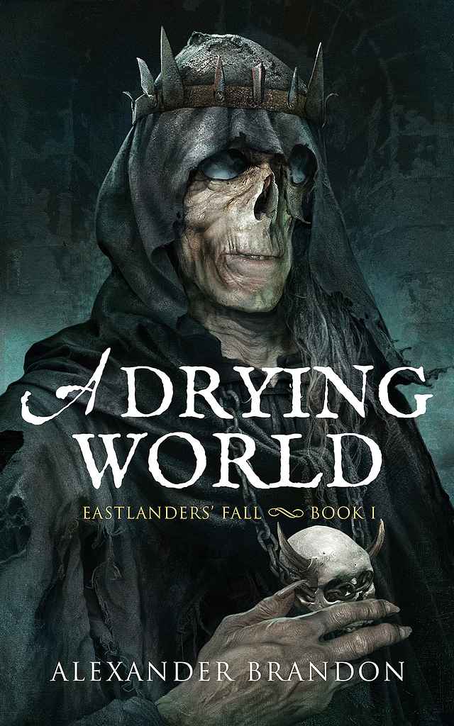
Designer: Alejandro C.
Designed by Alejandro C.
Available to hire ⏺"One of my favorite aspects of dark fantasy is bringing its characters to life, especially the villains. This piece portrays a once-human figure surrendering to dark magic, shedding the last fragments of his humanity. In dark fantasy, horror and decay must be conveyed with subtlety and balanced with a sense of elegance — a contrast I always strive to capture in my work."
Designer: Xavier C.
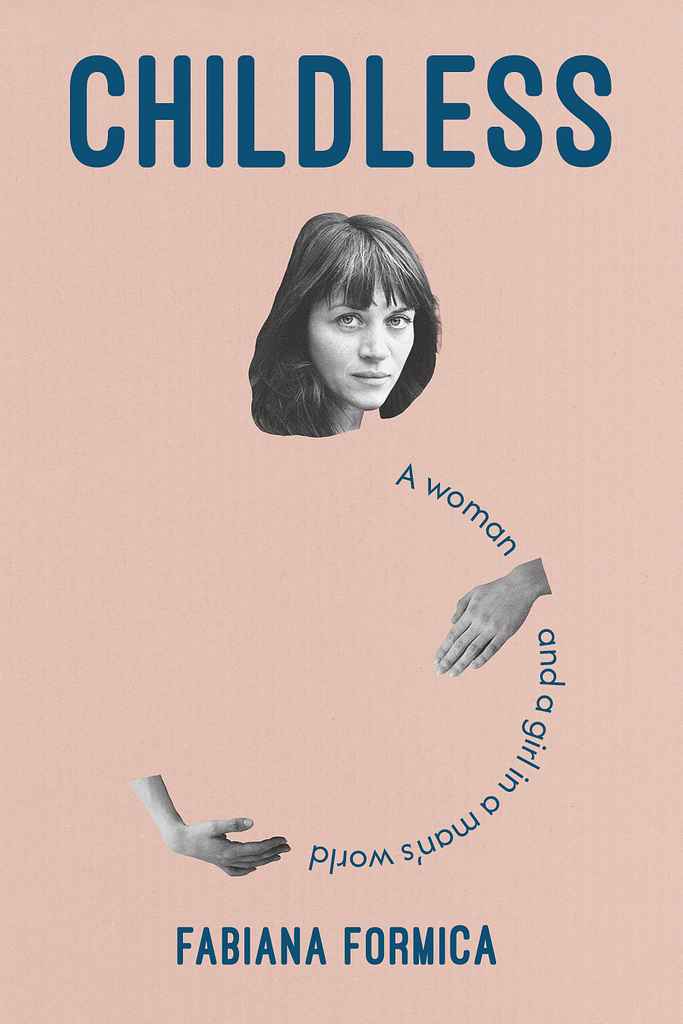
Designer: Natàlia P.
Designed by Natàlia P.
Available to hire ⏺“The cover was designed to evoke longing, identity, motherhood, and self-worth through a subtle, emotionally charged tone. A collage combining the author’s face with the subtitle near her womb symbolizes creation and absence, mirroring her unfulfilled desire for motherhood. This balance between presence and emptiness becomes a visual metaphor for self-realization and wholeness.”
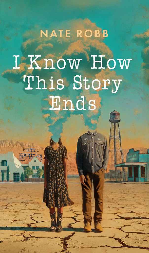
Designer: Robert J.
Nate Robb
Designed by Robert J.
Available to hire ⏺"I wanted the cover to feel both intimate and surreal—rooted in the heat and isolation of West Texas yet lifted by a sense of fate. The cracked earth and fading town set the stage for a love shaped by distance and time. The headless couple, their thoughts dissolving into clouds, reflects how love consumes and transforms us. Painterly textures soften the harshness, while the bold, typewriter title grounds it in memory—a visual echo of love found in desolation."
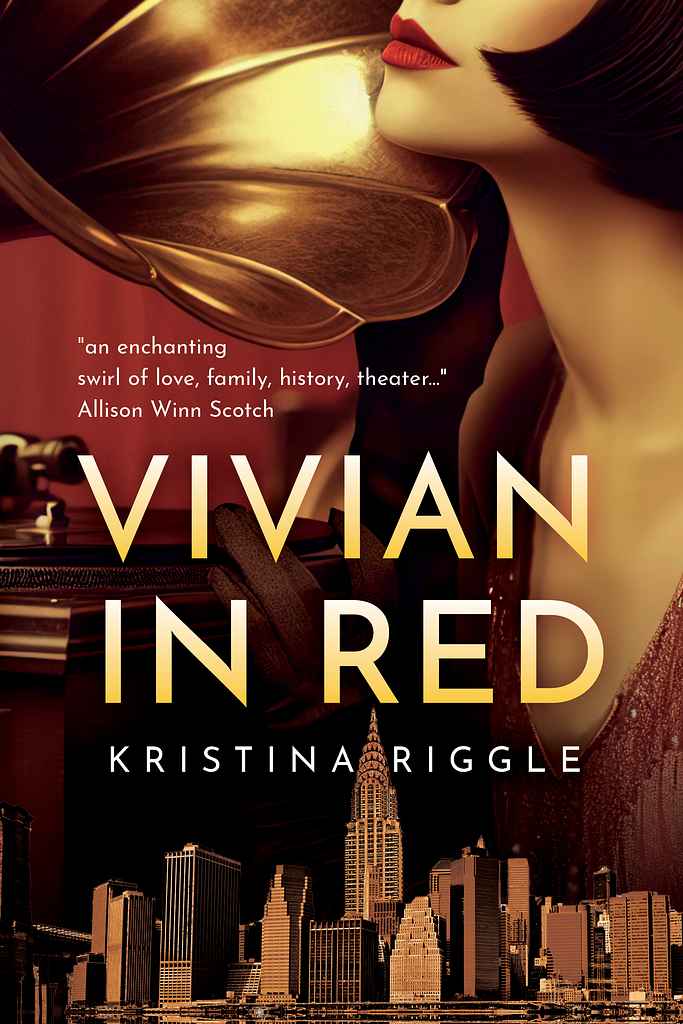
Designer: Christina M.
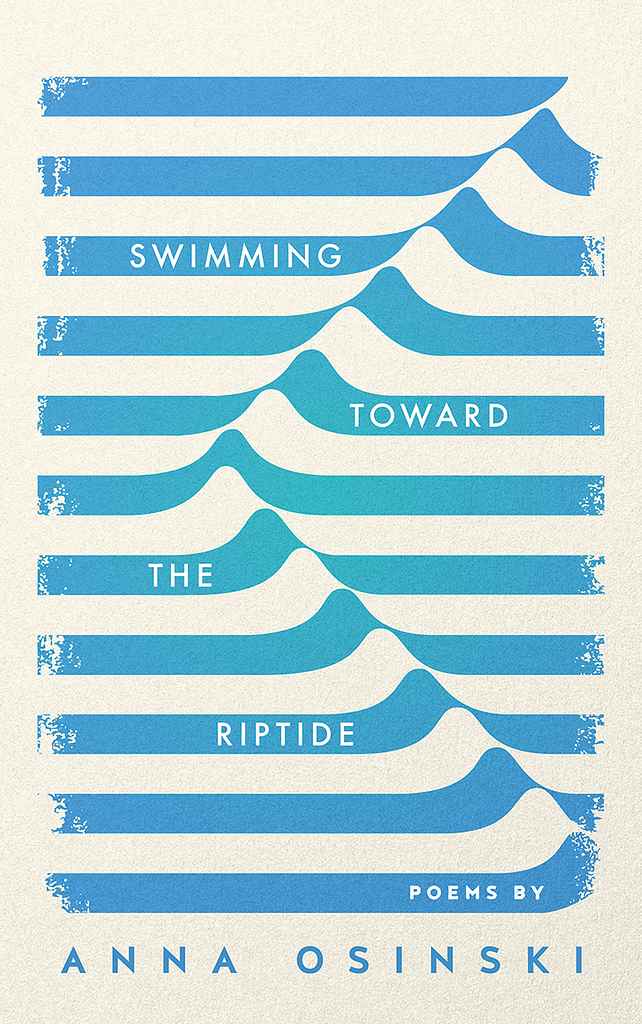
Designer: Vanessa M.
Designed by Vanessa M.
Available to hire ⏺"The idea was to capture the feeling of being pulled into something powerful. The wave lines get more intense as they go down, like emotions building up. Soft blues keep it calm, while the clean type keeps it grounded. Simple, flowing and a bit raw, just like the poems in this poetry book."
Designer: Rachel S.
Designed by Rachel S.
Available to hire ⏺"I start by understanding the book’s mood and visual landscape, then collaborate closely to capture key imagery in a unique way. For this cover, we built a photo collage to reflect the characters and fine-tuned the sunset tones to match the story’s emotion. I treated it like a painting—designed to feel like art, not just packaging. The final painted texture adds warmth and mystery, creating a cover that’s both visually striking and deeply connected to the book’s heart."
Designer: Barış Ş.
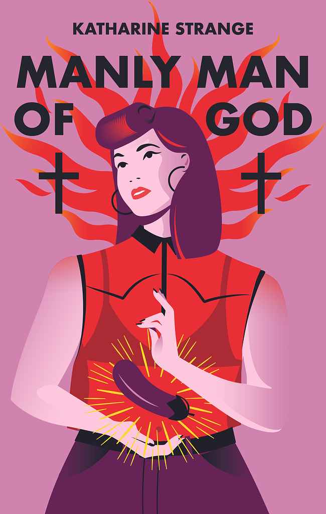
Designer: Margarita C.
Designed by Margarita C.
Available to hire ⏺"I aim to hint at the plot without giving too much away, sparking curiosity. Katharine wanted religious iconography and a subtle nod to the story’s sexuality, with humor and irreverence. So, I portrayed the protagonist as a divine figure—holding an eggplant instead of a heart, blending sacred visuals with a modern, cheeky twist. It’s a bold, trend-aware image that reflects both the book’s tone and how people communicate today."
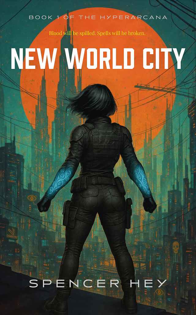
Designer: Ryan M.
Designed by Ryan M.
Available to hire ⏺"I worked with Spencer through several feedback rounds to capture the gritty-mystical vibe he wanted. A silhouetted heroine faces a neon megacity, signaling urban fantasy and tech action. I used bold teal-orange tones to stand out digitally, adding glowing arcane armor, glyph-inspired skylines, and easter-egg symbols—striking a balance between genre familiarity and layered detail."
Designer: Barış Ş.
Designer: Ian K.
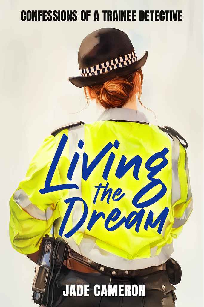
Designer: Robert J.
Designed by Robert J.
Available to hire ⏺"I wanted to avoid crime clichés and capture the real life of a trainee detective. The hand-painted style adds warmth and personality, matching the book’s tone. Showing the officer from behind—in a high-vis jacket and duty belt—hints at the gritty, unglamorous reality: more paperwork than drama. The handwritten title adds humor and energy. Overall, I aimed for something honest and relatable, yet still eye-catching on both bookshelves and digital screens."
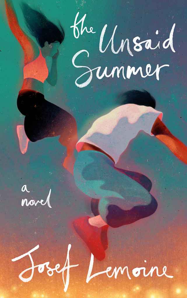
Designer: Owen G.
Designed by Owen G.
Available to hire ⏺"This cover captures a specific moment from Josef Lemoine's beautiful and nostalgic romantic novel. Through discussions with Josef it was clear he wanted to capture that vibrant, effervescent feeling of being young and in love so the artwork is rich, saturated and full of motion and warmth. The hand drawn type reflects the narrative which is told through letters between the two protagonists."
Designer: Arjan V.
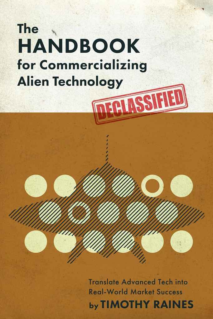
Designed by Arjan V.
Available to hire ⏺"This cover channels the authentic atmosphere of 1950s UFO sightings and classified government research facilities. Drawing inspiration from scientific publications of that era, the design captures the paranoid zeitgeist surrounding extraterrestrial encounters and secret military projects. The design aesthetic embraces heavy use-smudged surfaces, worn edges, and weathered appearance suggesting this is a document that has clearly been consulted by generations of researchers and believers."
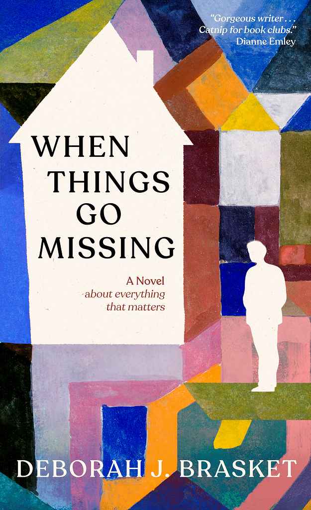
Designer: Owen G.
Designed by Owen G.
Available to hire ⏺"This was a really interesting collaboration as the author Deborah Brasket decided to use an existing, public domain painting by Paul Klee as the basis for the cover. By tweaking the artwork, adding small narrative elements and finding complimentary fonts and design, we managed to create a perfect cover for the novel whilst maintaining the feel and sprit of Klee's original painting."
Designer: Richard L.
Designer: Barış Ş.
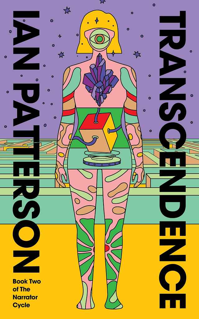
Designed by Barış Ş.
Available to hire ⏺"The cover is inspired by the author’s vision of a symbolic guided path - a translucent, body shaped tunnel that shows how a person will move through the cosmos. Inescapable and determinist. The design blends a sci-fi aesthetic with a psychedelic, multi-dimensional feel. As this book is part of a series, its typography and illustration style align with those used in the first book."
Designer: Elin T.
Designed by Elin T.
Available to hire ⏺"Designing this cover was a fun, collaborative process, shaped by the author’s vision to bring his trilogy’s culmination to life. Every choice—from colors to lighting—reflects the intensity and resolution of everything leading to this moment. It was exciting to visually capture the story’s crescendo in a way that feels both powerful and fitting for the journey’s conclusion."
Designer: Roderick B.
Designed by Roderick B.
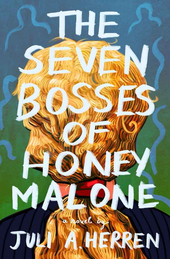
Available to hire ⏺"The artwork and title aim to capture the story’s youthful essence, portraying the protagonist with both strength and vulnerability as she faces seven abstract, swirling 'boss' figures. Bright, bold colors reflect youthful energy, while strong titling enhances this vibe. Blending comedy and drama, the design effectively represents both genres without conforming to the dainty, ultra-smooth style often seen in similar books."
Designer: Adam F.
Designer: Finn D.
Designed by Finn D.
Available to hire ⏺“I captured the unsettling, fragmented prose visually, using chopped-up typography and treated photography. While employing the familiar trope of a mysterious figure, I infused the cover with distinctive visual flair, blending genre familiarity with standout nuance. The bold, balanced color palette grabs attention, pairing rarely-seen shades for striking impact in a crowded marketplace.”
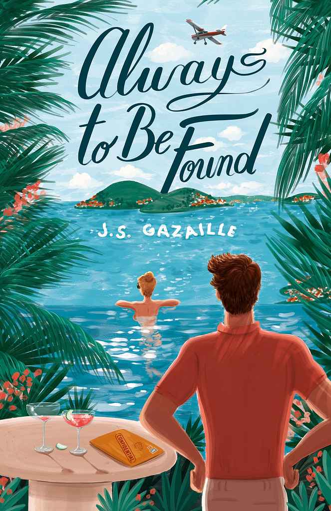
Designer: Felix D.
Designed by Felix D.
Available to hire ⏺“Always to Be Found blends rom-com charm with thriller intrigue against the stunning Caribbean islands of St. Barths and the Magdalen Islands. I created an illustration with joyful colors and carefree elegance—yet beneath, mystery simmers. The blonde protagonist lounges poolside at her luxurious villa, unaware she's being watched. Who is this hidden man—friend or foe? What's the secret in the confidential envelope beside her? My cinematic approach instantly immerses readers.”
Designer: Andy M.
Designer:
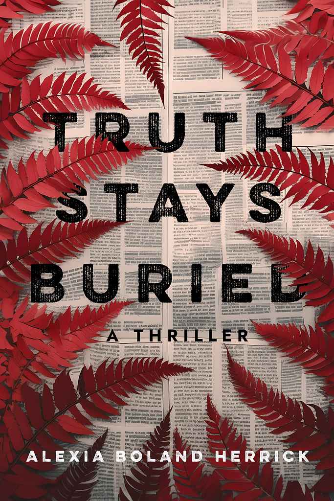
"In this Australian thriller, a body is discovered in the fern-dense Sapphire mountains of eastern Australia, and a local reporter must chase the truth. We decided to depict this almost literally, with ferns “covering” up the news print below. We chose a gritty, bold sans-serif to give a dark, contemporary feel. And we repeated the fern motif through my interior design of the book, using fern artwork on the title page for section breaks in chapters, providing a bespoke reading experience."
Designer:
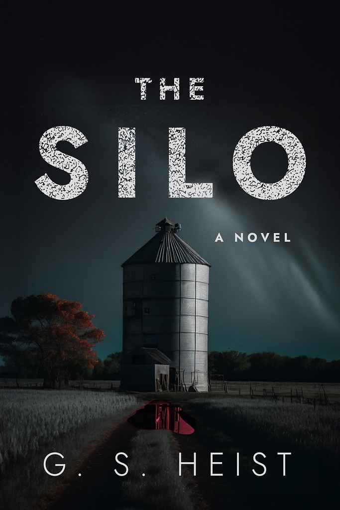
"We went dark and atmospheric for this debut novel by a former police chief—a psychological literary thriller set in the American Midwest. The cover focuses on the silo at the story’s core, with a subtle blood pool in front as ominous foreshadowing. A large, readable sans-serif font was distressed for a grungy, rough feel, mirroring the novel’s events. The silo motif was repeated throughout the interior design of the book, which I also designed, in section breaks and half-title artwork."
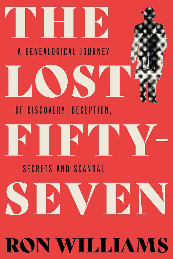
Designer: Paul P.
Designed by Paul P.
Available to hire ⏺"Ron had to turn detective for his geniolocical mystery, so in designing the cover, I was aiming for a modern take on the classic detective novel. I took vintage elements, and treated them in a modern way to give the overall composition a contemporary feel. The halftone picture is of the author and his sister staring quizzically out of their enigmatic father’s silhouette."
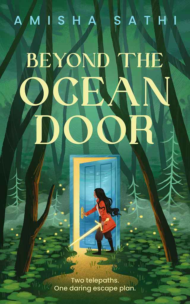
Designer: My Lan K.
Designed by My Lan K.
Available to hire ⏺"For this coming-of-age fantasy, I aimed to create a beautiful yet mysterious scene. The main character opens a door that only she can see through, sparking curiosity about what awaits her. Her glowing sword suggests both magic and danger, while the light pouring from the door has a liquid quality, hinting at its oceanic nature. Though digitally painted, I added texture and soft edges to give the illustration a traditional, hand-painted feel, enhancing its depth and atmosphere."
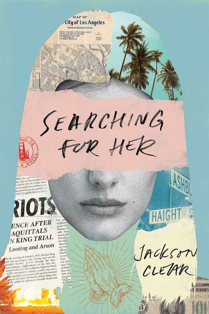
Designer: Richard L.
Designed by Richard L.
Available to hire ⏺"For this darkly comic novel of a disturbed young man’s unorthodox search for his soulmate I ended up with a collage approach centered around a young woman’s face. This suited not only the love story angle, but also the edgy writing style and all the mayhem that ensues—ultimately culminating during the Rodney King riots. California is an important aspect—almost as if a character in the story—and is featured prominently in the collage through various visuals. The typography is hand-lettered."
Designer: Danna Mathias S.
Designed by Danna Mathias S.
Available to hire ⏺"For this cover, we wanted to communicate the era (Jazz Age/Roaring Twenties) in New York City, a feeling of mystery with a touch of romance, and the underlying theme of musicals. I worked with the lush red and gold color palette to evoke warmth, lightly era-specific typography for the title, and framed the title with thematic elements to create a cohesive and clear message."
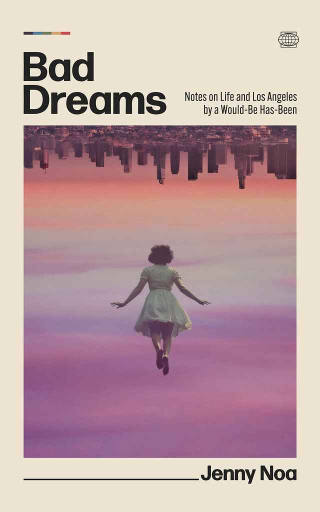
Designer: Ryan M.
Designed by Ryan M.
Available to hire ⏺"From the start, I imagined an upside-down L.A. floating above a dreamer in free-fall—perfect for Jenny’s surreal, witty essays on trying to make it in the city. That image became the core: disorientation meets hope, with retro-minimal type, a pastel-violet sky, and a subtle rainbow nod. Jenny’s thoughtful input helped refine every detail into a cover that feels both current and unmistakably hers."
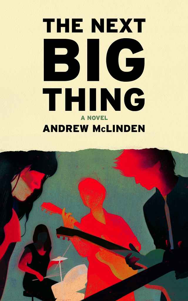
Designer: Owen G.
Andrew McLinden
Designed by Owen G.
Available to hire ⏺"In this dark satire of the music industry, The Next Big Thing follows Danny McAllister, a toxic, careless, and occasionally malevolent lead guitarist whose influence slowly corrupts those around him. Rather than depicting his misdeeds literally, I used color as a metaphor—violent red bleeding across and affecting the other band members. The design draws inspiration from live gig photography, band posters, and set lists, with the torn paper edge subtly hinting at Danny’s destructive nature."
Over 1,000 professional book cover designers are available on Reedsy, come meet them. Learn more about Reedsy
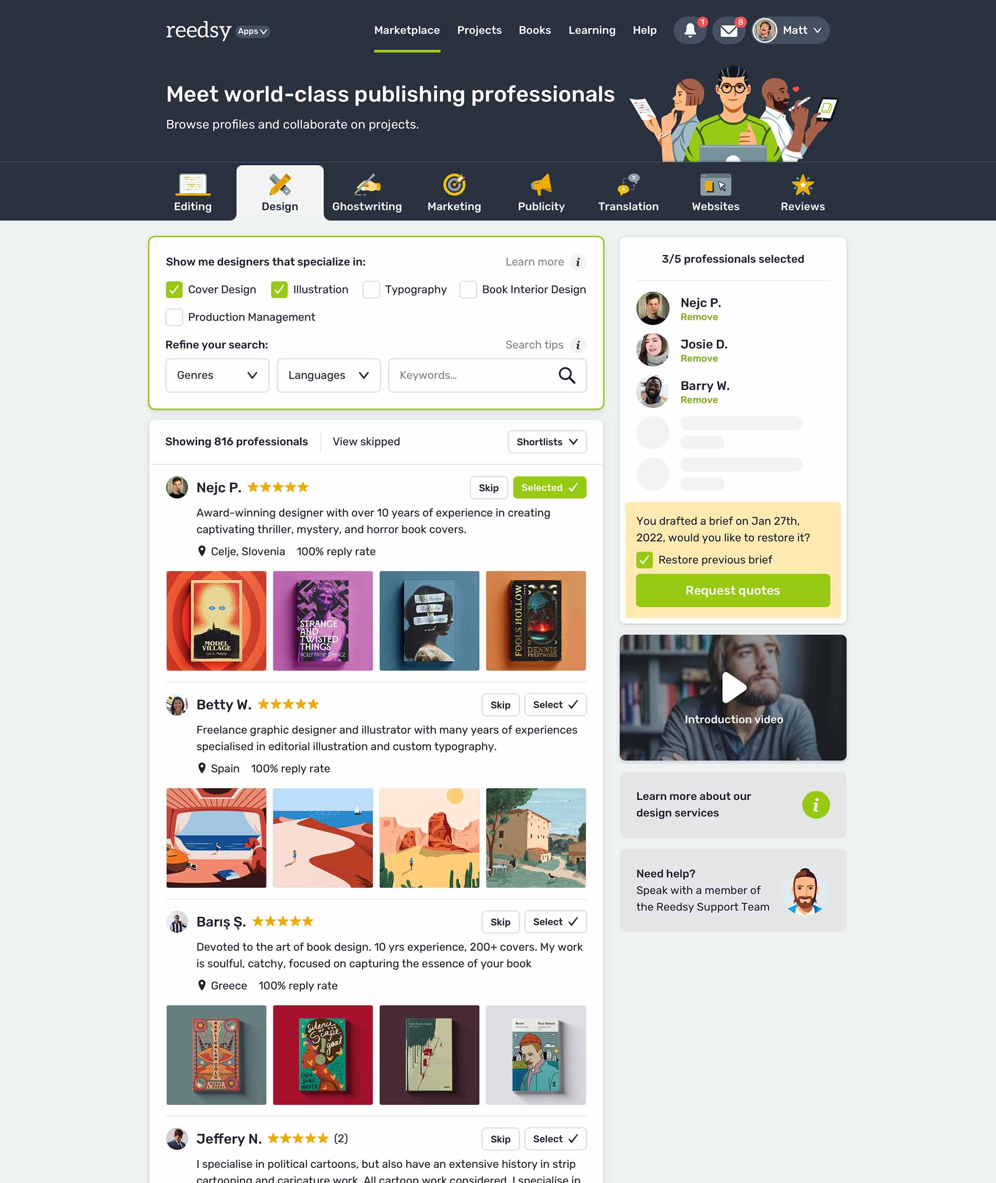
Get an eye-catching book cover
Request quotes from 200+ of the most talented cover designers in the industry.

Enter your email or get started with a social account:
