Menu
There are currently 1,000+ designers available on Reedsy, come meet them.
Find the perfect designer for your next book
1 million authors trust the professionals on Reedsy. Come meet them.
There are currently 1,000+ designers available on Reedsy, come meet them.
Find the perfect designer for your next book
1 million authors trust the professionals on Reedsy. Come meet them.
Looking for design inspiration? Explore these captivating fiction covers designed by professionals on Reedsy. See one you love? Get your own striking cover from that designer on our marketplace.
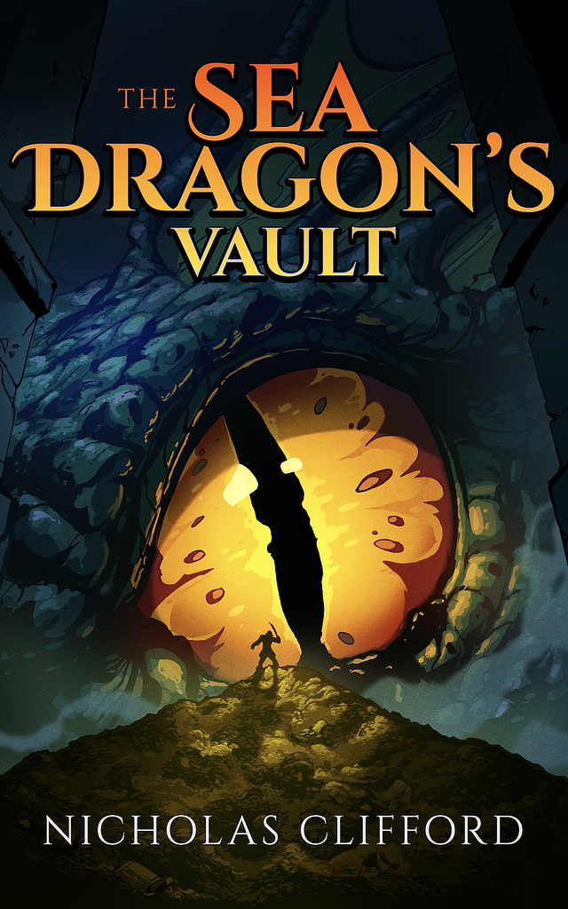
Designer: Matt H.
Designed by Matt H.
Available to hire ⏺"This cover aims to immerse the viewer in the epic scale of the story. A small human silhouette set against a looming eye conveys the sea dragon’s immense size, while the rest of the composition preserves its mystery. The distinctive rendering style, combining inked line art with bold, bright colors, is what makes the image truly pop."
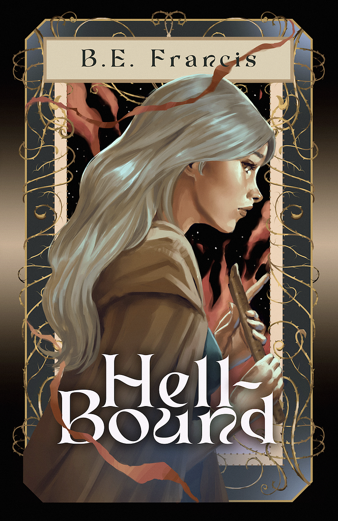
Designer: Sofía S.
Designed by Sofía S.
Available to hire ⏺"For Hell-Bound's cover, Bethany wanted to have her main character portrayed alongside a fantasy-looking frame. Painting the character (Renata) was a smooth ride, that's my speciality after all. However, the frame was a different story, so I tried different approaches and ended up mixing graphic design with my painterly style. The result is cohesive and pleasant."
Designer: Ryan M.
Designer: Ryan M.
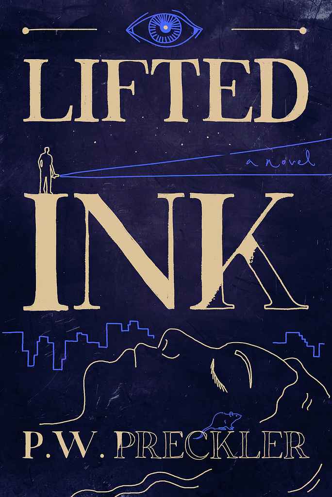
Designer: Roderick B.
Designed by Roderick B.
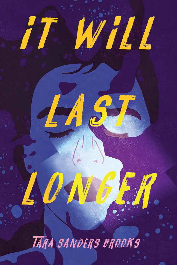
Available to hire ⏺"I felt this book — and its title alone — called for a handcrafted feel with a surreal edge. The stark blue paired with pale yellow detailing creates a dreamlike mood, pushing the limits of the format while remaining minimal at first glance. The half-finished 'inking' gives it a sense of movement, which I hope adds to the overall feel and represents the story well, without being explicitly on-the-nose."
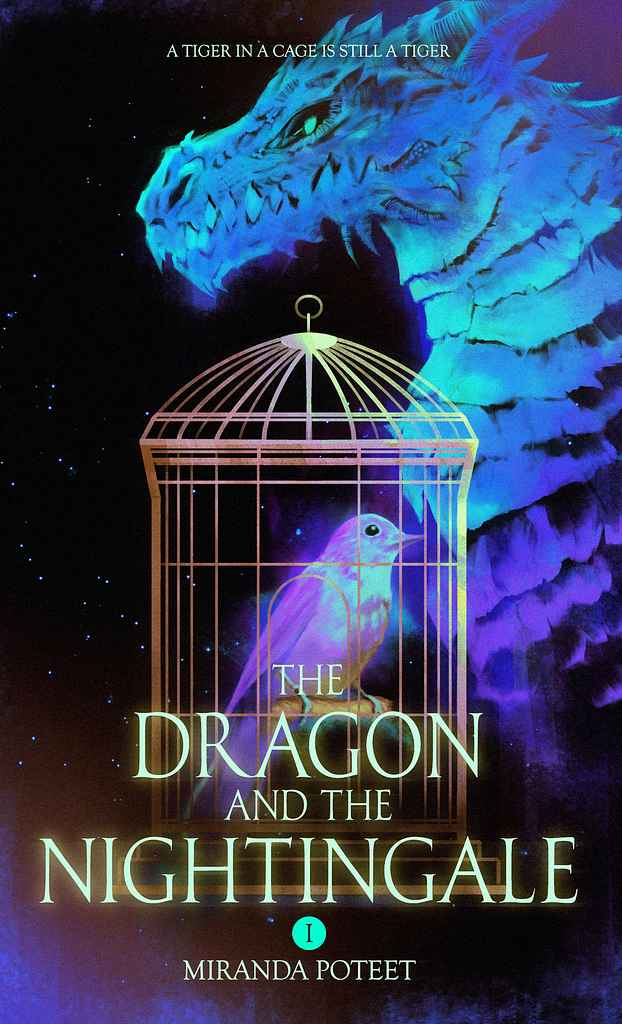
Designer: Sofía S.
Designed by Sofía S.
Available to hire ⏺"The Dragon and the Nightingale might look simple in its design, but it turns out I love to complicate my designs. I hand painted both the dragon and the bird so they would have a bit of a sketchy, pencil-ish look, and filled them with carefully selected colors to give the cover an electric feel. I finished it up with glowing particles and a sober font for the title, and here's the eye-catching result!"
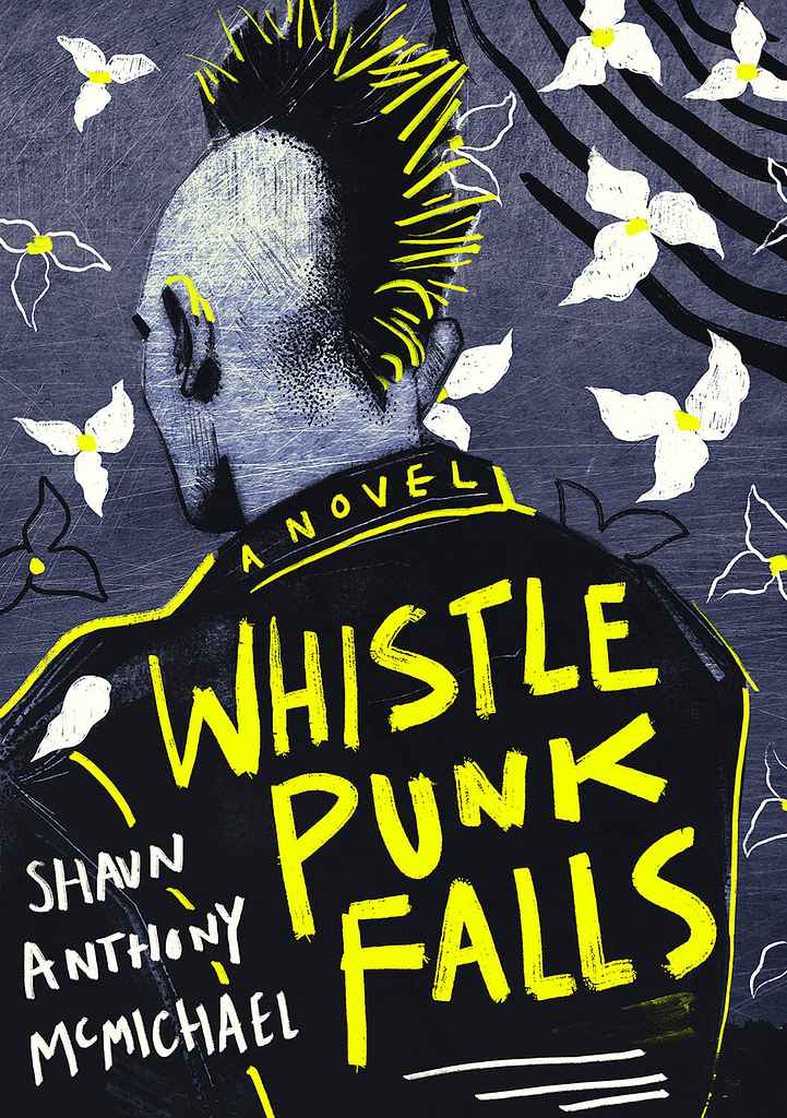
Designer: Roderick B.
Designed by Roderick B.
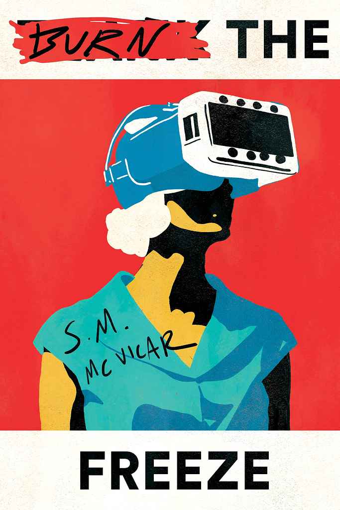
Available to hire ⏺"This cover came together almost instinctively, without much planning. It felt like the only way it could exist, so I worked quickly to preserve that energy, which mirrors the stories’ aesthetic. The bright yellow was essential from the start, with stark contrasts reinforcing the punk spirit. A handcrafted approach and minimal palette create immediate impact, while the flowers counter the sharp, rebellious character. A appropriately 'punk' clash of imagery."
Designer: Pascale H.
Designer: Bailey M.

Designer: Margarita C.
Designer: Barış Ş.
Designer: Barış Ş.
Designer: Bailey M.
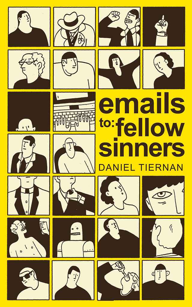
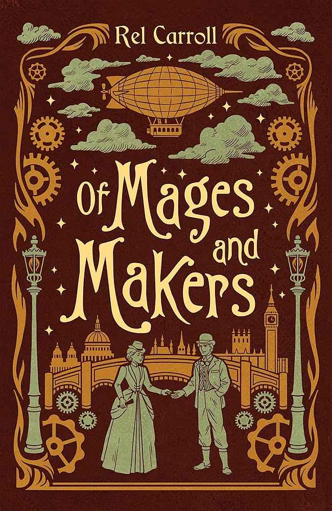
Designer: Alexander N.
Designed by Alexander N.
Available to hire ⏺"This cover design is a rare case of an idea arriving effortlessly while I was reading the book. Daniel’s book is a collection of fictional emails sent to unknown recipients, exploring character through subtext rather than plot. I wanted the cover to suggest a cast of distinct voices, while the tile-style typography nods to the writing’s wry, comic tone. Daniel is a returning client, and our strong rapport played a big role in the cover’s success."
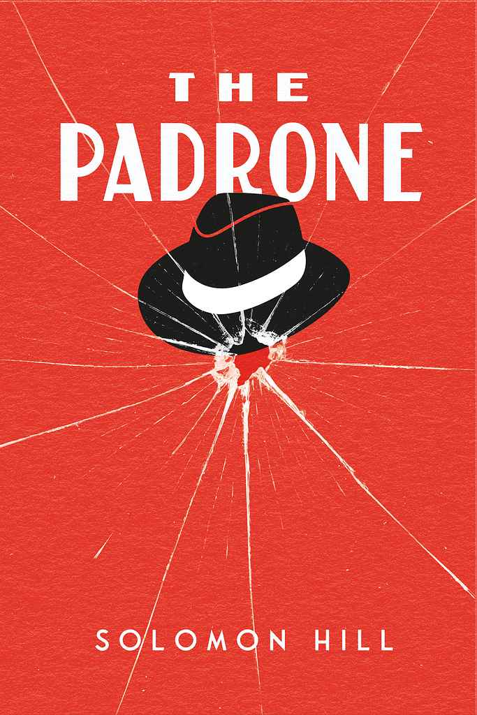
Designer: Arjan V.
Solomon Hill
Designed by Arjan V.
Available to hire ⏺"This cover design was created for a 1920s prohibition-era crime novel centred on a mobster. The approach prioritised simplicity while maintaining strong visual impact. The shattered glass effect serves dual purposes—it immediately suggests gunfire and violence, while the radiating crack pattern mirrors the intricate network of criminal connections and influence that emanates from the crime boss at the story's heart."
Designer: Steve M.

Designer: Vanessa M.
Designed by Vanessa M.
Available to hire ⏺"The cover feels playful, chaotic, and a bit unhinged. The hand drawn type and bold illustration match the A.I.’s ironic, intrusive voice. It signals a strange, funny, and slightly unsettling novel about art, humanity, and meaning."
Designer: Zuza M.
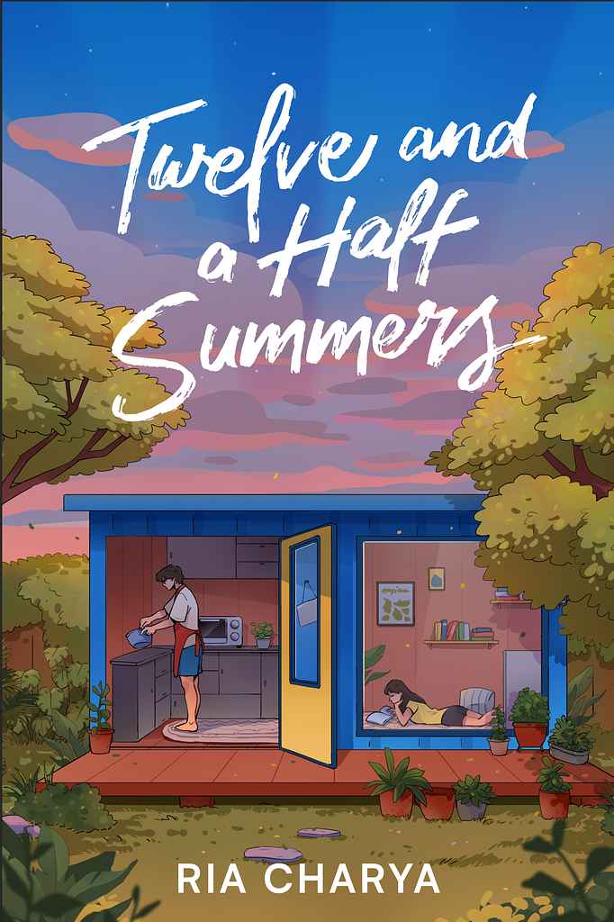
Designer: Zuchal R.
Designed by Zuchal R.
Available to hire ⏺"From the outset, Ria wanted a laid-back, cozy, homey feel. The goal was to invite readers into the container house and the characters’ everyday life. I showed them doing simple, intimate activities—baking and reading—anchored in a backyard container home that grounds the story in closeness and routine. Vibrant yet balanced tones keep the cover engaging while preserving a calm, welcoming mood."
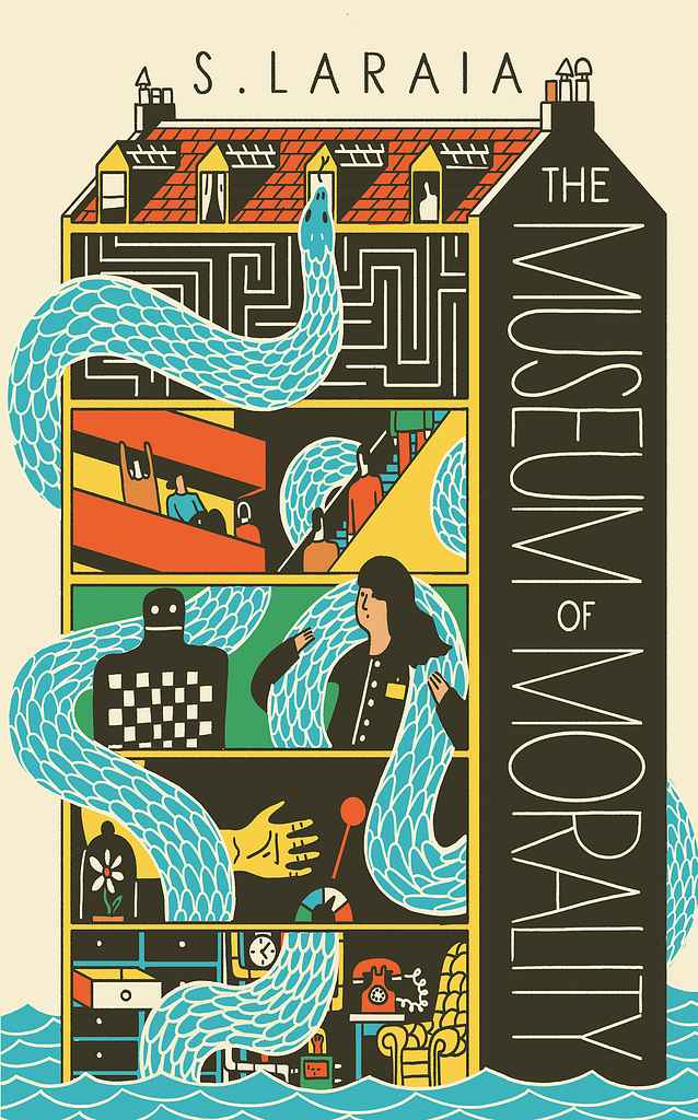
Designer: Alexander N.
Designed by Alexander N.
Available to hire ⏺"The Museum of Morality is set in a converted Victorian schoolhouse whose layout carries clear metaphorical weight. Silvia and I agreed the building itself should drive the design. Each level houses an experiment or artefact of moral philosophy, which I translated into simple, bold illustrations. The goal was to create intrigue by hinting at key story elements, while the winding snake echoes the central character and her quiet influence over the narrative."

Designer: Danna Mathias S.
Designed by Danna Mathias S.
Available to hire ⏺"The book is a sequel to Ellis River, so I wanted to create a cohesive and branded look while still providing a unique and eye-catching image. The title reflects the gold of the grass, paired against the striking dark sky to help it pop at thumbnail size. "
Designer: Bailey M.
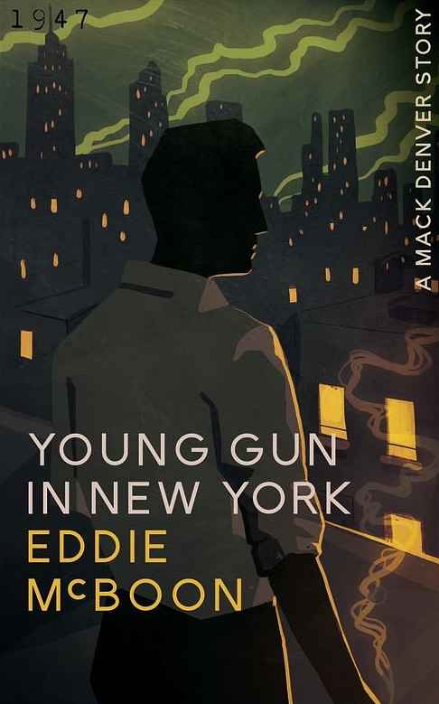
Designer: Roderick B.
Designed by Roderick B.
Available to hire ⏺"The cover was designed to evoke a sense of intrigue, placing the character into a well defined setting. Mood above all else. Aesthetically, I was obviously going for a noir feel, but with a modern twist (in its style). The angled smoke plumes in the distance and the smoke from his cigarette to give a bit of movement and dynamism to what could have been too static a scene."
Designer: Betty M.
Designer: Sofía S.
Designed by Sofía S.
Available to hire ⏺"My approach to illustration focuses on vibrant color palettes, beautiful character depictions and striking compositions. My painting technique, while entirely digital, recreates the look of traditional paintings, as I strive to create everything from scratch, without shortcuts. The result is an appealing fusion of classic fantasy covers and contemporary aesthetics, which undoubtedly leaves readers intrigued."
Designer: Alejandro C.
Designed by Alejandro C.
Available to hire ⏺"Epic confrontation between light and shadow! A classic epic fantasy cover featuring a hero on his noble mount facing a dark rider and dragon. In this genre, a realistic and meticulous technique is essential — combined with a dynamic, flowing composition that brings motion and tension to the scene. These are hallmarks of my work in the world of fantasy illustration."
Designer: Ryan M.
Designed by Ryan M.
Available to hire ⏺"I worked with the client to design this fantasy cover to feel like something ancient and alive, almost like a spell carved into the burnt wood. I kept the title big and centered so it commands attention even in thumbnail view. I think the end result balances elegance with a sense of mystery. It’s both gritty and poetic, just like the wonderful story inside."
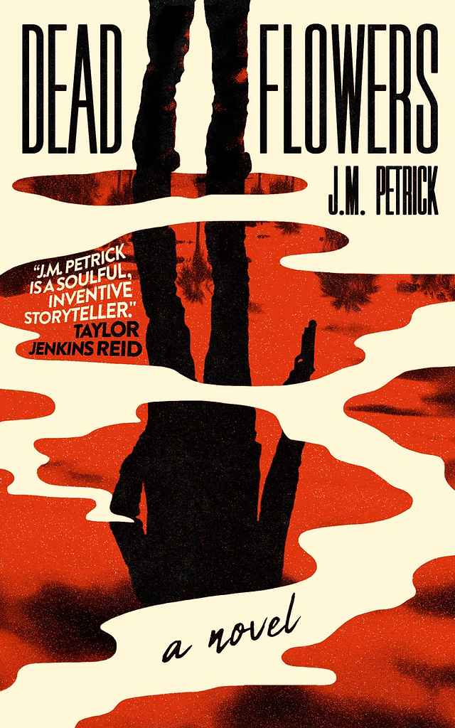
Designer: Nejc P.
Designed by Nejc P.
Available to hire ⏺"For Dead Flowers, I designed a cover that captures the book’s bold, rebellious spirit and moody noir tone. Drawing inspiration from classic pulp covers, I reimagined their raw energy through a modern lens. Merging vintage grit with contemporary minimalism and a dash of Hollywood flair."
Designer: Sofía S.
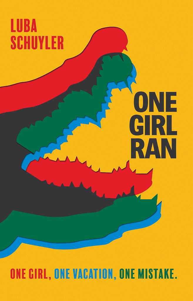
Designer: Jason A.
Designed by Jason A.
Available to hire ⏺“After several explorations — from a photo collage splicing a crocodile with a palm-fringed beach, to rocky shapes forming its face, to a writhing silhouette of crocs — we chose a pared-back design. A simple crocodile silhouette, given a double-printed look, creates an alarming yet timeless retro feel. It extends across the jacket, striking in its simplicity and echoing the protagonist’s peril in the Costa Rican jungle.”
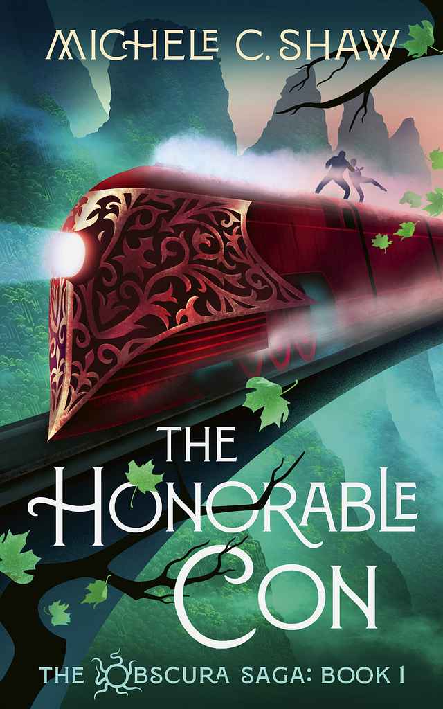
Designer: Tim B.
Designed by Tim B.
Available to hire ⏺“With this cover — the first in a fast-paced fantasy series — I aimed to capture a cinematic sense of motion and adventure aboard a high-speed train cutting through the mountains. The sweeping composition and wind-blown leaves reinforce the energy, pace, and momentum at the heart of the story.”
Designer: Peter S.
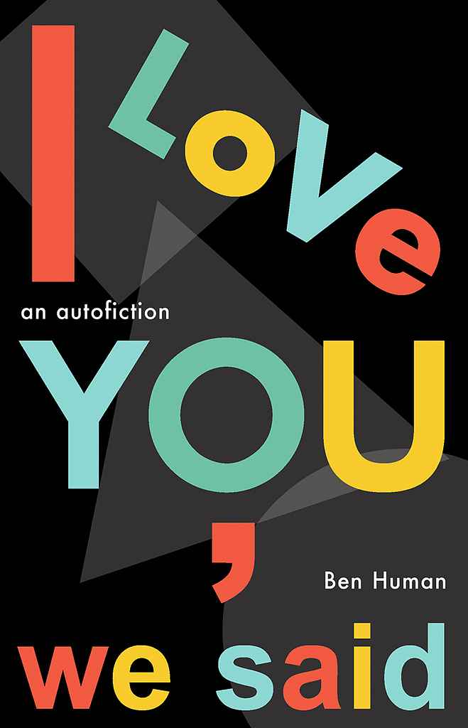
Designed by Peter S.
Available to hire ⏺"For Ben Human’s autobiographical novel about an American writer newly expatriated to London, I aimed to evoke the city’s atmosphere and the book’s avant-garde spirit. Inspired by the iconic Tube map, I ultimately kept only its P22 Johnston Underground font, overlaying bright colors on a dark, shadowy background — a nod to the tension beneath Swinging London’s surface."
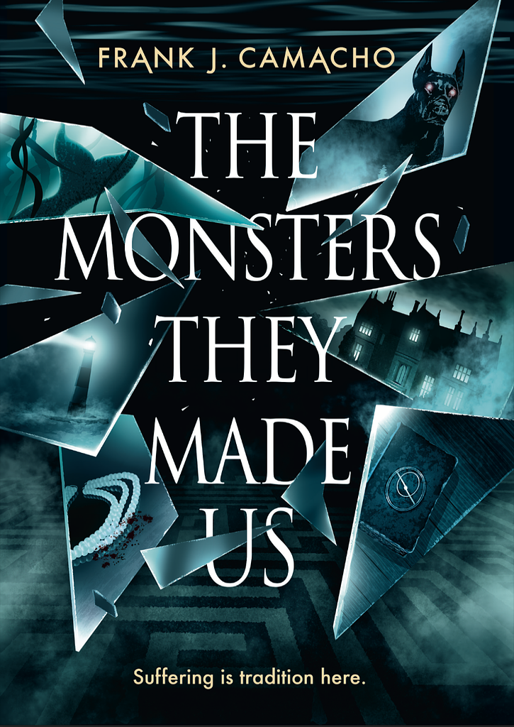
Designer: Tim B.
Designed by Tim B.
Available to hire ⏺“In this YA novel, four main characters grapple with the weight of their family legacies. I designed the cover so that each shard reflects an aspect of their stories, interacting with the title to add depth and drama. The blue-green palette evokes the ever-present water and the mysterious coastal town of Driftmore.”
Designer: My Lan K.
Designed by My Lan K.
Available to hire ⏺"For this cosy gaslamp adventure romance, I combined different elements of the story in the cover using a style that recalls old adventure novels. The title is playful, hand-drawn to show the lightheartedness of the story. The background and decorative elements show a steampunk London. The MMC is offering his hand to the FMC, who accepts it, which is a hint to how he is the one introducing her to a world of adventure and magic."
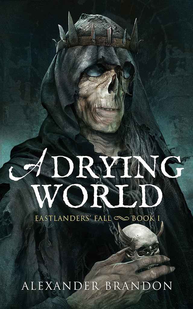
Designer: Alejandro C.
Designed by Alejandro C.
Available to hire ⏺"One of my favorite aspects of dark fantasy is bringing its characters to life, especially the villains. This piece portrays a once-human figure surrendering to dark magic, shedding the last fragments of his humanity. In dark fantasy, horror and decay must be conveyed with subtlety and balanced with a sense of elegance — a contrast I always strive to capture in my work."
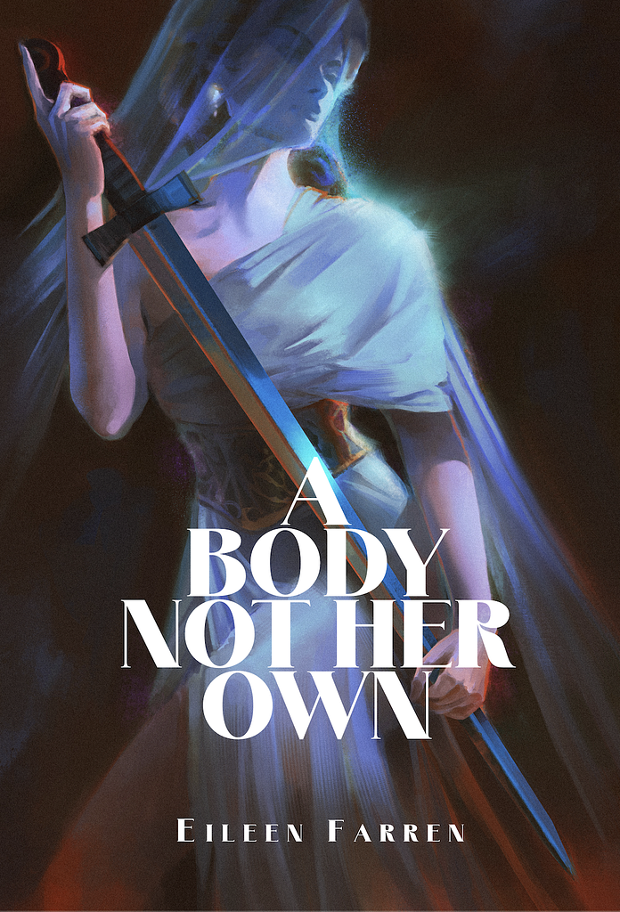
Designer: Xavier C.
Designer: Rachel S.
Designed by Rachel S.
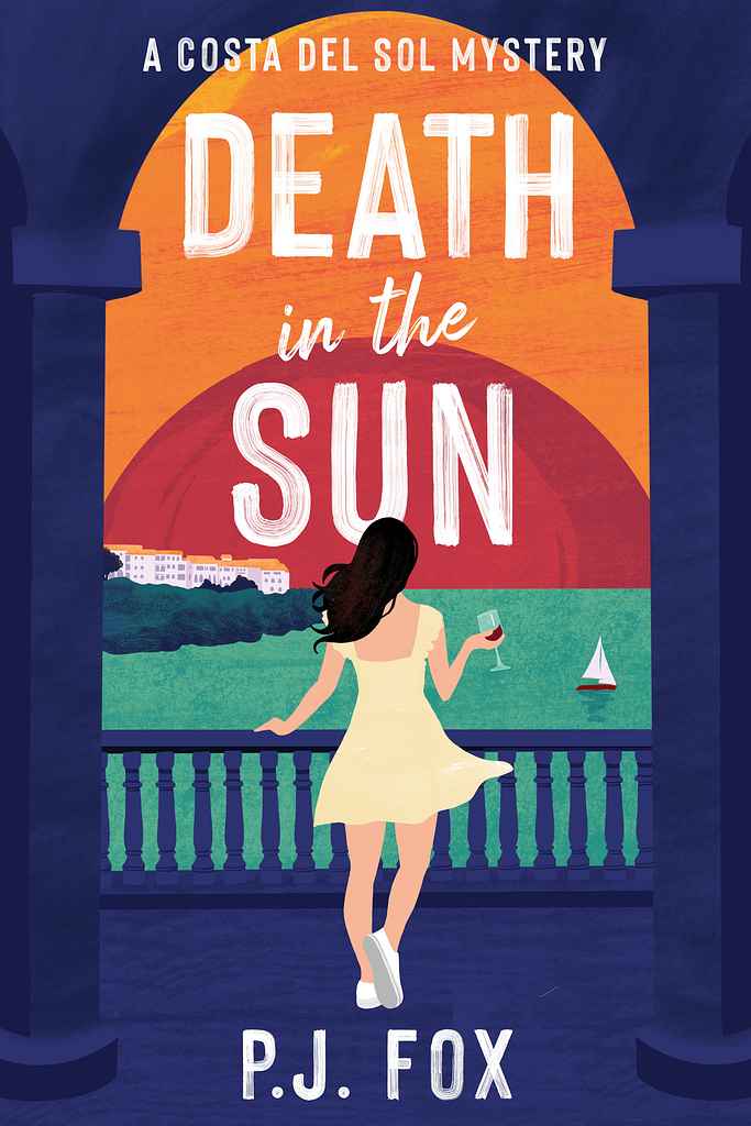
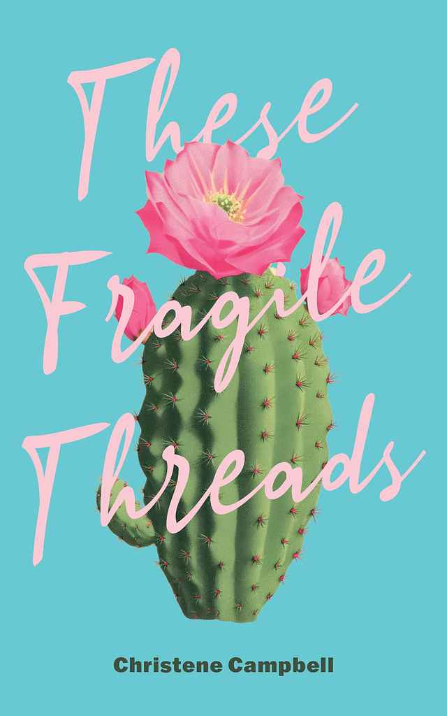
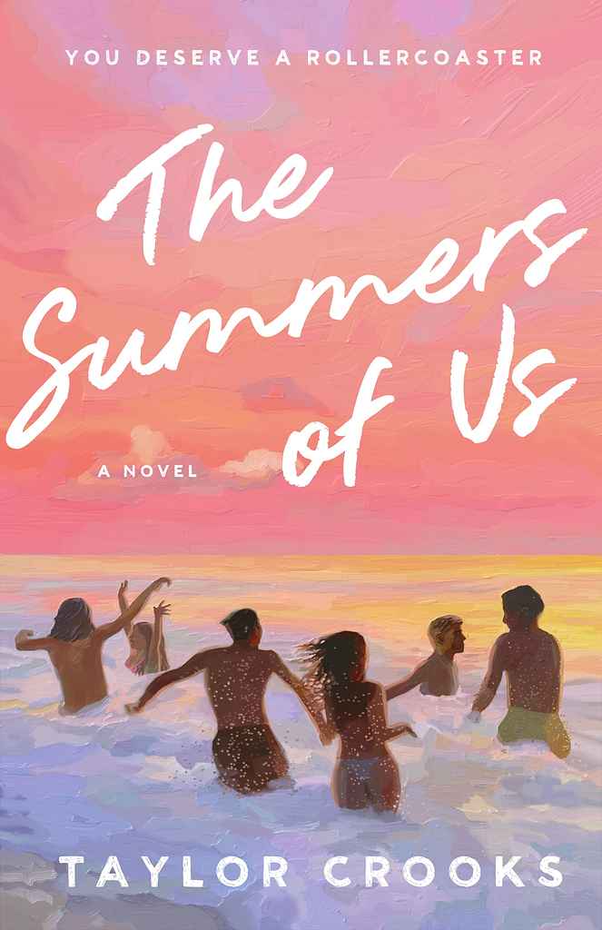
Available to hire ⏺"I start by understanding the book’s mood and visual landscape, then collaborate closely to capture key imagery in a unique way. For this cover, we built a photo collage to reflect the characters and fine-tuned the sunset tones to match the story’s emotion. I treated it like a painting—designed to feel like art, not just packaging. The final painted texture adds warmth and mystery, creating a cover that’s both visually striking and deeply connected to the book’s heart."
Designer: Barış Ş.
Over 1,000 professional book cover designers are available on Reedsy, come meet them. Learn more about Reedsy

Enter your email or get started with a social account:
