Menu
There are currently 1,000+ designers available on Reedsy, come meet them.
Find the perfect designer for your next book
1 million authors trust the professionals on Reedsy. Come meet them.
There are currently 1,000+ designers available on Reedsy, come meet them.
Find the perfect designer for your next book
1 million authors trust the professionals on Reedsy. Come meet them.
Looking for design inspiration? Here are the best book covers designed by professionals on Reedsy. See one you love? Get your own top-tier cover from that designer on our marketplace.

Designer: Paul P.
Designed by Paul P.
Available to hire"Ron had to turn detective for his geniolocical mystery, so in designing the cover, I was aiming for a modern take on the classic detective novel. I took vintage elements, and treated them in a modern way to give the overall composition a contemporary feel. The halftone picture is of the author and his sister staring quizzically out of their enigmatic father’s silhouette."
Designer: My Lan K.
Designed by My Lan K.
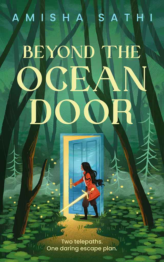
Available to hire"For this coming-of-age fantasy, I aimed to create a beautiful yet mysterious scene. The main character opens a door that only she can see through, sparking curiosity about what awaits her. Her glowing sword suggests both magic and danger, while the light pouring from the door has a liquid quality, hinting at its oceanic nature. Though digitally painted, I added texture and soft edges to give the illustration a traditional, hand-painted feel, enhancing its depth and atmosphere."

Designer: Richard L.
Designed by Richard L.
Available to hire"For this darkly comic novel of a disturbed young man’s unorthodox search for his soulmate I ended up with a collage approach centered around a young woman’s face. This suited not only the love story angle, but also the edgy writing style and all the mayhem that ensues—ultimately culminating during the Rodney King riots. California is an important aspect—almost as if a character in the story—and is featured prominently in the collage through various visuals. The typography is hand-lettered."
Designer: Danna Mathias S.
Designed by Danna Mathias S.
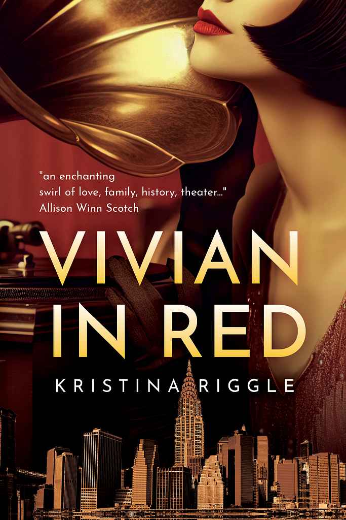
Available to hire"For this cover, we wanted to communicate the era (Jazz Age/Roaring Twenties) in New York City, a feeling of mystery with a touch of romance, and the underlying theme of musicals. I worked with the lush red and gold color palette to evoke warmth, lightly era-specific typography for the title, and framed the title with thematic elements to create a cohesive and clear message."

Designer: Alejandro C.
Mary Shelley (New illustrated edition)
Designed by Alejandro C.
Available to hire"Frankenstein is an enduring icon that has been reimagined countless times, though the creature's true appearance often remains ambiguous. My challenge was to faithfully capture Mary Shelley’s original vision. For the slipcase design, I imagined a scientific sketch—a conceptual blueprint of the creature's face, as if drawn by Victor himself. This creates a striking contrast: the slipcase shows the creature in its 'draft' phase, while the book cover depicts it fully realized, in flesh and blood."

Designer: Ryan R.
Designed by Ryan R.
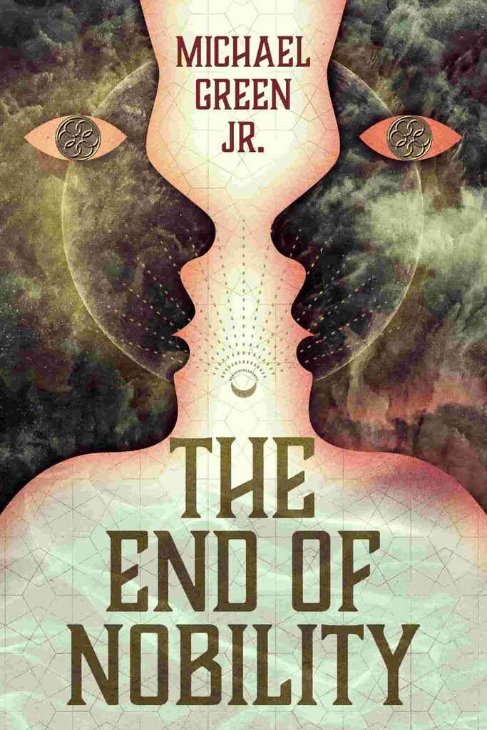
Available to hire"The classical framed art reflects the book's timeless exploration of love and relationships, inspired by the Aristophanes Myth on the Origin of Love. To blend originality with current trends, I added rich, moody foliage in the background, focusing on the classical portraits. The right frame, featuring a female figure within a crescent moon, captures the ethereal themes, while the left portrait represents the main character. This unconventional romance cover suits a story that defies the genre."

Designer: Richard L.
by Xinhua Lu (Author), Capella Cao (Translator)
Designed by Richard L.
Available to hire"The book opens with a haunting scene in a secluded Cambodian jungle temple in the early 1970s. Tutu, a young woman, finds her fiancé, a Khmer Rouge officer, crushed beneath a Buddha statue, setting Wu Lou, the temple’s master monk, on a path of exile. The cover reflects this era and setting, with a "never-ending redness" of trees, leaves, and petals evoking beauty and bloodshed. Tutu is featured prominently but tightly cropped, with a subtle Cambodian landscape and temple in the foreground."
Designer: Richard L.
Designed by Richard L.
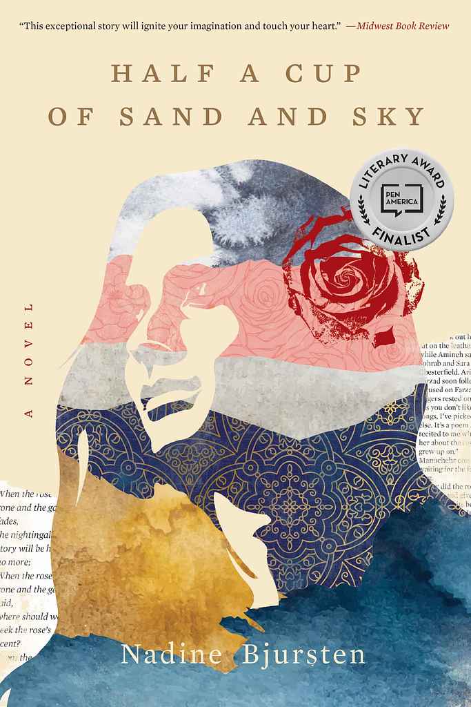
Available to hire"Finalist for the PEN/Bellwether Prize, the book portrays one woman's search for love and belonging amid political turmoil. Bjursten immerses readers in a life, nation, and era with lasting impact. For this layered story, I aimed to depict the protagonist as a strong, visionary woman without resorting to visual clichés or a literal photo. The solution was a silhouetted collage incorporating fragments of the title and story... sand, sky, sea, rose gardens, Persian heritage, and literature."
Designer: Driss C.
Designed by Driss C.
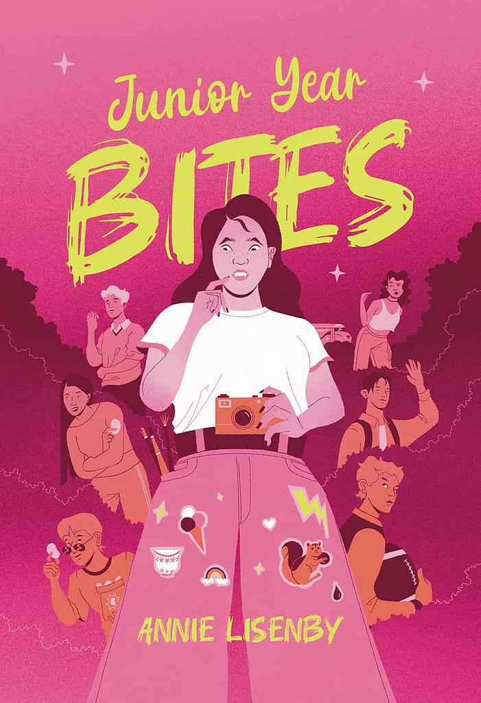
Available to hire"This book is a YA story where the protagonist must adapt to her new vampire life. The quirky story and characters inspired a cover featuring the protagonist as a bridge between her vampire friends on the left and her human social circle on the right. A pink palette and bright yellow title signal it as YA at first glance. To incorporate elements the author requested, like a teacup, squirrel, and paintbrushes, I included them within the protagonist's outfit, foreshadowing events in the book."
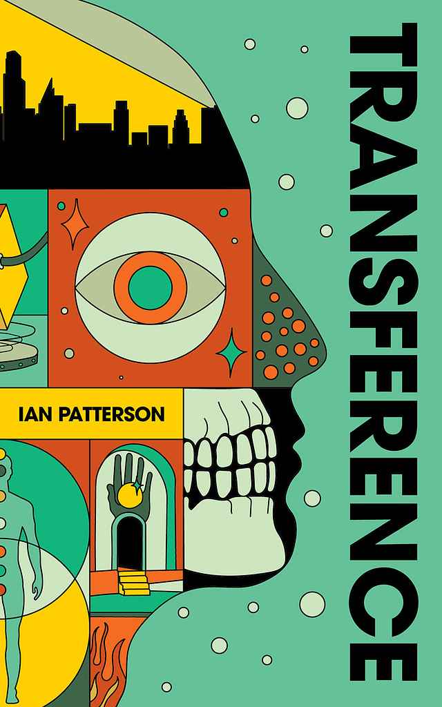
Designer: Barış Ş.
Designed by Barış Ş.
Available to hire"This cover captures the story’s layered narrative, blending illness and the human body with interdimensional travel. Symbolic elements—halls, doors, paths, and a watching eye—evoke the narrator’s presence and themes of surveillance. With a magical realist, maximalist aesthetic, the design reflects the story’s fusion of medical, spiritual, and speculative elements, setting it apart within the dystopian and cyberpunk genres."
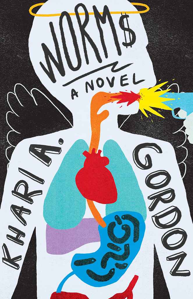
Designer: Barış Ş.
Designed by Barış Ş.
Available to hire"The cover is directly inspired by the plot, aiming to capture the intense sense of action and adventure. It embraces an underground vibe, signalling to the audience that they’re in for a wild, unpredictable ride filled with eccentric twists. The bold typography and edgy illustration style were carefully chosen to reflect the chaotic energy of the story, letting readers know they’re about to dive into something thrilling and out of the ordinary."
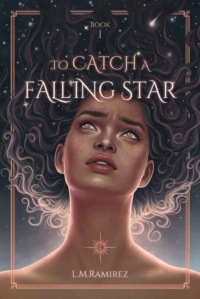
Designer: Madli S.
Designed by Madli S.
Available to hire"The author requested a fully illustrated cover featuring a portrait of the main character. After discussing the storyline, it became clear that stars and the universe play a key role in the story. The final concept shows the main character gazing up at the stars, reflecting on her identity and origins. We aimed for a dreamy, mysterious mood to captivate YA fantasy readers and evoke the sense of wonder central to the narrative."
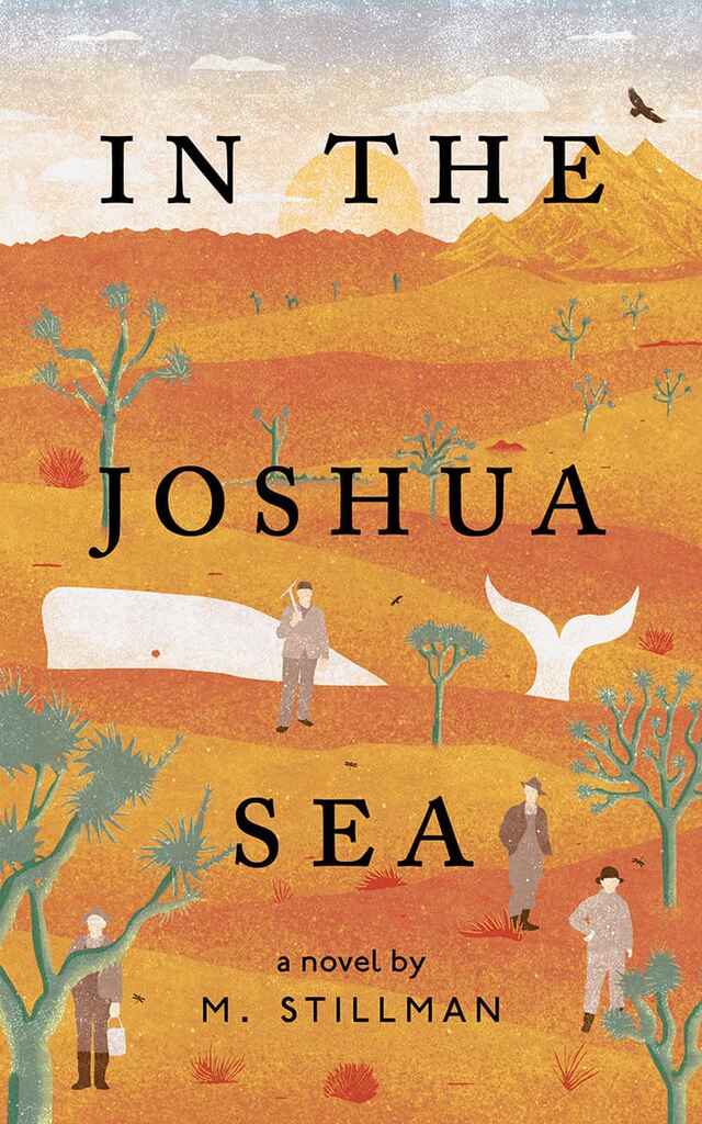
Designer: Barış Ş.
Designed by Barış Ş.
Available to hire"The cover art aims to visually encapsulate the author's deep connection to Joshua Tree National Park. The challenge was to harmoniously merge the desert landscape with oceanic elements, striking a balance between these contrasting environments. By combining unexpected imagery—such as a whale amidst the desert and Joshua trees—the illustration becomes both captivating and intriguing."
Designer: Owen G.
Designed by Owen G.
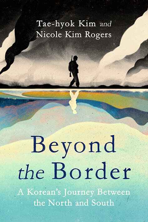
Available to hire"The book is an honest memoir of one man's experience through the Korean War and the country's divide to the modern day. The cover, split in half, reflects both the North-South Korea divide and the author's contrasting life experiences. The design symbolizes the divide between past and present, young and old, positive and negative. A serif font grounds it as a serious memoir, while painterly tones and hand-drawn elements add a sensitive, human touch, balancing contrast without being too harsh."

Designer: Vanessa M.
Designed by Vanessa M.
Available to hire"The cover is a minimalist yet powerful design that reflects the book's themes of hidden pain and resilience. The image of two hands holding a delicate flower, partially obscured by darkness, symbolises the hidden secrets and emotions that the protagonist struggles to confront. The contrasting colours and stark typography create a sense of tension and mystery, inviting readers to delve deeper into the story."
Designer: Caitlin B. A.
Designed by Caitlin B. A.
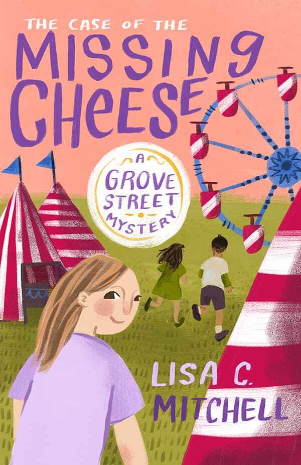
Available to hire"For this Middle Grade, the author and I wanted to find the right balance of whimsy and mystery 一 nothing too "kiddy" and nothing too scary. The carnival is an important setting in the book, and this audience usually responds well to character-based covers, so I put together a narrative image that included enigmatic body language with slightly discordant but vibrant colors that aligns with the genre while still intriguing the reader to find out more."
Designer: Nuno M.
Designed by Nuno M.
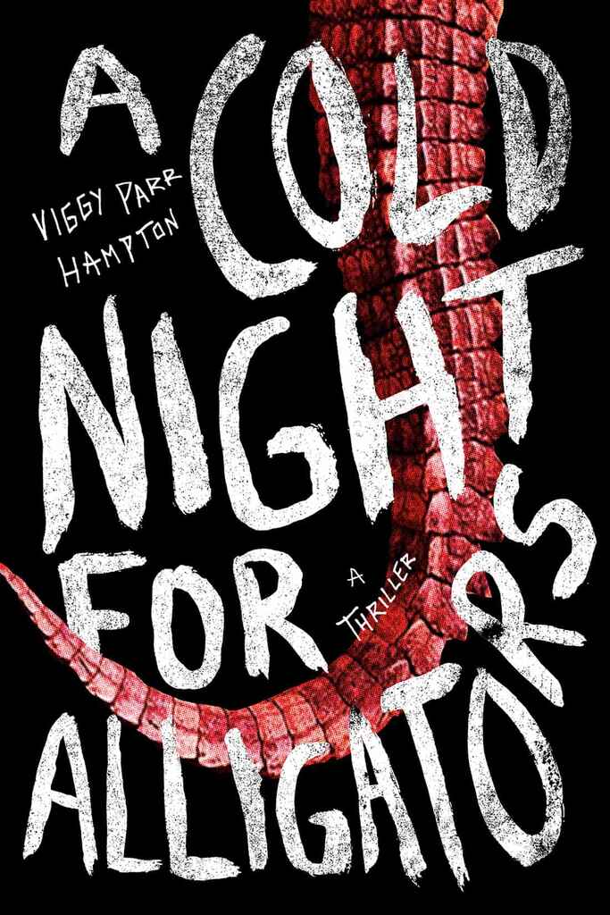
Available to hire"The hand-drawn, distressed calligraphy on this cover conveys a sense of danger and primal energy. The rawness of this approach, combined with the looming red alligator tail, suggests an untamed, suspenseful story. The tail runs diagonally across the cover, creating dynamic movement that complements the title. Its curve guides the viewer’s eye from the upper right to the lower left, pulling the reader into the action, as if they’re being drawn into the alligator's grasp."
Designer: Danna Mathias S.
Designed by Danna Mathias S.
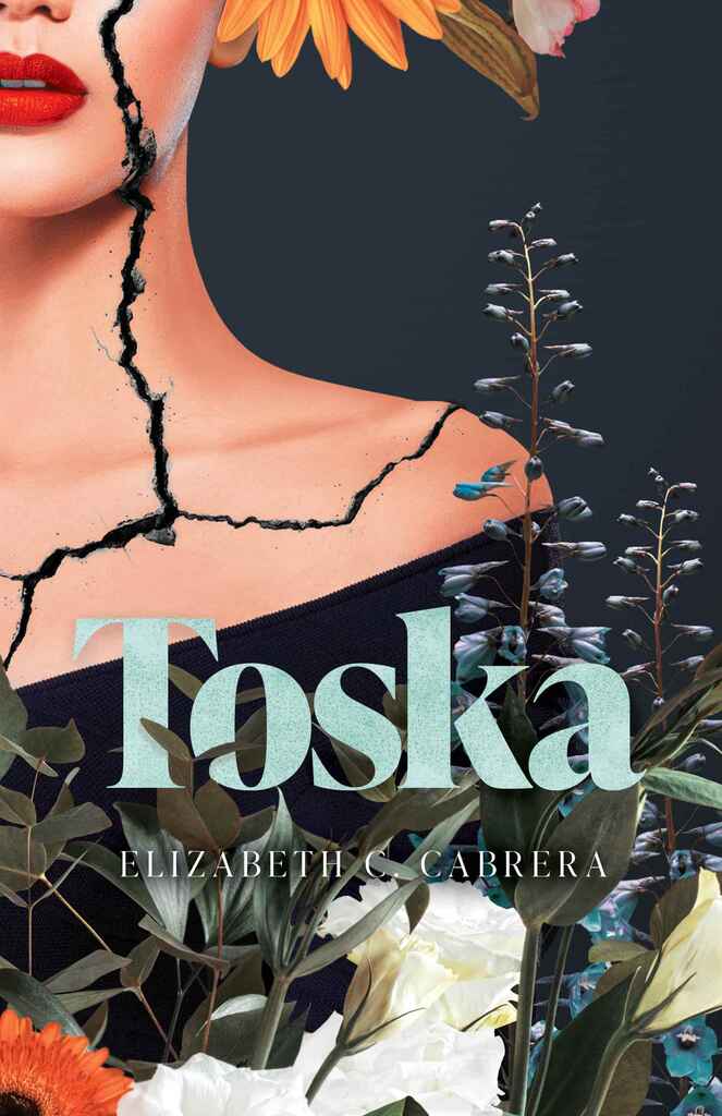
Available to hire"The book is about a woman navigating adulthood. We used florals to symbolize her 'blooming beautifully' into it, with the crack representing the challenge of 'keeping it together.' The heavier serif title font, common in fiction, is balanced by the unique cover image and florals winding through the text. The contrast between the woman's cracked face and the beauty of the florals adds a unique, fun element. I also used texture in the title for cohesion and chose an unexpected title color."
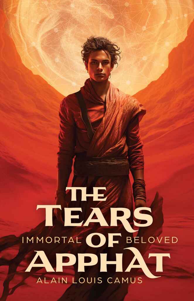
Designer: Arjan V.
Designed by Arjan V.
Available to hire"The author and I aimed to give this book cover a cinematic feel, like a movie poster, full of atmosphere while showcasing the main character. The story is set in a fictional desert world with Arabic influences, which is expressed mainly in the typography. The subtle sacred geometry in the sky references the magical aspect of the story. These geometric designs reappear at the start of each chapter, creating a cohesive and unified design throughout the entire book."
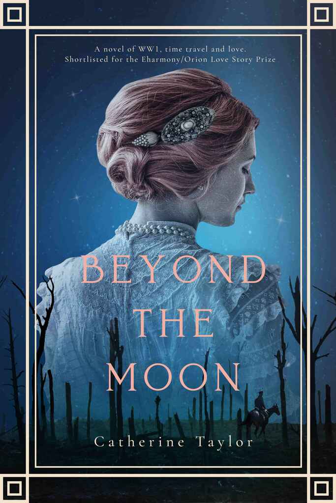
Designer: Vanessa M.
Designed by Vanessa M.
Available to hire"The cover features a stunning image that captures the book's themes of time travel and love. The beautiful portrait of the woman set against a war-torn landscape adds a layer of mystery. The overlapping elements and contrasting colours symbolise the connection between the past and present, inviting readers to dive into this captivating story."

Designer: Euan M.
Designed by Euan M.
Available to hire"The brief for ‘Enough.’ called for a “clean, crisp, and straight to the point” cover. This was understandable, since these are features of many of the best tech-related covers, and so the challenge at the core of this project was to balance the tech aesthetic with elements that reflected the thoughtful psychology that runs through the book. This was accomplished primarily through the use of a warmer colour palette, which was also applied to create a unique wordmark for the title."

Designer: Eva P.
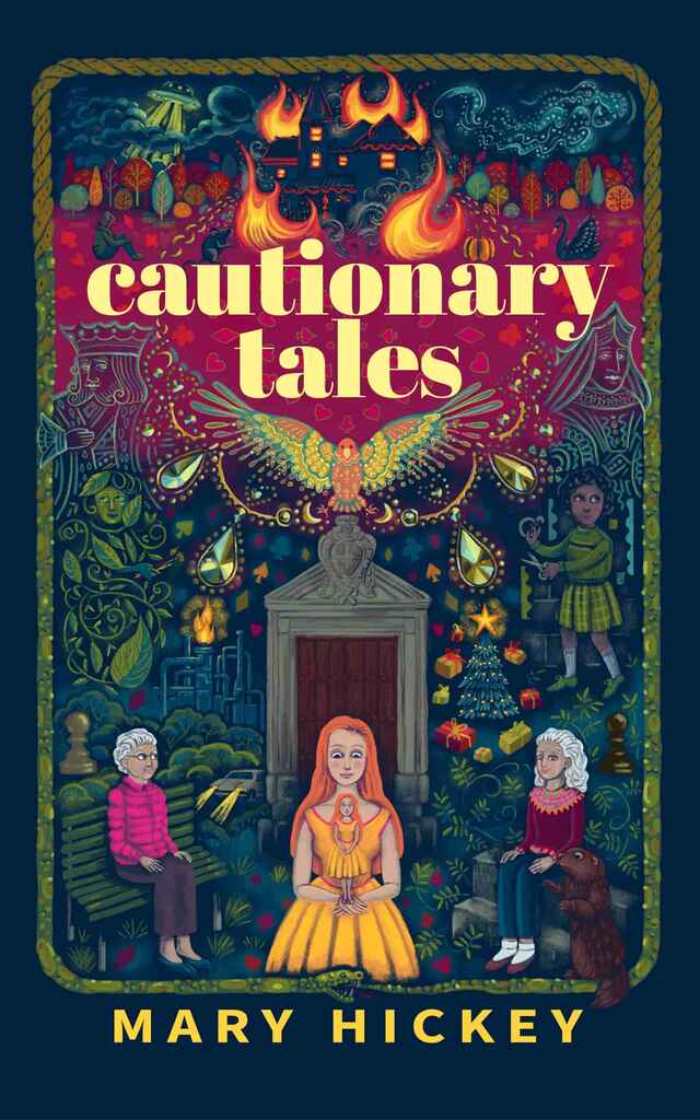
Designer: Patricia M.
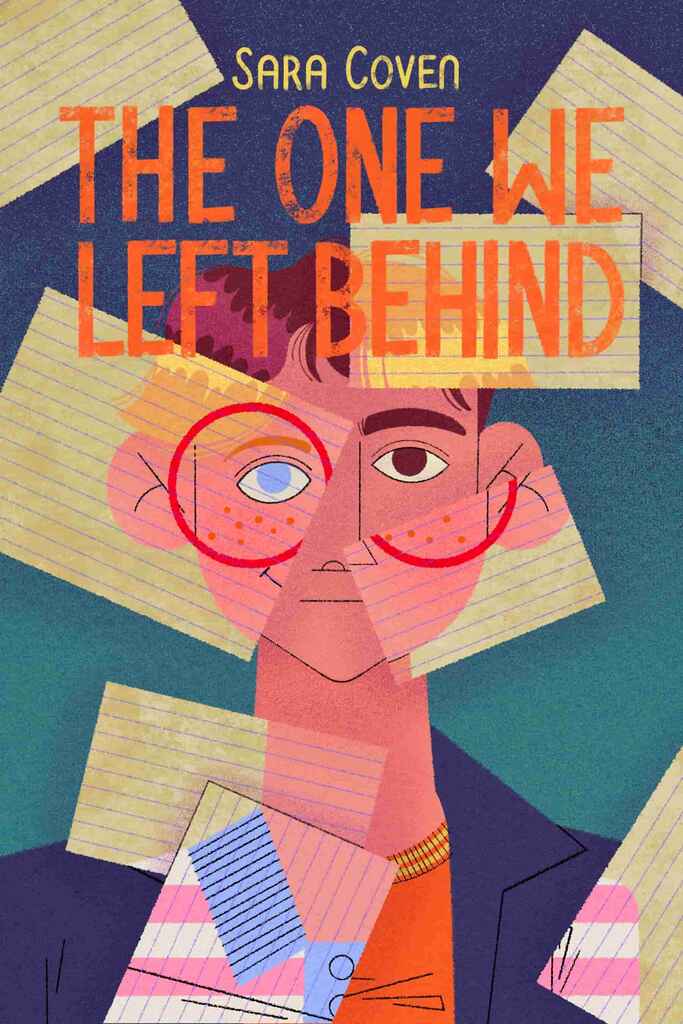
Designer: Taylor B.
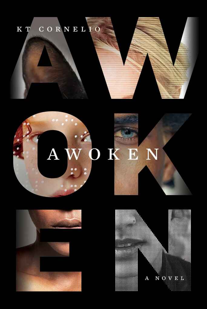
Designer: Richard L.
Designed by Richard L.
Available to hire"Awoken immerses readers in the lives of highly sensitive characters, diverse in age, race, gender, ability, sexuality, and even species. The novel follows parallel timelines, and the visual solution was to use the title letters as canvases, displaying fragments of these scenes while forming one unified character when viewed as a whole. Straddling the line between sci-fi and literary fiction, the design reflects this duality, capturing the novel's complexity and depth."

Designer: Mark T.
Designed by Mark T.
Available to hire"The design was drawn from ideas of the UK’s corporate culture business and personal excesses of the mid 1980s. The imagery of a paint-daubed Neoclassical statue is a nod toward the financial market background of the main character. The rugby ball has ties to the same character’s sporting background. Basically: work hard, play hard. The typography is cool and considered. The green colour scheme has a playful Penguin-esque vibe."
Designer: Xavier C.
Designer: Xavier C.

Designer: Rafael A.
Designer: Dion MBD
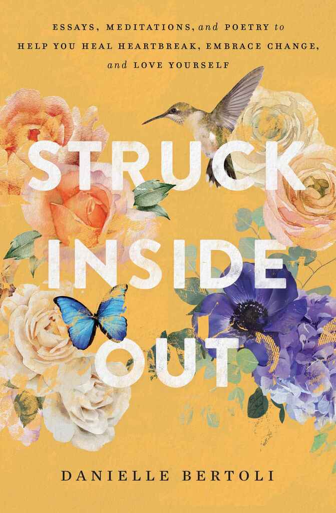
Designer: Richard L.
Designed by Richard L.
Available to hire"This book is about creating magic in your everyday life, letting go of experiences that no longer serve you, and honoring every step of your journey, no matter where you currently stand. The visual solution became to incorporate elements that were important to the author and the story, while creating an overall magical and inspirational mood."
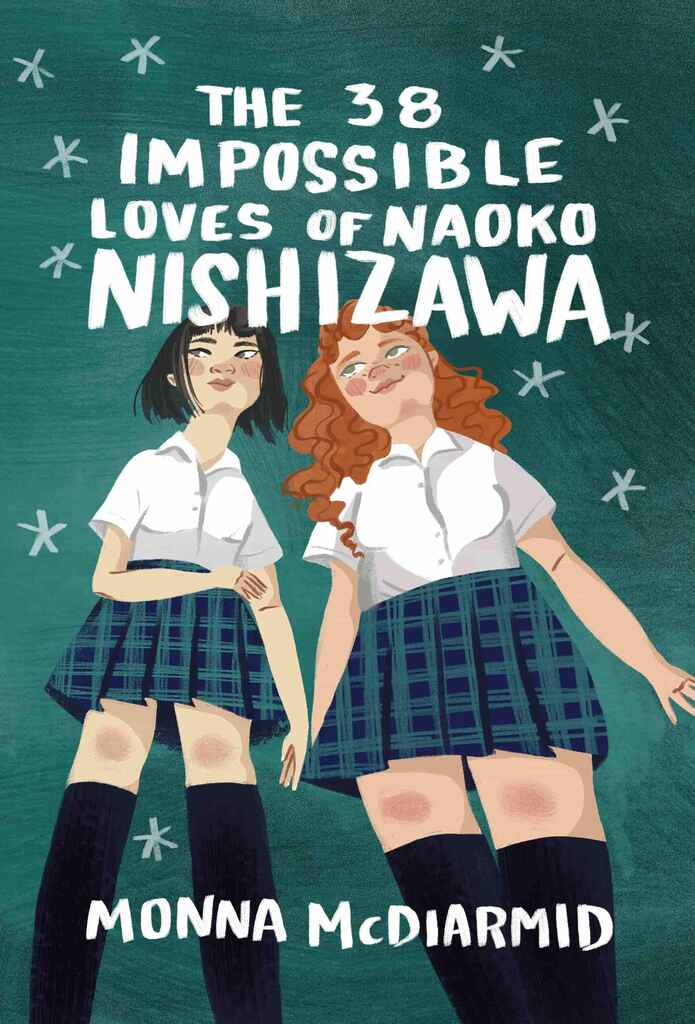
Designer: Caitlin B. A.
Designed by Caitlin B. A.
Available to hire"For this YA novel, the author wanted to emphasize the relationship between these two characters, which was in line with common visual themes in the genre. The friendship is at the center of the story, so I was sure to use body language that showed a comfortability and closeness, and we wanted to be sure to spend a lot of time getting the features of each character correct, emphasizing the uniqueness of the girls, despite their uniforms."
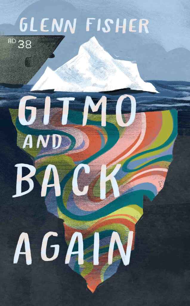
Designer: Caitlin B. A.
Designed by Caitlin B. A.
Available to hire"The author initially envisioned a ship crashing into a sailboat or icebergs adorned with peace signs, reflecting the story of a young man in the 1970s eager to escape his small town and join the revolutionary events shaping his country. To bring the 1970s counter-culture concept to life without falling into clichés, I opted for a collage-style design. Instead of the overused peace signs, I "cut" the icebergs from a psychedelic print, balancing clear messaging with a fresh, original aesthetic."
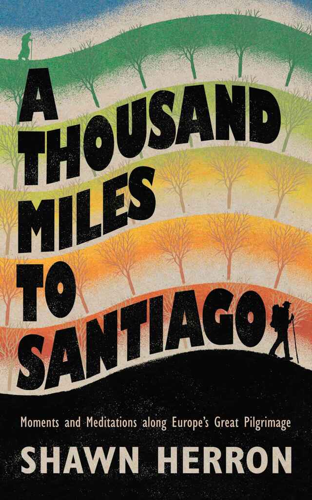
Designer: Andy B.
Designer: Devin W.
Designed by Devin W.
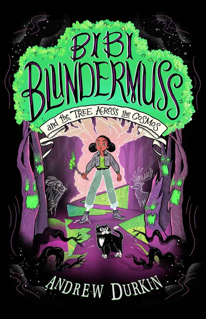
Available to hire"I leaned heavily into the young adult illustration aesthetic for this cover design. I worked closely with the author to understand his vision and incorporated several spooky elements in the illustration that pop up throughout the story. I illustrated the main characters in addition to designing a number of interior illustrations and a hand-drawn typeface. The author said it was fun to see his story come to life. It was a bit like getting to illustrate my own animated movie."
Designer: Kim D.

Designer: Rafael A.

Designer: Stella M.
Designed by Stella M.
Available to hire"The cover design, which I both created and illustrated, aims to evoke ethereal beauty and introspection, aligning with the contemplative nature of poetry. The cosmic background suggests a journey of transformation, while the delicate butterflies, dragonfly, and glowing lights symbolize renewal and the ephemeral. A clean serif font adds elegance and timelessness. The text placement is unobtrusive, keeping the artwork as the focal point while ensuring the title remains prominent and readable."
Over 1,000 professional book cover designers are available on Reedsy, come meet them. Learn more about Reedsy

Enter your email or get started with a social account: