Menu
There are currently 1,000+ designers available on Reedsy, come meet them.
Find the perfect designer for your next book
1 million authors trust the professionals on Reedsy. Come meet them.
There are currently 1,000+ designers available on Reedsy, come meet them.
Find the perfect designer for your next book
1 million authors trust the professionals on Reedsy. Come meet them.
Looking for design inspiration to say more with less? Browse this collection of minimalist book covers designed by professionals on Reedsy. See one you love? Get your own powerful cover from that designer on our marketplace.
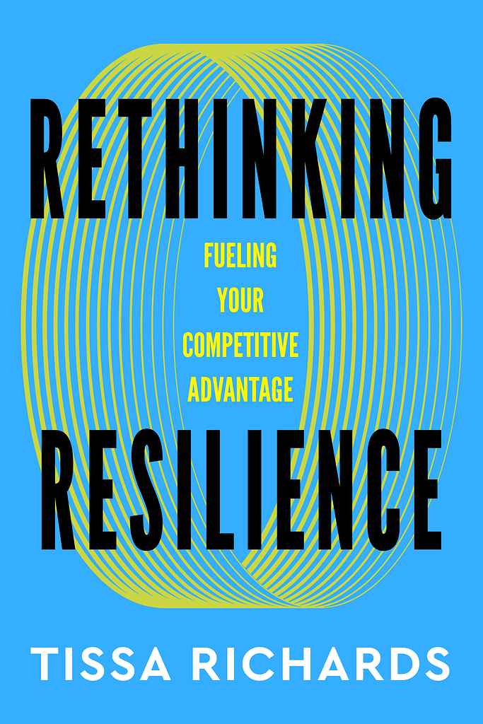
Designer: Alan H.
Designed by Alan H.
Available to hire"Designing business book covers often means resisting clichés and literal ideas. That can be hard for authors to let go of—but when it works, you get a cover like this. The circular graphics suggest tension and cohesion, paired with bold typography and a confident palette. The cover works on multiple levels: instantly legible as an icon at thumbnail size, yet flexible as a visual metaphor, hinting at the book’s ideas without over-explaining."

Designer: Victoria H.
Designed by Victoria H.
Available to hire"The tone of this cover needed to feel oppressive and isolating in its colour palette, to match the accusations the protagonist is faced with after a schoolgirl goes missing. Throughout the story, he often feels like he’s drowning, plus the book is set in a small whaling town, and so the image of waves also felt really important, as did a harpoon, targeted at the protagonist's car in place of a whale. "

Designer: Mark K.
Designed by Mark K.
Available to hire"I chose this moment because it’s small, strange, and easy to overlook. Early in the story, the worm forming shapes feels incidental, but as the book unfolds, you realize it’s quietly teaching you how power and intention work in this world. That ambiguity is important. I tend to avoid literal character-driven covers and instead look for a single image that hints at the rules of the story. Something simple, a little unsettling, that trusts the reader to connect the dots."

Designer: Nuno M.
Designed by Nuno M.
Available to hire"Lisa’s book is filled with quiet, contemplative moments. The cover acts as a window into those pauses, using a restrained palette and collage-driven concept. A soft gray background creates visual calm, while circular cutouts of classical botanical illustrations float like lyrical fragments, evoking memory, nature, and poetry’s nonlinear rhythm. Minimalist typography adds a contemporary presence without overpowering the artwork, conveying sensitivity, refinement, and conceptual clarity."
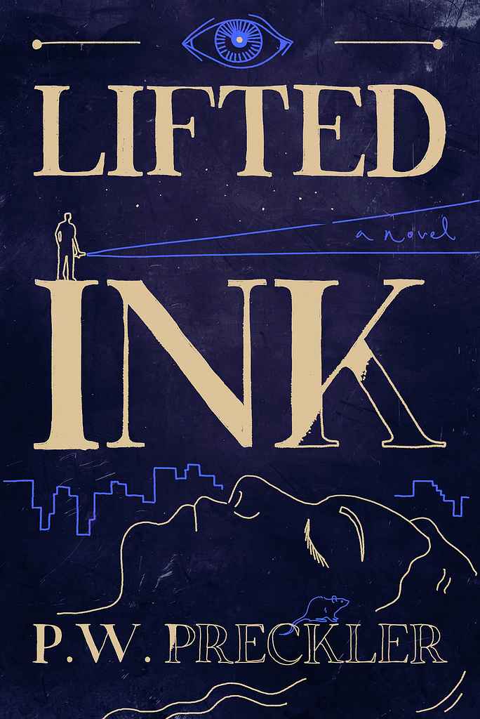
Designer: Roderick B.
Designed by Roderick B.
Available to hire"I felt this book — and its title alone — called for a handcrafted feel with a surreal edge. The stark blue paired with pale yellow detailing creates a dreamlike mood, pushing the limits of the format while remaining minimal at first glance. The half-finished 'inking' gives it a sense of movement, which I hope adds to the overall feel and represents the story well, without being explicitly on-the-nose."

Designer: Ryan R.
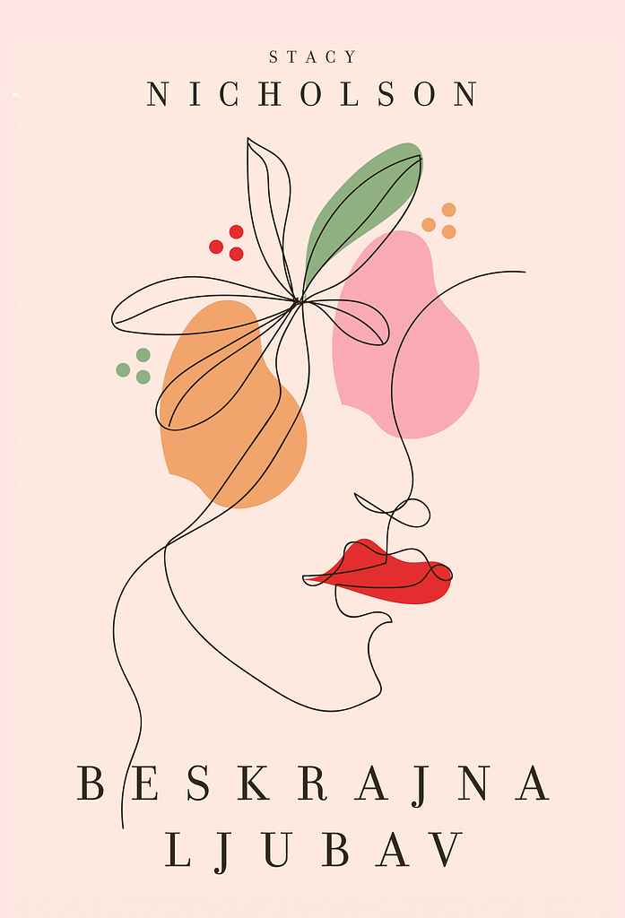
Designer: Natalia A.
Designed by Natalia A.
Available to hire"For Stacy’s poetry Beskrajna ljubav, the design relies on a delicate interplay of line, color, and abstract form. Rather than literal imagery, gentle outlines and soft color blocks evoke love and openness, reflecting the collection’s blend of spiritual and earthly affection. The visual space feels tender yet expressive, inviting quiet emotional reflection. Typography remains calm and spacious, leaving room for the poetry’s voice to breathe."
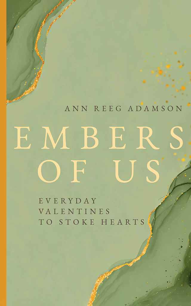
Designer: Natalia A.
Designed by Natalia A.
Available to hire"Since this is a poetry collection, atmosphere, sensation, and emotional resonance take precedence over plot. The visual language favors mood over narrative, using color, texture, light, and typography as emotional cues. For Ann’s book, synesthesia guided the design: a soft green palette, golden accents, and subtle shimmer translate warmth and sound into a visual experience, echoing embers and inner glow. Fluid, breathing shapes suggest movement and resonance rather than fixed form."
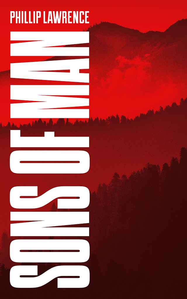
Designer: Jonathan H.
Designed by Jonathan H.
Available to hire"The novel is set in the hills of Appalachia, which I wanted to feel ominous and potentially lethal, aligning with the book’s military themes. The huge, blocky title reinforces a sense of oppression and brutality. Appalachia is often shown as peaceful; here, a blood-red palette, heavy filtering, and visible grain replace serenity with unease. Instead of restrained debut typography, I chose a bold, vertical treatment with maximum contrast to deliver real weight and impact."

Designer: Caerus K.
Richard S. Dillard and Brian G. Dillard
Designed by Caerus K.
Available to hire"Take Your Lead is for leaders who know the platitudes of ‘good’ leadership but seek deeper, empathy-driven insight to elevate their impact. Given the book’s rich content, Richard and I chose a clean, light palette to keep the design mature, offset by an uplifting blue to stand out among business titles. The figure moves not to a peak, but toward higher ground and the warmth of sunrise, symbolizing growth through humanity."
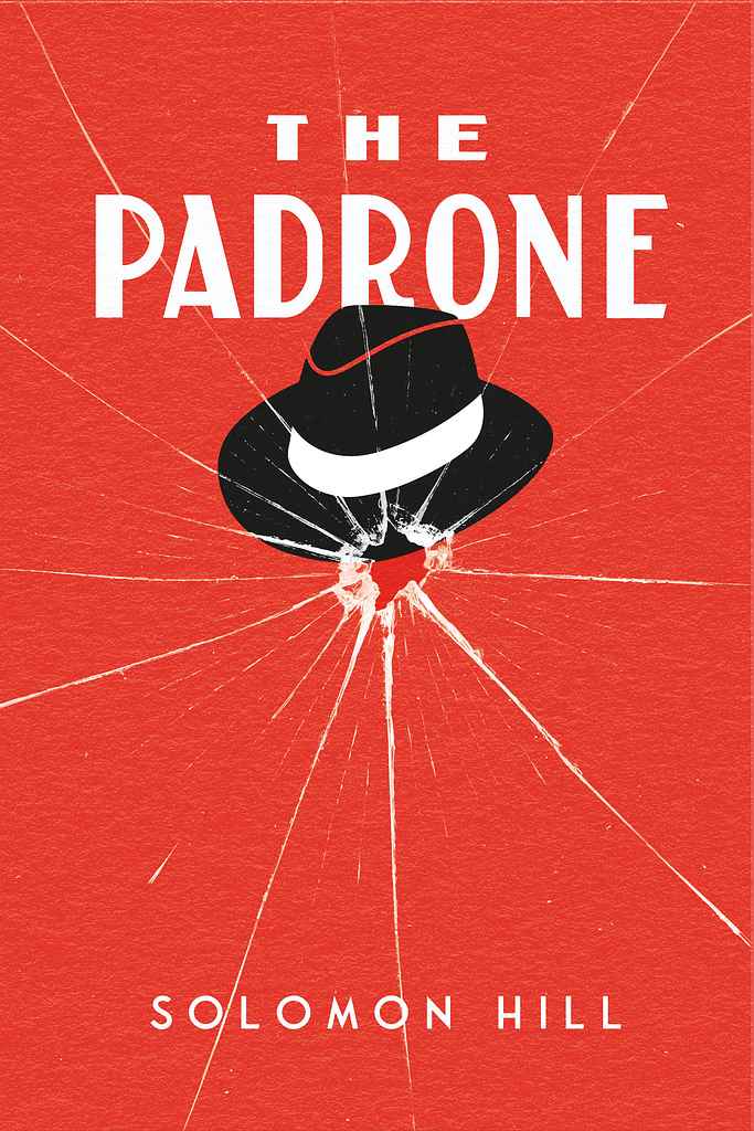
Designer: Arjan V.
Solomon Hill
Designed by Arjan V.
Available to hire"This cover design was created for a 1920s prohibition-era crime novel centred on a mobster. The approach prioritised simplicity while maintaining strong visual impact. The shattered glass effect serves dual purposes—it immediately suggests gunfire and violence, while the radiating crack pattern mirrors the intricate network of criminal connections and influence that emanates from the crime boss at the story's heart."
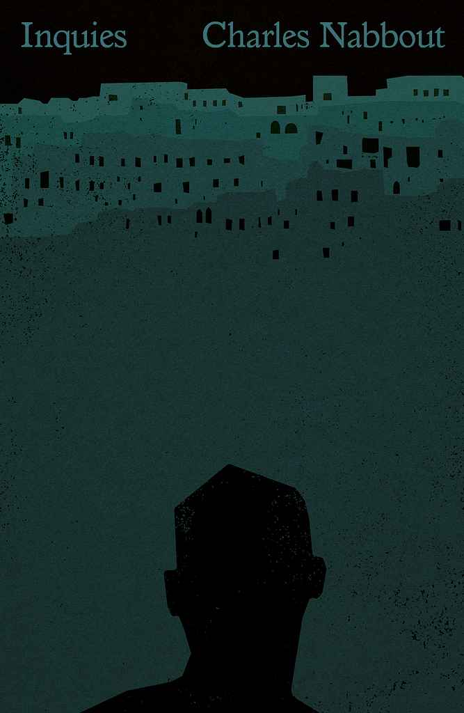
Designer: Steve O.
Designed by Steve O.
Available to hire“The cover uses stark imagery and negative space to mirror psychological tension and isolation, placing a lone figure beneath an oppressive landscape shaped by grief and moral weight. I leaned into a graphic, minimalist approach common in contemporary literary fiction, drawing on the existential visual language of Albert Camus and Franz Kafka. Exaggerated scale, white space, and gritty textures echo the novel’s inner world.”

Designer: Vanessa M.
Designed by Vanessa M.
Available to hire"The cover feels playful, chaotic, and a bit unhinged. The hand drawn type and bold illustration match the A.I.’s ironic, intrusive voice. It signals a strange, funny, and slightly unsettling novel about art, humanity, and meaning."
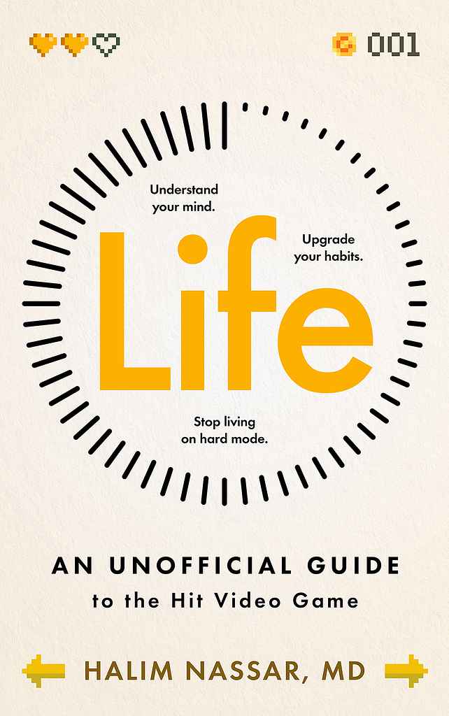
Designer: Vanessa M.
Designed by Vanessa M.
Available to hire"The cover meant to feel like a start screen or status menu, with progress meters, pixel icons, and simple prompts. It frames life as something you play, not something you need to fix. At a glance, the idea is clear, this is a guide to the game of life, using visual language people already recognise from games."
Designer: Ece E.

Designer: Alan H.
Dr. Ken Harmon and Ashley Harmon-Poston
Designed by Alan H.
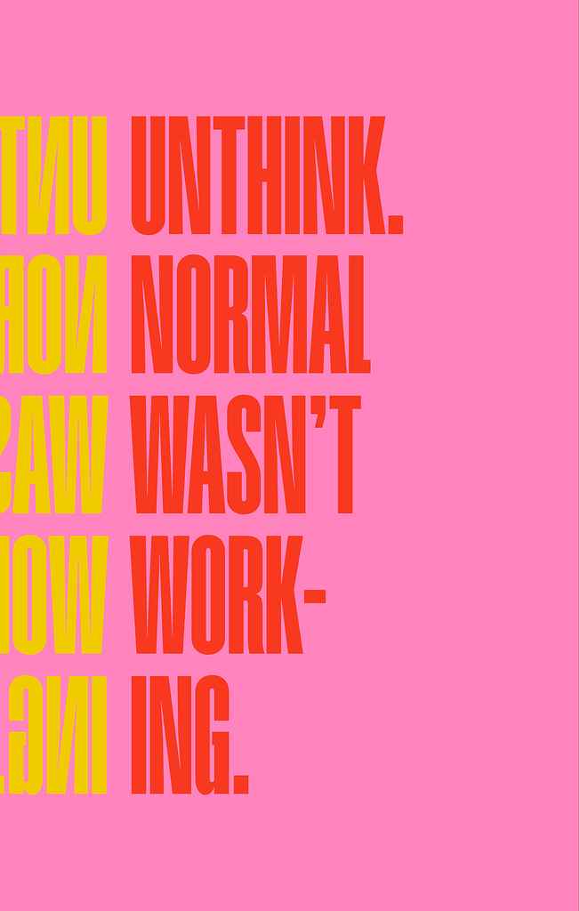
Available to hire"The cover centers on a primitive yet contemporary sun symbol—disarming, playful, and carefree. Its bright palette suggests happiness is accessible through small mindset shifts, available right now. The design feels market-aware rather than showy, pairing uplifting colors and playful illustration with clean, upmarket typography. The intentionally imperfect sun stays human and approachable, while restrained, spacious type lets the image breathe. Simple, confident, and unfussy."
Designer: Victoria H.
Designed by Victoria H.
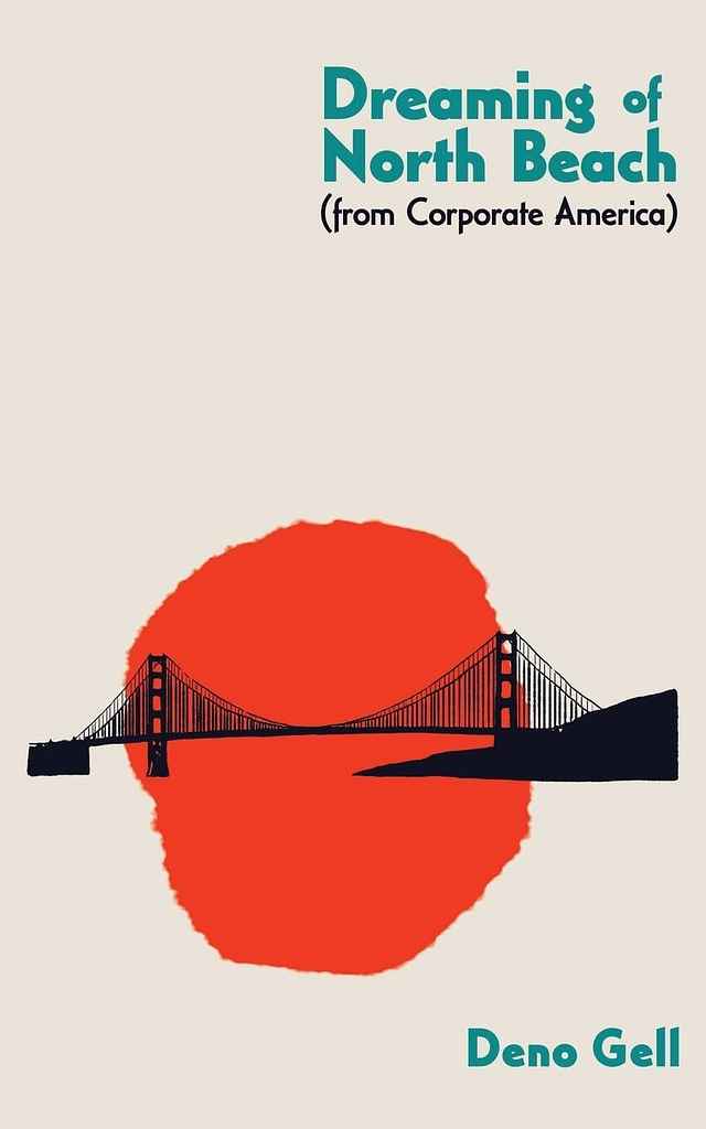
Available to hire"The author wanted a nod to San Francisco, and the idea of using the Golden Gate Bridge emerged early on. But these poems are irreverent and often moving, and so, to reflect those elements, I created an inky sketch of the bridge set against a large abstract “sun” in a bridge-like hue. The result is light, minimal, and deliberately unpolished."

Designer: Nuno M.
Designed by Nuno M.
Available to hire"This cover exudes elegance and sophistication, with a sumi-e–style illustration whose delicate brushstrokes convey movement and fluidity. The contrast between the purple snake and cream background creates visual impact, while the vertical title aligns with the snake’s head for balance. The design evokes softness and vulnerability through subtle, deliberate shapes."

Designer: Vanessa M.
Designed by Vanessa M.
Available to hire"We wanted the cover to feel bold and smart, so I used a deep navy background with clean white text to give it that confident Wall Street look. The golden bull is the classic market symbol, but I added a blindfold to capture the book’s main idea about missing what’s right in front of you. The touch of gold keeps it polished and professional, while the layout stays simple so the message comes through straight away."
Designer: Jason A.
Designed by Jason A.
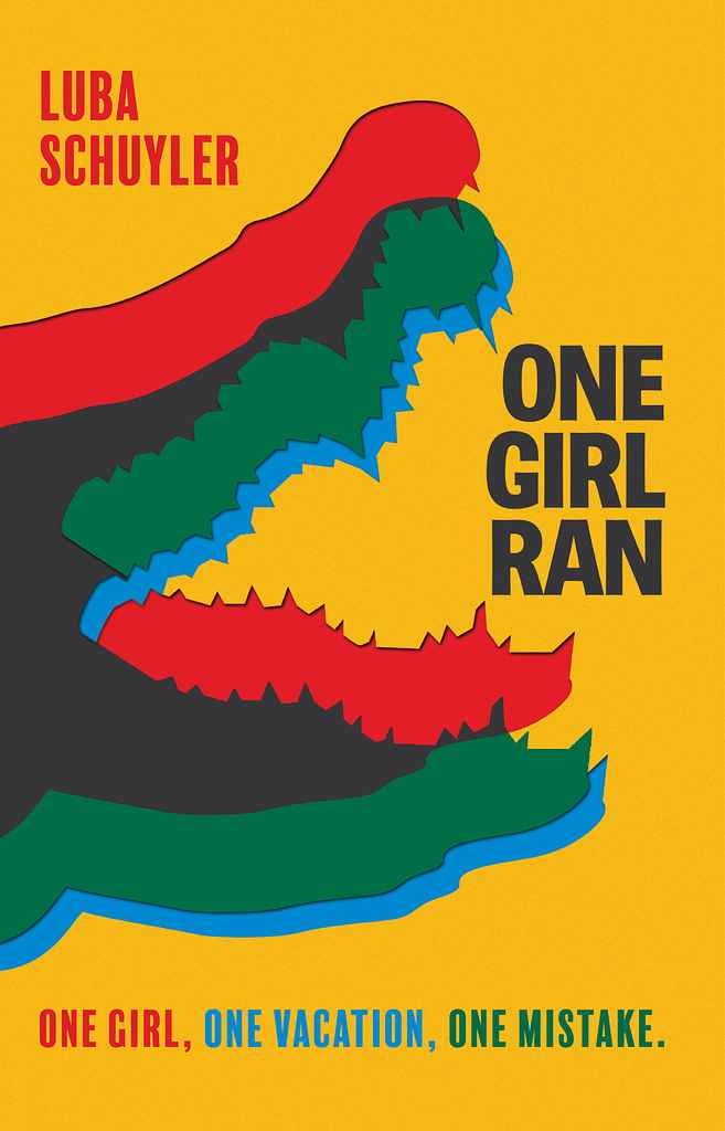
Available to hire“After several explorations — from a photo collage splicing a crocodile with a palm-fringed beach, to rocky shapes forming its face, to a writhing silhouette of crocs — we chose a pared-back design. A simple crocodile silhouette, given a double-printed look, creates an alarming yet timeless retro feel. It extends across the jacket, striking in its simplicity and echoing the protagonist’s peril in the Costa Rican jungle.”
Designer: Vanessa M.
Designed by Vanessa M.
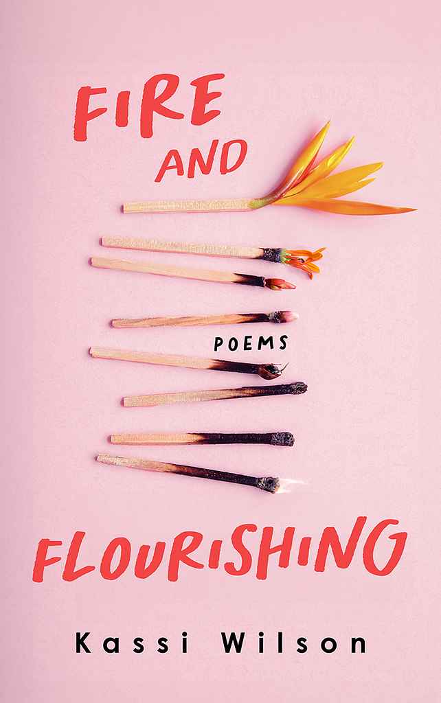
Available to hire"I envisioned the cover as visually striking and meaningful, featuring an artistic arrangement of burned matches that gradually transition into a vibrant flower, symbolising resilience and rebirth. It serves as an invitation for readers to delve into a collection that celebrates the strength and beauty of healing and flourishing, even after life’s most challenging moments."
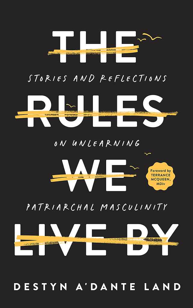
Designer: Vanessa M.
Designed by Vanessa M.
Available to hire"I wanted the cover to be striking and thought-provoking. The bold, crossed-out title symbolises breaking free from societal expectations and embracing personal freedom. Birds taking flight, superimposed on the crossed-out text, reinforce the theme of liberation. The minimalist design—with its stark black background and clean typography—creates a powerful visual that invites readers to explore the book's journey of self-discovery and growth."

Designer: Raúl L.

Designer: Dominic F.
Designed by Dominic F.
Available to hire"I had great fun designing The Day Lemmy Loved Johnny the Most. This cover uses bold typography to highlight the strong prose within the story. Mixing colors and typefaces keeps it modern while retaining a classic literary feel. Stephen wanted a clean, graphic approach, so I experimented with typography to form the story’s tree. In the end, the bold type-only approach won out, with the tree motif featured on the back and spine."
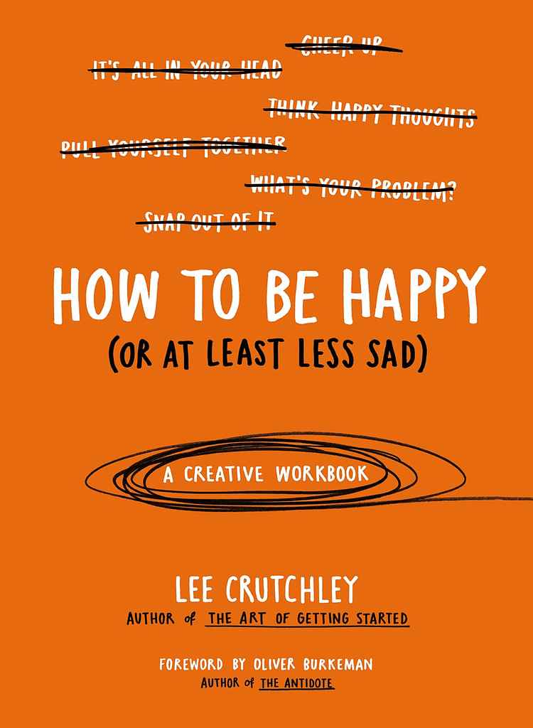
Designer: Lee C.
Designed by Lee C.
Available to hire"The book has a down-to-earth, approachable tone and simple content, so I kept the cover straightforward in layout and color. Hand-drawn lettering adds a human touch, matching its unique approach as a creative workbook on depression and happiness. The two colors, black and white, emphasize that this isn’t just another self-help book, with white text for typical advice and black for added realism and humanity."
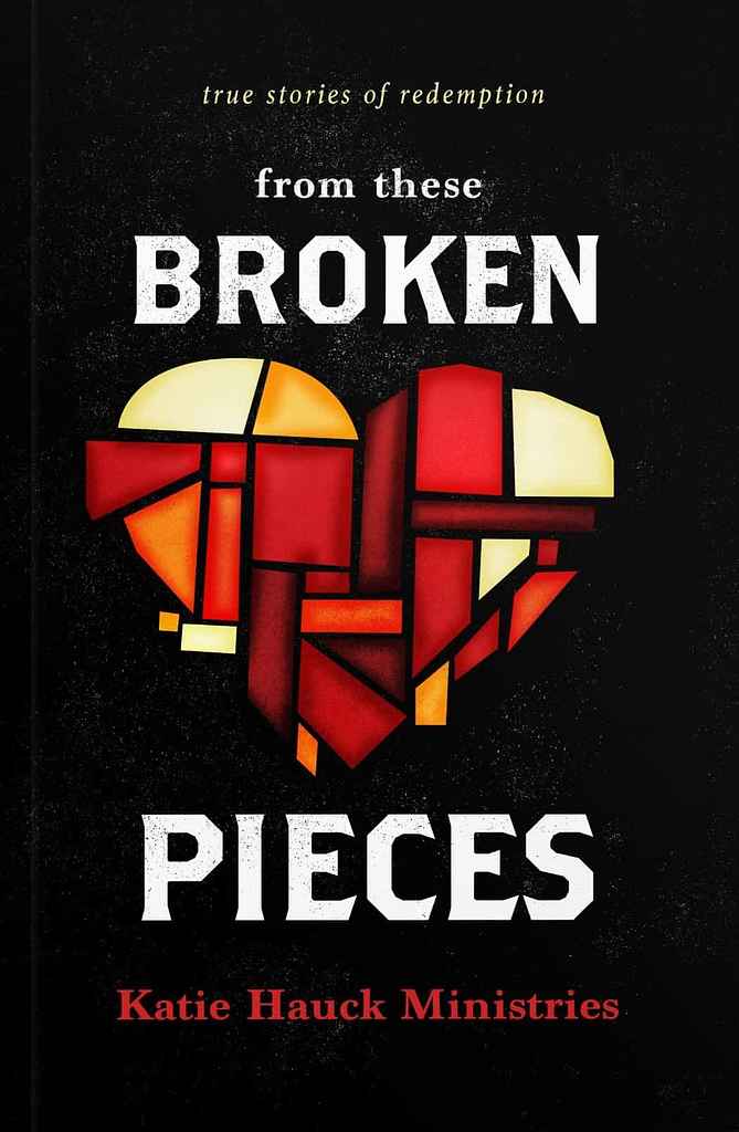
Designer: Christian R.
Designed by Christian R.
Available to hire"Broken Pieces is a collection of stories about healing from trauma through the power of Jesus. The central image of a reassembled stained glass heart conveys this theme. Aimed at those who have been incarcerated or are in rehab, we used a grittier font and bold colors to attract the audience, avoiding the typical Christian self-help look. The bold colors and illustrated elements set the book apart from others in the genre, while still accurately reflecting its message."
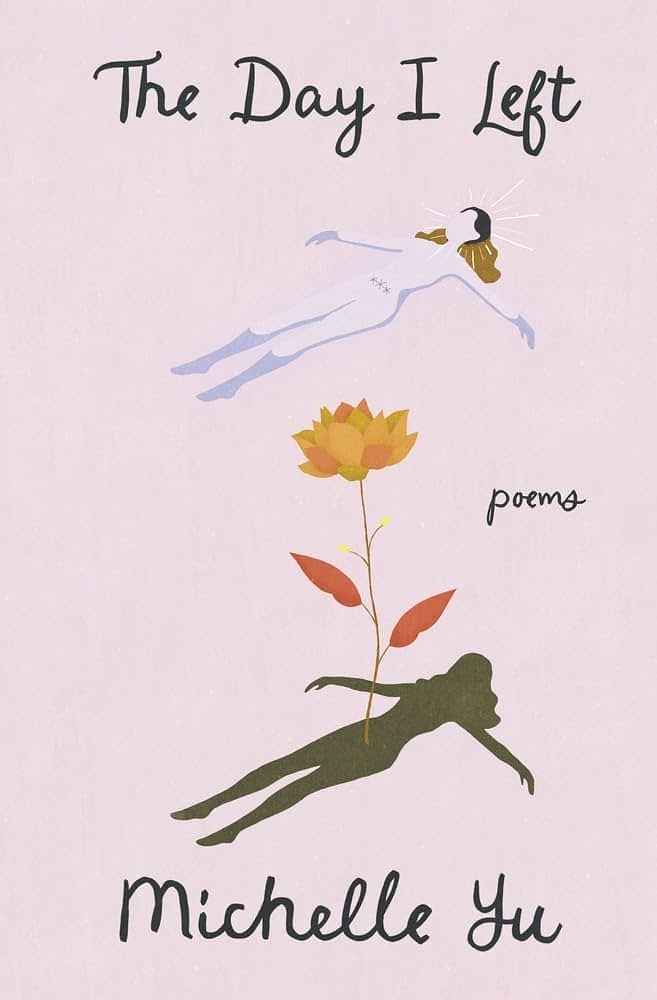
Designer: Barış Ş.
Designed by Barış Ş.
Available to hire"The cover explores themes of transformation and progression with a distinctly feminine and empathetic touch. The aim was to convey these ideas through a sense of calm and serenity, illustrating the process of healing, personal growth and renewal."
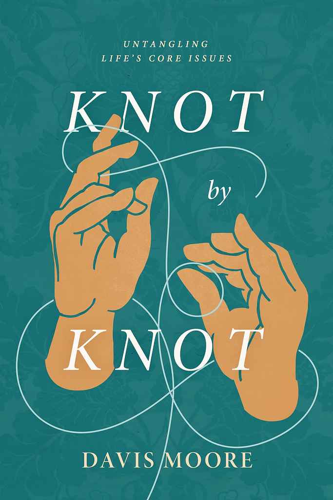
Designer: Christian R.
Designed by Christian R.
Available to hire"The book explores how the good news of Jesus helps readers untangle the knots of sin and addiction. The hand, inspired by ancient Christian iconography, symbolizes God's hand, while the background texture comes from historic art archives. The colors and illustration are on-trend with Christian self-help books, but the ancient elements add uniqueness. I love incorporating Christian symbolism and artwork to connect modern readers to the rich history of the church and the timeless Gospel message."

Designer: Jason A.
Designed by Jason A.
Available to hire"The novel is a mystery about good and evil, focusing on symmetry. A mysterious woman and two six-spotted moths are significant to the plot, so they had to be on the cover. To portray these themes I went with a high contrast color scheme in a vector art style, to give it a modern feel. The woman's obscured face and cutaway title effect are meant to convey there's much more going on under the surface in this story."
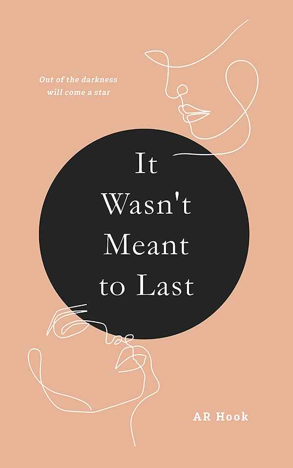
Designer: Vanessa M.
Designed by Vanessa M.
Available to hire"I wanted the cover to reflect the emotional depth and raw honesty of the poems. The minimalist design, with its contrasting colours and simple lines, creates a sense of quiet intensity. It’s like a visual metaphor for the rollercoaster of emotions that readers will experience as they delve into the collection."

Designer: Jason A.
Designed by Jason A.
Available to hire"The priority was to create a consistent series look across all three books, focusing on the protagonist's arm transformation as the story progresses. S.J. prefers minimalist compositions and wanted to pay homage to the Southern Reach series, which was a big influence. We used a gridded title treatment and a textured background interacting with the protagonist's hand, tied to the book's events. These core elements will be carried through the entire series."

Designer: Latte G.
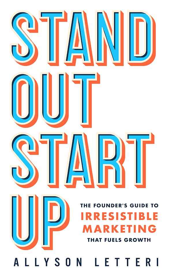
Designer: Vanessa M.
Designed by Vanessa M.
Available to hire"I envisioned the cover as a bold and attention-grabbing design that would reflect the book's practical and actionable approach. The bold 3D typography, with its contrasting bright colours, creates a sense of energy and momentum, inviting readers to discover the secrets to building a successful start-up."

Designer: Vanessa M.
Designed by Vanessa M.
Available to hire"The cover is a minimalist yet powerful design that reflects the book's themes of hidden pain and resilience. The image of two hands holding a delicate flower, partially obscured by darkness, symbolises the hidden secrets and emotions that the protagonist struggles to confront. The contrasting colours and stark typography create a sense of tension and mystery, inviting readers to delve deeper into the story."
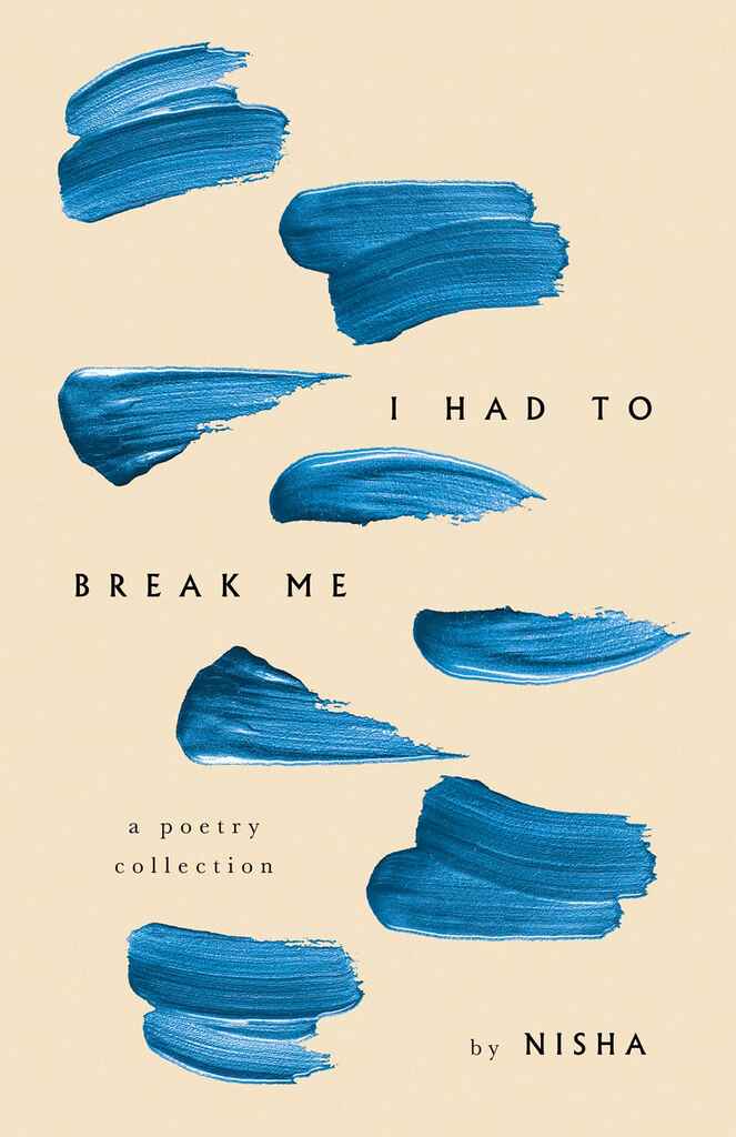
Designer: Nuno M.
Designed by Nuno M.
Available to hire"Nisha’s poems are reflective and expansive, exploring a range of themes. To capture this, the cover design centers around the idea of an unfinished brushstroke, symbolizing openness and exploration. Multiple brushstrokes interact with the book's title, integrating organically with the text layout. The phrase “Break Me” in the title serves as the conceptual anchor, creating a bold and visually striking design that is both raw and arresting."

Designer: Vanessa M.
Designed by Vanessa M.
Available to hire"I wanted the cover to be a visual representation of the book’s core message: that with the right tools and mindset, anyone can achieve financial success in the trades. The golden wrench symbolises the practical, hands-on approach, while the clean, professional design reflects the book’s focus on building a sustainable business."
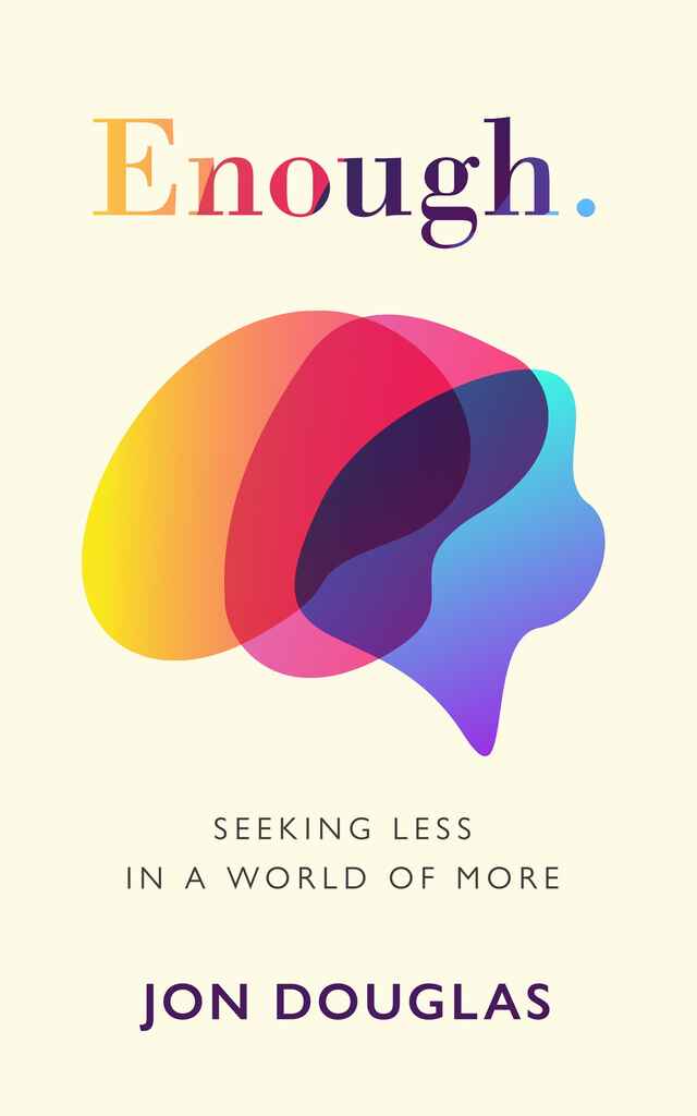
Designer: Euan M.
Designed by Euan M.
Available to hire"The brief for ‘Enough.’ called for a “clean, crisp, and straight to the point” cover. This was understandable, since these are features of many of the best tech-related covers, and so the challenge at the core of this project was to balance the tech aesthetic with elements that reflected the thoughtful psychology that runs through the book. This was accomplished primarily through the use of a warmer colour palette, which was also applied to create a unique wordmark for the title."

Designer: Jonas P.
Designed by Jonas P.
Available to hire"The book discusses how fossil fuels, despite being maligned today, can aid in transitioning to a cleaner world. The goal was to create a clean, simple image with a strong graphic element. A blooming flower from an oil well was chosen to represent this idea, integrated with the title to highlight the climate crisis. A color gradient was used across the author's name, title, illustration, and subtitle, symbolizing the planet's temperature change while tying together the flower and oil well."
Over 1,000 professional book cover designers are available on Reedsy, come meet them. Learn more about Reedsy
Enter your email or get started with a social account: