Menu
There are currently 1,000+ designers available on Reedsy, come meet them.
Find the perfect designer for your next book
1 million authors trust the professionals on Reedsy. Come meet them.
There are currently 1,000+ designers available on Reedsy, come meet them.
Find the perfect designer for your next book
1 million authors trust the professionals on Reedsy. Come meet them.
Looking for design inspiration for your literary fiction novel? Check out this collection of thought-provoking, elegant covers designed by professionals on Reedsy. See one you love? Get your own exquisite cover from that designer on our marketplace.
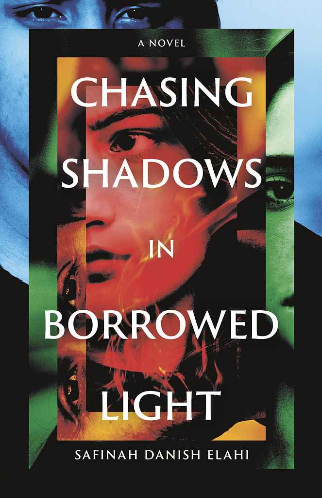
Designer: Rachel K.
Designed by Rachel K.
Available to hire"The novel centers on the interwoven connection of four friends. A four-part color system gives each a distinct visual voice, while the framing reflects how their stories nest within one another. The specific order and color temperature (radiating from warm to cool) mirrors their varying degrees of intimacy, with Areen at the core. Each face is partially obscured, hinting at their shared secret. This subtlety suits the literary tone, while the photographic treatment appeals to adult readers."

Designer: Eva P.
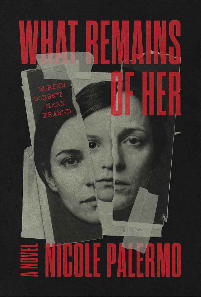
Designer:
"This cover was designed to feel fragmented, uneasy, and emotionally unresolved, mirroring the novel’s themes of buried trauma and fractured identity. The torn photographic composition creates a sense of memory pieced back together, while the stark red typography adds urgency and tension. The minimalist palette keeps the focus on emotion, allowing the imagery to feel unsettling."
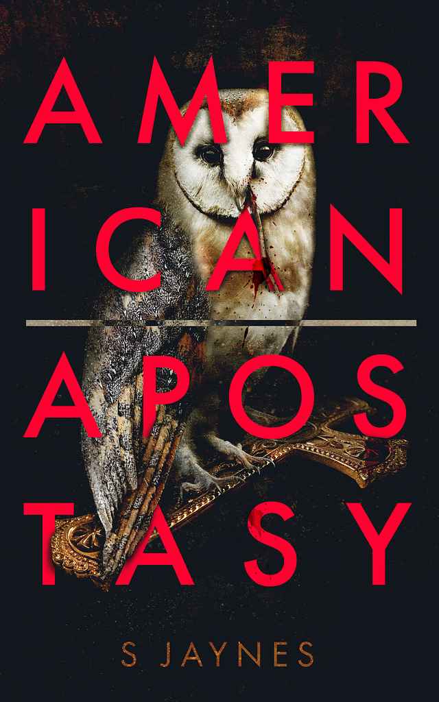
Designer: Samantha S.
Designed by Samantha S.
Available to hire"I read each book I dress the cover of. Each element is take from the story and blended together with typography. Here I took inspiration from Barbara Kruger, the reference and ethics resonated with the themes in the book."

Designer: Milica S.
Designed by Milica S.
Available to hire"The cover for Mist visually bridges the novel’s psychological tension and its underlying sci-fi elements. The glitchy, ethereal portrait embodies the title's 'mist' while hinting at the AI forces hidden within the narrative. I wanted to represent the generations of Black women at the story's core using digital textures that reflect the dual timelines and fractured realities. The modern, spacious typography adds an enigmatic touch to the thriller."
Designer: Peter S.
Designed by Peter S.
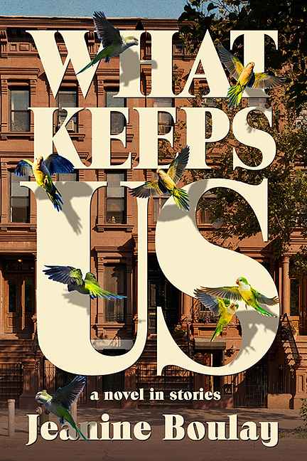
Available to hire"Since the main linking element in Jeanine Boulay’s novel-in-stories is its historic Brooklyn setting, I emphasized that in my design by way of an emblematic row of Brooklyn brownstones peeking out from behind the book’s title, which fills the design, such that the enormous “US” allays any doubt as to what country Brooklyn is in. Meanwhile another famous Brooklyn feature, it’s wild parrots (parakeets, actually), fly over the letters, casting ominous shadows on them."

Designer: Vanessa M.
Designed by Vanessa M.
Available to hire"The intention was to make it feel warm and human. We wanted a sense of care, connection, and quiet support, something that reflects healing and growth without being heavy. The open setting feels hopeful, and the figures together suggest guidance and trust. The soft light and gentle typography were chosen to keep it approachable and emotionally comforting."

Designer: Heather V.
Designer: Nuno M.
Designed by Nuno M.
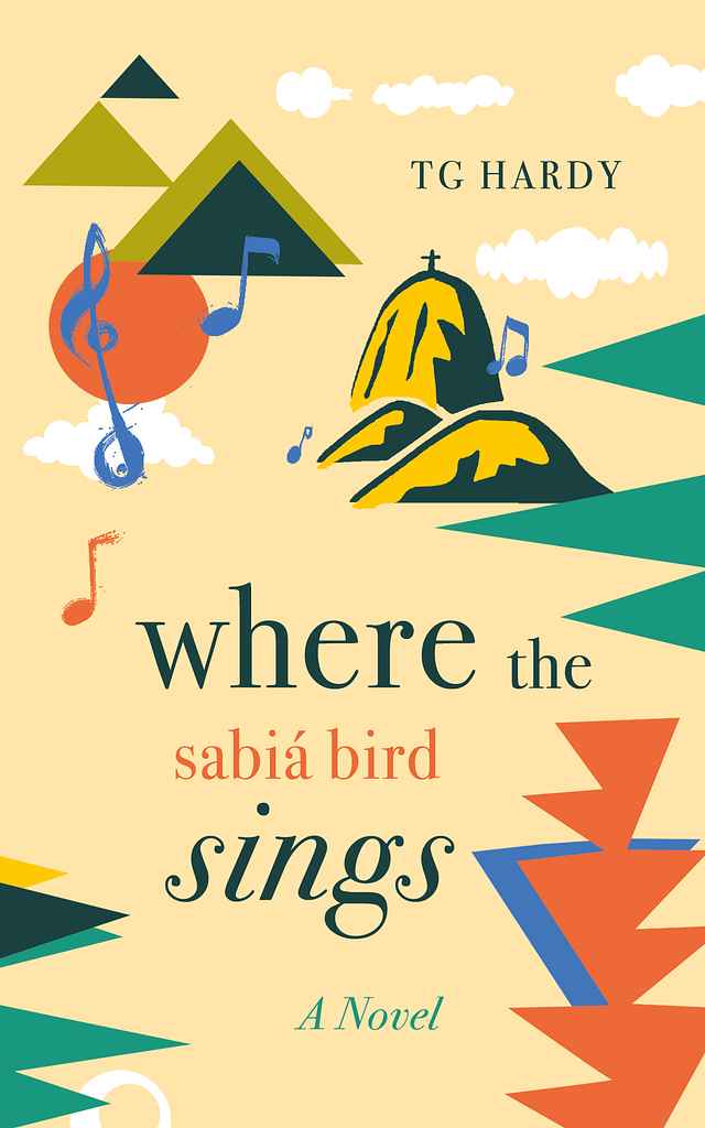
Available to hire“The cover for this coming-of-age novel set in Rio de Janeiro uses a stylized, modernist language to evoke memory, music, and place rather than literal storytelling. Geometric shapes suggest the city’s mountains and coastline, while floating notes and a warm sun introduce rhythm, alluding to the ‘sabiá’ of the title. A restrained palette — sand, deep green, coral, blue — echoes tropical light, and the typography balances playfulness with a literary tone and nostalgia.”

Designer: Zuza M.
Designer: Owen G.
Designed by Owen G.
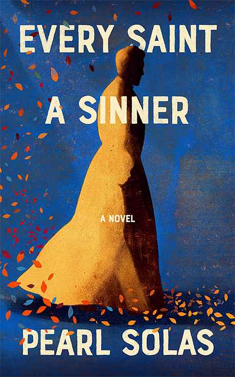
Available to hire"Pearl Solas's unflinching novel about a sensitive subject needed a delicate design approach. I used a hidden image of a child within the flowing robes of a priest to show the seen and the unseen, and hint at what the book explores. It was important to reflect that the book wasn't written to shock but to explore human nature. The colour palette, hand-traced font choices and flowing leaves from the narrative help balance the themes with the tone of the book."

Designer: Alex D.
Designed by Alex D.
Available to hire"Portraying the protagonists within their phone screens immediately communicates key themes of the novel: internet culture and its impact on identity, intimacy, and modern relationships. The subtle emotion and subtext in each character’s face also tell their own quiet stories and draw the reader in. The cover’s uniqueness comes from its illustration style and aesthetic, with an unusual colour scheme that suits the blend of dark themes, dark humour, and intimacy."

Designer: Barış Ş.
Designer: Steve O.
Designed by Steve O.
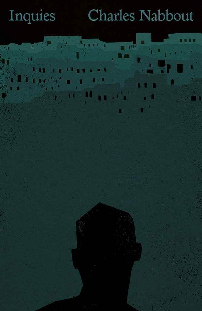
Available to hire“The cover uses stark imagery and negative space to mirror psychological tension and isolation, placing a lone figure beneath an oppressive landscape shaped by grief and moral weight. I leaned into a graphic, minimalist approach common in contemporary literary fiction, drawing on the existential visual language of Albert Camus and Franz Kafka. Exaggerated scale, white space, and gritty textures echo the novel’s inner world.”

Designer: Vanessa M.
Designed by Vanessa M.
Available to hire"The cover feels playful, chaotic, and a bit unhinged. The hand drawn type and bold illustration match the A.I.’s ironic, intrusive voice. It signals a strange, funny, and slightly unsettling novel about art, humanity, and meaning."
Designer: Peter S.
Designed by Peter S.
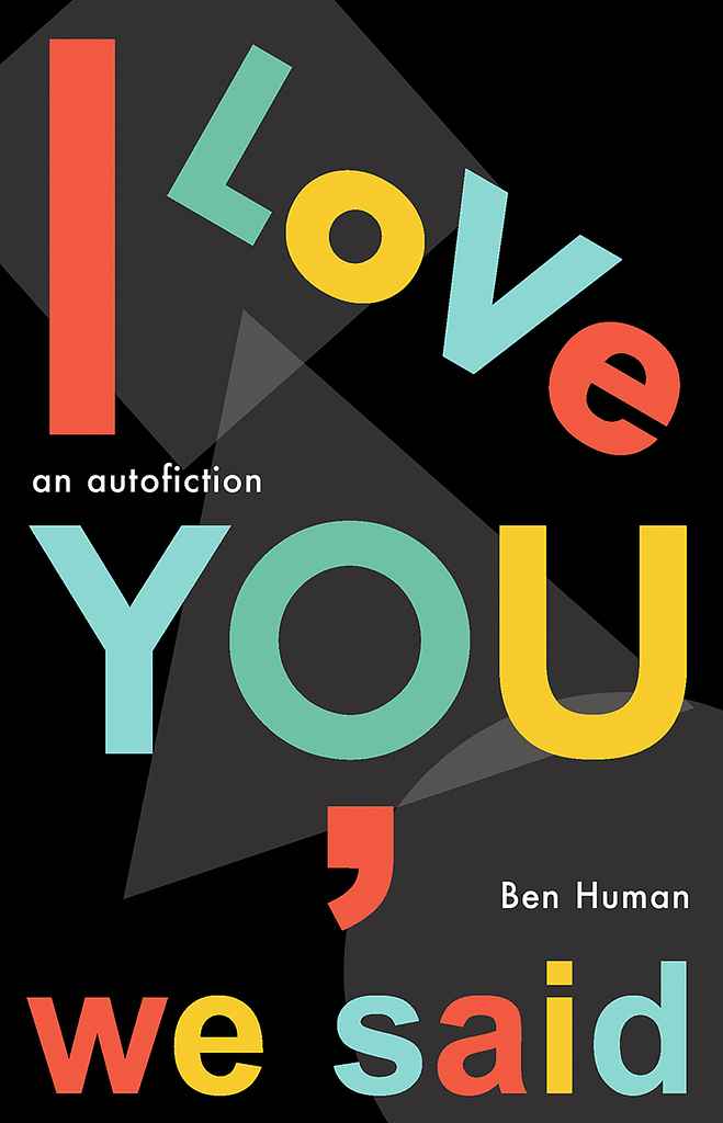
Available to hire"For Ben Human’s autobiographical novel about an American writer newly expatriated to London, I aimed to evoke the city’s atmosphere and the book’s avant-garde spirit. Inspired by the iconic Tube map, I ultimately kept only its P22 Johnston Underground font, overlaying bright colors on a dark, shadowy background — a nod to the tension beneath Swinging London’s surface."
Designer: Xavier C.
Designer: Barış Ş.
Designer: Owen G.
Designed by Owen G.
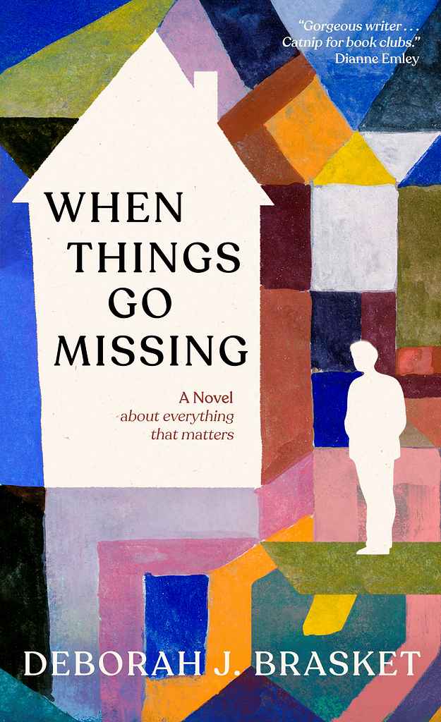
Available to hire"This was a really interesting collaboration as the author Deborah Brasket decided to use an existing, public domain painting by Paul Klee as the basis for the cover. By tweaking the artwork, adding small narrative elements and finding complimentary fonts and design, we managed to create a perfect cover for the novel whilst maintaining the feel and sprit of Klee's original painting."
Designer: Roderick B.
Designed by Roderick B.
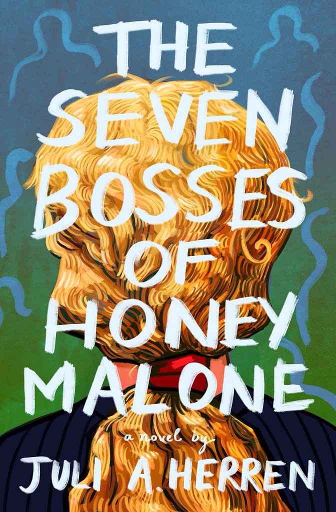
Available to hire"The artwork and title aim to capture the story’s youthful essence, portraying the protagonist with both strength and vulnerability as she faces seven abstract, swirling 'boss' figures. Bright, bold colors reflect youthful energy, while strong titling enhances this vibe. Blending comedy and drama, the design effectively represents both genres without conforming to the dainty, ultra-smooth style often seen in similar books."

Designer: Richard L.
Designed by Richard L.
Available to hire"For this darkly comic novel of a disturbed young man’s unorthodox search for his soulmate I ended up with a collage approach centered around a young woman’s face. This suited not only the love story angle, but also the edgy writing style and all the mayhem that ensues—ultimately culminating during the Rodney King riots. California is an important aspect—almost as if a character in the story—and is featured prominently in the collage through various visuals. The typography is hand-lettered."

Designer: Ryan M.
Designed by Ryan M.
Available to hire"The classical framed art reflects the book's timeless exploration of love and relationships, inspired by the Aristophanes Myth on the Origin of Love. To blend originality with current trends, I added rich, moody foliage in the background, focusing on the classical portraits. The right frame, featuring a female figure within a crescent moon, captures the ethereal themes, while the left portrait represents the main character. This unconventional romance cover suits a story that defies the genre."

Designer: Richard L.
by Xinhua Lu (Author), Capella Cao (Translator)
Designed by Richard L.
Available to hire"The book opens with a haunting scene in a secluded Cambodian jungle temple in the early 1970s. Tutu, a young woman, finds her fiancé, a Khmer Rouge officer, crushed beneath a Buddha statue, setting Wu Lou, the temple’s master monk, on a path of exile. The cover reflects this era and setting, with a "never-ending redness" of trees, leaves, and petals evoking beauty and bloodshed. Tutu is featured prominently but tightly cropped, with a subtle Cambodian landscape and temple in the foreground."
Designer: Richard L.
Designed by Richard L.
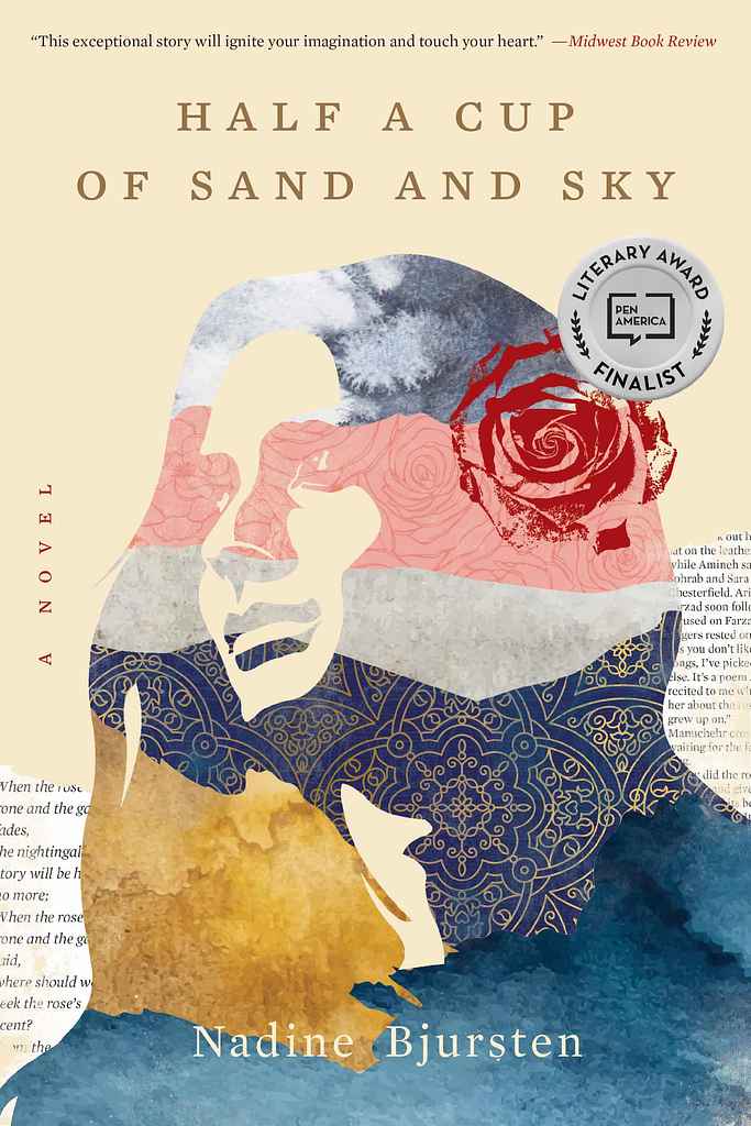
Available to hire"Finalist for the PEN/Bellwether Prize, the book portrays one woman's search for love and belonging amid political turmoil. Bjursten immerses readers in a life, nation, and era with lasting impact. For this layered story, I aimed to depict the protagonist as a strong, visionary woman without resorting to visual clichés or a literal photo. The solution was a silhouetted collage incorporating fragments of the title and story... sand, sky, sea, rose gardens, Persian heritage, and literature."

Designer: Richard L.
Designed by Richard L.
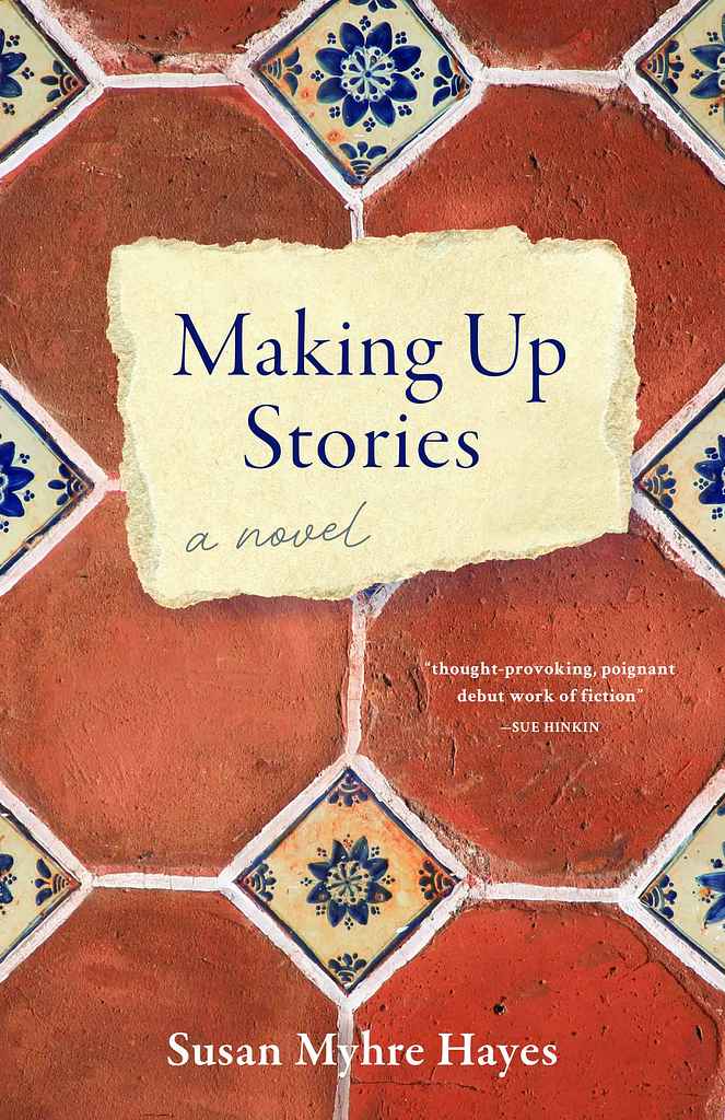
Available to hire"This novel draws inspiration from the heroic true stories of the Women’s Timber Corps, a branch of the Women’s Land Army in the UK during WWII. Image research was challenging, but finding a great reenactment photo with playful, optimistic women’s gaits felt perfect. It captures camaraderie and warmth, true to the book’s spirit, while contrasting with the harder visual of crossed axes. The Union Jack takes center stage, adding a pop of color and almost becoming a character itself."
Designer: Sarah L.

Designer: Alexander N.
Designed by Alexander N.
Available to hire"The cover features a fictional but typical Minneapolis dive bar, grounding the story in a distinct aesthetic while hinting at key plot elements. The 'Art Deco' style, common to Minneapolis bars, influenced both the cover design and the font. It worked well for a modern minimalist design: it's readabile at small scales while remaining interesting up close. Details like the main character, a lurking figure, broken glass, and a cat stalking a pigeon on the roof add suspenseful hints to the story."
Designer: Margarita C.
Designed by Margarita C.
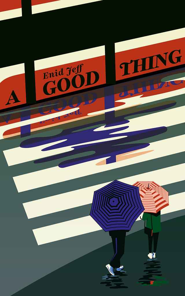
Available to hire"In the plot, the moment when the characters meet is important—it's the trigger for the story, and it happens while they are waiting for the tram. I believe the key is to introduce the tram almost as a third character. Overlaying the title on its side adds dynamism and metaphorically reinforces the idea of how fleeting that moment of meeting is. Either you act, or it never happens, and the opportunity vanishes just as the tram does."
Designer: Laura D.
Designed by Laura D.
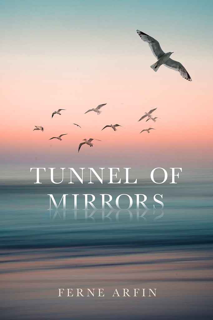
Available to hire"It was important that this beautiful novel have a beautiful, romantic cover without being trite. The story takes place in the 1900s and is about a young woman coming to New York from Ireland. The ocean is a big part of the story in various ways. The gull flying away from the other birds was inspired by the main character, a very independent, unique young woman. I wanted to add some interest by having the title look like it's sinking into the sea and being reflected like a mirror."
Designer: Owen G.
Designed by Owen G.
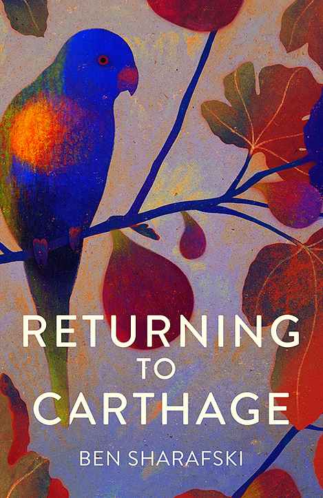
Available to hire"For this short story collection, I aimed to evoke a sense of place and atmosphere without focusing on a specific narrative. The fig tree and Lorikeet, featured in multiple stories, serve as a tonal and geographical anchor. While botanical and avian illustrations are popular, I chose a less patterned approach with a mix of delicate and saturated colors. Starting with a subdued palette, I added rich, vibrant hues to bring the cover to life and reflect the warmth of the stories."
Designer: Nuno M.
Designed by Nuno M.
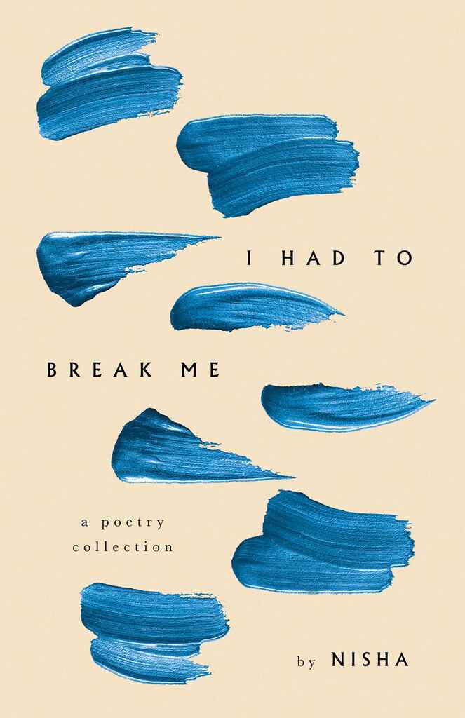
Available to hire"Nisha’s poems are reflective and expansive, exploring a range of themes. To capture this, the cover design centers around the idea of an unfinished brushstroke, symbolizing openness and exploration. Multiple brushstrokes interact with the book's title, integrating organically with the text layout. The phrase “Break Me” in the title serves as the conceptual anchor, creating a bold and visually striking design that is both raw and arresting."

Designer: Danna Mathias S.
Designed by Danna Mathias S.
Available to hire"The book is about a woman navigating adulthood. We used florals to symbolize her 'blooming beautifully' into it, with the crack representing the challenge of 'keeping it together.' The heavier serif title font, common in fiction, is balanced by the unique cover image and florals winding through the text. The contrast between the woman's cracked face and the beauty of the florals adds a unique, fun element. I also used texture in the title for cohesion and chose an unexpected title color."
Designer: Vanessa M.
Designed by Vanessa M.
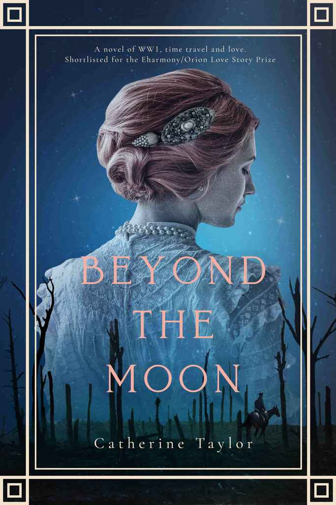
Available to hire"The cover features a stunning image that captures the book's themes of time travel and love. The beautiful portrait of the woman set against a war-torn landscape adds a layer of mystery. The overlapping elements and contrasting colours symbolise the connection between the past and present, inviting readers to dive into this captivating story."
Designer: Richard L.
Designed by Richard L.
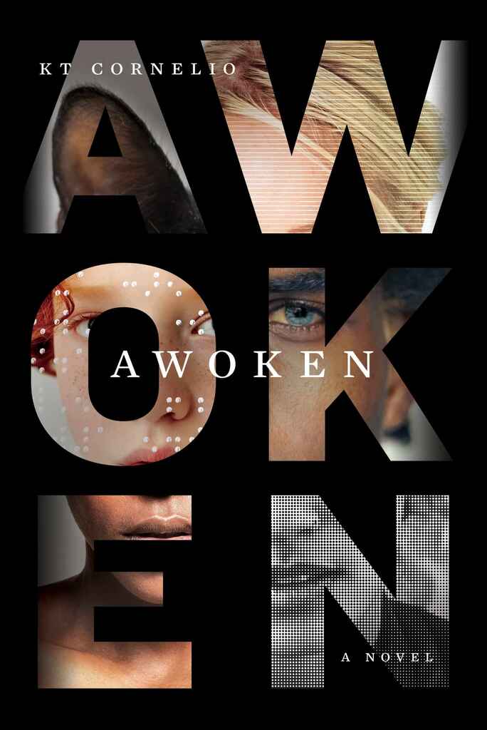
Available to hire"Awoken immerses readers in the lives of highly sensitive characters, diverse in age, race, gender, ability, sexuality, and even species. The novel follows parallel timelines, and the visual solution was to use the title letters as canvases, displaying fragments of these scenes while forming one unified character when viewed as a whole. Straddling the line between sci-fi and literary fiction, the design reflects this duality, capturing the novel's complexity and depth."

Designer: Rafael A.

Designer: Devin W.
Craig A. Czuchna
Designed by Devin W.
Available to hire"The author of this sci-fi-meets-dark-academia book wanted to see the story's two main characters on the cover, but divided by spans of time and space. I used double exposure photography mixed with glitchy visual elements to create a surreal movie poster style cover, and really let the book title placement create separation in the design."
Designer: Caitlin B. A.
Designed by Caitlin B. A.
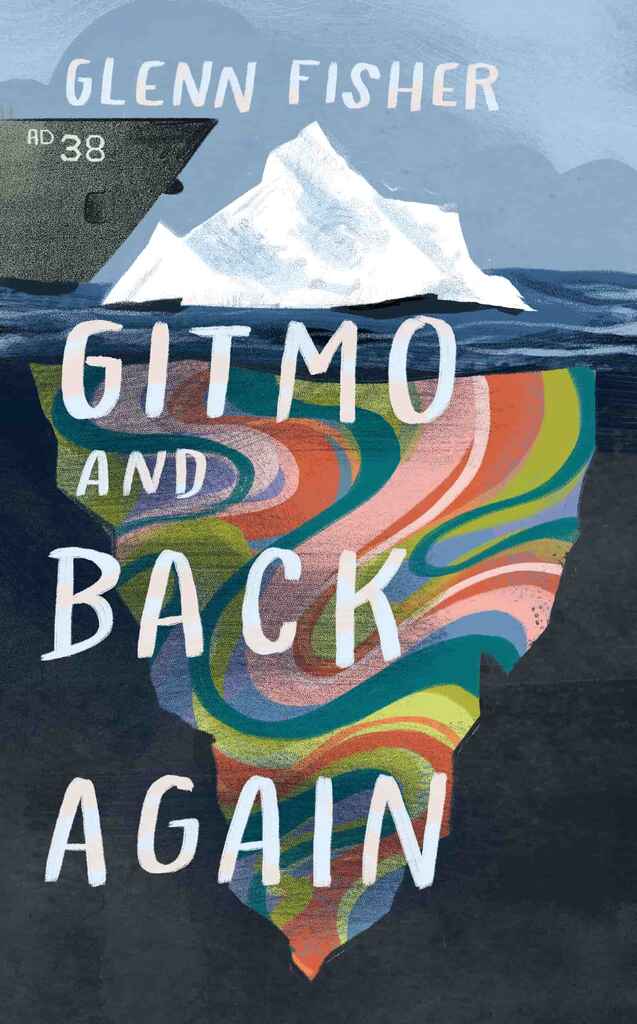
Available to hire"The author initially envisioned a ship crashing into a sailboat or icebergs adorned with peace signs, reflecting the story of a young man in the 1970s eager to escape his small town and join the revolutionary events shaping his country. To bring the 1970s counter-culture concept to life without falling into clichés, I opted for a collage-style design. Instead of the overused peace signs, I "cut" the icebergs from a psychedelic print, balancing clear messaging with a fresh, original aesthetic."
Designer: David P.
Designed by David P.
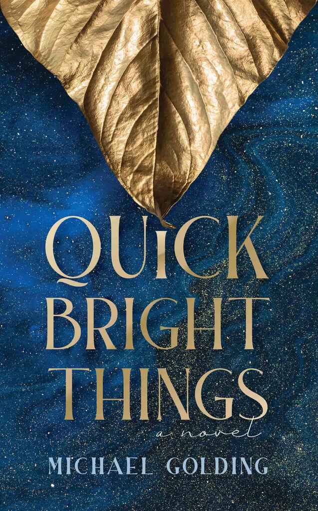
Available to hire"Set in New York City in 1948, this novel follows a production of “A Midsummer Night’s Dream”. The cover is intended to evoke the glamour and magic of the theater. The gilded leaf suggests the forest, as the background conveys the enchantment of Shakespeare’s AND Golding’s stories."
Over 1,000 professional book cover designers are available on Reedsy, come meet them. Learn more about Reedsy


Enter your email or get started with a social account: