Posted on Dec 31, 2025
The 20 Best Book Covers of 2025
Nick Bailey
Nick is a writer for Reedsy who covers all things related to writing and self-publishing. An avid fan of great storytelling, he specializes in story structure, genre tropes, and character work, and particularly enjoys sharing insights that spark creativity in fellow writers.
View profile →Happy new year, Reedsy readers! To celebrate the end of 2025, we've curated 20 of the year's most striking book covers — a pair of picks each from 10 different genres. These selections appear in no particular order, organized simply by genre.
Every last one of these covers was crafted right here on Reedsy. If you’d like to hire one of our talented designers yourself, you’ll find links to their profiles in the image captions throughout the post.
Fantasy
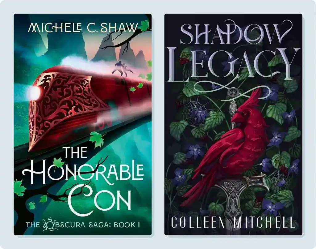
Ready to go full steam ahead? The cover for The Honorable Con, featuring an ornate ruby-red train, is the opening entry on our list. Contrasting with the red, this luminous green background gives the cover an appropriately otherworldly-feel. Simultaneously, the high-speed train cutting through an otherwise ethereal landscape captures the momentum of this lighting-fast fantasy series.
Our second fantasy pick also features a deep red focal point, but this time it’s a burgundy bird that takes center stage. Our cardinal, well, cardinal may seem ordinary at first glance. But observant readers may notice something strange: the single, blood-red eye gazing directly at the viewer.
Designer K.D. added this detail to hint at the dark fantasy tale within, which features a forbidden human-vampire romance. The eerie red eye signifies the cardinal’s vampiric traits, while the sword, spider webs, and dark background add to the overall foreboding tone.
🧙 Discover more first-rate fantasy book covers in our gallery
Romance
We’ve covered the first half of the romantasy phenomenon, so it’s only appropriate for us to follow up with the second: romance.
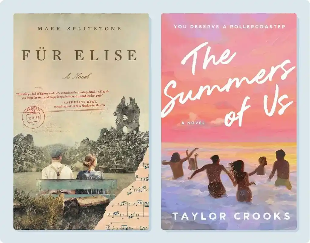
First, we have Mark Splitstone’s Für Elise. Classical music-loving readers may recognize the title from Beethoven — which designer Richard L. alludes to via the torn sheet music in the bottom right. The rest of Für Elise’s vintage cover screams (or sings?) “historical romance”: our leads in their 20th century clothing, the dilapidated building in the background, and the faded colors reminiscent of an old photograph. Formatting the blurb like an old-school letter is an especially thoughtful touch.
We’ll fast forward to the twenty-first century for our second pick: The Summers of Us. Its designer, Rachel S. doesn’t just create covers that sell — she aims to invoke the feeling of the story. With The Summers of Us, this feeling is one of sweet nostalgia. Rachel uses the coral, pink, and lavender hues of a setting sun to create a dreamlike aesthetic and evoke an intense longing for sun-kissed days.
Science Fiction
Up next, two sensational science fiction covers — each embodying sci-fi in wildly different (though still genre-indicative) ways.
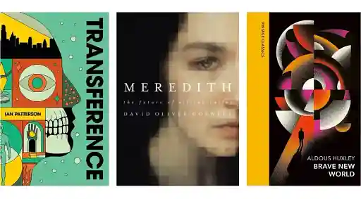
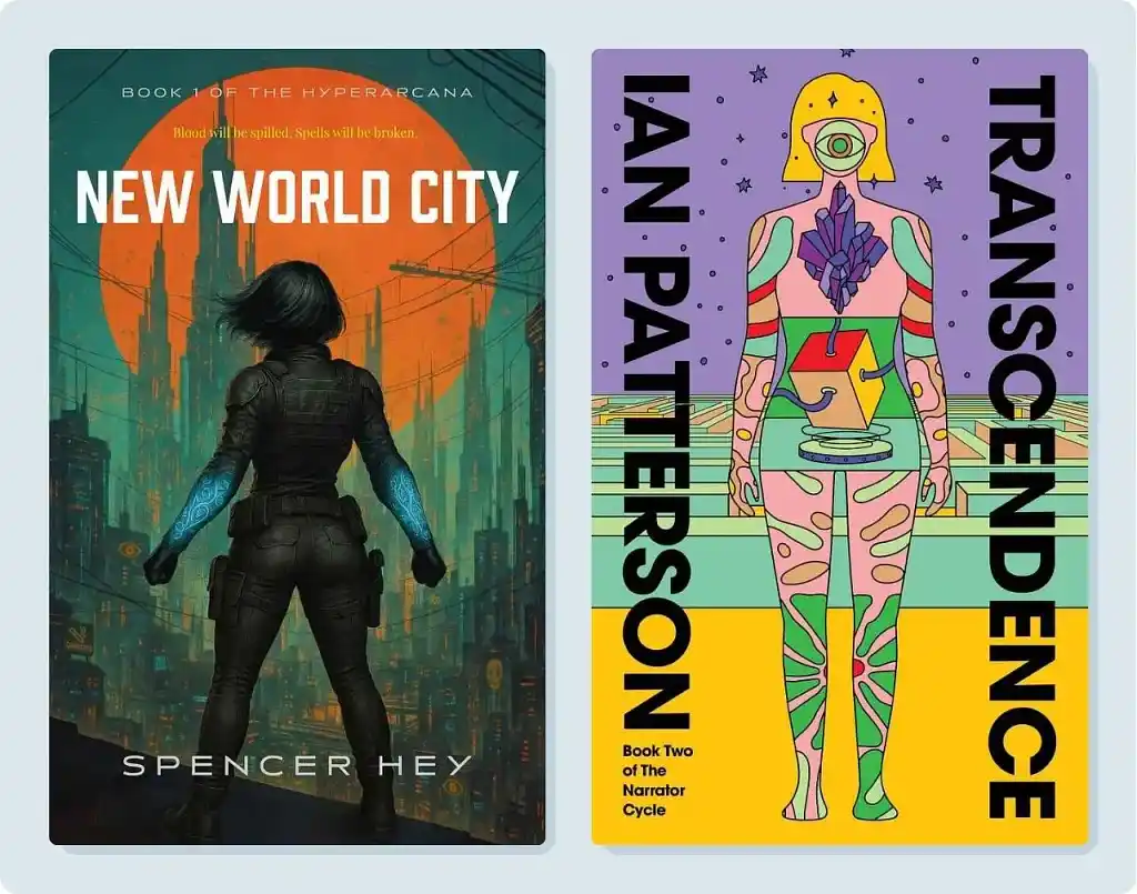
For Spencer Hey’s New World City, designer Ryan M. takes traditional sci-fi tropes and executes them immaculately. The silhouetted heroine acts as the cover’s centerpiece, her action-ready stance and glowing arcane armor adding intrigue. The neon megacity in the background signals gritty urbanity and tech action, while the crisscrossing power lines add visual texture and reinforce the setting.
The cover of Ian Patterson’s Transcendence, meanwhile, takes a more psychedelic approach; according to designer Barış Ş., the cover is inspired by Patterson’s vision of a “symbolic guided path” through the cosmos. The single watchful eye also nods to the series’ theme of surveillance, while the scattered geometric elements contribute to the cover’s eerie sense of surrealism. Lastly, the color palette here is reminiscent of 20th century artists like Mœbius — building on both historical sci-fi precedent and Barış’s own visual language from the previous installment in this series, Transference.
Mystery
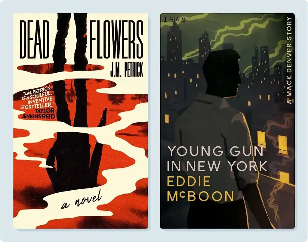
Mystery covers often make use of moody color palettes and cryptic yet eye-catching imagery. Case in point: the cover of Dead Flowers, designed by Nejc P.
Nejc drew on classic pulp covers for inspiration, looking to blend their raw, expressive energy with a modern minimalist design and “a dash of Hollywood flair.” This cover is undoubtedly cinematic, from the shadowy, gun-slinging silhouette — a dramatic centerpiece — to the pools of blood (or are they blood?). Nejc also obscures the figure’s head using negative space, subtly planting questions in the viewer’s mind about his identity.
Designer Roderick B. is no stranger to a silhouette either. But unlike our previous sinister figure, the focal point of Eddie McBoon’s Young Gun in New York is a bit more visible. His rolled-up shirtsleeves have quintessential mid-century detective appeal — as does the cigarette hidden just off-page. And in case the setting wasn’t clear from the title, the unmistakable outline of the Empire State Building places this story firmly in New York… and the rest of the city’s skyline consolidates the classic noir atmosphere.
Literary Fiction
Literary fiction may not technically be a standalone genre, but that won’t stop us from including our two favourite lit fic covers on this list!
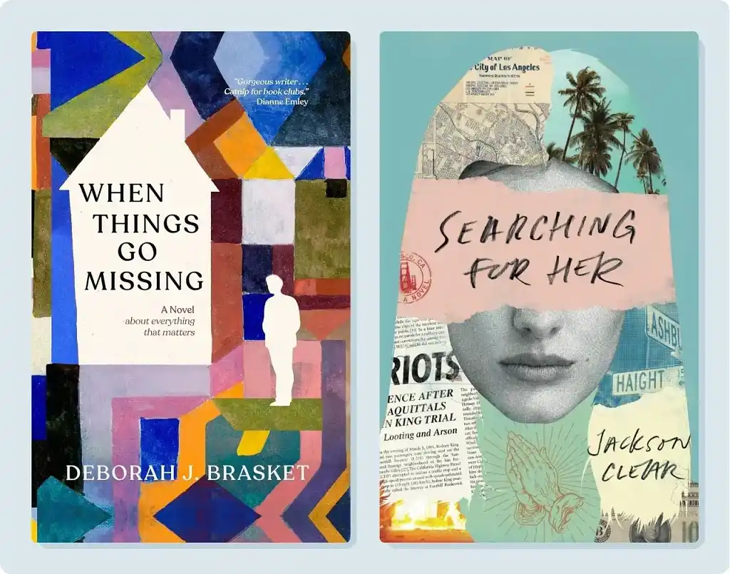
Author Deborah J. Brasket knew she'd found her foundation for When Things Go Missing when she discovered Colorful Architecture, a public-domain painting by Paul Klee. This presented designer Owen G. with a unique challenge: how could he transform a piece of fine art into a functional book cover, while still honoring the spirit of the original?
Owen started with some minor tweaks to the original artwork, then added a few narrative-friendly elements like the whited-out house and silhouette. One fittingly elegant font later, and voilà: a book cover that bridges the gap between gallery and bookshelf.
Jackson Cleary's Searching for Her is a novel about a deranged young man’s search for his soulmate, which designer Richard L. captured with an appropriately unhinged collage. Richard layers a number of disparate elements around a young woman’s face — vintage maps of Los Angeles, palm trees, streets signs, and newspaper clippings — to create a visual representation of the protagonist’s scattered psyche. The hand-lettered title scrawled across torn pink paper adds a raw, urgent energy as well.
Young Adult
Young adult covers have mastered the art of bold, immersive design.
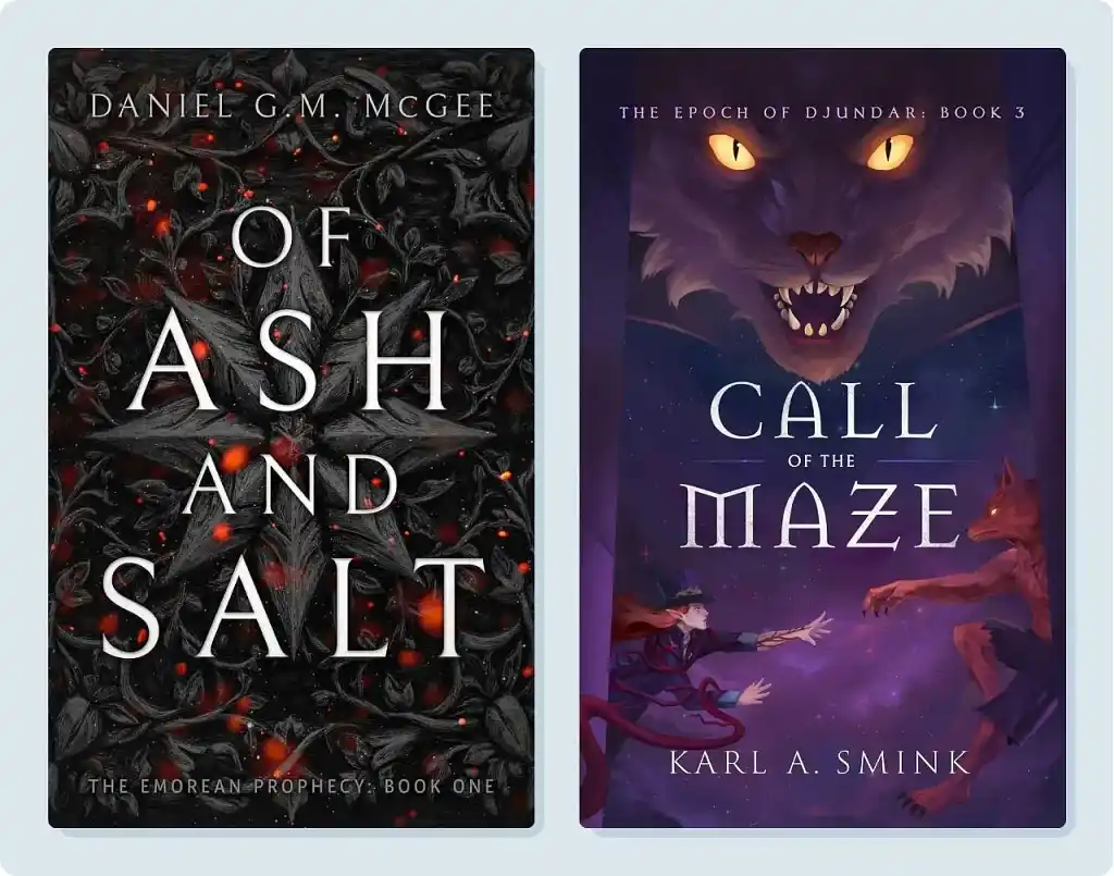
Of Ash and Salt is more old-world-town than New World City, but that didn’t deter designer Ryan M., who expertly captured an entirely different aesthetic for this YA adventure fantasy.
According to Ryan, the cover was designed to feel ancient and alive, “like a spell carved into the burnt wood”. It certainly succeeds, as the auspicious red glow underpinning the arcane, floral styling conjures images of dark, foreboding magic.
While Of Ash and Salt kicks off an all-new YA fantasy series, Call of the Maze concludes another, a fact that remained at the forefront of Elin T.’s mind at every stage of the design process.
The celestial indigo background represents the series’ titular maze, an ominous prison that protagonist Djundar has spent two books struggling against. Cosmic horrors lurk within the walls of the labyrinth, one of which adorns the top of this cover — their bright, glowing yellow eyes stand out against the otherwise velvety color scheme.
Finally, Djundar can be seen in the bottom left, his face marked by conviction as he fights through the Maze’s wicked tendrils to reach out to his canine companion. A fittingly intense cover for a YA fantasy finale.
Children's books
Next up, let’s shift our focus from young adult to not-yet-an-adult with our favorite children's book covers of 2025.
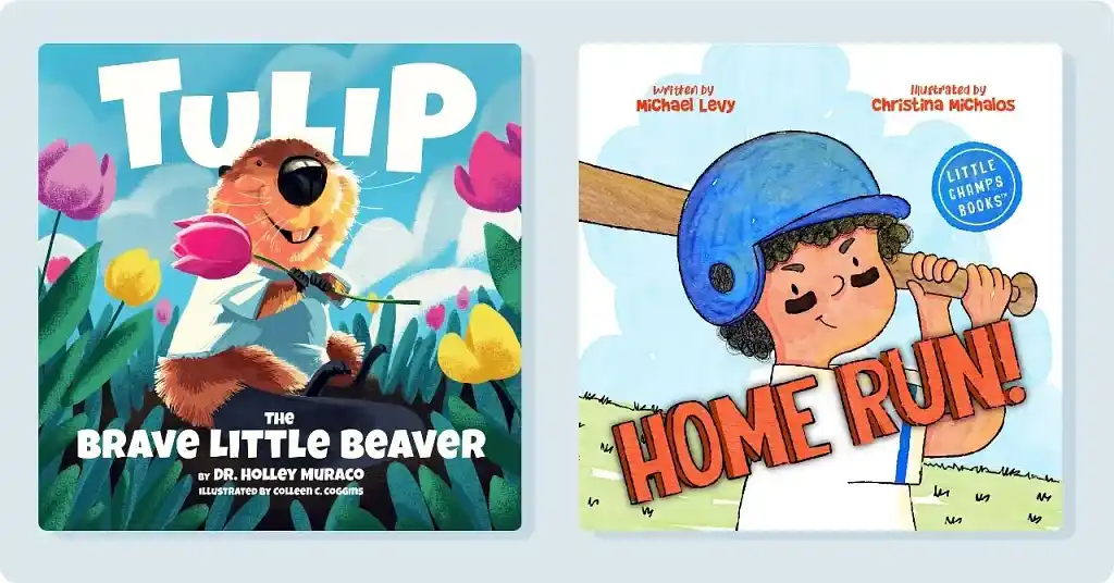
Tulip is an optimistic and adventurous young beaver, and designer Colleen C. wanted to embody that spirit on the cover of Tulip: The Brave Little Beaver. To that end, our brave little beaver takes pride of place with a joyful expression on her face, looking out towards the adventure to come. The color scheme sticks to simple, primary colors to match the story's upbeat mood, and background elements were kept to a minimum to ensure the focus remains on Tulip. The bright pink and yellow flowers surrounding Tulip are, of course, tulips — a playful nod to our toothy protagonist.
From beaver to batter, our other top children’s cover of the year adorns Michael Levy’s Home Run!. The first thing that jumps out from this cover is the title — the bright red, all caps typography evokes the exuberant energy of a play-by-play announcer.
Much like Tulip does on her cover, Leo’s expression here does an excellent job expressing the tone of the story inside. His determined grin is beaming with confidence — perfect for a story about the thrill of competition. Christina M. knocked this design out of the park!
Nonfiction

While fiction books allure viewers with thought-provoking and imaginative covers, non-fiction favors a more no-nonsense approach. Both of our non-fiction picks exemplify this design philosophy to a tee, choosing typography over imagery to effectively represent the content waiting within.
Vanessa M. truly takes the bull by the horns with her cover for Wall Street’s Blind Spots by Jose Mayora. The iconic Wall Street bull takes center stage, cleverly blindfolded to capture the book’s main idea about overlooking the obvious. The deep navy background paired with the bold white text radiates confidence, while the splash of gold keeps things looking polished and professional.
Sometimes less really is more, and designer Alan H. demonstrates this on his cover for The Happiness Handbook by Dr. Ken Harmon. A vibrant yellow background grabs attention, while the white sunburst adds optimism without competing with the text. It's a straightforward design that embodies the book's promise of practical guidance, with assertive text placement that tells readers exactly what they're getting.
Memoir
Memoir is, by nature, an extremely personal form of storytelling, and as such, their covers often reflect the intimate tone of the stories they represent.
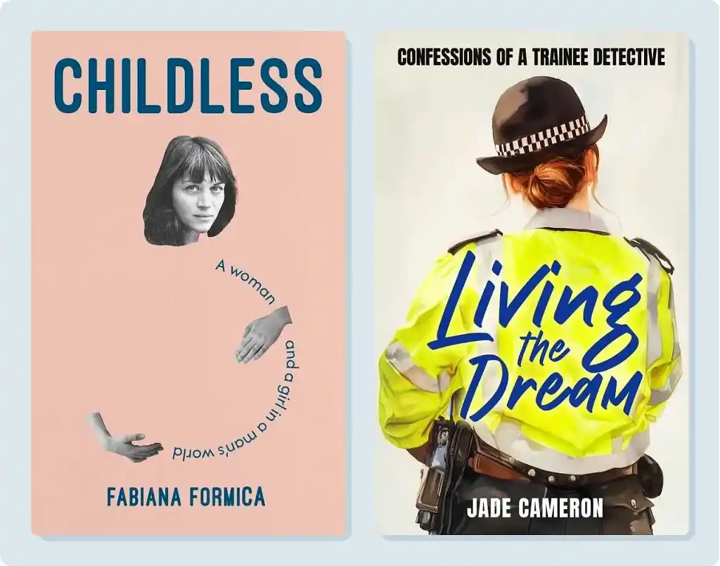
In her memoir Childless, Fabiana Formica explores her complex relationship with motherhood and identity — themes designer Natàlia P. thoughtfully carries into the cover. Design elements were kept to a minimum here, as Natàlia utilized clever typography and negative space to create a striking, minimalist cover.
Fabiana’s face is placed front and center, while the round curve of the subtitle below combined with her hand placement evokes the silhouette of a pregnant woman. According to Natàlia, the placement of these elements was designed to “symbolize creation and absence, mirroring [Fabiana’s] unfulfilled desire for motherhood.”
While Childless uses a woman’s visage as its focal point, designer Robert J. intentionally obscures the officer’s face in his cover for Jade Cameron’s Living the Dream.
This memoir is about detective work — an exciting, high-octane profession in the eyes of many. But the everyday life of a trainee detective often isn’t quite so glamorous. By showing the officer from behind, dressed in a high-vis jacket and duty belt, the viewer is exposed to the more mundane realities of trainee detective work. The handwritten typography injects some humor and energy into the composition, resulting in an eye-catching cover that’s sure to stand out on any bookshelf.
Poetry
Object-based covers dominate modern poetry design for a reason: a single, striking image paired with strong typography can say a lot with very little.
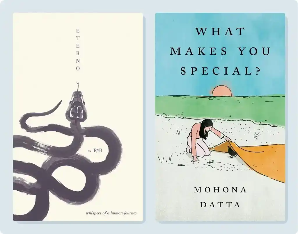
For Eterno, designer Nuno M. chose a sumi-e–style snake illustration as the main subject. The vertical title aligns with the head of the snake for a satisfying sense of balance, while its handpainted style invokes movement and fluidity. Snakes typically evoke danger, but Nuno's delicate brushstrokes transform this one into something soft and vulnerable — perfect for the reflective poetry inside.
Mohona Datta’s What Makes You Special? is a more uplifting, coming-of-age collection about the trials and triumphs associated with entering adulthood. Designer Barış Ş. used a serene beach scene to capture this contemplative, yet hopeful tone.
The soft turquoise sky, tranquil teal-green ocean, and warm peachy sunset in the center of the composition creates an optimistic, dreamlike atmosphere. The bold, widely-spaced typography adds visual weight to the top half of the cover, and the curious interaction between woman and bird draws the eye downward, forming a balanced watercolor design.
There you have it: the best book covers of 2025, crafted with love by some of Reedsy's finest designers. If you’re looking to hire one for your own book, you can browse more designer profiles below. (And if you’re curious about pricing, we’ve broken down cover design costs by genre here.)
Hire an expert

caterina B.
Available to hire
Children’s book & YA illustrator since 2011. Trusted by publishers worldwide to deliver engaging, timeless illustrations.

Robert J.
Available to hire
I'm a book cover designer with over 20 years of experience. I will help you transform your literary masterpiece into an eye-catching cover!

Clint E.
Available to hire
Art director and designer since 2007 creating bold, story-driven visuals with a strong background in the music industry.