Last updated on May 26, 2026
How to Design a Book Cover in 7 Steps

Your book’s cover is one of its most important marketing assets. A great cover instantly conveys tone and draws readers in, whether in a physical bookstore or online. In fact, a professional-looking book cover can potentially double your sales.
As Reedsy’s in-house illustrator with over 25 years of design experience, I know exactly what distinguishes an excellent book cover from an amateur one. Of course, the best way to guarantee a professional-looking cover is to hire a professional — but in case you need to DIY your cover for whatever reason, I’ll share my secrets to designing a cover concept that will help your book stand out.
Then, in the next post in this guide, I’ll walk you through the process of bringing your concept to life in your preferred design software.
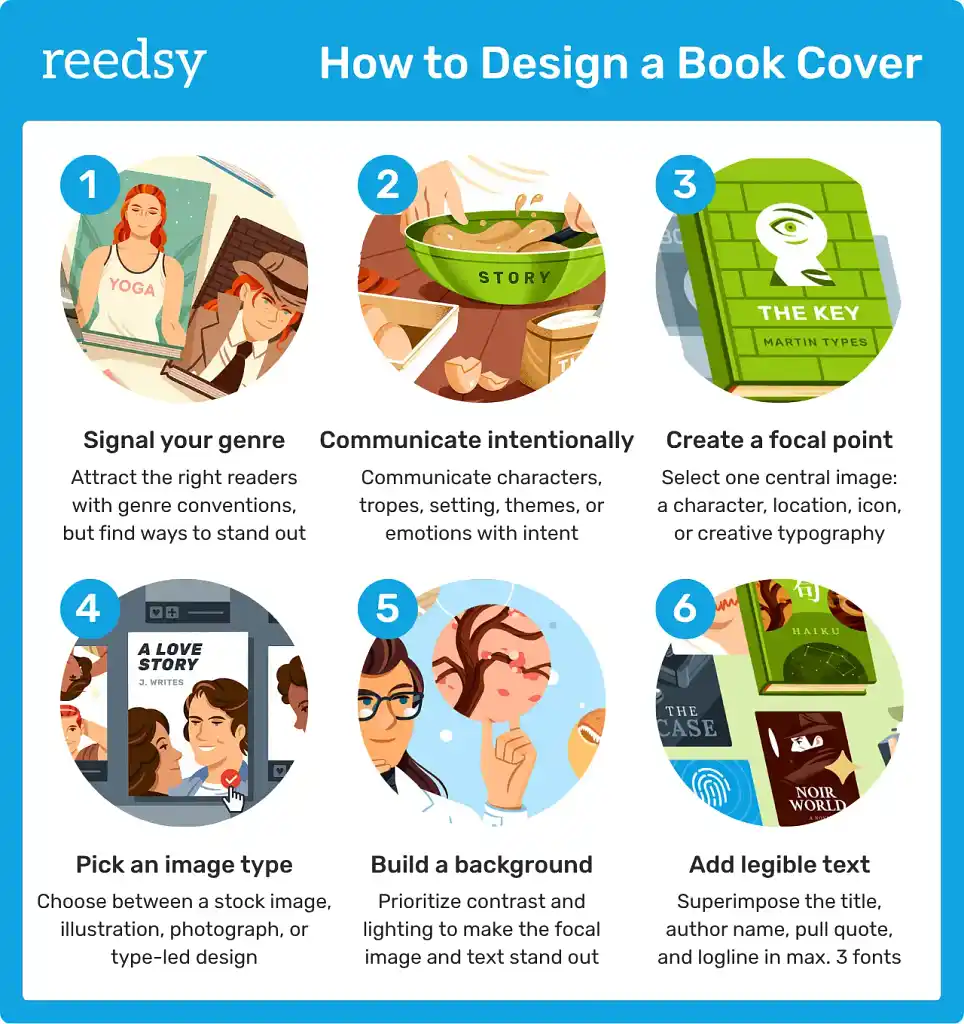
1. Signal your genre to readers
Naturally, you want your cover to be eye-catching and set your book apart from the crowd. But you don’t want it to stand out so much that readers have no idea what’s in it. Your cover needs to clearly indicate your genre and subgenre — and to do that, it must share certain visual cues with similar (successful) books.
To increase your knowledge of your genre’s norms, read my guide to researching book cover trends. You should only start designing in earnest once you have a strong understanding of the color palettes, typography, imagery, etc. that signal your genre to readers.
Q: How do you keep up with industry trends?
Suggested answer
Always looking for what is out there, on new book's releases. Reading about trends not just on books but in design, fashion, and color trends. Social media is also one of the best ways to keep up with the new trends.
I like to interact with younger professionals and keep a GLOBAL MINDSET when looking around.
Veronica is available to hire on Reedsy

I keep up with industry trends in a few different ways. I regularly research bookshops, both online and in person, to see what is happening on the shelves right now and how design is shifting across genres. Social media is also useful, especially Instagram and Pinterest, which are full of designers, illustrators and publishers sharing new work and fresh ideas.
I also follow design blogs, agencies and publishers, and I keep an eye on what is being shortlisted for design awards. Often, those projects are the ones pushing boundaries and setting the direction for what comes next.
That said, I do not believe in following trends for the sake of it. For me it is about being aware of the landscape, so that I can make informed choices: when to align with current styles, and when to deliberately do something different so a book stands out.
And honestly, nothing beats wandering around a bookshop, picking up the latest releases and seeing what catches your eye. It is my guilty pleasure and my favourite research lab all in one!
Clare is available to hire on Reedsy

I stay on top of industry trends in several ways, but being an avid reader helps the most. The majority of the genres I specialize in are the ones I read myself, so I naturally absorb what works for readers — from themes and tone to popular visual cues.
I also keep an eye on bestselling covers, explore new tools and techniques, and follow other designers and illustrators for inspiration. Combining this ongoing research with my own reading experience helps me create covers that feel current, professional, and true to the story.
Alexandra is available to hire on Reedsy
Don’t yield too much to trends
That said, don’t let design trends dictate your every move. What is ideal for one cover may not work for another, even if they share the same genre and themes.
At design school, we learn that each problem requires a unique solution. Remember: design is first and foremost about communication — in this case, with potential readers. You should never get carried away by trends at the expense of effective communication.
Let me illustrate my point with an example. I designed this cover for an anthology of various romantic and erotic stories:

It’s not your typical romance/erotica cover — because this isn’t your typical romance/erotica anthology. All the stories share a strong female perspective and discuss themes of inner exploration and self-knowledge.
I felt that erotic photographs of models would betray the true nature of this work. Likewise, I didn’t want to use colorful vector art of a couple, as this could convey the tone as too light and “beachy” — or imply that all the stories were about the same two people.
Instead, my design contains a degree of sensuality, but remains restrained, harmonious, and elegant. The key-shaped zipper symbolizes how the woman is opening the door to her inner self. This almost literary symbolism communicates that there is more to the collection than love affairs and sex.
In short: know the trends in your genre, but don’t adhere to them blindly. Every decision should be based on what best serves the communicative intent for this specific book.
Speaking of which…
2. Decide what to communicate
Communicating your genre, one way or another, is key. But beyond that, it’s up to you what you want readers to take away from your book cover.
You can communicate characters, tropes, setting, themes, emotions, and more — but not all at the same time. To help you maintain focus during the design process, decide on your top communicative priorities now.
Personally, I like to think about my primary goal in terms of its degree of abstraction. Do I want to depict something tangible about the story’s events, or do I want to convey the abstract emotions, tone, or themes prevalent in the book?
You can see that these goals will lead to very different concepts. The first will result in a literal image of a key scene, setting, or character, whereas the second may lead to more open-ended or abstract imagery or symbolism.
Now let’s talk about how to actually come up with a cover concept. Don’t worry about professional design tools or precise measurements yet — just get your ideas down on paper.
3. Create a single focal point
I recommend that you start with your focal point: the part of your cover that will capture readers’ attention. Note that you’ll want to draw them in with one strong image, rather than trying to handle multiple plot points or themes equally.
Note: The central "image" doesn’t have to be an image at all. Plenty of effective book covers spotlight creative typography instead, as I’ll show you in the examples below.
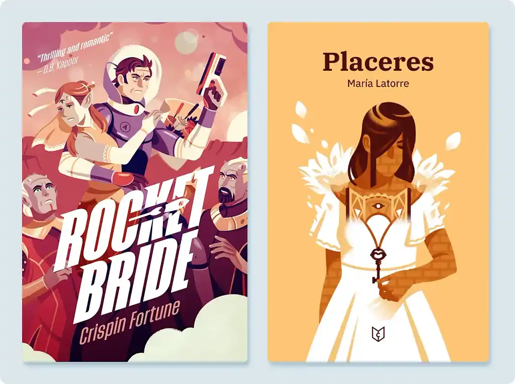
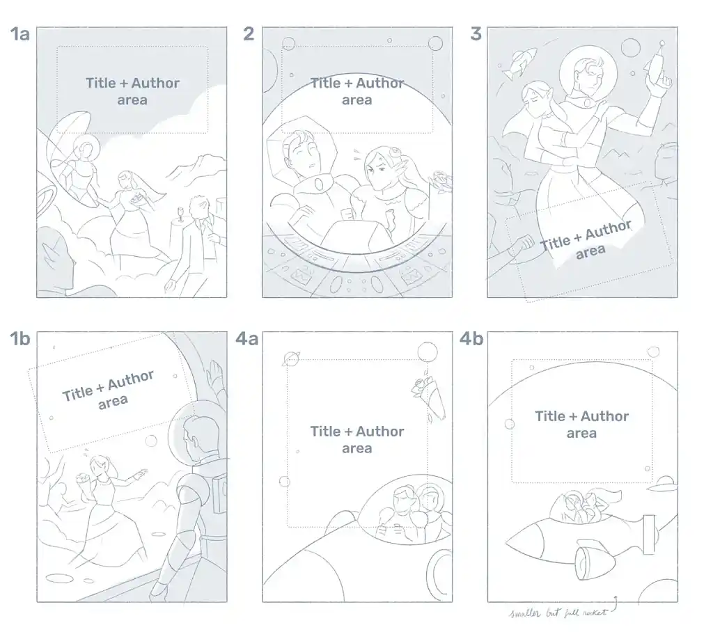
You’ll probably need to brainstorm multiple concepts before you come up with one that feels right. I usually do 5–6 sketches before I find a concept that speaks to me (and my client). For instance, I came up with six different ways to depict the escape scene in Rocket Bride:
With that in mind, here are some of my favorite ideas for focal images to help inspire you (alongside your research, of course).
Character(s)
I may be a designer, but even I understand the importance of developing compelling characters for a given story. It follows that a visually intriguing character can similarly draw readers in.
You can portray your character(s) realistically or unrealistically, depending on your communicative intent. For literal depictions, you might like to highlight the protagonist’s most interesting or prominent physical traits, or position two characters in a way that reveals the nature of their relationship. For abstract portrayals, you can weave symbolism into the image or omit certain features to represent loss of self, some sort of narrative mystery, etc.
Let’s look at two examples with different communicative intents:
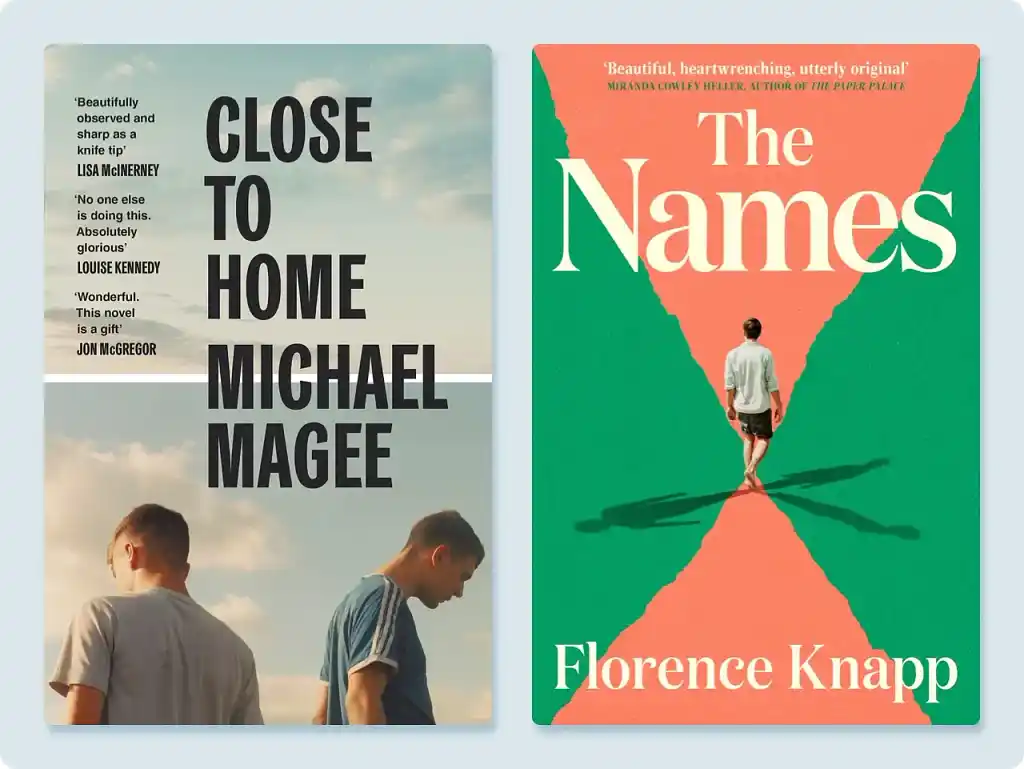
The cover of Michael Magee’s Close to Home uses realistic imagery of two young men, who — crucially — have their backs to each other. We can deduce that their relationship is strained, hinting at character-driven conflict.
The cover of Florence Knapp’s The Names, on the other hand, adds an abstract feature to the otherwise nondescript character: three shadows. These imply that the book will explore multiple identities and the character’s sense of self.
See how these characters’ faces are deliberately obscured — a common practice in many genres. There are several reasons why this might be the case, but I think it boils down to the fact that readers want to put themselves in a protagonist’s shoes. Seeing a specific face on the front cover can make it harder to do that.
Location
If the setting of your story is particularly interesting or important, you might prefer to feature a location on your cover. I see this a lot in historical fiction, science fiction, and fantasy, where much of the story’s appeal is its worldbuilding, as well as in horror, where the creepy setting establishes the atmosphere.
That said, I advise you not to overwhelm the reader with a complex landscape. Instead, draw the reader’s attention to one main image — perhaps a particular building or natural feature.
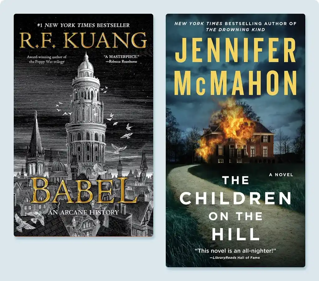
On the cover of R. F. Kuang’s Babel, for instance, a single tower stands out from the rest of the cityscape. The building is old-fashioned and imposing, hinting at the historical setting and the dark academia genre.
The cover for Jennifer McMahon’s The Children on the Hill, meanwhile, focuses on a burning building — instantly conveying the dark nature of the novel and sparking intrigue (no pun intended) as to the fire’s source.
Q: What sources of inspiration do you turn to when creating book covers?
Suggested answer
When I start a new cover, I always research the genre first. Even if I am familiar with it, things change and evolve, so it is important to understand what is out there, what readers expect visually, and where there might be space to do something fresh. I also look closely at the subject matter itself, which often takes me beyond books into films, comics, toys, merchandise and anything else that captures the right mood or cultural references.
I need to sit with a project at the beginning. Inspiration does not arrive instantly, it often comes once I have started the research, and sometimes in completely unexpected places. I might be walking in the park when something clicks, or scrolling Instagram and stumble across a striking animation that sparks an idea.
Normally I am looking for a key that unlocks the design, a spark or concept that brings everything together and makes the direction clear.
Typography is another big source of inspiration. The right typeface can set the tone before a single image is added, so I spend time exploring fonts that express the feeling of the book. I usually pull everything together into mood boards, which help me and the client see how colour, imagery and type might combine into a strong direction.
Inspiration can come from anywhere, but I always try to anchor it back to the book’s story and its audience, so the cover feels both creative and perfectly placed for its market.
Clare is available to hire on Reedsy

The first and best source of inspiration is the work itself. I love to read the works in their entirety, if possible, and steep myself in the words, characters, and worlds of the book. Often a scene, or simple well written line can set off a whirlwind of ideas.
I love when authors send other imagery that excites them, as that often excites me too and gets us into the world of visual communication. Some authors have gone as far as to create entire mood boards and playlists, which I love! (You know who you are!)
Artists also inevitably bring with them everything else excites them. For me this is other paintings, other stories, music, poignant moments from real life, and more. In my experience the best images come from fusing the author’s world and enthusiasm with my own, and together we pull off something we are both genuinely stoked about.
Charles is available to hire on Reedsy

The starting point is always the story. Then comes the world around me: the September breeze, the open window, the neighbor hanging laundry, the child running along the beach, and the shapes of his movements, my cats, the people I observe, the shifting colors of nature. Afterwards, I turn to references, exploring different cultures, clothing, and traditions to enrich my imagination and transform it into images.
Sasha is available to hire on Reedsy
Iconography
An increasingly popular approach to cover art is to focus on a simple but iconic symbol. Whereas iconography was previously confined to mostly literary fiction, you now see it on plenty of genre fiction covers too.
I think minimalism has become more popular because it suits the modern market: a good icon is memorable and evokes an instant meaning, allowing it to make an impression even when a user only scrolls past it for a split second.
You can reuse existing symbols (with permission, of course), or invent a brand new one. To come up with an icon, reflect on the main themes and symbols in your novel. Is there a recurring image or sentiment that you wish to convey?
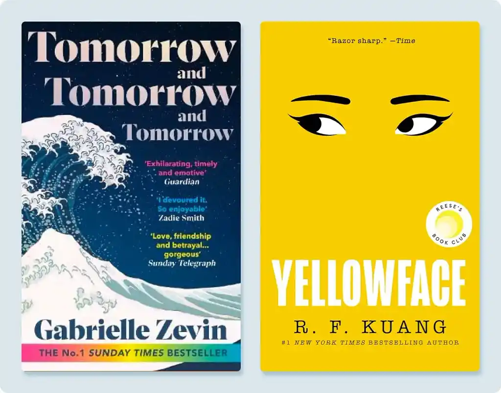
The cover of Gabrielle Zevin’s Tomorrow and Tomorrow and Tomorrow recontextualizes Hokusai’s famous woodblock print The Great Wave off Kanagawa — which simultaneously nods to a Japanese-inspired video game in the novel and to its themes of resilience and transience.
The cover of R. F. Kuang’s Yellowface uses original art that has now become iconic thanks to the book’s success. The pair of eyes on a yellow background embodies the offensive practice of yellowface, forefronting the novel’s perhaps-uncomfortable themes of racism and exploitation.
🚨A word of warning: Icons are powerful for a reason. There is no room for error or embellishment — meaning they require extreme care in their creation. If you go the iconography route, try to think through every possible interpretation, or risk the dreaded miscommunication!
Typography
Finally, remember that you can focus on the title itself. You can convey a lot of meaning through creative typography. Just look at the examples below:
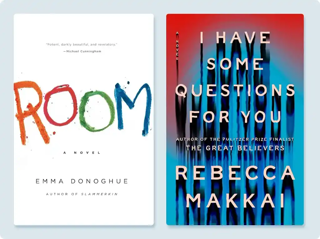
The title of Emma Donoghue’s Room looks like it has been hand-painted by a child, alluding to the 5-year-old narrator of the story. The bright colors also inspire hope, promising that this tale of abuse will not be entirely depressing.
In contrast, the shaky shadows on the cover of Rebecca Makkai’s I Have Some Questions for You, combined with the harrowing red and blue colors, indicate that this is a mystery/crime book which may indeed be scary.
Whichever focus you choose, make sure your cover paints an accurate picture of your book’s contents. Don’t mislead the reader with the promise of an atmosphere or theme that your book never delivers.
Q: How do you best work with clients to capture their vision for their book cover?
Suggested answer

Working at Penguin Random House means the conversation around a cover rarely involves just one person. There's the author, the editor, the sales team, the marketing team — everyone has a stake, and they don't always agree. Learning to work in that environment has taught me something useful for any client relationship: the brief people give you and the cover they'll actually love are often two different things.
So my starting point is always to ask what the book needs to do commercially, not just what it should look like. Who is buying it, where, and why? That shapes every creative decision before a single element goes on the page.
From there I try to show directions rather than options — not three versions of the same idea, but three genuinely different creative territories. It gives clients something to react to — and from there, the vision tends to find itself.
The vision is rarely fully formed in the client's head. Part of the job is helping them discover it.
Cloe is available to hire on Reedsy

Firstly, always listen to what the client is saying and - read between the lines - what do they really want. Read the brief. Then read it again. I don't just slavishly give the client exactly what they ask for. They are paying me for my expertise. So I will consider what they want to achieve (which is usually different than what they initially want to see). Then I will come back with ideas that will achieve their aims. Its a bit of back-and-forth between me and the client until we align on the final cover. Clients tell me all the time, they could never have expected the final cover to look how it does, and how thrilled they are with the result. Sometimes a client will come with a firm idea or element. If that serves the book then great, I will incorporate it in a way that optimises what the cover needs to communicate. Its ultimately about communicating clearly with the client.
Wayne is available to hire on Reedsy
The best way to capture a client’s vision is to start by asking lots of questions. I like to find out not just about the story, but also about any concerns or fears they might have, what they do and don’t like, and how they want the book to feel on the shelf. Sometimes a video chat helps enormously to get a sense of their taste and personality.
If a client has a specific idea, I always do my best to use that and make it look professional. If I think the project could benefit from a different approach, I will suggest alternatives, but always as part of a collaborative discussion.
Stage one of my process is research and idea generation. I play around, try out unusual or even odd concepts, and see what comes from that experimentation. With every idea I present, I include variations in colour, composition, or typography so the client can see the possibilities.
Many authors actually do not know exactly what they want, and that is great too. In those cases, I cast my visual net wider, presenting lots of ideas and styles to see what resonates with the book. Once we have settled on a direction, the refining and to-and-fro can take several stages to resolve. Getting every detail right on the spine and back cover is equally important. From there, we work together to shape a cover that is both creatively exciting and commercially strong.
Clare is available to hire on Reedsy
4. Pick a suitable image type (that matches your skill level)
Once you have a concept you’re happy with, the next step is to pick your image type. You have four main choices: a stock image, an illustration, a photograph, or a type-led design. Each has its pros and cons — you are limited only by your budget or DIY skills.
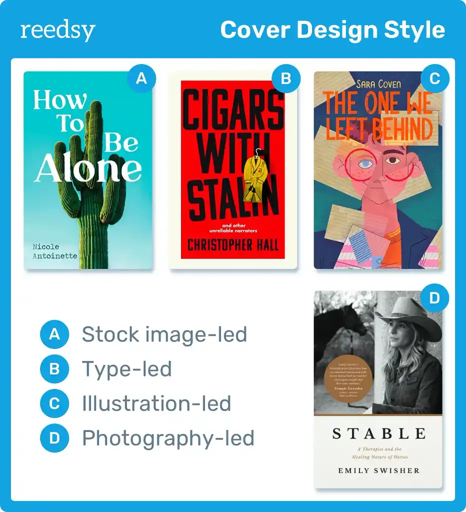
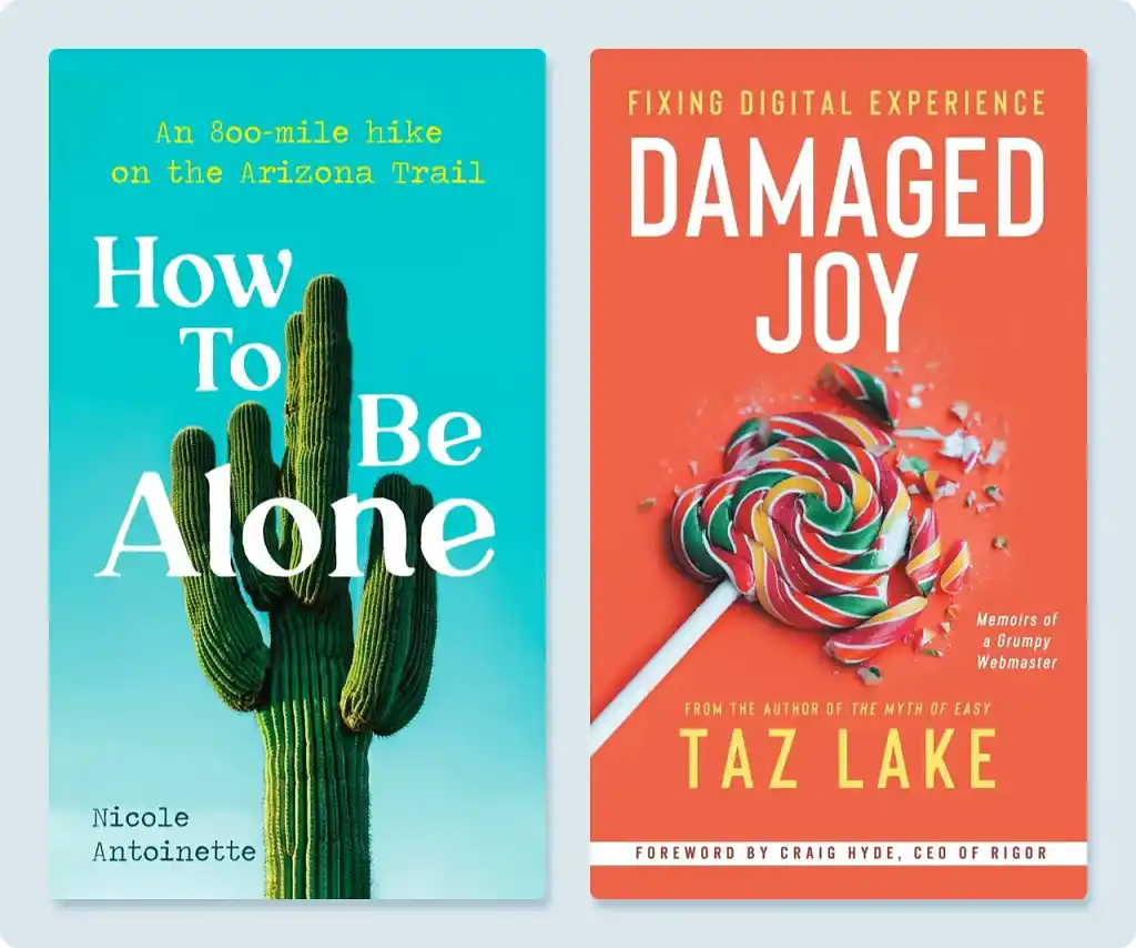
Stock image
Many covers released by major publishers feature stock images that are then cropped, manipulated, or edited into the design. You see a lot of these covers in certain romance subgenres (think Colleen Hoover), as well as crime/thriller and self-help.
|
✅ Pros |
❌ Cons |
|
Less expensive than a dedicated photo shoot |
Impersonal |
|
Flexibility in digital post-editing |
Limiting if you don’t have high-level image editing skills |
|
Risk of dozens of other covers using the same image |
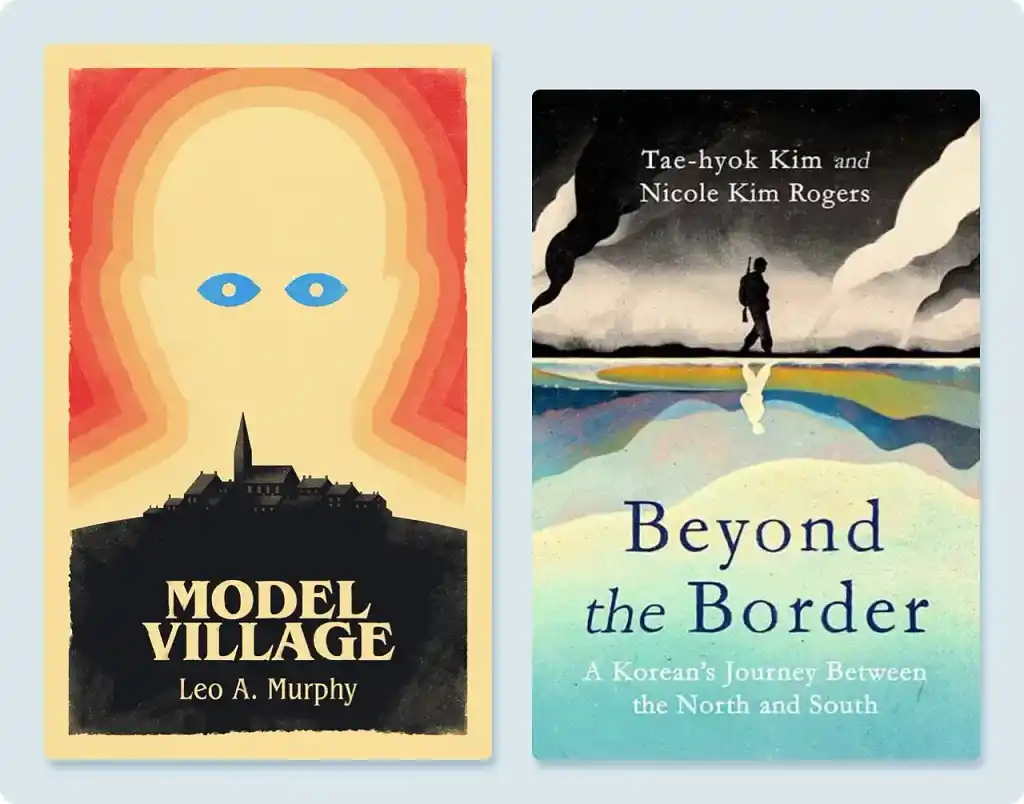
Illustration
Illustrations on book covers come in a vast array of styles; they’re arguably the most versatile, sophisticated approach to cover design (though also the most time-consuming).
Illustrated covers range from intricate, life-like illustrations of the book’s world (as seen on many fantasy and science fiction covers) to evocative works of abstract art (on literary fiction covers, etc.).
|
✅ Pros |
❌ Cons |
|
Anything is possible (with the right illustrator) |
Time-consuming |
|
Can create truly bespoke imagery |
Most authors are unable to DIY an illustration |
Photograph
These days, you only usually see specially commissioned photography on celebrity memoir covers, where the biggest selling point is the author. But any cover can benefit from a custom-shot photograph.

|
✅ Pros |
❌ Cons |
|
Get the exact image you need |
Expensive to hire a photographer |
|
100% unique |
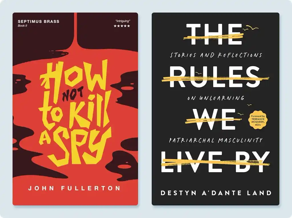
Type-led design
A type-led design has always been common in nonfiction and literary fiction — but I see it increasingly in genre fiction, too. The focus of the design is a creative manipulation of the typographic elements (title, author name, etc.).
|
✅ Pros |
❌ Cons |
|
Striking |
Not always as clearly “communicative” as other imagery |
|
Legible at almost any size |
|
|
Simpler to create than other designs — and potentially faster |
Once you've settled on the style of your focal image, you can look for a professional to execute your design, or continue refining it yourself if you are confident you can pull it off.
If you do choose to DIY your cover, read on for more of my design dos and don’ts as you begin to create your cover in your chosen software.
Q: What factors do you consider when calculating your rate for a book cover design?
Suggested answer

When I calculate the price of a book cover, I think beyond the hours it will take me to complete. A cover is the first impression a reader has of a book, and creating one involves much more than simply placing an image and a title together. It’s about translating the spirit of the story into a visual form that resonates with the right audience, and that process varies greatly from project to project.
One of the first considerations is scope. Some authors need only a digital front cover, while others require a full wraparound design for print, with spine and back cover included. There may also be requests for interior design or promotional graphics to accompany the launch. The nature of the design itself also plays a role: a cover built with custom illustration or hand lettering demands a very different level of time and artistry than a cover that relies on photography and an existing typeface. Both approaches can be powerful, but the amount of originality and craftsmanship involved inevitably shapes the fee.
Research and concept development are another invisible yet essential part of the process. A historical novel might send me digging through archives for visual references, while a contemporary title often involves exploring cultural trends and building moodboards. This stage is where the design starts to take shape, long before a single line or color is put on the page.
Revisions are also part of the calculation. I usually include a few rounds in my fee, so the author has room to refine the vision while keeping the project on track. Usage and distribution matter as well — a cover for self-publishing on digital platforms has a different scope and licensing implication than one created for a major publishing house with wide international circulation. And of course, the timeline can affect the price: a project that requires me to reshuffle my schedule to meet a tight deadline is not the same as one with more breathing room.
For this reason, I usually work on a flat project fee, tailored to the complexity of the book. A cover with custom illustration, bespoke typography, and full wraparound design will naturally fall on the higher end of my range, whereas a photo-based cover with lighter adjustments will be priced more modestly.
Ultimately, I view pricing as a way to ensure respect on both sides. The author gains clarity and knows what to expect, and I can dedicate the time and creative focus needed to do justice to the book. A strong cover has the power to become inseparable from how a story is remembered — and its price reflects the care it takes to create that.
Nvard is available to hire on Reedsy
When I calculate a rate for a book cover design, I take several factors into account. The subject matter and target age group can influence the amount of research and concept work needed at the outset — some projects require deep visual exploration, while others are more straightforward.
I also consider whether the design will involve illustration. That might mean creating the artwork myself, commissioning and art directing another illustrator, or combining photography and illustration, each of which carries different levels of work.
Practical elements also play a part: how many editions are required (for example, hardback, paperback, eBook), whether it’s a standalone or part of a wider series brand, if a series branding needs designing, and the level of Photoshop work or complex typography involved. Some effects in Photoshop take some time to get the feeling and atmosphere across, some simple typographic concept led covers may look easy, but they are in fact the hardest to finesse.
All of these details help me gauge how much time, creativity, and collaboration a project will need, and I set my fee to reflect that.
Clare is available to hire on Reedsy
If we are talking about a full color cover illustration I start with a flat rate for most quotes. This rate is calculated on many things, including, in no particular order: time, comparing market rates, my skill and experience, and rights I am agreeing to sell. I compare this against other things like complexity, exposure of images, any extras the client may be asking for including additional rights. I am also keeping in mind how this will translate to an hourly rate.
I have found that there is a fairly clear link between how much I charge and the quality I produce, which comes down to time. I like to read as much of the manuscript as the client will give me, ideally the whole book. If we add up reading the book, sketching and ideating, communication and negotiation with the client, assembling reference and photoshoots, painting the illustration, revisions, type and cover design, assembling the final files, billing (which Reedsy takes care of) and back end business organizing, then divide that by the total cost we get a rough hourly. This informs how many jobs I need over a given time.
In an ideal world I would work on an image until it’s done. In a world with deadlines and money, the more I charge the fewer jobs I need to work on at once and the more time, love and attention I can devote to the task at hand, which, for me, always yields better results.
Charles is available to hire on Reedsy
5. Build a contrasting background
With the foreground out the way, you’ll be ready to think about your background. Again, less is more here. A simple backdrop or even just a block color will do nicely. Remember: you don’t want to overstimulate or confuse the reader.
The main thing you’ll need to consider for your background is contrast. In order to make your focal image and text stand out, choose a different color (usually a gentle hue) or make use of shadows to prevent your background from overwhelming the other design elements.
However, be careful not to rely on shadows here, there, and everywhere. The lighting must be consistent, meaning all the shadows are cast by the same imaginary light (the exception, of course, being the cover of The Names!). If you’re struggling to make this work, that might be a sign to consult a professional designer.
Hire a professional

Michael B.
Illustrator drawing comics and designing covers for Oxford University Press for 12+ years. New York Book Award for Best Cover Design 2018.
Request a quote


Asia B.
Internal book designer with 11+ years’ experience, specializing in non-fiction — history, education, sociology, and philosophy
Request a quote

Veronica S.
Multi-cultural designer with over 20 years of experience in book design. Experience combining manuscript and design from concept to press.
Request a quote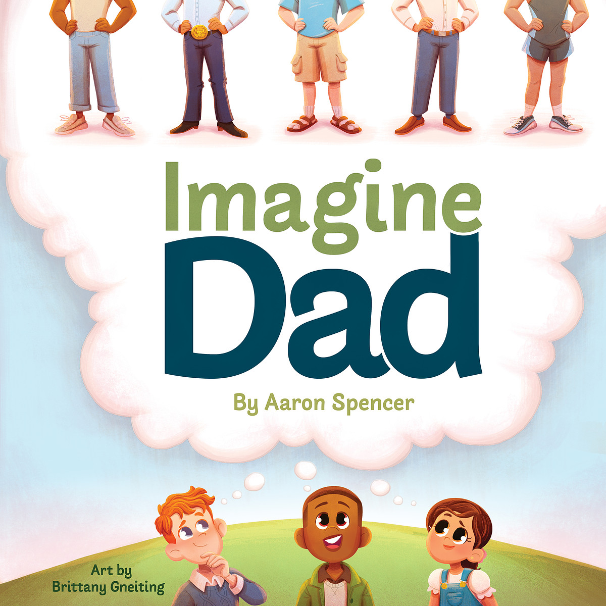


Test different color schemes
Don’t be tempted to settle for the first iteration of your design that you try. Instead, experiment with different color palettes. Remember that every color has hidden connotations and your choices should be deliberate, rather than random.
When I was finalizing my design for Rocket Bride, I tested six different color variations:
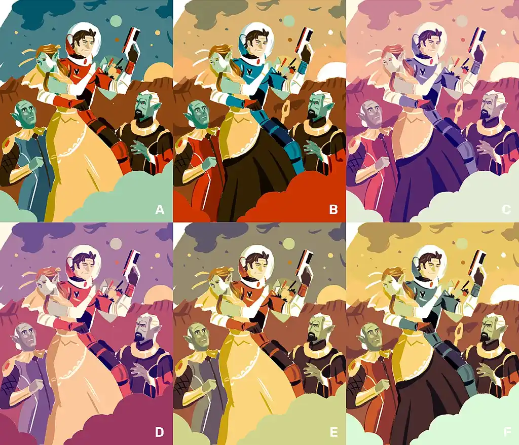
I chose to move forward with option C because it uses pastel shades often seen on romance covers — offsetting the sci-fi setting and letting the readers know that this isn’t just a straightforward shoot-’em-up in space.
Q: How did you experiment to discover your book cover design style?
Suggested answer
I wouldn’t say I have a defining personal style. My covers are always focused on the market and what works within a particular genre. Being a commercial designer and art director is a bit like being an actor: I put myself in the shoes of the reader or buyer and imagine what they are looking for, how the book will feel on the shelf, and what will catch their eye.
Thinking like the buyer makes it easier to make design choices that are both creative and commercially effective. It helps me balance originality with clarity, so the cover stands out while still fitting within the expectations of the genre. Every project is an opportunity to explore ideas, but the ultimate goal is always to create something that resonates with its audience.
Clare is available to hire on Reedsy

Often times your style comes from your limitations. Most of my favorite illustrators have a style that's quite different from mine and it's not from lack of trying. When I was starting out I would try to make a design in the style of someone I emulated and found myself unable to achieve it. So much of illustration and design is about problem solving so instead of giving up you have to navigate around it and maybe even embrace it to find success.
For example, I remember trying to do a cover with a city in the background. I love drawing people but I'm bored by pretty much everything else. My brain doesn't have any architectural acumen and eventually I just gave up on that part. I skipped ahead to laying out the text and found that it covered so much of my drawing, making the background almost irrelevant. I didn't want to lose the idea so I experimented with turning the text into the city itself. I've always been more an illustrator than a graphic designer so this felt like a world unfamiliar to me but I loved the outcome I had stumbled upon and found my style continuously moving into designs like these. Some people are maximalist and their art is amazing, but with book covers in particular, we've got so many ideas we have to condense and make apparent at the same time.
When I hit a roadblock with my style not working with the brief or connecting to my initial idea, "simplify" is usually my mantra. I look for ways to shave it down and make it more economical. Style doesn't come easy and often times you have to elbow your way through a lot of designs to reach the final one. That can be intimidating for me because it feels like the illustrations I make during this process are wasted, but just like going to the gym, the exercise creates the effect. Don't be afraid to scrap something so that it can be reborn anew. If you're good, your style never just reaches a set point. It continues to morph as you absorb new passions and experiences. Trust that your style is inherently inside of you always, it just needs the shaping from the expert that is you.
Nick is available to hire on Reedsy

A mixture of playing with colours & different brushes and creating a lot of covers! However, each book often requires a slightly unique approach to connect with the story.
Tommy is available to hire on Reedsy
6. Add legible text
Unless you’ve opted for a type-led design, now’s the time to add your title and author name.
To lend your book credibility, you can also quote a short snippet from an advance reader review, signpost readers to your previous bestselling title(s), and/or add a logline: a one-sentence teaser designed to capture the reader’s interest.
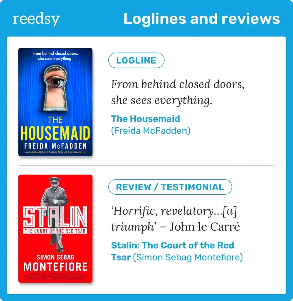
Aim to maximize the legibility of the text when choosing your fonts, colors, and placement. You don’t need to be too unique with your typography — and in fact, you should avoid it! Text written in a highly ornamental or unusual font runs the risk of being difficult to decipher, so I recommend sticking to tried and true typefaces.
Another big red flag on a book cover is having too many different fonts. You only need 2-3 fonts maximum. More than that will look unprofessional and may distract readers from the rest of your design. If you can stick to a single font family, using different weights if necessary, all the better.
Pro tip: Don’t make your name too big or too small on the cover. In general, the more famous the author, the larger their name — so if this is your debut book, stick to a readable but modest size.
Q: What common mistakes do authors make when designing their book cover, and how can they avoid them?
Suggested answer

The biggest mistake I see from authors when it comes to book cover design is having an overly prescriptive brief. They have a vision that they think will work and they want it done exactly like that.
It is uncommon for a piece of art or design to spring immediately from the mind. Usually, the first real interpretation of an imagined idea doesn't work. When the pencil is put to paper, the idea disintegrates. And so, you move on to the next idea, or you try a different approach.
While the initial idea might be the seed of a good design, it is not the finished piece of art; it needs time to grow. Designing any image requires a process of visual experimentation and investigation. Take the seed and expand on it using practiced visual techniques until something starts to emerge.
Experienced designers and artists know how to do this. Maybe it starts with loose sketches or notes, quick daubs of paint, clicking through font selections in photoshop. Whatever it is that the designer does, it is some sort of process that begins with an idea which evolves into a final design. This is where the life of a design comes from. Setting the idea in stone from the beginning robs it of this evolution and robs it of life.
Whenever I come across a very prescriptive brief, I usually message the author and politely ask if they are open to my own alternative design concepts or my interpretation of their ideas. If they are, it can be a rewarding collaboration. If they are not, sadly, I usually have to decline.
Alexander is available to hire on Reedsy

Nothing book cover design challenge is greater than designing a cover for one's own book. I know, having done so now for several of my own books. But I've also learned from my mistakes. Don't try to tell the whole story on the cover; be evocative, be suggestive, be provocative. Imply rather than state.
That said, it may be easier for someone who's less close to the work to see something that to them is obvious, but to you--the author--may not be.
Example: an author came to me not long ago with a request for a cover for a novel with a theme similar to that of "Leaving Las Vegas" (gambling, booze, one man's descent into an addict's inferno). Though he started of with all kinds of ideas involving liquor bottles and poker chips, the final design was purely graphic and typographic: the only image, if it even qualified, was the spade shape associated with the black Jack. Without resorting to any other imagery, the resulting cover was edgy, provocative, and (the author agreed) exactly what he really wanted, even if at first he didn't know it.
Peter is available to hire on Reedsy

You don't need every aspect of your story represented on the cover! I get a lot of authors who run through a list of very specific objects, places, and characters they want on the cover, but many times that doesn't align with the best selling strategies for their genre. Depending on the genre, to capture your audience, you may want to focus on a character or two only, or perhaps one setting. But usually not all of it. The main purpose of a cover is to capture the feeling of your book, not tell the whole story. Oftentimes the cover is more of a metaphor or abstracted visual that just indicates a mood. Less is more!
Caitlin b. is available to hire on Reedsy
7. Ask for feedback from the right people
Once you’re satisfied with your design, it’s time to show it to other people. As with your writing, an extra pair of eyes can spot things you can’t see in your work yourself.
That said, don’t just ask your partner or best friend for their opinion; seek out people who are genuinely voracious readers of your genre. You can look to online forums like Reddit communities and Facebook groups — or if you have a newsletter or decent social media following, you can even run a poll for your fans.
Finally, once you’ve collected feedback, don’t ignore it. If your book cover doesn’t appeal to these readers, there’s very little chance that less engaged readers will pick up your book.
Q: How many rounds of revisions do you include in your initial offer?
Suggested answer

For book cover designs, I typically provide unlimited revisions. I view each project on Reedsy as a genuine collaboration, with everyone working toward a shared goal.
So far, this approach hasn’t been abused. Rather, it assures authors that I’m committed to refining the cover design until they are completely satisfied with the outcome.
Jonathan is available to hire on Reedsy

Creating a picture book is a very fluid process and develops naturally over time.
I am very giving when it comes to revisions. As far as I’m concerned I’m not done until my client is happy.
Obviously, at some point you have to give your book to the world which requires you to say “We’re done” :)
Wayne is available to hire on Reedsy

I do not limit the number of revisions when working on a book cover illustration.
Each step of the process is designed to clarify the project, answer questions and avoid frustration.
Sometimes, people focus on details they consider important. That’s not an issue as long as the feedback is relevant, does not harm the overall quality of the visual and is not given piece by piece over time.
Florian is available to hire on Reedsy
Take your time and keep workshopping your concept until you’re 100% happy with it. Then, head to my next post to find out how to actually convert it into a file that is ready for publication.