Last updated on Oct 15, 2025
10 Brilliant Fonts for Your Book Layout

Martin Cavannagh
Martin Cavannagh is a publishing professional with 10+ years of experience in content strategy, editorial development, and author education within the indie publishing space.
View profile →
It’s easy to forget that the book fonts we see today result from hundreds of years of design evolution. From designs emulating handwriting to the crisp, clean serif designs you’ll find in most publications, modern fonts are the culmination of centuries of people combining form and function into something magnificent, but that its users barely even notice anymore.
As an author and publisher, you can’t get away with indifference: font selection is an essential step to designing your book — both inside and out. In his post, we're going deep into the topic of font choice in book design.
What Font Are Books Written In?
Before you dive headfirst into the technicalities of design choices, it can help to know the industry standards for book fonts. What font you use actually depends on where your manuscript is headed — and what your agents, publishers or printers expect.
✍️ When Submitting to Publishers or Agents
For manuscript submissions, clarity and legibility take priority over design. Publishers and agents usually have their own formatting guidelines, but the industry default is:
-
Font: Times New Roman (or Courier New if requested)
-
Size: 12 pt
-
Spacing: Double-spaced
-
Margins: 1 inch on all sides
📌 Tip: Always check the specific submission guidelines of the agent or publisher. Using Times New Roman won’t get you rejected, but ignoring their instructions might.
📚 When Formatting for Self-Publishing
For printed books, serif fonts are the industry standard. Their subtle lines help guide the reader’s eye, making long-form reading comfortable — which is why most traditionally published novels use them!
-
Most common font: Garamond — a classic, elegant serif used in a large share of traditionally published books.
-
Font size: 11 pt is standard for trade paperbacks.
-
Large print editions: 14 pt or more.
-
Other popular serif fonts: Minion Pro, Baskerville, Bembo, Caslon.
-
Line spacing: Published books use typographic leading (fine-tuned spacing between lines), not the double spacing used in manuscripts.
📌 Tip: Margins depend on trim size and gutter, but always leave enough room for headers, footers, and the spine to keep your book looking professional and easy to read.
🖥️ For eBooks
For eBooks, you (as the author) don’t control the font in the same way. Most eReaders allow users to choose their own typeface and adjust size, so your job is just to ensure clean, flexible formatting.
-
Common default fonts: Arial, Helvetica, Georgia
-
Avoid embedding custom fonts unless necessary.
-
Keep formatting simple and responsive.
📌 Tip: Use proper styles and CSS in your ePub or MOBI file so the text reflows correctly on all devices.
What is a font?
Let’s quickly clarify the terminology before we get into the nitty-gritty of choosing a font. True typography experts will quickly point out how the term ‘font’ is commonly misused in everyday, non-technical conversation.
Q: What's your process for creating typographic hierarchy in a book design?
Suggested answer

When creating typographic hierarchy in book design, I focus on simplicity and clarity, often following a principle known as "unity of type." This approach ensures that all typefaces work harmoniously to guide the reader through the content without unnecessary distraction.
For example, in the catalogues I design for Neue Galerie New York, I use a straightforward yet effective system. The primary typeface is Neue Bold, a custom font developed specifically for the museum. Its weight and boldness make it ideal for headlines, immediately drawing attention. For secondary text, I use Akzidenz Grotesk Light, which is thinner and provides a clear contrast to the heavier Neue Bold. This contrast establishes a visual hierarchy, making it easy for readers to distinguish between primary and supporting information at a glance.
By keeping the typography cohesive and intentional, I ensure that the design enhances readability and aligns with the overall tone and identity of the book.
William Loccisano
Senior Art Director, Books & Exhibitions
William is available to hire on Reedsy

When I start every project, I look to see what is working in the marketplace. When I specifically am looking at typography, I weigh what is working in the workplace, what is working with the age ground and genre with concept of the book cover.
Here are my general questions I ask myself:
What is the copy that needs to go on the front cover?
Is this a series?
Does it need a logo?
Are there multiple books in the series and you need to maintain a similar composition from book to book?
What's the age-group? The younger the age-group, the more readable I want the type.
What is the star of the over? For picture books, I may want to highlight the main character and have the type simp. For a series, the series logo is important and everything else could fall book. If the book is really commercial, the title is typically really large.
It always good to match what else is going on in the marketplace while being aware of readability.
Marci is available to hire on Reedsy

My approach to typographic hierarchy always starts with reading the manuscript and identifying what needs to be communicated first, second, and third. I’m thinking less about decoration at this stage and more about clarity: what is the reader meant to notice instantly, and what can sit more quietly in the background.
From there, I build a structure using scale, weight, and spacing. The title is usually the strongest element, but how strong it is depends entirely on genre and tone. I’ll then establish supporting levels such as subtitle, author name, and any key messaging, making sure each level has a clear visual relationship to the others without competing for attention. I rely heavily on contrast, but try to keep it controlled so the design feels intentional rather than noisy.
I also work quite intuitively with spacing and alignment, often using grids as a foundation but not letting them become restrictive. Small adjustments in tracking, leading, and placement can completely change the rhythm of a cover or page, so I tend to refine hierarchy through lots of subtle adjustments rather than bold jumps alone.
Finally, I always test hierarchy in context—at print size, on screen, and often at thumbnail scale. If the hierarchy still reads clearly when reduced, I know it’s working.
Clare is available to hire on Reedsy
When I design book covers, I consider the relationship between title and design (including both typography and any imagery) to be something like the relationship to lyrics and music in a song. In the same way that the song or tune must "carry" the lyrics, a good cover design should carry or convey the book's title.
For this reason, whenever I get a request from an author asking me to consider a design but who either doesn't wish to share the work's title or hasn't arrived at one yet, I always tell them I have to know the title. Likewise, if a client suggests a concept that doesn't in any way illustrate or reflect ("carry") the book's title, I'll argue that it must do so. In some cases, realizing that they love a concept more than their title, authors have wound up changing the title to go with the cover rather than vice-versa.
One I've arrived at a concept that aligns with the book's title, from there I proceed to consider fonts, illustrations, and whether to prioritize typography or other elements. I admit, though, that I'm always happiest when typography does much if not all of the heavy lifting. Those tend to be my favorite designs.
Needless to say, whatever the final design, the book's title should be clearly legible. But there are book whose themes align best with understated titles/typography: subtle or gentle works that want to whisper their names rather than shout them.
Peter is available to hire on Reedsy
For typographers, ‘typefaces’ are different lettering designs, like Times New Roman and Arial. ‘Fonts’, on the other hand, are size, weight and style variations on typefaces, like 12 pt Times New Roman bold and 14 pt Arial italic. However, for convenience’s sake, we’re going to be using the term ‘font’ to refer to both the overall styles of type and their variations.
How to choose a book font
Choosing the 'right' font to use for a book's body matter often comes down to individual taste. With the exception of a few universally reviled typefaces — cough cough, Comic Sans — almost any legible font can be considered. Having said that, there are a few things that any discerning book designer will want to keep in mind.
It needs to be readable
Imagine a beautiful chair. It may be the most gorgeous thing to look at, but if it’s uncomfortable to sit on, then what use is it really? The same goes for fonts. Though you obviously want your font to look nice on the page, it also needs to do its job and be easily readable so that readers can immerse themselves in your words without getting distracted or having to decipher what things say.
To serif or not to serif?
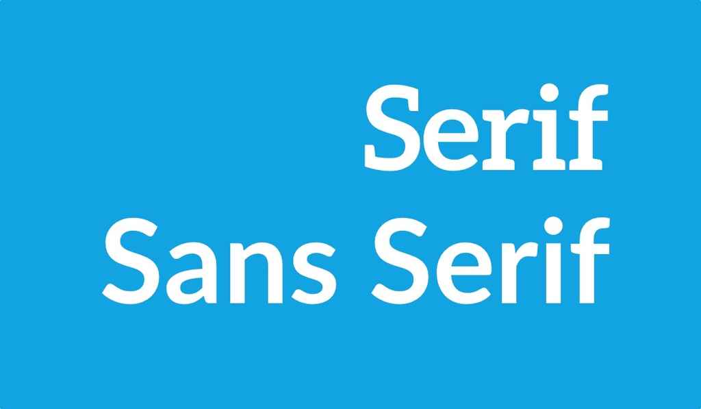 Although you may not know the serif by name, you’ll definitely have noticed these little lines or strokes coming off the end of letters in certain fonts like Times New Roman (and the modified Times font that we use here on the Reedsy blog!).
Supposedly, serifs lead the eye from one letter to the next, making the reading experience easier and less tiring — although there isn’t actually much scientific evidence in favor of this. But as a result of this theory, you'll commonly see serif fonts used for large bodies of text while 'sans serif' fonts — literally, without serifs — are usually reserved for shorter bits of text like chapter titles and headings.
All this said, humans are adaptable and your reader should be able to adjust to pretty much any font after a chapter or so. If there is a font choice that you think would really elevate or set your work apart, feel free to choose novelty over convention.
Style is still important
To draw your reader in, you’ll want a modern, stylish font that will appeal — but this is pretty subjective, so again, go with one that you like. Your font choice should also be influenced by the contents of your book. You can get a bit creative with titles and headings that capture the spirit or genre of your book a little better. Or even go all out and do something funky with the body text — as long as it makes sense for the layout of your book. Many of the so-called font rules can be broken if the situation really calls for it.
Q: What common mistakes do authors make when designing their book cover, and how can they avoid them?
Suggested answer

You don't need every aspect of your story represented on the cover! I get a lot of authors who run through a list of very specific objects, places, and characters they want on the cover, but many times that doesn't align with the best selling strategies for their genre. Depending on the genre, to capture your audience, you may want to focus on a character or two only, or perhaps one setting. But usually not all of it. The main purpose of a cover is to capture the feeling of your book, not tell the whole story. Oftentimes the cover is more of a metaphor or abstracted visual that just indicates a mood. Less is more!
Caitlin b. is available to hire on Reedsy
Nothing book cover design challenge is greater than designing a cover for one's own book. I know, having done so now for several of my own books. But I've also learned from my mistakes. Don't try to tell the whole story on the cover; be evocative, be suggestive, be provocative. Imply rather than state.
That said, it may be easier for someone who's less close to the work to see something that to them is obvious, but to you--the author--may not be.
Example: an author came to me not long ago with a request for a cover for a novel with a theme similar to that of "Leaving Las Vegas" (gambling, booze, one man's descent into an addict's inferno). Though he started of with all kinds of ideas involving liquor bottles and poker chips, the final design was purely graphic and typographic: the only image, if it even qualified, was the spade shape associated with the black Jack. Without resorting to any other imagery, the resulting cover was edgy, provocative, and (the author agreed) exactly what he really wanted, even if at first he didn't know it.
Peter is available to hire on Reedsy

The biggest mistake I see from authors when it comes to book cover design is having an overly prescriptive brief. They have a vision that they think will work and they want it done exactly like that.
It is uncommon for a piece of art or design to spring immediately from the mind. Usually, the first real interpretation of an imagined idea doesn't work. When the pencil is put to paper, the idea disintegrates. And so, you move on to the next idea, or you try a different approach.
While the initial idea might be the seed of a good design, it is not the finished piece of art; it needs time to grow. Designing any image requires a process of visual experimentation and investigation. Take the seed and expand on it using practiced visual techniques until something starts to emerge.
Experienced designers and artists know how to do this. Maybe it starts with loose sketches or notes, quick daubs of paint, clicking through font selections in photoshop. Whatever it is that the designer does, it is some sort of process that begins with an idea which evolves into a final design. This is where the life of a design comes from. Setting the idea in stone from the beginning robs it of this evolution and robs it of life.
Whenever I come across a very prescriptive brief, I usually message the author and politely ask if they are open to my own alternative design concepts or my interpretation of their ideas. If they are, it can be a rewarding collaboration. If they are not, sadly, I usually have to decline.
Alexander is available to hire on Reedsy

The biggest mistake would be not being open to input. Most people in the book world have a working knowledge of what particular books are supposed to look like. BUT, there is a great big world of book creatives out there who specialize in every single aspect of making a book. Cover design is no different. Authors and designers should ideally have an organic collaboration. Reedsy has given me the opportunity to cultivate this exact skill while working with authors.
Michael is available to hire on Reedsy

Trying to tell the whole book story on the cover. The cover needs to be simple and eye catching. The design style, like fonts colors and images, will give the hint of the story and attract the reader. Then let the blurb explain the story.
Veronica is available to hire on Reedsy

I think a lot of authors approach their cover thinking very literally about what they want to depict. Sometimes they want to create a specific scene from the story. And of course, this is normal. The author has been living these scenes and moments, imagining the characters - how they look, what they say, their gestures.
But I try to approach the cover by thinking more about themes - what essentially is your book saying? Is it a story of hope? Of bravery? Of loss? And I try to convey that over-arching theme. That way you'll achieve a timeless design that speaks to your potential readership before they've read a single word. Other times I might focus on a recurring motif that's present throughout the book. What I always try to avoid is recreate the story literally in a single cover image - that method always fails because you're trying to pack in too much information which is impossible and only makes sense once the book has been read.
Wayne is available to hire on Reedsy

One of the biggest mistakes authors often make when thinking about book cover design is focusing too much on personal preferences rather than the target audience and market trends. While it’s natural to want the cover to reflect their vision, a book cover’s primary purpose is to attract the right readers and communicate the genre and tone of the book instantly.
Robert is available to hire on Reedsy

Authors often think the cover needs to explain the book, when really it just needs to sell it.
I totally get it — you’ve poured your heart into every twist, every subplot, every character nuance. But a cover isn’t there to explain all that. It’s not the book report. It’s the billboard.
A strong cover grabs the right reader’s attention, sets the mood, and creates just enough intrigue to make them want more. It’s not about stuffing in objects and characters from every chapter — it’s about vibe, clarity, and positioning.
Think of it this way: the cover doesn’t need to tell the whole story. It just needs to make someone want to start reading it.
The job of the cover isn’t to tell the whole story. It’s to make someone want to open the book and discover it for themselves. So don't try to turn the cover into a summary of the book. Let the creative (your book cover designer) make the visual translation of why a reader needs to buy your book.
Arjan is available to hire on Reedsy
A common mistake authors make when designing their book cover is trying to make everything shout. Not every element needs to be front and centre. Part of the skill of a designer is creating the right hierarchy, so the reader’s eye knows where to go first, whether that is the title, the visual, or another key element.
Another issue is not fully understanding the market. Sometimes authors pick the wrong age group or try to make a cover that will appeal to the largest possible audience. In most genres, this rarely works. It is far more effective to focus on the target audience for the book and design something that resonates strongly with them.
Authors often love their characters and want to showcase a favourite moment from the story. While that is understandable, it may not always be the best visual for selling the book. Understanding the story, its tone, and its audience is key to selecting the right imagery and creating a cover that works both creatively and commercially.
Clare is available to hire on Reedsy

One of the most common mistakes authors make is trying to include too much of their story on the cover. A book cover cannot show every important moment, character detail, or plot point. Trying to include everything can make the design feel cluttered and can actually make it less compelling.
Instead, it is usually better to focus on a key scene, central theme, or the overall feeling of the story. We do not need to show the characters, the scar they get in chapter nine, the magical item they discover later, and every major event that happens throughout the book. Those details may be important to the story, but they do not always belong on the cover.
Another challenge is descriptive language. Different people can interpret the same description very differently. If a character has “honey coloured” hair, that could mean gold, yellow, orange, or many other variations depending on the reader. Clear communication helps ensure the final design matches the author's vision.
The best covers capture the heart of the story rather than trying to summarise the entire book.
Reece-alexander is available to hire on Reedsy
Use fonts to tell a story
For example, the novel Interior Chinatown tackles the idea of typecasting and stereotyping in the film industry. To give it the feel of a Hollywood movie, the book is written in screenplay format using Courier as the standard font.
Needless to say, this is an unusual choice for a novel — using a specific font that is often strongly advised against for book typesetting. But in the case of Interior Chinatown, Courier is a very intentional choice serving a particular purpose and contributing to the impact of the book itself. This is a prime instance in which typical font conventions can be eschewed in favor of effect.
Pro tip: Some sites such as MyFonts allow you to test samples of text in a particular font before you take the plunge and buy it. This is especially useful when choosing among very similar fonts, as you may not be able to pick up subtle differences until you see them in a larger block of text.
10 brilliant book fonts
1. Garamond
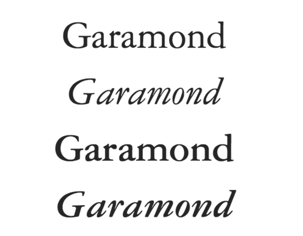 Quick fact: Styled after the work of prominent 16th-century engraver Claude Garamond, this family of fonts rose to prominence as a standard option in Microsoft Word.
If this font were a character: Garamond, a 1920s detective lurking in the shadows of a New York alleyway, waiting for a corrupt district attorney to leave a mob-connected nightclub — right at home in a suspenseful thriller.
2. Caslon
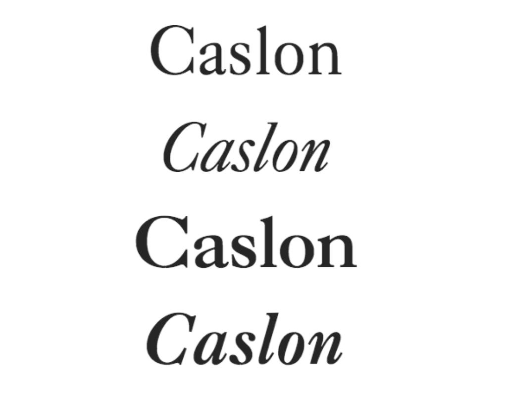 Quick fact: Caslon's designer William Caslon spearheaded the development of an English typographic style, sparking a move away from imported Dutch fonts that were common in England at the time.
If this font were a character: Caslon, a no-nonsense bespectacled professor, who still gets visits from ex-students years down the line because they feel like they owe all their success to him. Clear and reliable, Caslon is great for nonfiction.
3. Baskerville
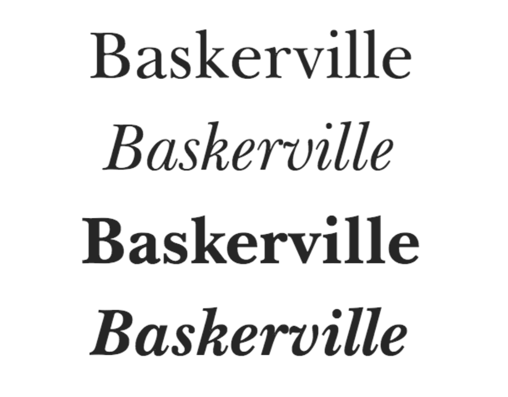 Quick fact: Baskerville was novel in the 18th century for its contrasting thick and thin strokes. John Baskerville, the creator of this font, was heavily influenced by his background in calligraphy.
Q: What challenges do you face when balancing author requests with design principles?
Suggested answer

One of the biggest challenges is finding the sweet spot between what the author envisions and what actually works visually for their genre and audience. Authors usually know their story inside out—they’ve lived and breathed it—so naturally, they want the cover to reflect every nuance. But a good cover needs to grab attention in seconds, not tell the whole story.
Sometimes that means gently steering them away from overly complex concepts or scenes that don’t translate well visually. For example, they might want to include several symbolic elements or a very literal depiction of a scene, but too much detail can overwhelm a design. I often explain that it's better to capture the mood or theme than every plot point.
Typography is another common one—some fonts an author loves just might not match the tone of the book or be readable in thumbnail size. I always try to keep them involved in the process, but part of the job is helping them see the bigger picture and how the cover will function in a real marketplace.
At the end of the day, it’s all about communication and trust. I want them to feel heard and respected, while also delivering a cover that works hard for their book.
Evgeniya is available to hire on Reedsy

As an interior book designer, my job is to strike a balance between aesthetics and functionality. A book, after all, needs to be easy for its readers to actually read, and certain designs might look really cool, but practically, be visually straining on a reader's eyes. This is especially true when it comes to font selection and line breaks.
If a client requests something that I think simply doesn't look great, I will tell them it's not my preference and why, but I'm happy to set things up how they want if they disagree. But if they request something that I know will impact readability or goes against typesetting standards, I always tell them this and explain why the readability will be impacted or why the typesetting standards are important.
I strive to work collaboratively with my clients to find ways to make their vision come true, while still staying true to design principles. Sometimes, this will take the form of compromise. As an example, some interior book designs require a lot of handiwork and end up looking gorgeous on the printed page, but fall flat in an ebook where reflowability is necessary for screen-size changes. In these cases, the extras that make the printed book "pop" are removed for the ebook.
Emily is available to hire on Reedsy

It’s my job to bring the author’s vision to life. If I think aspects of the design need to be changed, I’ll show the author alternative sketches for feedback. But ultimately it’s the author’s decision.
Tommy is available to hire on Reedsy
If this font were a character: Baskerville, lady of the manor, runs the house like a tight ship. Servants quiver under her iron gaze — but her icy exterior melts away when she sits down at her easel. Baskerville clips down the hallways of a transporting piece of historical fiction.
4. Sabon
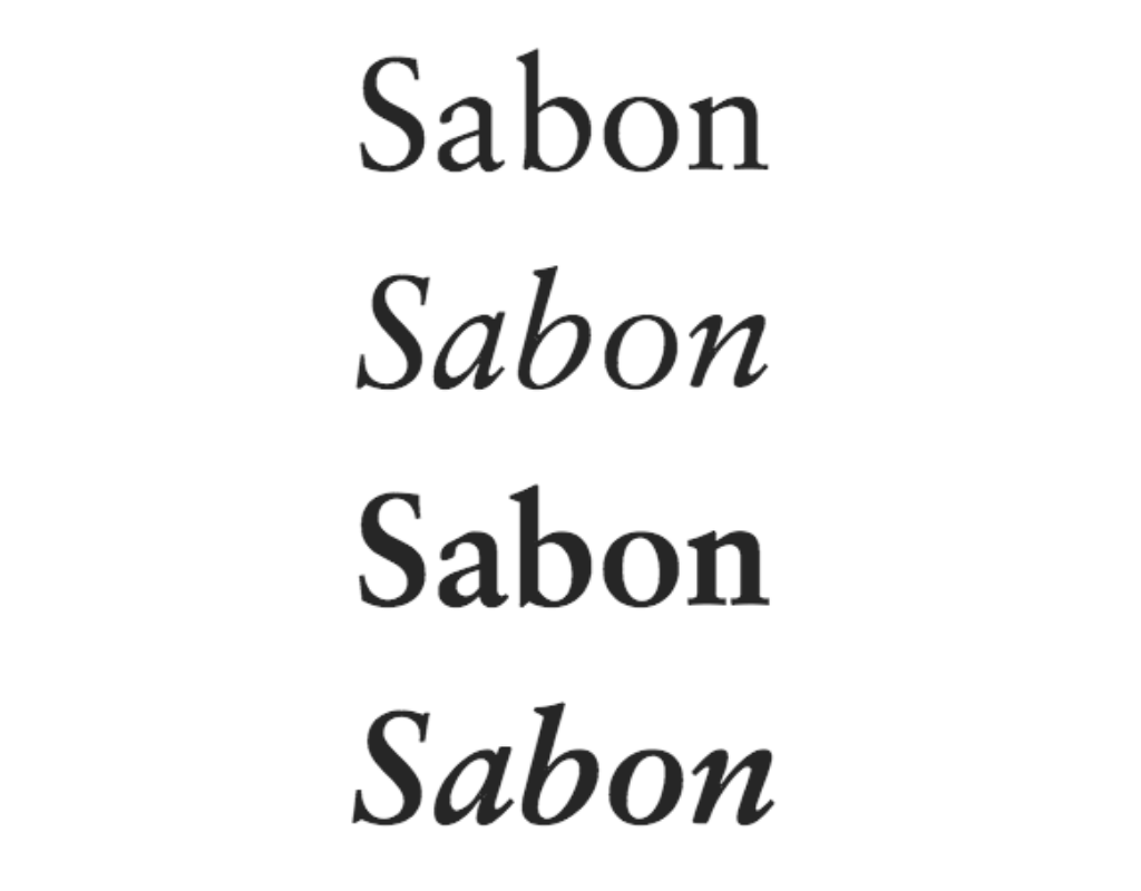 Quick fact: You may notice from the image above that each variant of the Sabon font has the exact same letter spacing (or tracking, as typographers call it). This is a consequence of limitations of the hot-metal typesetting machines used at the time of its development.
If this font were a character: Sabon, a shy hopeless romantic, steals a glance at the sweetheart who doesn’t know of her true feelings — before finally plucking up the courage to go and say ‘hello’. Hence springs a sweet and dreamy romance.
5. Dante
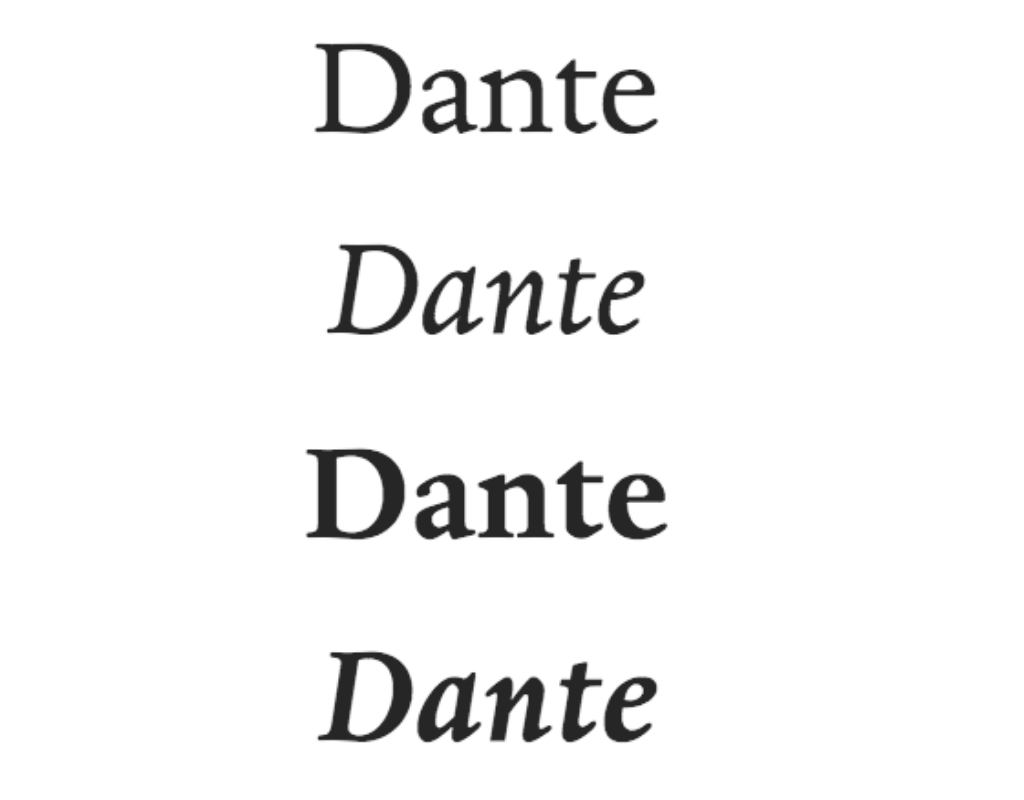 Quick fact: Dante was originally designed in the mid-20th century, for exclusive use by the Officina Bodoni, a private press admired by book collectors across the world.
If this font were a character: Dante, a mischievous teen who just pressed the forbidden big red button in the control room. The spacecraft lurches. Dante dares to take you on a rollicking sci-fi adventure.
Speaking of which, want to take readers on an otherworldly adventure? Check out our post on how to write science fiction!
6. Bembo
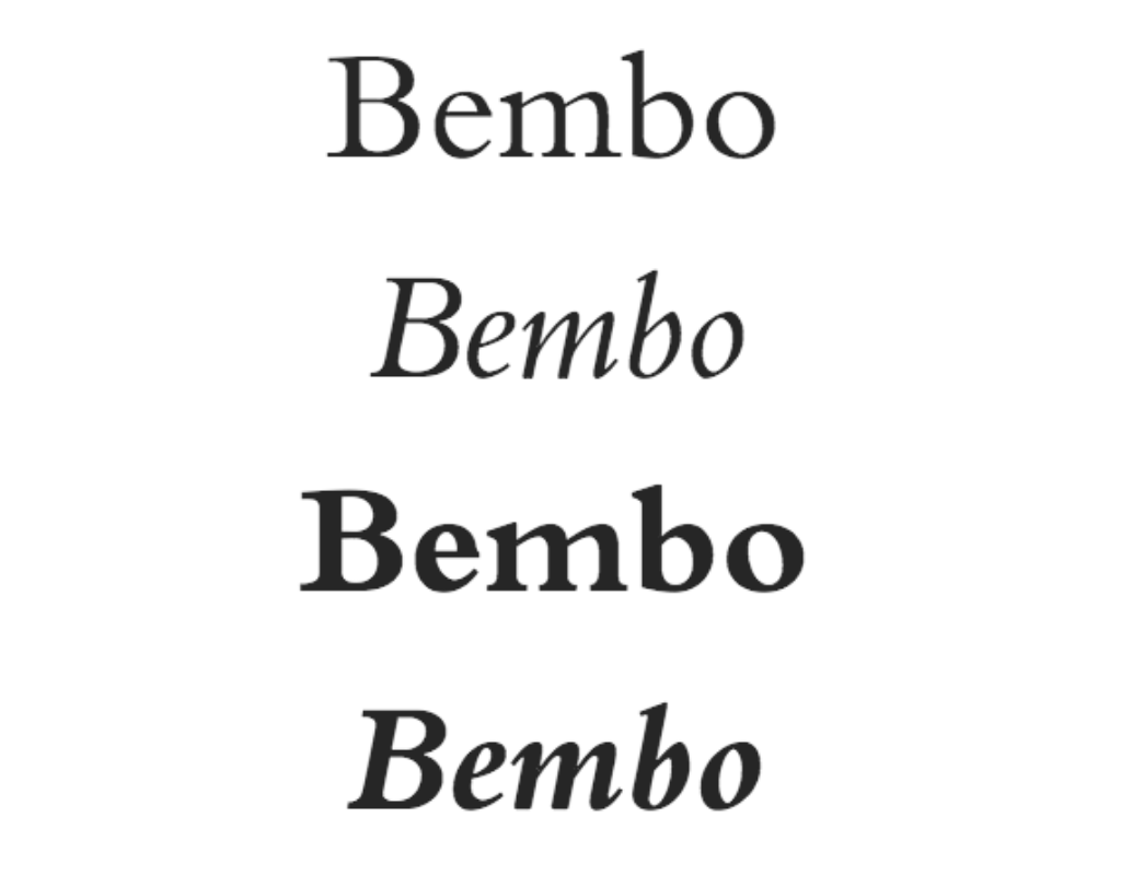 Quick fact: Unlike many typefaces which are named after their designers, Bembo takes its name from the author who first used it in publication: Italian poet Pietro Bembo.
If this font were a character: Bembo, a wanderlusting photographer dining alone in the shade of a palm tree, a third helping of fried fish already on its way — but can it truly fill the chasm inside of him? Bembo is a great choice for some evocative literary fiction.
7. Janson
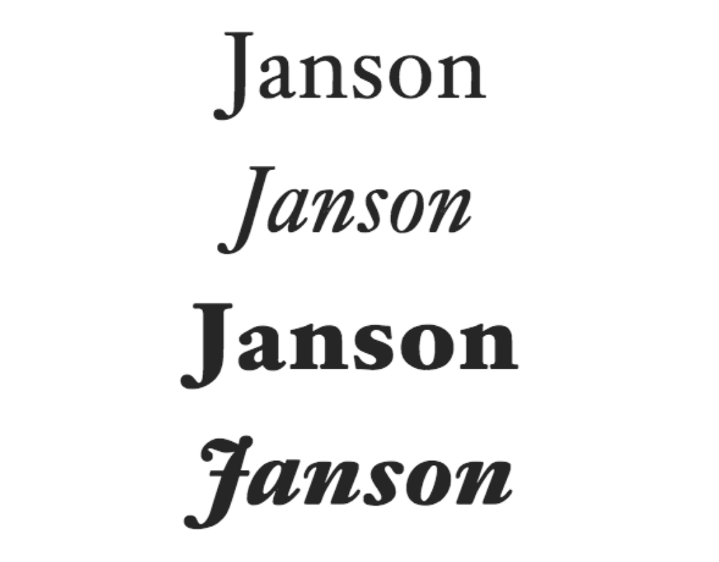 Quick fact: Although this typeface was actually designed by the Hungarian punchcutter Miklós Kis, it was originally mistakenly attributed to Anton Janson, whose name it still bears.
If this font were a character: Janson — a wise old soul who, after years living the fast life of a musician, has traded in the trumpet for a trowel, growing fruit and vegetables in abundance. Take a trip down memory lane with Janson in your memoir.
8. Bison
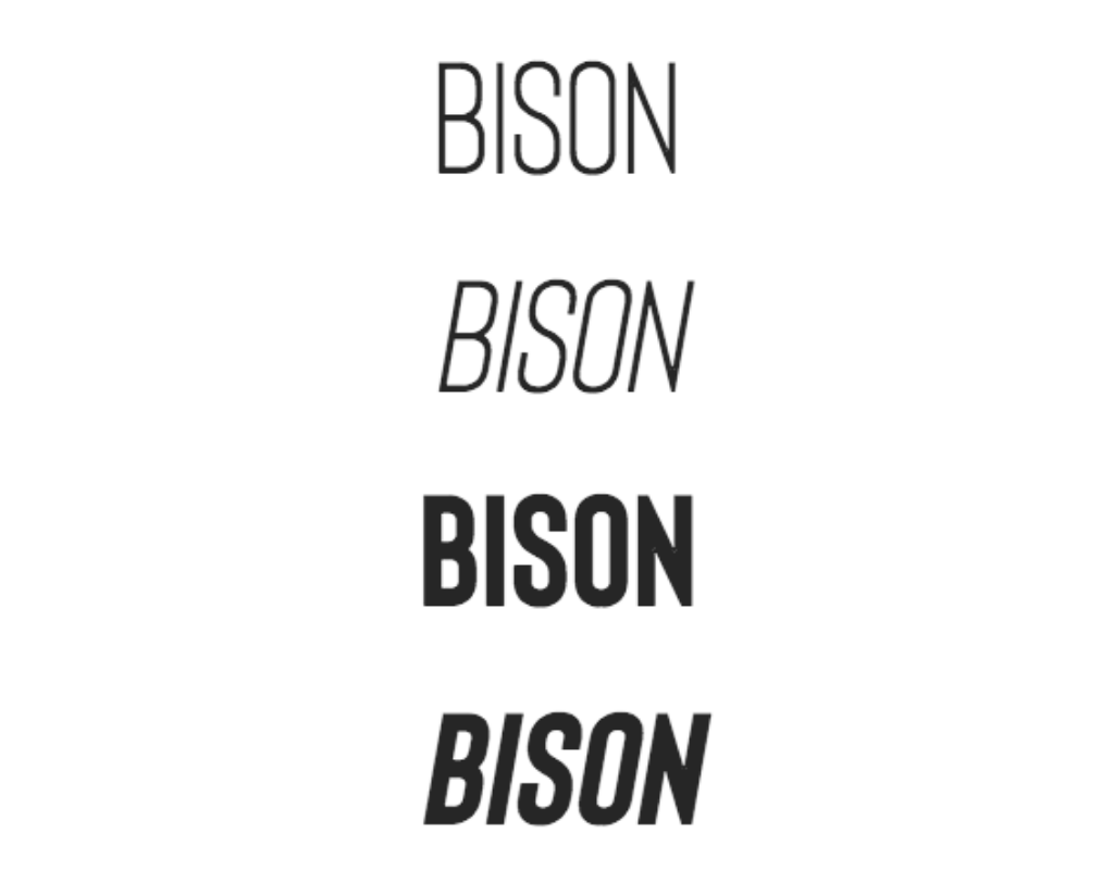 Quick fact: This all-caps sans serif font was inspired by the animal from which it takes its name. (But to be honest, we don't really see the resemblance.)
Q: How do genre-specific tropes influence book cover design, and how important are they for appealing to the target audience?
Suggested answer
Very. You want the audience to perceive the book's genre at a passing glance. A part of the design should deliver what the audience expects. But that doesn't mean you can't have fun with the design, either. Start with the tropes, and then put your own spin on them. Best case, you help to modify what audiences expect.
Michael is available to hire on Reedsy
Genre tropes are crucial in book cover design because they instantly communicate the book's category to potential readers, helping it stand out in a competitive market. By aligning with familiar visual cues while adding a unique twist, a well-designed cover can both meet audience expectations and spark curiosity.
Robert is available to hire on Reedsy
Genre-specific tropes can be useful, but I don't believe they should dictate every cover design decision. A cover certainly needs to appeal to its target audience, but there are many ways to communicate a genre beyond simply following established conventions.
Take romantasy as an example. The genre can be represented through a single rose, an elegant character portrait, a serene fantasy landscape, or a couple embracing in a dramatic scene. Each approach communicates something different while still reaching the same readership. Beyond the subject matter, factors such as colour, composition, typography, and whether the artwork is a photo composite or a painted illustration all influence how a book is perceived.
For me, genre tropes are tools rather than rules. They can provide useful visual shorthand, helping readers quickly understand the type of story they're looking at. However, if every cover follows the same formula, it becomes much harder for a book to stand out in a crowded marketplace.
The most successful covers balance familiarity with originality. They give readers enough information to understand the genre while offering something distinctive that sparks curiosity. In many cases, I think it's worth stepping outside the predefined box and exploring how far those expectations can be pushed. A cover should communicate the story and attract the right audience, but it should also have its own identity rather than simply repeating what has been done before.
Reece-alexander is available to hire on Reedsy

There will always be key visual indicators that are specific to a genre. As there will also be trends that come and go such as a particular typeface, colour or motif. It’s incredibly important to know these visual identifiers as ultimately they signal to the readers brain in a fraction of a second, much less than we process the written word, that the book is for them. The key to iconic book cover design and artwork is to know these and yet create something that sits within the genre without blending in with everything else. Think the old saying “you need to know the rules in order to break them”. That’s exactly what a designer and artist should be able to do. Create a visual that stands out but isn’t just different for the sake of it. It’s a balancing act. No one wants a cookie cutter approach to their book cover, someone that just churns out the same thing that is on every other book in the genre.
I do this by reading the book. I find out what is within the pages. I create art from the words the story. That way I’m not just looking up what typical covers look like. I’m inspired not just following what everyone else is doing. This is how we stand out, become trend setters instead of followers. We get noticed, with a cover that is truly representative of the writing , nuanced and full of visuals plucked from the pages within.
Samantha is available to hire on Reedsy

The simple answer is yes. Genre-specific tropes are important in book cover design. At the same time, it’s important to be aware of the risks they can bring.
Book cover design needs to make a book both accessible and marketable, while also helping it stand out, create an emotional impact, and reflect the uniqueness of the story itself. For that reason, both designers and authors should be aware of market trends and genre-specific tropes, but we should also actively avoid clichés and aim for innovation rather than producing covers that feel like copies of what already exists.
I believe books should be understood within the broader framework of their genre, while also being treated as unique works that express something found only within their pages. Conventions can be very useful, and breaking them can be equally important. A good designer or artist should know how to do both and how to find the right balance between the two.
Barış is available to hire on Reedsy
If this font were a character: Bison, a large and in-charge CEO, feet propped up on the desk, looking out across the city from the 90th floor. Bison brings a sleek and confident touch to headers and titles.
9. Captain Comic
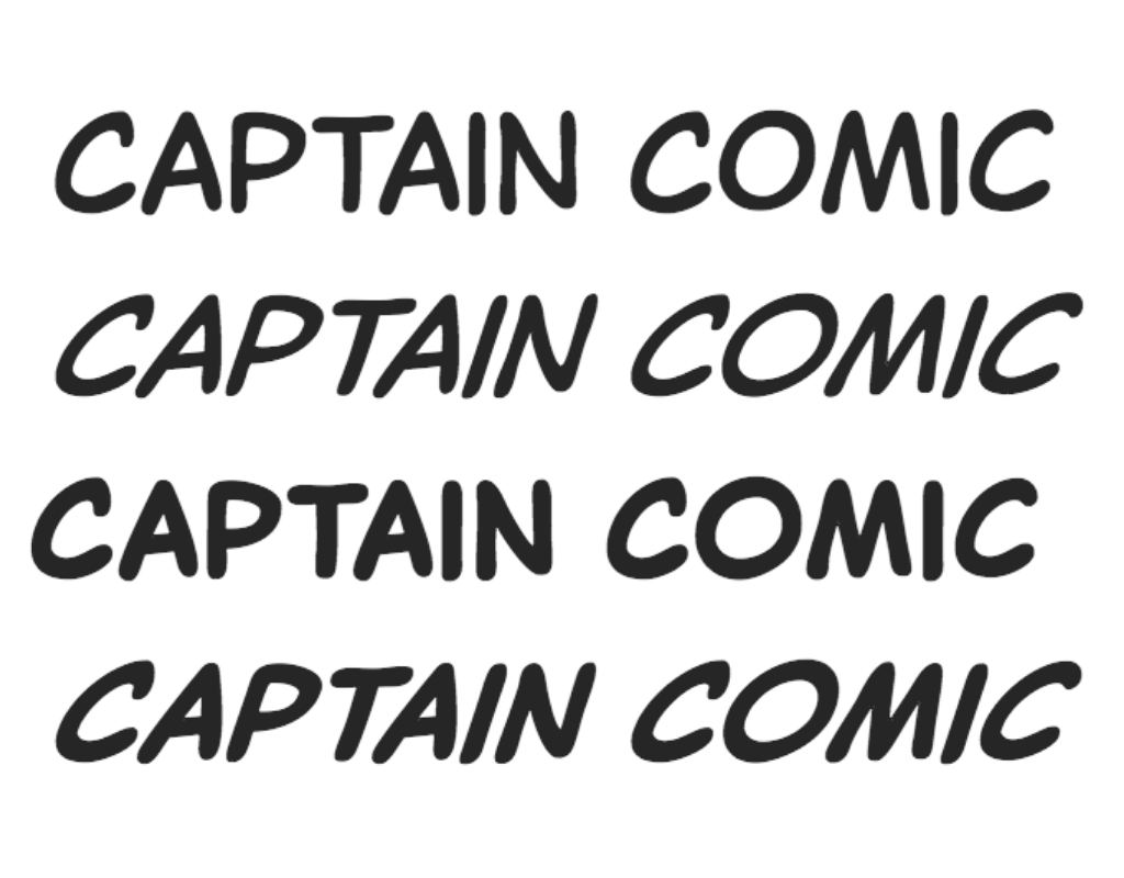 Quick fact: Clearly inspired by the lettering style found in the pages of comic books, Captain Comic is the sophisticated older sister of Comic Sans. Use with caution!
If this font were a character: Captain Comic, a dauntless hero, scales a clocktower in the dead of night — aware of what danger could await at the top, but fearless nonetheless. Captain Comic reigns supreme in an action-packed graphic novel.
10. Pequena Pro
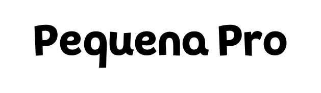 Quick fact: Pequena Pro was designed in 2016 by Rodrigo Araya Salas and supports both Roman and Cyrillic alphabets. (Look, these quick facts can't all be winners.)
If this font were a character: Pequena Pro, a talking hippo, is on the lookout for food (as always) when she comes across a family of meerkats stuck on the bank, and offers to help them cross the river. Pequena Pro is delightful for a picture book.
How to access book fonts
The simplest way to get your hands on the most suitable fonts for your book is to work with a professional typographer. They will have access to font libraries and many of these experts can even create bespoke typefaces, should your project call for it.
🤩 The best typographers are on Reedsy

Milica S.
Hey! I'm Milica, a book design pro with 8+ years of experience. I transform raw text into shelf-ready masterpieces!
Request a quote
Peter S.
I'm an award-winning book cover designer, with Simon + Schuster, The New Yorker, Forbes, university and independent presses among clients.
Request a quote
Oliver B.
With over 20 years of experience in graphics, I've always been passionate about design and truly immersing myself in every project.
Request a quoteBut if you take the DIY approach to formatting your book, then you’ll need to get hold of fonts yourself. Here’s what to know if you’re taking this route:
You don't buy a font, you license it. If you're going to be printing physical copies as well as publishing ebooks, you need to confirm that the font can be used in print and not just in digital work (which some are).
Q: How does a professionally designed cover impact the success and sales of a self-published book?
Suggested answer
I think it determines in most cases whether or not the book gets sold. Either consciously or subconsciously. Part of my job as a designer is understanding marketing and trends. I look at book covers, LOTS of book covers. And take notes. Personally I don't think I'd buy a book with an unprofessional cover. If the author didn't take the cover seriously, then what's to say the story is any better? Is this project something they just typed up and published on a whim? Or is it something they really believe in and want to make the best product possible?
Michael is available to hire on Reedsy
A professional cover plays a huge role in the success of self-published books because it’s the first thing people notice. It gives your book credibility and helps it stand out, making it look just as polished as those from traditional publishers. A great cover not only grabs attention but also sets the tone for your story and appeals directly to your target audience. In a crowded market, it can be the difference between someone scrolling past or deciding to give your book a chance.
Robert is available to hire on Reedsy
It's an enormous impact. I would say it's the single biggest factor in whether your book sells. When I see a cover that looks amateurish, I subconsciously assume that the writing is probably going to be at an amateur level as well. It's as simple as that. I always judge a book by its cover. The book may be the greatest work of the new century but if it is packaged in a way that communicates carelessness or lack of attention, then that has huge repercussions for the reputation of the work and the respect that it needs in order to sell.
Just go into any book store. Look at the new released that are elegantly designed. You immediately assume that its worth reading because the author, the publishers, everyone deemed it worthwhile to invest time in producing. That assumption is critical in getting your work out to a new audience. Humans are visual creatures. Otherwise, art, advertising, TV, the internet, social media, none of that would need to exist.
Wayne is available to hire on Reedsy
First impressions count. An eye pleasing cover ensures that the book gets picked up in the first place!
Tommy is available to hire on Reedsy
Fonts come in bundles. Quick switch to typography terminology here — to use all fonts of a certain typeface (for example Caslon Regular, Caslon Bold, and Caslon Italic) you need to buy the whole family of Caslon fonts, either individually or as part of a bundle.
Free isn't always good. Free font download links can sometimes carry viruses. Also, bear in mind that the individual offering the free font might not actually have the right to distribute it — and there could be consequences for using them.
On that note, here some trustworthy sites that offer both free and paid fonts:
Paid:
Free:
⚠️ Whether you download your fonts for free or purchase them, make sure to read the Terms and Conditions carefully so that you understand exactly what you are and aren’t allowed to do with them.
All fonts have a time and a place — yes, even Comic Sans — but that place may not be in your book. As you undertake this critical selection process, make sure that you’re thinking about the specificities of your book and precisely what you want your font to achieve.