Posted on Nov 11, 2026
2026 Book Cover Trends: Paintings, Acid Colors, Bold Type & More

Dario Villirilli
Dario Villirilli is a senior content marketer, editor, and SEO strategist with many years of experience in publishing. He is Managing Editor of the Reedsy Blog and has also written for IngramSpark, ProWritingAid, Written Word Media, and PublishDrive.
View profile →
Book cover design trends come and go. They surface, get overused, fall out of fashion, and return years later in slightly different clothes. Gilded frames, bold typography, painted portraits — designers have been adapting these ideas for decades.
Today’s covers need to do more than stand out in a physical bookstore — they also need to look enticing on a digital storefront, and grab attention in a fast-moving social media feed. Several of this year’s trends celebrate handmade texture, visible brushwork, and deliberate imperfection — qualities that carry new weight in an age of AI-generated images.
Here are seven trends defining book cover design in 2026 and why they work, with examples from major publishers and self-published books with covers made on Reedsy.
Discover talented designers

Tim B.
I am a cover designer/illustrator with over 20 years experience having worked with Penguin, LittleBrown, Harper Collins, Faber and more.
Request a quote


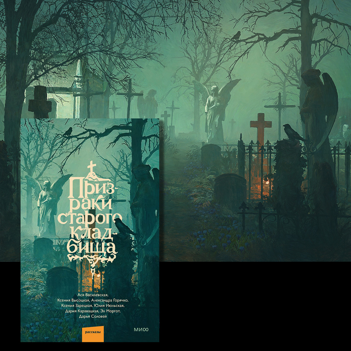
Alexander N.
Professional illustrator with a passion for cover design. I create unique, vibrant art for independent writers and publishers worldwide
Request a quote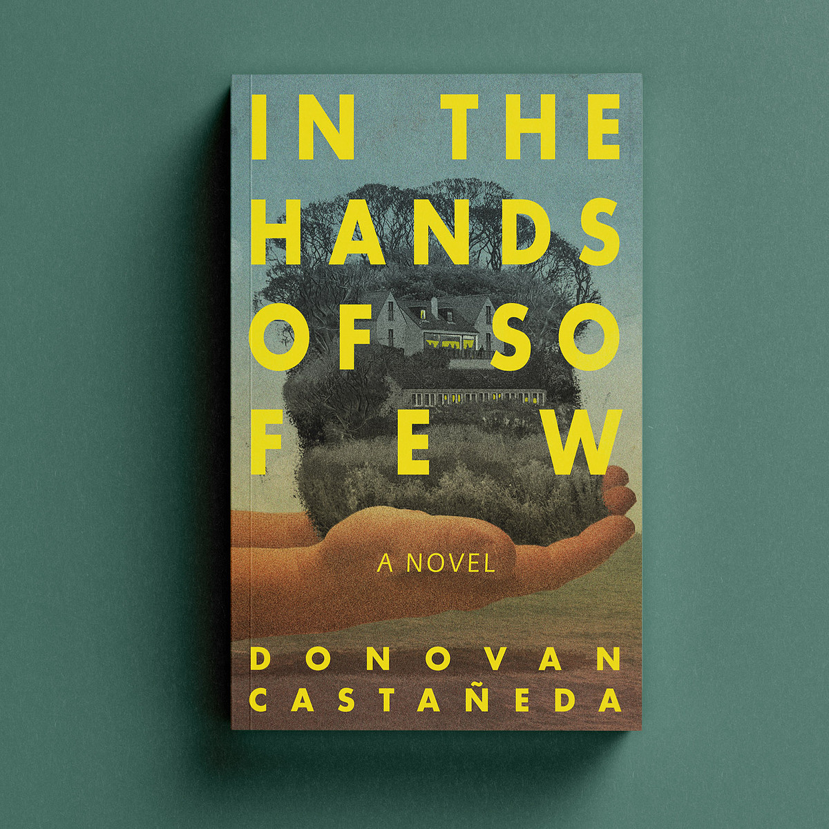

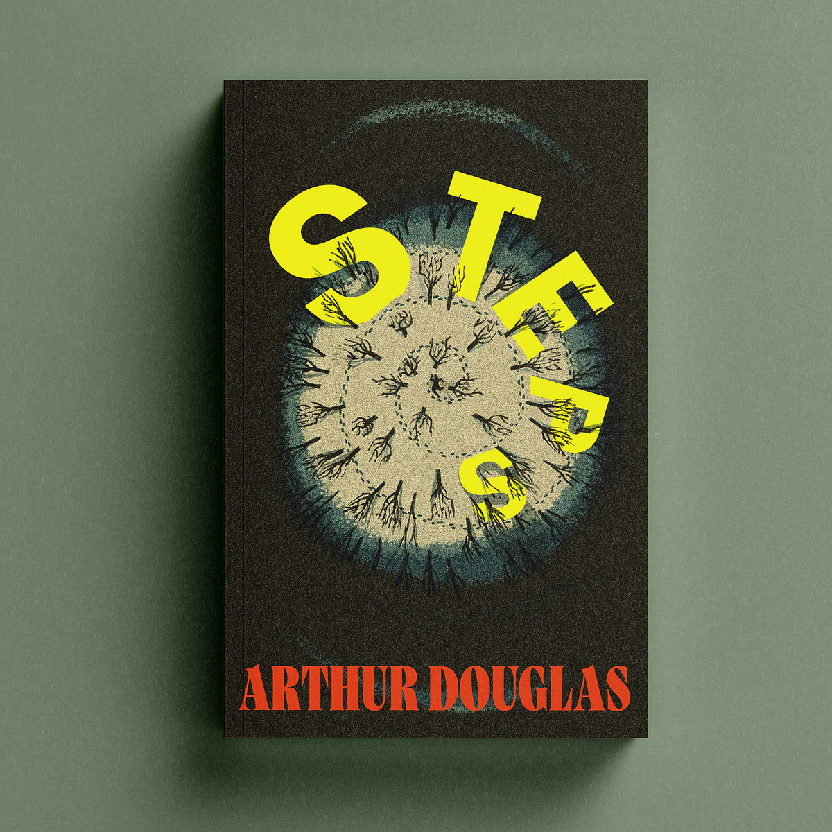

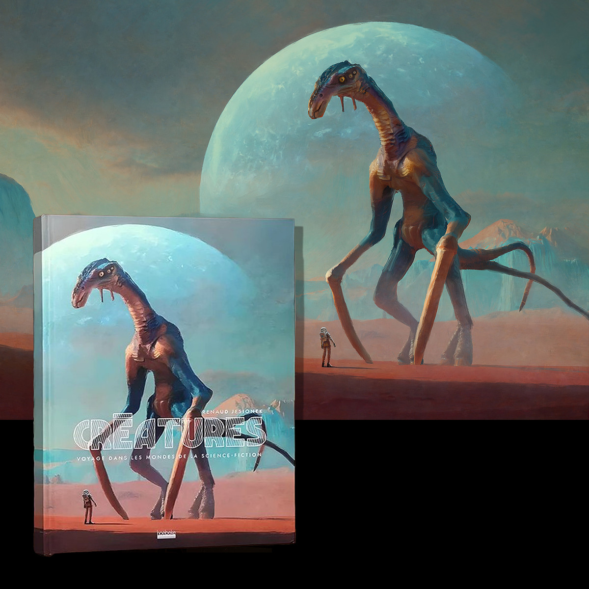
Maxim M.
I am professional digital artist and illustrator specialized in book covers design and illustrations with over twenty years of experience.
Request a quote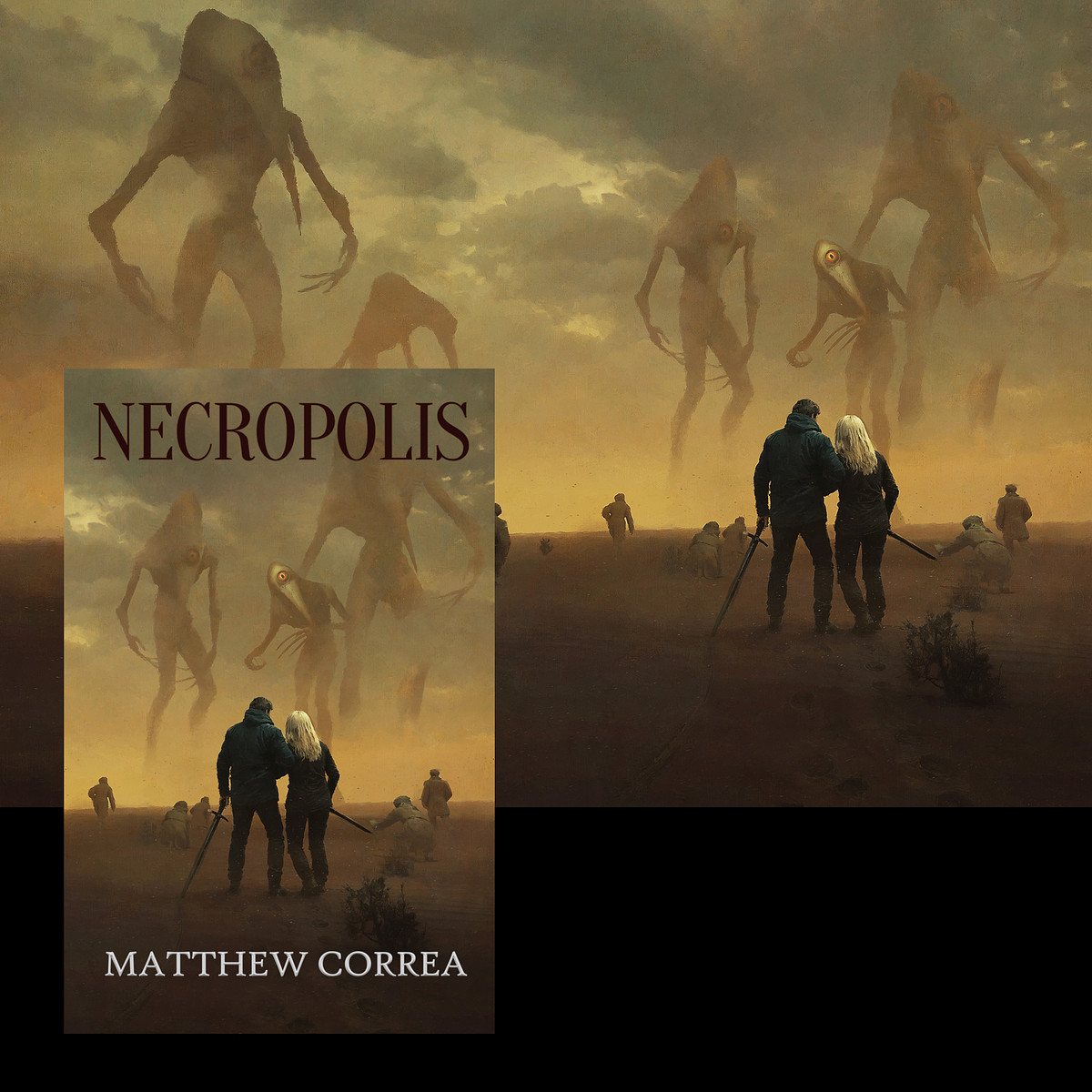

1. Painterly and classical-art energy
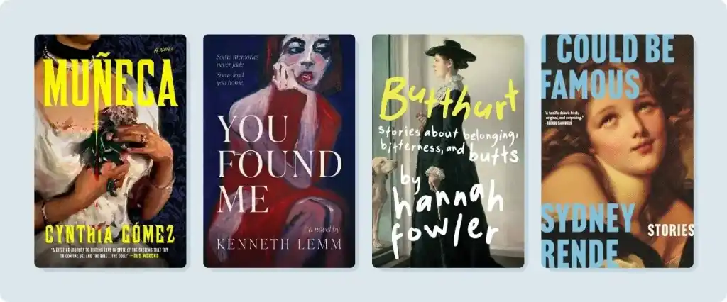
After years of flat vectors, smooth gradients, and immaculate digital finishes, paint is back. Think visible brushwork, canvas texture, and, in many cases, actual paintings — often topped with modern typography. A painterly style can give a cover a sophisticated, emotional feel, while playful type adds a fresh, fun contrast.
Butthurt is the clearest example: a stately Victorian portrait with the title scrawled across it by hand in yellow and white. Muñeca places yellow type over a painted Gothic scene, while I Could Be Famous pairs a tightly cropped Rococo portrait with vibrant, colorful block text. But a cover doesn’t need an old artwork to capture the effect. You Found Me uses loose brushstrokes in navy and red to create a similarly classic feel.
This trend has been growing over the past few years, perhaps in response to the flood of AI-generated covers. Perhaps it will open a door for a bold, vibrant new generation of painters.
2. Neon pink and green
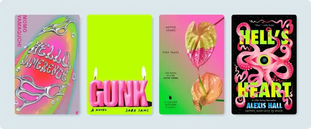
Acid green and electric pink have become the loudest palette in publishing. This pairing holds its own through compression, on poor-quality phone screens, and at thumbnail size. Plus, they’re just cool to look at.
Gunk commits hardest: a flat chartreuse field with the title in fat pink letters. Hell’s Heart pushes neon green type against black and hot pink, while Fish Tales takes a gentler route, letting green bleed into pink behind a single anthurium. Hello, Limerence renders its lettering in molten chrome over an iridescent blob, leaning into both Y2K-era nostalgia and modern digital surrealism at once. They are all unmistakable at any size.
3. Big, bold titles
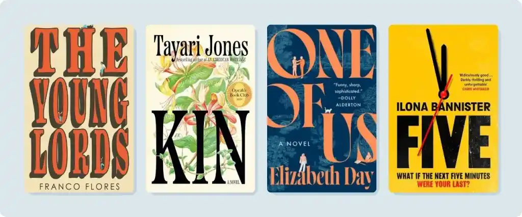
When a cover is likely to be seen on a small screen, letting the title take up more than half the space can be a powerful strategy. This trend pushes type to the edges of the cover, weaves imagery into the background, and trusts the letterforms to carry the design.
The Young Lords fills almost the entire cover with stacked vintage serif capitals. Five places a heavy slab-serif title beneath a clock face. One of Us lets its letters run right off the edge. Kin offers an especially elegant approach: John Gall’s design threads honeysuckle blooms through and behind the letterforms until the two become one. The flowers also evoke the novel’s setting: the town of Honeysuckle, Louisiana.
With more headline fonts available than ever, designers have an ocean of possibilities to explore.
4. Typography becomes the image
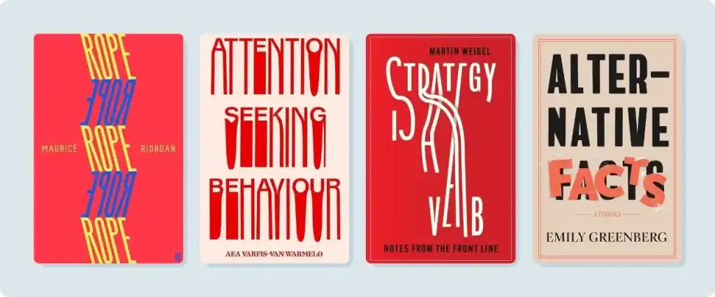
This trend takes big titles a (playful) step further: the letters become the image, stretched, rearranged, and transformed into something for viewers not just to read, but to contemplate.
Rope repeats its title down the cover in alternating blue and yellow strands that twist around each other. Attention-Seeking Behaviour lets its letterforms sag and drip to, well, catch your attention. Strategy Is A Verb pulls its letters into formation, while Alternative Facts uses layered, slightly misaligned type that covers the original font — a fitting choice for a book about things that aren’t quite true. In each case, the type isn’t supporting the design. It is the design.
5. Sharp, intentional minimalism
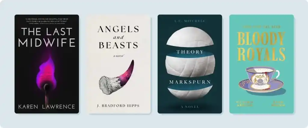
Minimalism never really goes out of style, thanks to its sharp, intentional designs. A flat color, plenty of empty space, and a single object in the middle — often with a subtle twist — can convey layers of meaning.
The Last Midwife is the clearest example: a lit match on a black background, its flame shaped like a pregnant woman. Angels and Beasts isolates a single horn, rough and monochrome for the beast, and faintly ethereal for the angel. Theory Markspurn places a volleyball cracked into three against a deep teal backdrop, hinting at the darkness lurking beneath sports ambition. And Bloody Royals sets a gilded teacup against a flat seafoam background, dripping with blood and murderous gossip.
These concepts are like little oases of genius in our crowded feeds.
Q: How did you experiment to discover your book cover design style?
Suggested answer

I’ve always strived to improve and provide my clients with the best artwork I can create, experimenting with different techniques and approaches along the way. Funny enough, there was a time when I worried I didn’t have a recognizable style — and maybe I still can’t claim that 100%!
Over time, though, my work naturally evolved. By focusing less on “having a style” and more on honing my craft, my covers became more polished and personalized without me even realizing it. That process of experimentation and growth is really what shaped the style I use today.
Alexandra is available to hire on Reedsy

My answer to this is very simple: by only designing covers that I myself enjoy looking at. Whatever the project or genre, whether the design calls for something quiet or aggressive, literal or poetic, always end up with a design that pleases YOU: that would make you want to pick the book up off a table whatever its subject or genre.
Please yourself, and in doing so you will find that, while your range of projects may be great and the covers you've designed for each of them are very different, are certain tendencies and choices that unite, making them part of the same big family with all its nephews and second cousins. There is a signature there.
So rather than having experimented to discover a style, I simple followed wherever my tastes lead me given the book's needs.
Peter is available to hire on Reedsy

I experimented by taking on diverse genre projects, playing with different digital manipulation techniques, exploring typography pairing, and refining how I merge custom illustration with clean layouts until I found my signature aesthetic.
Jacob is available to hire on Reedsy
6. Glitch, melt, and pixel stretch
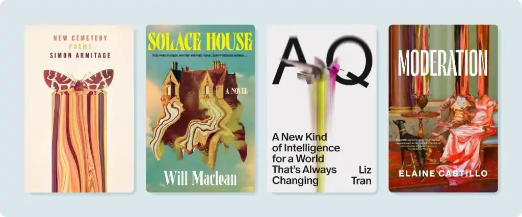
One of the most eye-catching trends in modern cover design is the pixel stretch, in which part of an image is pulled into long vertical streaks. The effect suggests a disruption of reality, identity, or time — or perhaps all three.
AQ dissolves a hummingbird into a ribbon of color that stretches down a white cover. New Cemetery pulls the lower edges of a moth’s wings into long, colorful trails. Solace House melts an entire house (and its nested portrait) into drips, while Moderation crops and smears Vittorio Reggianini’s painting Admiration to create a glitchy effect.
This kind of distortion is hard to miss on a shelf.
7. Ornate frames and gallery portraits
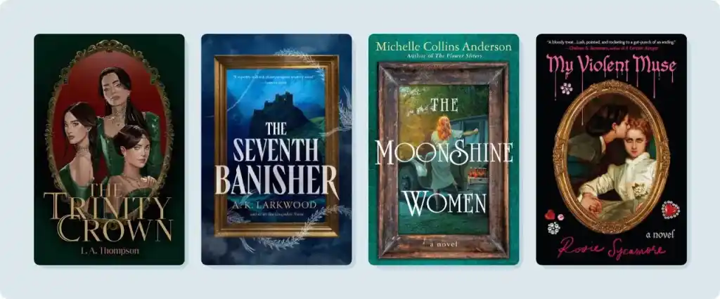
This is the oldest device on the list, and the one enjoying the most obvious revival: a decorative frame with a striking portrait or scene resting within. The frame turns the reader into an art gallery attendee, adding distance, voyeurism, and a sense of mystery to the arrangement. It’s a natural fit for Gothic, historical fiction, and dark romance.
The Trinity Crown places three sisters in a gilded oval against deep green. The Seventh Banisher hangs a crumbling fortress in an ornate gold frame, its single lit window the only warmth in a sea of bruised blue. The Moonshine Women uses a distressed wooden frame, giving the book a distinctly time-trodden feel. And My Violent Muse frames Auguste Toulmouche’s The Reluctant Bride in ornate gold against a black backdrop, with eye-catching pink script bleeding above it.
Each one looks like it could belong in a museum as well as on your bookshelf.
Bonus trend: Conceptual design
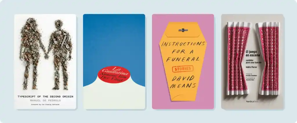
Conceptual design has existed for years, yet it remains remarkably underrepresented in modern cover design. In an era where image generation tools make it possible to create almost anything, bold, abstract designs stand out amongst the crowd. By turning everyday objects into visual metaphors, these covers feel daring, intelligent and distinctly counter to the mainstream.
Typescript of the Second Origin — a story about rebuilding a devastated world, featuring a new Adam and Eve — constructs the silhouettes of its protagonists using the remnants of the destruction. La Guillotina (The Guillotine) makes striking use of a character’s severed neck to display the book’s title and author. Instructions for a Funeral transforms an envelope containing instructions into a coffin. El Juego en Escena (The Play on Stage) utilizes two playing cards, folded accordion-style, to mimic a theater curtain parting slightly to reveal the book’s title. Try do that, machine!
Some of these trends will continue into 2027 and beyond. Others will fade as they become too familiar, or shift as the way readers discover books changes.
One thing seems certain: the tension between AI-generated and human-made covers will continue to play out as authors, readers, and designers alike lean more strongly in one direction or the other. We’ve seen this in our own data. Among the 13,000 cover briefs authors sent to our designers in 2026, nearly four times as many explicitly requested no AI-generated artwork compared to 2025.
Ultimately, great covers will do what they have always done: catch a passing eye, promise an unforgettable story, and sell the book. If you’re looking for a cover of your own, or want more ideas and examples, visit our book cover gallery to see more amazing work from our talented designers.
Q: What should I look for in a book cover designer’s portfolio?
Suggested answer

Personally, when I look at a designer's portfolio, I'm less interested in whether every cover is beautiful and more interested in whether each one feels right for the book. A cover can be stunning, but if it gives readers the wrong impression about the story, it's not really doing its job.
One thing I often ask myself is: if I came across this cover on Amazon or a book store, would I immediately know what kind of book it is? A good thriller, fantasy, or romance cover usually gives you that sense straight away.
I also like seeing some range in a portfolio. Every book brings different challenges, so it's always a good sign when a designer can adapt their approach instead of applying the same formula to every project.
Sandra is available to hire on Reedsy

Besides skill, style, and craft, I think what some authors may not realize is that a designer's portfolio is not a showcase of all their projects. A cover designer's portfolio is also (typically) a collection of their favorite projects. This is helpful to keep in mind as you scroll. If a cover designer doesn't have, for example, any romantic comedies in their portfolio, it doesn't mean they're not capable of doing them. The omission of work is just as important as the inclusion. In other words, it's probably better to seek a design from someone who has examples of work in your genre. There's a better chance of scoring a designer who is truly passionate about the genre and is more personally invested in the collaboration.
Alex is available to hire on Reedsy

When looking for a cover designer, there are a multitude of factors that you could consider. How many covers do they have, how much time do they take, etc., but I think there is one important factor that supersedes them all. You need an artist who's portfolio reflects the style or feeling you're trying to achieve with your cover.
I would suggest first trying to decide what you want your cover to look like. Search out examples and styles of covers that you love and think would fit your book. Once you've settled on the general direction, its time to start your search for an artist.
Look at the artists portfolio and see what consistencies pop up. For me, my art tends to be colorful, painterly, and very illustrative. I also lean into fantasy tropes, and enjoy landscape painting. I occasionally have people come to me with requests that don't really match my art style, and often have to decline to help. I'm not saying no because I can't do it, but rather because I know my heart wouldn't be in the process and I know there would be a better fit out there.
As an illustrator, I do my best work when I'm creating the work I'm passionate about. So, I think finding someone who gets excited about the style you'd like to achieve is the most important factor in searching for your artist.
Matt is available to hire on Reedsy