Last updated on May 13, 2026
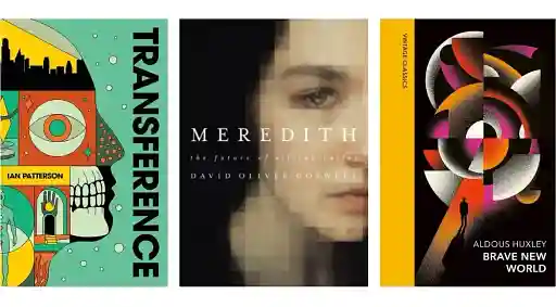
Book Illustration: 25 Beautiful Examples
Dario Villirilli
Dario Villirilli is a senior content marketer, editor, and SEO strategist with many years of experience in publishing. He is Managing Editor of the Reedsy Blog and has also written for IngramSpark, ProWritingAid, Written Word Media, and PublishDrive.
View profile →We all remember the illustrations of our childhood reads — the wild scribbles of Quentin Blake, the gentle watercolors of Beatrix Potter, the simple line drawings of Shel Silverstein. Many book illustrations become as iconic as the stories they accompany.
But book illustrations span further than picture books. To give you a sense of the myriad styles out there, we’ve gathered 25 stunning examples from illustrators in the Reedsy community — including fantasy illustrations, comics, and more. Whether you’re planning your own visual project or just want to browse a gallery of gorgeous work, dive in.
Browse professional illustrators

Ed S.
Available to hire
Hi, I'm Ed and with 30 years of publishing experience as a designer, illustrator and art director, I'm looking forward to working with you!

Michael R.
Available to hire
Internationally recognized book designer in both fiction + non-fiction, incl. Penn Press S+S Harlequin PRH Hallmark Harper and Sourcebooks.

Shaun F.
Available to hire
Artist and Illustrator, I love creating compelling worlds full of natural forms, expressive figures and creatures both real and fantastical
Children’s picture books
Let’s begin with picture book illustrations, ranging from cozy domestic scenes to wild adventures.
Ravan S.
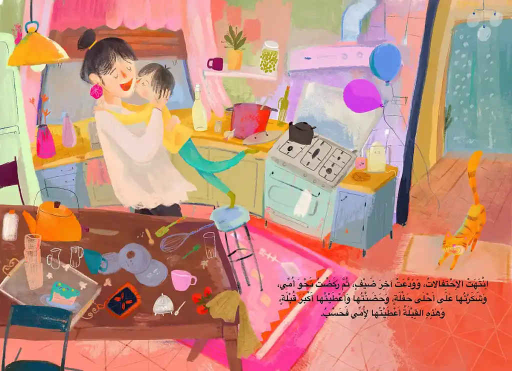 Ravan S. works in acrylics and watercolors with visible energy — her loose, textured brushstrokes make the scene above feel kinetic. Here, she captures a rush of warmth: the child’s leap, the mother’s laughter, the kitchen still cluttered with the evidence of a good celebration. The soft, warm color palette radiates domestic happiness, and there are small rewards for attentive readers too (like the orange cat slipping in quietly on the right).
Andreea C.
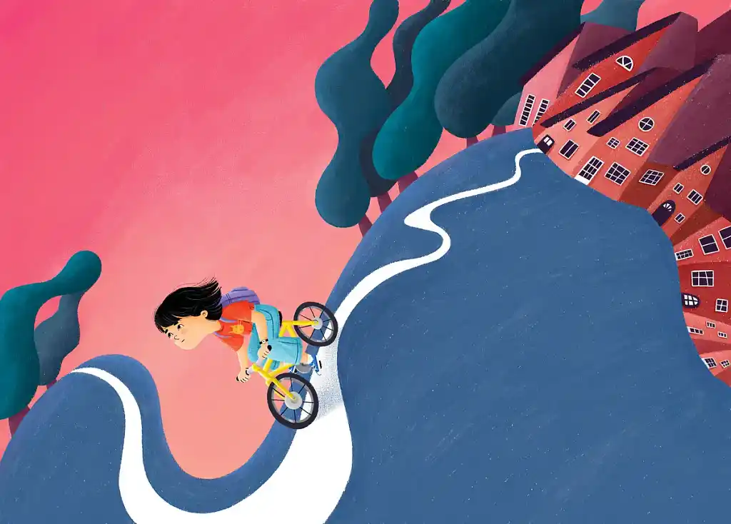 Andreea C. is a confident designer of space, as this illustration shows. Built around a single sweeping road that snakes through the image like a ribbon, it pulls the viewer’s eye from the buildings on the right to the bottom left. The girl on her yellow bike is diminutive against the landscape — which makes her feel all the more determined for it. The innate emotion of this scene makes the design work; the curve of that road tells you everything about the journey ahead.
Check out Andreea’s portfolio.
Zixiao C.
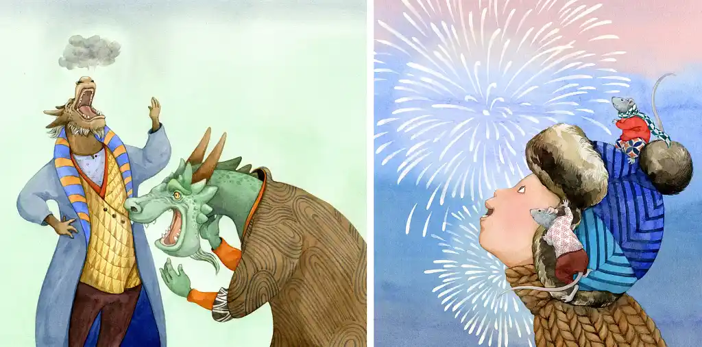 Zixiao C. blends traditional and digital methods, for results that feel hand-made regardless of the exact process. These two illustrations capture her range well. On one side, pure comic theatre — two extremely fashionable dragons sharing a laugh. On the other, a boy in a fur hat watching fireworks, two mice perched on him like passengers, each dressed for the occasion in their own miniature knitwear. Tiny details, enormous charm.
Q: Where do you go to for inspiration on illustration projects?
Suggested answer
![]()
The manuscript serves as my primary source of inspiration. The characters, locations, and plot all influence the choices I make as an illustrator. A story filled with fun might suggest the use of bright colors, while a narrative centered on loss or grief may require soft, muted tones. If the setting is a jungle, a green palette would be fitting, whereas a story set in the city might demand tall buildings.
As I read through each manuscript, I take notes. My vision for the illustrations is shaped by my personal experiences. As a children's book illustrator, I tap into my childhood memories to visualize each page, which may differ from the author's own experiences. This is where the author’s vision and my vision as an illustrator merge, creating something greater than ourselves.
At some point, I have to sit down and start working. For instance, if the story is about a child dreaming of flying to the moon, I’ll explore various picture books on similar themes. I examine the colors they use and how they represent space and rocket ships. If you don’t have an extensive picture book library, you can visit websites that showcase other illustrators’ work. When I first began, I maintained a large library of reference material, tearing out images from magazines and organizing them in folders within a filing cabinet. This has since evolved to using Google image searches. Recently, I've relied less on Google as more search results are AI-generated.
Many artists find inspiration by keeping sketchbooks, they sit in a park to sketch what they see each day. This practice sharpens your observational skills, which you then bring into your illustrations.
Ultimately, artists are great collectors. We examine the work of other illustrators, observe the world around us, and repurpose those images into something new.
What inspires me may not inspire you. I know illustrators who find motivation in art galleries or through travel. Personally, I enjoy watching movies and taking note of how directors frame their scenes. Illustrating a picture book is much like storyboarding a movie, so I pay attention to the different camera angles they use and consider how I can apply that knowledge to my next project.
I hope this helps
Vaughan
Vaughan is available to hire on Reedsy
I find resources such as Pintrest to be hugely helpful. I can file away reference and inspiration in folders relevant to each project. I also use googledrive to save images and screenshots from things I see. I also keep an extensive photo library from my travels.
My main expertise is Picture Books, So I keep a large collection (shared with my four year old) of books and refer to them often. This is a good way to learn how to make a picture book but I have to emphasise, not to copy, just for things such as composition ideas, how to use light and dark, how to place text etc, the technical stuff. As an Illustrator of many years, I have confidence to draw almost anything, this comes from experience, I know how to draw a subject, how to frame that across 28 pages is the tricky (but fun) part.
Rich is available to hire on Reedsy
My inspiration comes from a diverse range of sources that extend far beyond the publishing world. While I regularly study current book cover trends on platforms like Goodreads and Amazon, I also draw inspiration from classical art, contemporary photography, film posters, and even fashion design. This broad approach helps me bring fresh perspectives to book illustration.
I maintain an extensive digital library of visual references, regularly updating it with screenshots of interesting designs, color combinations, and compositional ideas. Social media platforms like Pinterest, Instagram, and ArtStation provide continuous inspiration, while also helping me stay current with emerging design trends and techniques.
Most importantly, I find inspiration in the stories themselves. Each manuscript provides unique opportunities for visual interpretation, and I often find that deeply understanding the author's narrative leads to the most innovative and effective cover designs.
Sergey is available to hire on Reedsy
Dali W.
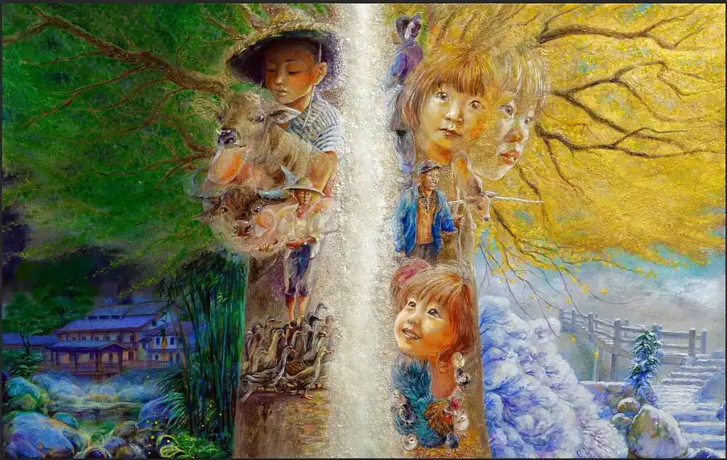 Dali W. stands apart from other illustrators with her surreal and intricate compositions. A glowing waterfall bisects this image like a seam between worlds: lush summer vs. a golden autumn that soon surrenders to winter. To the left, a farm boy cradles animals and fireflies flicker near a traditional house; to the right, children’s faces look onward and upward. In each section, people and animals emerge from — and dissolve back into — the landscape itself, as if memory and place have become the same thing.
Ilaria C.
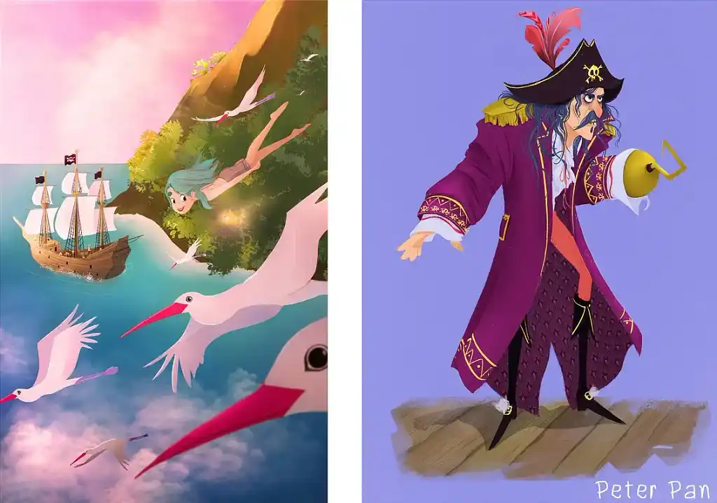
Both of these images come from the world of Peter Pan, showing how Ilaria works two registers within the same story. The first scene is all atmosphere: a teal-haired Peter Pan dives above a tropical island, the whole thing drenched in dreamy soft pinks and lavenders. The Captain Hook portrait is a proper character design, every detail of his purple-and-gold coat considered, his expression pitched between menace and absurdity. What links them is a polished fluency that’s almost animation-adjacent — you could imagine them as frames from an independent studio’s adaptation.
Yuliia Z.
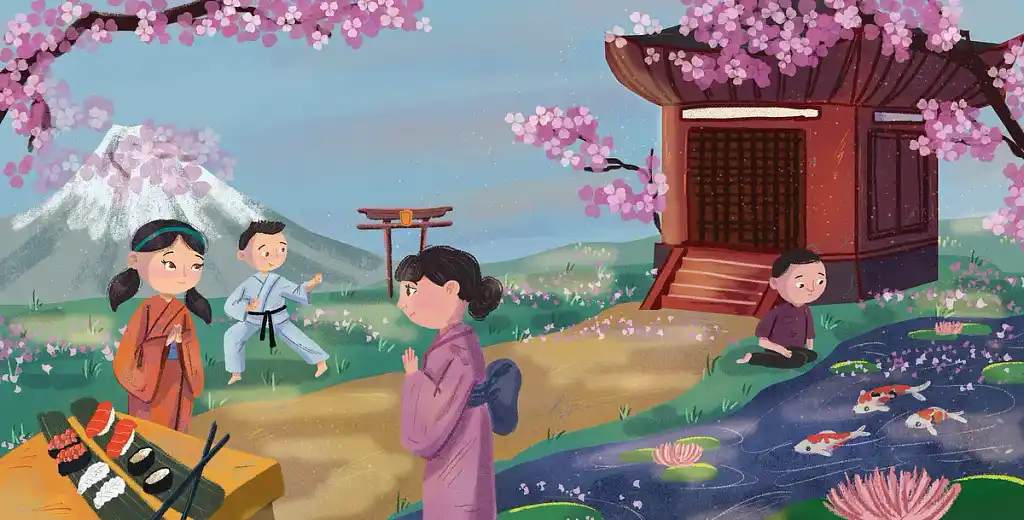 Yuliia Z. has a talent for packing cultural specificity into a scene without it ever feeling like a checklist. Here, four children go about their day against a Japanese landscape: a girl in an orange kimono, a boy mid-karate kick, another child in quiet prayer, and a fourth by a koi pond in meditation. Mount Fuji softens into the background, cherry blossoms frame the scene like a natural border, and the palette is delicate throughout. It’s the kind of illustration that invites young readers into a new cultural realm, rather than lecturing them.
Q: What qualities should a picture book author look for when selecting an illustrator to complement their story?
Suggested answer
![]()
When looking for a picture book illustrator, I first look for someone who can capture the overall feeling of your book. Look at their portfolio and see if they have work with similars themes, color palettes and expressions. Do they have sequential work? Is there work consistent? What will they bring to the table?
Marci is available to hire on Reedsy
Most importantly, you want to work with an illustrator that understands the correct formatting, page breakdown, and processes for picture book work. There is a lot more to creating a picture book than just the art itself. Pacing, page layout, etc are all crucial, and you don't want to be stuck with an artist that is providing beautiful art that is also incorrectly dimensioned. This often is reflected in their pricing structure. You know an illustrator understands the entirety of the job and is professional when they are quoting you an appropriate amount for the work. Picture books are expensive for a reason and if someone is quoting you a great deal... it's probably too good to be true.
Caitlin b. is available to hire on Reedsy
Aside from the obvious aspects such as whether the author likes the illustrator's style/artwork, I think communication is key. If an incredibly talented skilled illustrator isn't great at explaining their process or doesn't fully respond to your questions, the project is just going to be a lot more difficult for both parties. I also think personal experience with self-publishing is so useful and the authors I've worked with have been delighted with the 'insider' tips and advice I've been able to share as we go through the process – from formatting and design, to marketing and creating a buzz on social media. Those aren't part of an illustrator's remit, but it helps because I know what an author is likely to need for marketing, for example, and can provide those elements within the project package, saving the author time and money.
Siski is available to hire on Reedsy
Well said dear colleagues! I'd just add: think of your illustrator as your project manager. In traditional publishing, there's a whole team behind the scenes, in a direct collaboration, it's just the two of us. When one is a client, the other one must take a lead as professional. Your illustrator must be able to give you a clear idea of the workflow, set milestones, explain the process. A smooth, transparent process makes all the difference, especially when you've poured your heart into a story and are trusting someone to bring it to life visually.
Evgenia is available to hire on Reedsy
Béibhínn M.
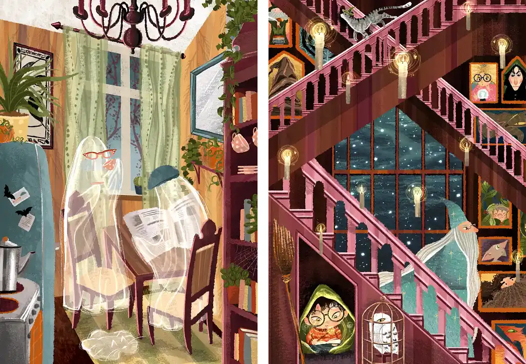 Béibhínn M. has a gift for making the supernatural feel domestic without losing any visual magic. In the first image, two ghosts go about their evening routine in a kitchen full of plants and books. The second image takes on the Hogwarts staircase: floating candles, Harry tucked under the stairs with Hedwig, Dumbledore descending in front of a starlit window. Both illustrations reward attention to detail, with novelties in every corner. Both also share a quality that’s harder to define: a sense that even the strange and spectral can become cozy and familiar
Check out Béibhínn’s portfolio.
Geta B.
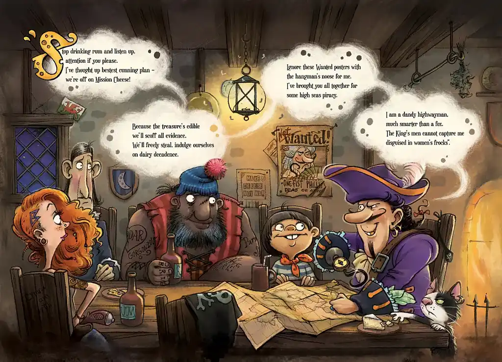 Geta B. draws like she’s having the time of her life. This tavern scene — a pirate captain assembling a crew for the ambitious “Mission Cheese” — is packed with quirkily lovable characters. From the skeptical redhead to the big bearded man in the bobble hat, every figure bursts with rubbery caricature energy. Even the cat in the corner looks like it has opinions. P.S. Don’t miss the “Make Cheese Not War” sign hanging on the wall!
Oksana D.
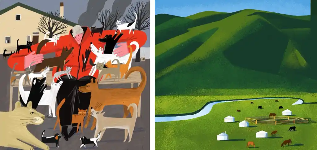 These two images could hardly be more different — one an intimate winter courtyard, the other a vast green field and mountainside — yet the style is unique in both. In the first, a man stands with arms wide open, surrounded by cats and dogs; his red coat (and welcoming energy) shine against the grey winter setting. The second is all landscape: rolling green hills in bold planes of shadow and light, a river cutting through a valley dotted with yurts and grazing horses. Yet the fine-grain texture is Oksana’s signature in both; it keeps the flat colors from feeling cold.
Q: How do illustrators maintain character and scene consistency across a children’s book?
Suggested answer
![]()
To create a consistent look for a children's book, you'll need a strong foundation!
First, the author and the artist should work together to establish each character and then create detailed character sheet illustrations for each of your main characters, capturing their personality and unique features in full-body illustrations, front and back. These will be used as references for the illustrations, making sure that all the character's details are portrayed in each of the scenes in the book.
At the same time, they'll choose a color palette that matches the book's theme and give each character their own special colors. This will help them stand out and feel unique!
The artist and the author should explore different illustration styles and use lots of visual references to find the perfect look for their book and work closely throughout the process, checking in regularly to make sure everything feels cohesive and true to the author's vision.
They should also establish a step-by-step approach to each illustration, starting with sketches, then adding flat colors, and finally finishing with the details. The author will be involved in every step of the process, approving each stage and ensuring the illustrations perfectly capture their vision for the book.
Natalia is available to hire on Reedsy
Sketch, sketch & more sketching! I find it useful to create character turn arounds from multiple angles so I can use these as references moving forward. By getting to know the characters it becomes second nature to create dynamic scenes with consistent characters.
Tommy is available to hire on Reedsy
Nataliia P.
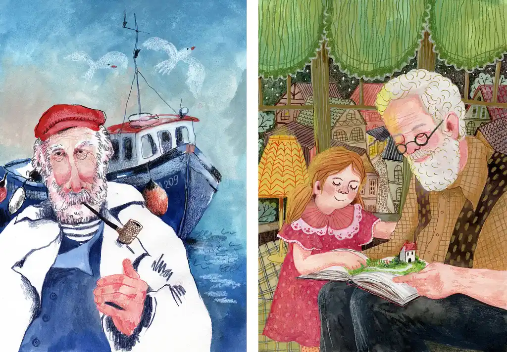 Nataliia P. works in pastels and watercolors, then refines digitally. Consequently, the texture of her work feels hand-painted, while the finish is professionally crisp. In the reading scene on the right, a grandfather and granddaughter lose themselves in a storybook, the background rendered like folk embroidery. The fisherman portrait is less warm: loose, rugged, all weight given to that expressive face. Together they demonstrate an impressive range from Nataliia, always with that distinctive hand-made quality.
Check out Nataliia’s portfolio.
Christopher M.
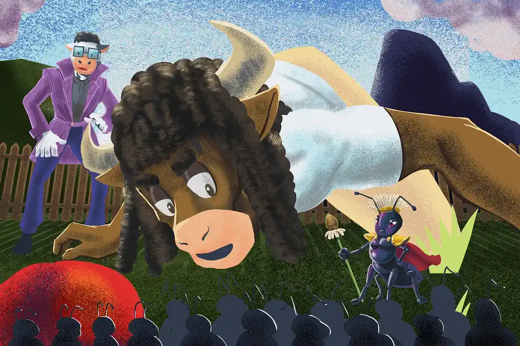 Christopher M.’s work is immediately distinguished by its theatrical staging: a smirking bison dominates the frame, while a caped ant holds court (with improbable dignity) just a few feet away. Each character bursts with personality — from the purple-suited cow in trendy shades to the sea of silhouetted ants below, anonymous yet expressive. The whole scene feels like a showdown that’s about to go somewhere wonderfully unexpected.
Check out Christopher’s portfolio.
Pauline P.
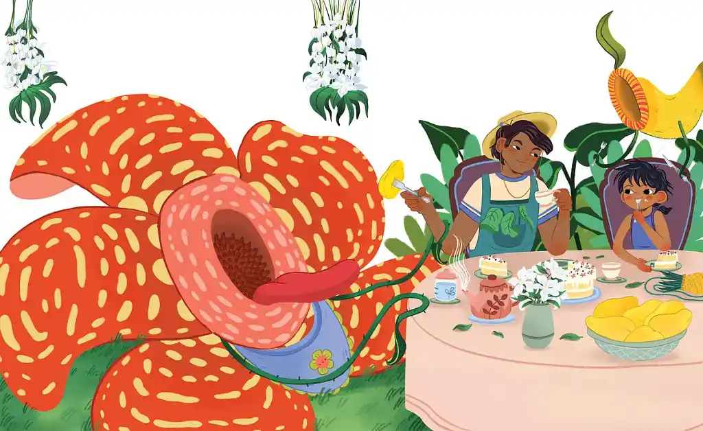 Pauline P. has a gift for presenting the absurd with complete aesthetic sincerity. A colossal Rafflesia — the world’s largest and famously pungent flower — has been invited to a tea party, and is wearing a blue bib to prove it. As viewers, we can’t help but savor the contrast of the overwhelming, almost carnivorous mass of orange and yellow vs. the soft, sweet normalcy of the table setting. A single outstretched fork unites these two sides; plus, clean linework and smooth colors keep the scene feeling palatable despite the flower’s scale.
Check out Pauline’s portfolio.
Q: How do you collaborate with authors to ensure your illustrations align with their vision?
Suggested answer
![]()
I like to keep the process really collaborative. Early on, I share concept art and encourage plenty of back-and-forth so we can make sure the illustrations match the author’s vision. For picture books especially, I ask for lots of detail about the scenes and characters — the more I know, the closer I can get to what the writer imagined.
Of course, I add my own artistic touch, but the best results always come from that open communication throughout the project.
Paul is available to hire on Reedsy
It's important to remember that every author is different. Even if an author has worked on their book for months, if not years, and has a deep understanding of places, characters and content, it doesn't always mean they know how it should look. Other times the author knows exactly what they want.
Often an author has prepared visual references and described their project in detail in their proposal. But others can be less sure. Either way, I will want to pick their brains and try and get as much information and hopefully relevant picture references from them as possible. This could be other illustrations, art or books they like, but also experiences and situations that have inspired the book that they think are relevant. I may also suggest some references here if I think it can help. If the author is unsure at the start, then this process will help them find a visual idea that we can build upon.
Then the next stage is to find a coherent look and style from this material that can work for the project. To do this I will narrow down the references to find a core idea by making a number of sketches and mockups of characters or scenes with references for colours, lines, light or textures that we can discuss. It's good to give this phase a little extra time to ensure we both understand what I am aiming for in the visuals. It may take a couple of variations but hopefully we can agree on a look that we are both happy with. I want to make illustrations that match their vision but also need to be sure it's a look that I am comfortable making that's not too far from my personal style.
After this, and if its a bigger project with many illustrations, then it can be a good idea to choose a 'typical' scene from the book and make a single, finished illustration for approval that can be a style reference for all the rest.
Even if we both agree on the visuals, it's still important to me that the author can follow the progress throughout the rest of the project to avoid any problems or disappointment at the end. This doesn't mean the author has to give a critique of everything I make, but it's good to confirm my work feels right for them and see if there are details that they want to change.
In short its a process of respect, understanding and guidance from both parties that leads to a successful visual interpretation.
Ben is available to hire on Reedsy
Working with authors means making sure the illustrations match their vision while staying true to my style. Here’s how I make that happen:
They come for my style – My portfolio does the talking. I keep it fresh and up to date, so when an author reaches out, they already know what to expect. This keeps our creative visions aligned from the start.
Visual brainstorming – We dive into the project, discuss ideas, and swap references. Mood boards, sketches, inspirations—whatever helps us get on the same page.
Open process on Miro – I share my progress on a Miro board, where the author can follow along, give input, and be part of the journey. This keeps everything transparent and collaborative without disrupting my workflow.
In the end, I want the final illustrations to feel natural and exciting for both of us.
Evgenia is available to hire on Reedsy
When an Author sends me their text, my first step is to produce a written visual layout on their text. So for each page I will write in red my idea for the page or spread. This is solely for me to begin researching any reference I need and collect this into a folder to refer to later.
I will then produce a rough layout of each page, very loose, quick sketches to convey the action and composition of the scene, I will do this for the whole book. Then all the text and rough sketches go into a PDF which is sent to the author for notes. This way, we can agree overall composition, make sure it flows well etc, but also, we can make changes easily. So when I move into producing the final artwork, we are both as prepared as can be. There will inevitably be further changes for the final art but this way, they tend to be minimal. It's about setting the ground work early on so the client knows what to expect.
Rich is available to hire on Reedsy
To make sure a book cover aligns with the author’s vision, I need the following at the start:
- a full description of the story
- the tone of the book
- examples of book covers they like
- the target audience
- a description of their ideal cover
Once I have this information, we can discuss the creative direction that will best highlight the book as a product.
This involves refining our ideas, analyzing the market and then describing a new concept that usually improves on the author’s initial vision.
This step is done in writing and serves as the foundation for creating a first cover sketch.
The sketch follows the new brief closely and acts as a crash test for the concept.
- If it works, we move forward.
- If it doesn’t, we identify the issues and propose a new idea in writing.
Florian is available to hire on Reedsy
Cat C.
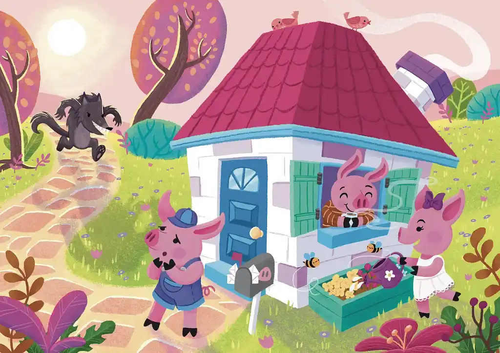 Cat C. rounds every edge and warms every corner. Here, the Big Bad Wolf bounds up the path with malicious intent, but two of the little pigs are so cheerfully absorbed in their routines — drinking tea, watering the flowers — that the threat doesn’t register. Only the pig in the middle is aware of the wolf, powerfully connecting the characters in this scene. It’s a masterclass in dramatic timing through composition.
Marcin P.
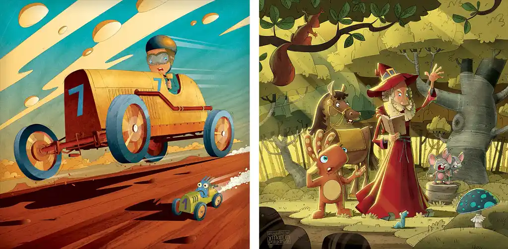 Marcin P. builds his scenes using light and scale to generate maximum excitement. In the racing image, a golden car fills the frame while a tiny, bug-eyed rival trails beside it. The forest scene works the same magic in a different setting: a red-robed wizard mid-incantation, surrounded by animals and an orange creature lodging what appears to be a formal complaint. Marcin’s command of amber-drenched light (and skillful shadows) means that each element looks three-dimensional — and these characters’ expressions certainly feel authentic too!
Santhya Shenbagam R.
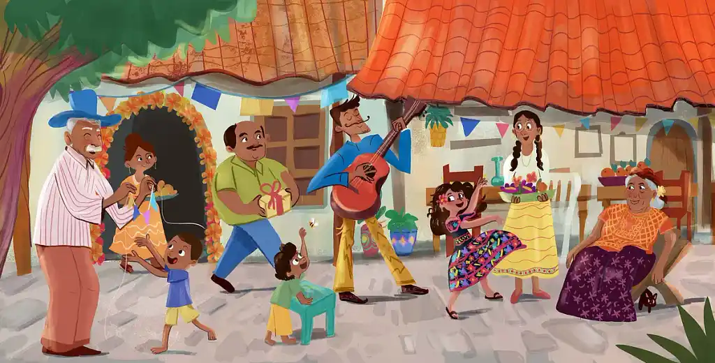 Santhya Shenbagam R. has a talent for scenes that feel crowded and carefree, but never cluttered. In this image, a multi-generational family celebrates in a sunny courtyard: a playful grandfather, a guitarist mid-strum, a grandmother watching from her chair, children darting everywhere in between. Cultural details — from the marigold-framed arch to the floral dress — add richness and specificity. Each character feels distinct, with their own story written into their posture and expression, yet all of them belong to the same cohesive whole.
Check out Santhya’s portfolio.
Q: What's your process for creating a storyboard and refining character designs in children’s books?
Suggested answer
![]()
When working on a new book, I read the story over and over until I picture the main parts in my mind.
From there, I divide the story into a number of pages that is acceptable (often 24 but not always), depending on the amount of text and the writer’s requirement sometimes. For each part of the text, I write a short sentence that will remind me of the main elements I want to place on that illustration and if I think this should be a spread, single page or spot illustration.
Then, I start drawing thumbnails of each scene, this should not take more than a couple of minutes per illustration. I am looking at placing the right elements in the right spots on the page.
I keep in mind that every decision I want to make will have to be approved by the author so there is quite a bit of messaging back and forth going on at this stage of the project.
When it comes to character design, I have found that children’s book author often have a very vague idea of what they see in their mind and that’s also why they hire me. So, there’s room to play but the author will often ask for different version of the same character or will want to add details as you go. The main thing is to keep communication happening until they are satisfied.
Charlotte is available to hire on Reedsy
I begin with character design as this is the foundation for any book. Without strong character design the storyboarding will not be as impactful. Storyboarding then follows which brings the scenes to life!
Tommy is available to hire on Reedsy
Irene S.
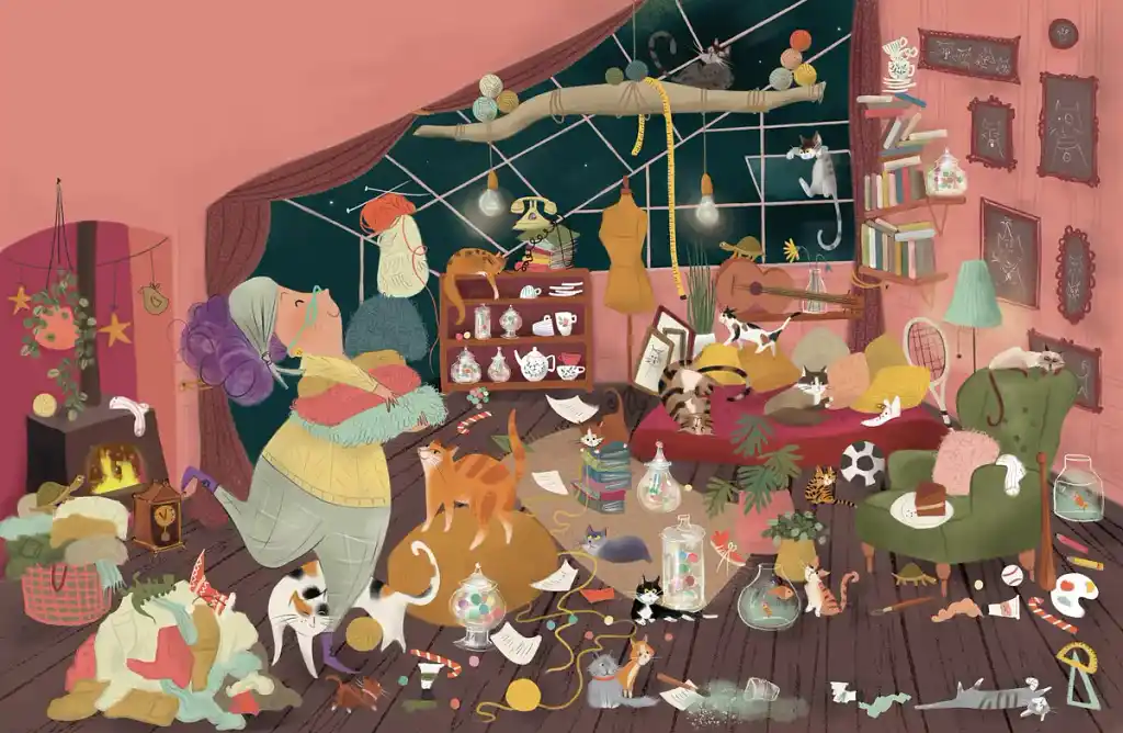 Irene S. is a master of the lived-in scene — the kind of illustration you could stare at for five minutes and still be discovering new things. This room contains at least a dozen cats and one magnificently unbothered woman, knitting away while chaos reigns around her. Dusty pinks and warm browns wrap the whole scene in cozy disorder, offset by the teal night sky. It tells you exactly who lives here without a single word of explanation.
Fantasy & genre fiction
Moving beyond children’s literature, many authors commission illustrations for fantasy and other genre fiction to visually bring their worlds to life.
Miha B.
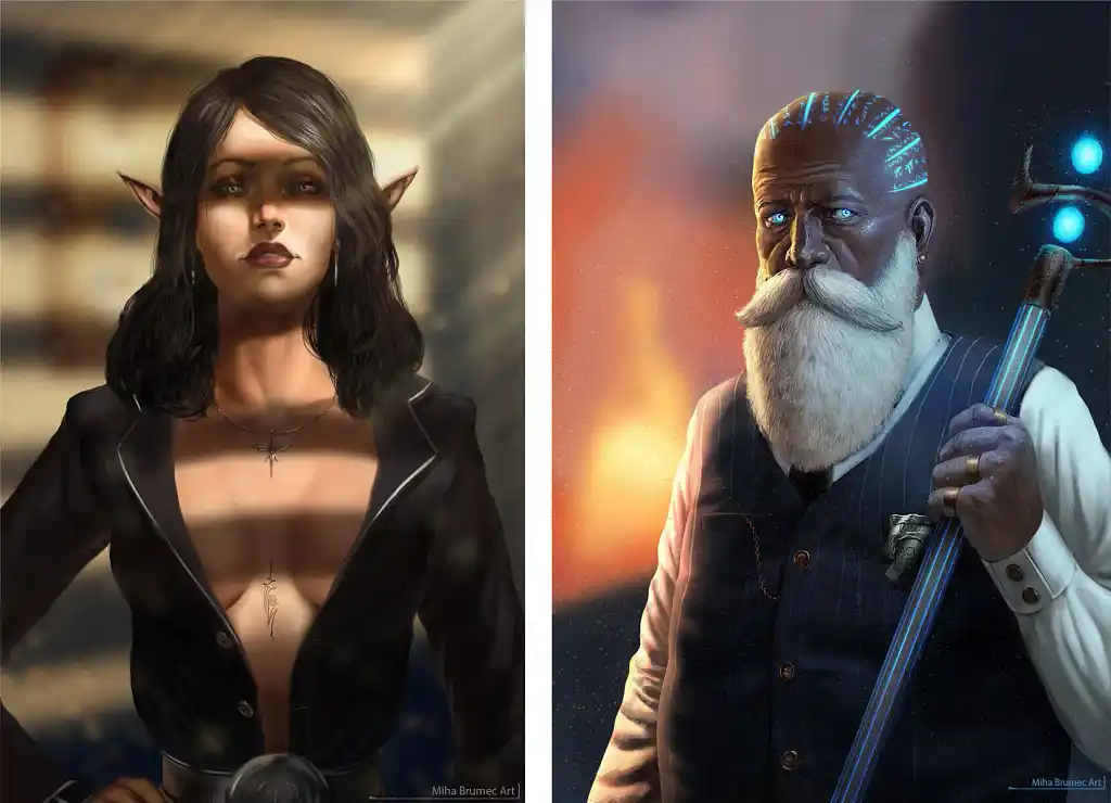 Miha B.’s work balances on the line between illustration and digital fine art. The first portrait — an elven woman with greyish-green eyes and a dragonfly pendant — is rendered with photographic precision. The fantasy here is understated, carried by her pointed ears and runic tattoo rather than obvious magic. The second swings the other direction: an elder mage with glowing blue script across his skull, piercing eyes, and a luminous staff. Both feel like characters you could really know — people with histories, not just aesthetics — which is the hardest thing to achieve at any level of realism.
Sofía S.
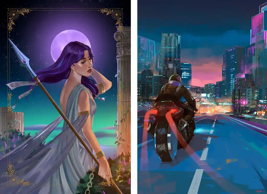 Sofía S. is a veritable sorceress of fantasy illustrations. On the left, a warrior-goddess stands among ancient ruins, purple hair catching the wind, a glowing moon haloing her figure — all within a delicate gold border so it feels like a living, breathing tarot card. The second illustration is more cyberpunk: a lone rider heading into a neon-drenched city at dusk, rendered in streaky brushwork that crackles with atmosphere. What connects both is Sofía’s use of color as mood: deep violets, teals, and ceruleans that spur you to find out what happens next.
Q: How do you balance creativity with the technical requirements of book illustration, like text placement and bleed margins?
Suggested answer
![]()
Once the size of the book is decided, I draw the margins on my canvas and make sure I mark where the middle of the page is, especially when working on spread illustrations. Depending on the amount of text on the page, I decide where it should be placed (sometimes in more than one spot). The rest of the space is free for play!
Charlotte is available to hire on Reedsy
For me, every book starts with a complete rough layout. I will draw out the entire book in rough scribbly lines. This allows me to work quickly on the composition and how the image will work with the text. This also allows me to work out which pages will be full spreads, which will be spots etc. This can take several iterations but once I'm happy I will neaten the roughs so the author can read the layout, then I will send to the author for any notes.
The rough nature of the book at this stage allows for quick edits before committing to final layout. I will then work up one spread to finished art and send to the author so they can get a feel for the style. Once approved I work though all pages.
I make sure to work at full bleed size of the book, usually 3mm bigger than the agreed size, then work within a margin of the agreed sizes so Illustrated elements and text are not to close to the edge, or disappearing into the gutter.
Once all the art is complete I will layout the book with text using Indesign or Affinity Publisher and play with the text layout. This will then be exported into the various formats required by the book printers.
Rich is available to hire on Reedsy
Space is incredibly important. As important as the illustrations themselves. I often overcompensate on space so I can always add more illustration to that region later if needed. Text & illustration are both equal parts in the overall composition.
Tommy is available to hire on Reedsy
Travis H.
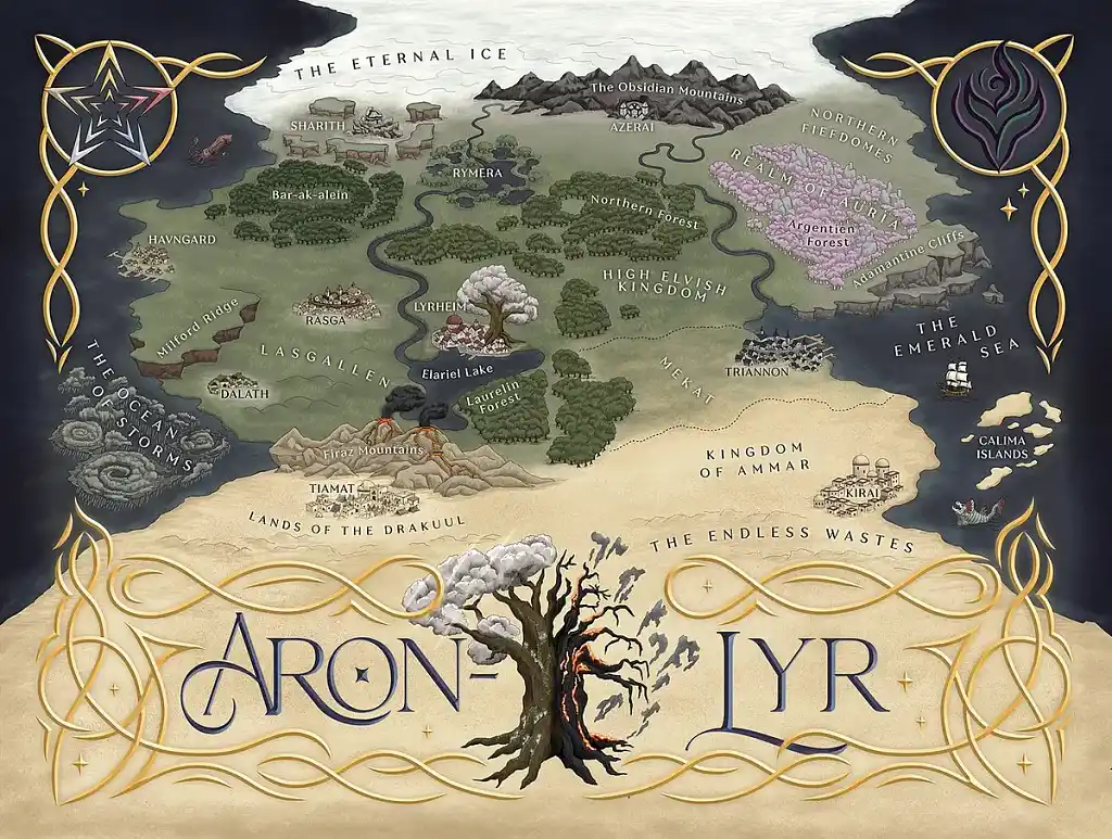 A great fantasy map makes you want to jump into the world it depicts. Travis H.’s map of Aron-Lyr does exactly that, letting you glimpse the journey that awaits — from the frozen sea of the north to the sun-bleached wastes of the south. Each region is rendered in its own visual language: lush greens for the High Elvish Kingdom, lavender crystal formations for the Realm of Auria, churning vortexes for the Ocean of Storms. The elegant border and beautifully lettered title turn a worldbuilding tool into a piece of art you’d happily frame.
Comics & graphic novels
Now let’s look at a few comic book illustration examples 一 works where panel rhythm and linework do as much storytelling as the words.
Nina V.
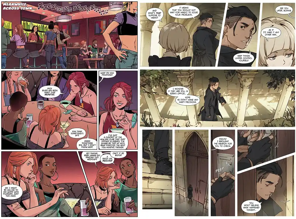 Sequential art lives and dies by panel work, and Nina V. has clearly mastered it. In the Heavy Vinyl page, you can feel the buzzing energy of the bar and the complicity of the girls gossiping. The second piece leans closer to manga: a dark-cloaked figure moving through sunlit stone colonnades, followed by a wide shot before the tension tightens again. Nina’s command of pacing is evident in both pieces — she knows when to zoom in, when to pull back, and how to let a single panel carry the weight of an entire scene.
Rebecca S.
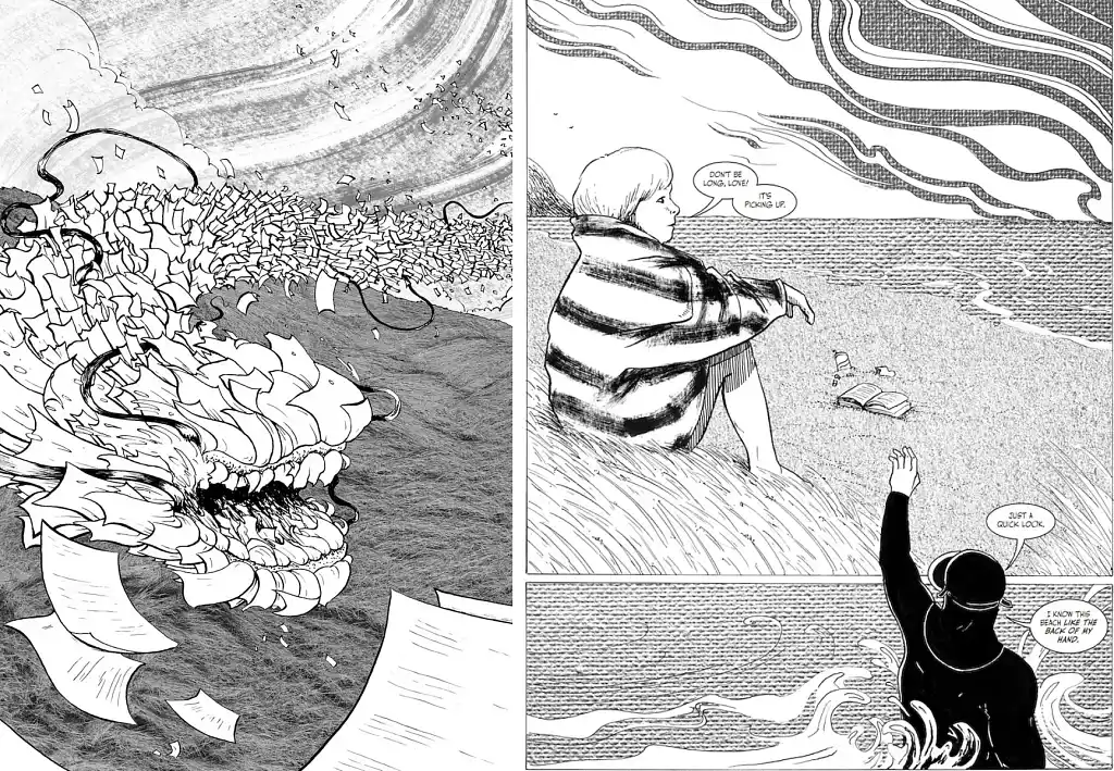 Rebecca S. works in black ink, and not always with conventional tools: chicken skewers, nibs on backwards, cardboard, sometimes her own fingers. Whatever the implement, the goal is always feeling over finish — with textural backgrounds collaged in to add a visceral quality.
The beach scene above is quietly foreboding. A pensive woman sits on a blustery shore while her partner in the water waves back — a hand that crosses the panel border itself, bridging the frames. The dragon image strikes a different chord: a creature erupting amid a blizzard of scattered pages, loose and explosive. Both are a reminder that black and white, in the right hands, doesn’t mean artistic sacrifice.
Check out Rebecca’s portfolio.
Conceptual & editorial
Finally, let’s look at illustrations that don’t necessarily fit within a single genre — from retro and dreamy editorial work to Art Nouveau portraits and detailed scientific drawings.
Irene B.
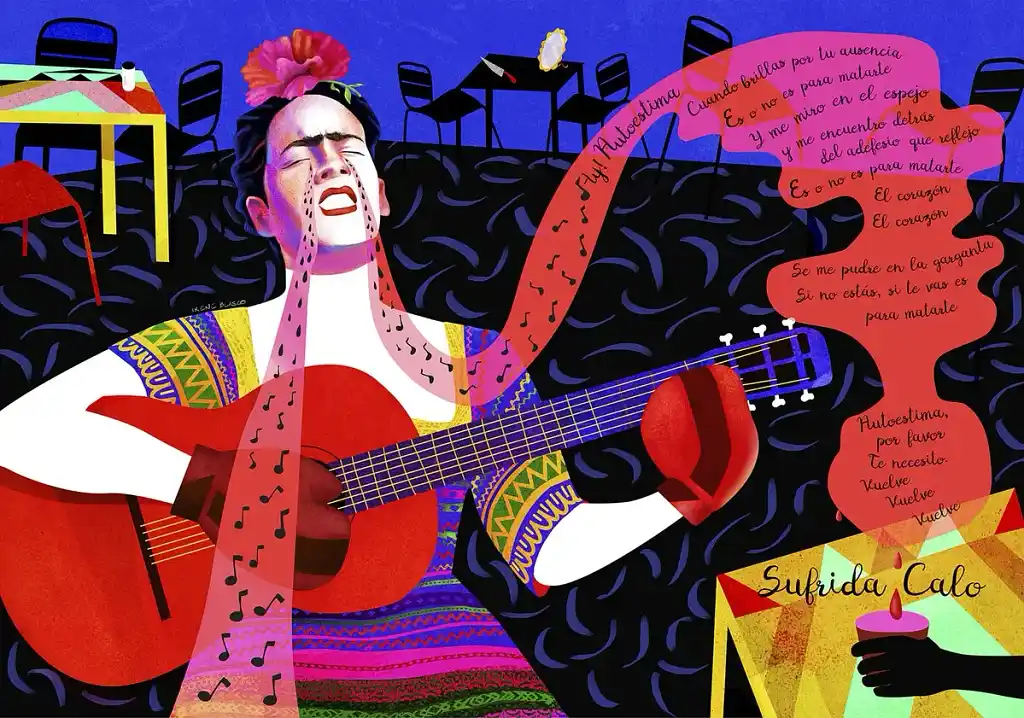 Irene B.’s works feel immediately iconic. Frida sings with her whole body — head thrown back, guitar pressed close — while a ribbon of Spanish lyrics unspools alongside her. The empty chairs behind her, along with the potent blend of tears and musical notes, suggest a story already underway… and steeped in melancholy. What’s especially striking is how Irene uses color to convey emotion: the fiery reds, hot pinks, and geometric patterns of the image feel like the visual equivalent of singing at full volume.
Ben B.
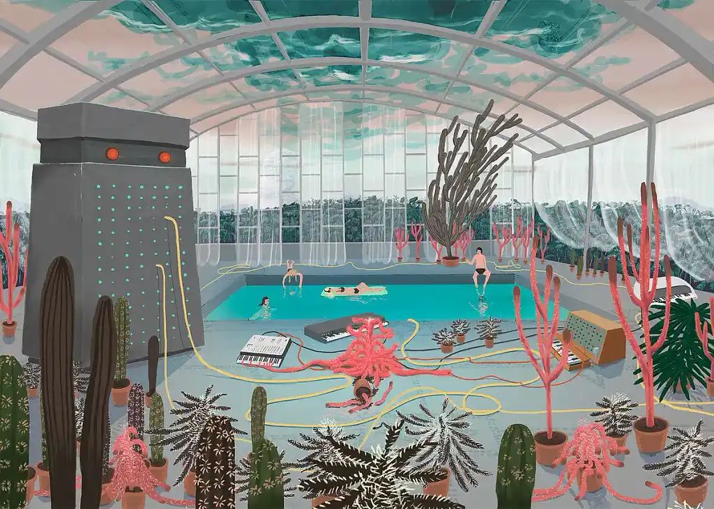 Ben B. has an appetite for the peculiar, turning speculative ideas into scenes that still feel tangible. This indoor greenhouse — where people swim, synthesizers litter the floor, and an imposing robot stands sentinel with long yellow cables — presents the bizarre as entirely natural. Ben’s colors are unusual, yet balanced: cool turquoise water set against coral-pink growths and muted gray architecture. Look closely at the swirling ceiling panels and you’ll find the whole space has an underwater quality to it, as if the greenhouse itself has drifted to the bottom of the ocean.
Rachel R.
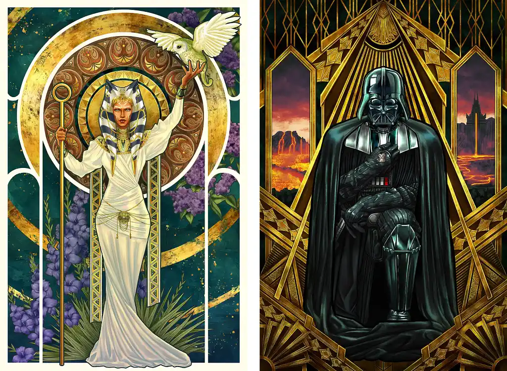 Rachel R. takes two of the most recognizable characters in popular culture and asks: what if they’d always belonged to art history? The first renders Ahsoka Tano in full Art Nouveau mode — circular mandala behind her, purple wisteria at her side, a snowy owl released from one hand — and the Mucha influence is so fluent, it never reads as pastiche.
The second reframes Darth Vader in an Art Deco composition of radiating gold geometry and volcanic drama. The contrast between his absolute black and the ornate golden framework does enormous visual work here. Both function as collector’s posters, but the craft underneath is complex and layered: Rachel understands the design logic of these movements well enough to apply them thoughtfully, not just borrow their aesthetics.
Evelyn P.
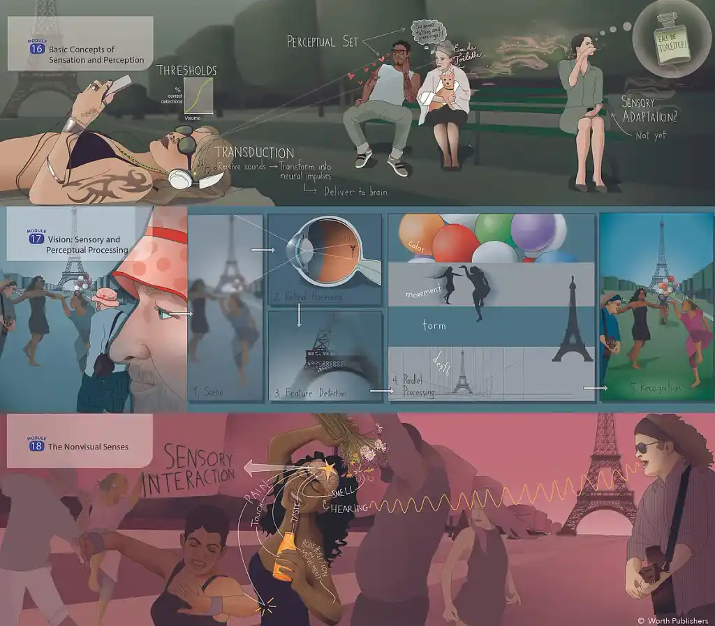 Finally, this spread by Evelyn P. — created for a psychology textbook — takes concepts like transduction, perceptual set, and sensory interaction and weaves them into a visual story. As an added bonus, it’s set in Paris, cleverly using the Eiffel Tower as anchor across panels. Diagrams feel like part of the illustration rather than interruptions, and each module has its own distinct color atmosphere. A perfect blend of education and entertainment.
Hopefully this gallery inspired you with a wide range of book illustration styles — and maybe even unearthed the right illustrator to transform your manuscript into something readers will never forget.