Last updated on Oct 14, 2025
How to Format a Children’s Manuscript (with Template & Example)
Dario Villirilli
Managing Editor of the Reedsy blog, Dario is a graduate of Mälardalen University. As a freelance writer, he has written for many esteemed outlets aimed at writers. A traveler at heart, he can be found roaming the world and working from his laptop.
View profile →When sharing your children’s manuscript with literary agents or children’s publishers, it’s important to adhere to industry standards. Proper formatting will make it easier for everyone to quickly assess your work, and show that you understand the publishing process.
In this post, we’ll take you through our Children’s Manuscript Template (download below) and show you how to format your draft in a way that will impress your potential collaborators.
FREE RESOURCE
Children’s Book Manuscript Template
Pair your dazzling story with professional formatting.
Here are the formatting features of children’s manuscripts:
- 1. A4 or Letter Size with 1” margins
- 2. Times New Roman 12pt Black, double-spaced
- 3. Name, contact, and word count on the cover page
- 4. Headers with page number, title, and author
- 5. Each new paragraph is indented
- 6. Start each chapter on a new page
- 7. Simple art notes, but no dummy pages
- 8. Saved under a descriptive file name
1. A4 or Letter Size with 1” margins
While agents and publishers are always on the lookout for writers with imagination, the format of your manuscript is not where you should start getting creative. Unless the submission guidelines explicitly state otherwise, your manuscript should be:
- Letter Size (8.5” x 11”) for the US and Canada; and
- A4 (21 cm × 29,7 cm) for any other territory.
Q: What are the most common formatting mistakes authors make when submitting children's manuscripts, and how can they be avoided?
Suggested answer
![]()
It depends on the end-goal of the manuscript. One issue I see frequently is that many picture book authors think they need to have an illustrator before reaching out to an agent or publisher. You do NOT need an illustrator for either of those.
The second note I have is that I see too many illustrator notes. If you're hoping to have a picture book published or represented, you need to keep in mind that you'll often have less creative control over the illustration. A few light notes are totally fine, but you'll want to let the illustrator have creative control.
For picture books, you also don't need to space each "page" or "spread" on a fresh page. Usually, the page-breaks and spreads will be decided by the illustrator and editor. It's often better if you send it without page breaks and just as a standard document with double spaced lines and standard font and font size (Times New Roman 12pt).
In terms of MG or YA, you'll want to set up your chapters with heading styles and populate the table of contents using those headings versus going in and typing the actual pages and such.
Val is available to hire on Reedsy ⏺
Including illustrations (Don't! unless you are an author-illustrator)
Funky fonts (You can't go wrong with Times New Roman, double spaced, 12 pt size)
Extensive art notes (It's important to leave room for the illustrator to tell part of the story; keep these to a minimum)
Pagination (Too early in the manuscript stage! Just use paragraph breaks for now)
Rennie is available to hire on Reedsy ⏺
This is for all manuscripts, really.
Standard manuscript format is Times New Roman, 12 pt font, though a font like Calibri works fine too. The manuscript should be double spaced with new paragraphs indented. There should not be an extra line break between paragraphs! Word's default is to add those line breaks, so you'll have to go in and remove them!
Whenever a new character/person is talking, it's a new paragraph.
Each chapter should start on a new page.
Use CTRL/ENTER to start a new page versus hitting the return key until there's a new page.
Page numbers can be at the top or bottom, and in that same header/footer you should include the manuscript's title and your name: GREAT BOOK/Author name.
Kim is available to hire on Reedsy ⏺
You should also have 1” margins (or 2,54 cm) on all four sides of the page. In most cases, this layout will be the default settings on your word processor.
2. Times New Roman 12pt Black, double-spaced
Your manuscript’s font is another place where you’ll be rewarded for simplicity. Don't fall into the trap of writing with a whimsical font like Comic Sans, it’ll only turn agents into the Grinch.
Times New Roman (12pt, black) double-spaced is as close to a universal standard as you get in children’s publishing. Use this unless the agency or publisher guidelines state otherwise. Even if your final book will be rendered in handwriting (like Jeff Kinney's Diary of a Wimpy Kid series), your manuscript should still be very down-the-line. And yes, these settings also apply if you’re writing a picture book.
All the fun typography and typesetting that you see in finished books by the likes of Lauren Child, for example, will be added after your manuscript has been accepted, when page designers and art directors work their magic. So don’t sentence your manuscript to the scrap pile by doing it now. Simply focus on readability and the quality of your writing.
Now that the basic settings are sorted, let’s look at the cover page.
3. Name, contact, and word count on the cover page
The cover page of your manuscript should have the essential information an agent or publisher will want easy access to. The top left-hand corner should list your name, address, email address, and phone number. Or, if you already have an agent, you would list their contact details here instead.
Q: How should the formatting of children's manuscripts differ from that of adult books to meet industry standards?
Suggested answer
![]()
Formatting for children's books can be different to adult books, particularly if they are 'picture-led', where illustrations or images are key to the story. However, many writers are hesitant to offer ideas on how to set their words to any accompanying pictures. Perhaps they feel their job is done, or they don't feel it's their area of expertise.
I couldn't agree less!
Think of Jon Klassen's missing hat books, Goodnight Moon or the fabulous 'You Choose' series, where the illustrations reveal fantastic additional layers and a chance for the reader to go back again and again and see something new.
This is where I believe formatting shines, offering instructions for an editor, designer and illustrator on how they can enhance and build on a manuscript. If you are writing for children, I recommend inserting a descriptive sentence or two on the pictures you envision alongside the text for each of your pages or spreads (two pages opposite each other).
These 'instructions' can be crucial to understanding your manuscript's narrative, plot and characters. For example, a monster in the dark outside the window . . . the text is about a 'monster' but the illustration instruction asks for a cat on a branch. The author is now saying – the narrator thinks it is a monster, but we, the reader, can see it is a cat on a branch. Without this note, the illustrator may have simply drawn a monster – and changed the author's story entirely.
Sometimes an author won't have solid illustration ideas yet. And I love helping with this part. Thinking together on the pictures and their narrative possibilities can be a lot of fun. Text mentions a missing teddy? Perhaps teddy can appear - a little leg poking from under the bed - a few pages later. Further on in the book, teddy is found. And how nice for the reader to have seen that first and to be waiting – hoping – teddy is found. But the designer must know about this, so we add a note on the 'little foot poking out' on the correct page.
For older children's books, with fewer pictures, visualizing a book remains important. Here are some tips:
- Use shorter chapters, paragraphs and sentences than for adult books.
- Read your words aloud, slower than you might normally, and the ideal chapter lengths for your age range will become more clear.
- Give the text more room to 'breathe' than an adult book. Break it up with quotes, sketches or even the odd doodle or border.
- Visualize the text itself. If suitable, have words that wiggle, letters of different sizes, paragraphs in bold or a contrasting font, and give clear instructions such as [bold] or [wiggly] or [bigger font here] placed within the actual text.
Finally, after all this, read your manuscript again, keeping your visual formatting instructions in mind as you go. You'll be amazed at how many more ideas you might come up with.
Happy writing (and visualizing)!
Robin is available to hire on Reedsy ⏺
If you are writing a children's picture book, it is important to insert page breaks as a practice to see how the story fits into the standard 32-page format. But, for submission to an agent or editor, you would format the manuscript as you would adult fiction with standard formatting: a recognizable 12-point font like Times New Roman, double spaced, 0.5" indent for new paragraphs.
Jenny is available to hire on Reedsy ⏺
If they are chapter books (in any form, for any age), they can be formatted similarly to adult books. For picture books, which obviously have a completely different architecture, it's important to break the text into spreads (PBs typically have 13 spreads--though this can differ). Doing this does a couple of key things.
First, it forces us to think in scenes. This helps us consider the illustrations--both what they might look and how they help tell the story. But second, this helps us tap into the power of the page flip. In PBs, page flips play a huge role. Page flips set the pace. Page flips foster mood--be it intrigue, humor, or a good calm down. Page flips help build suspense, land that joke, or help draw out that sleepy-time yawn.
While first drafts certainly can be written in straight prose or verse, as you edit, as you sharpen, tighten, revisit, consider the book's architecture (what happens on each spread, what role the page flip plays) every bit as much as you consider the words, the story, and the illustrations.
Caryn is available to hire on Reedsy ⏺
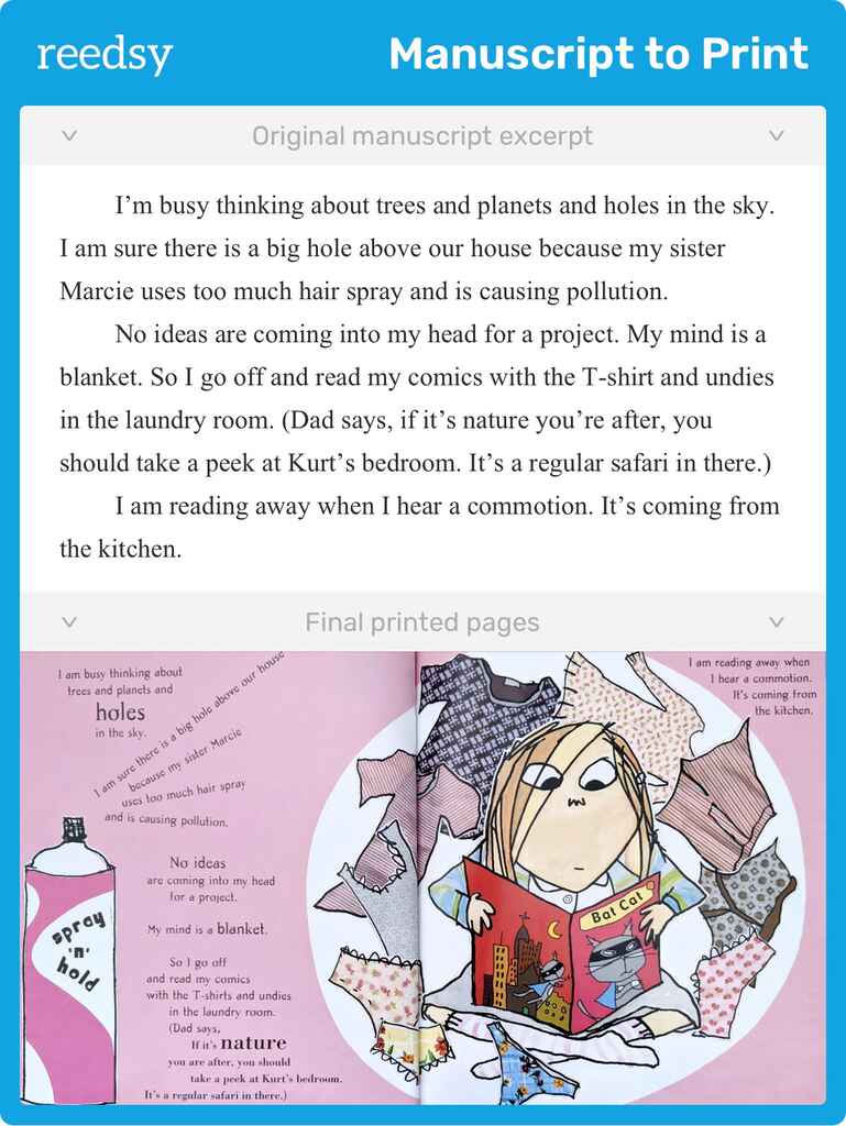
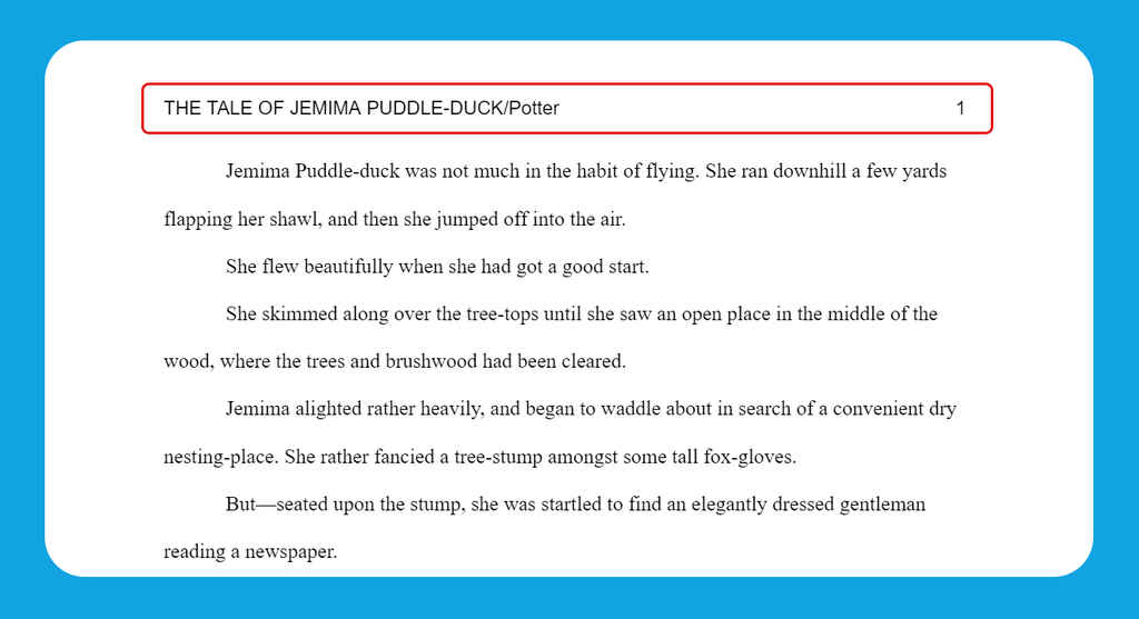
Here’s a manuscript example for The Tale of Jemima Puddle-Duck by Beatrix Potter, which you can download along with our free template.
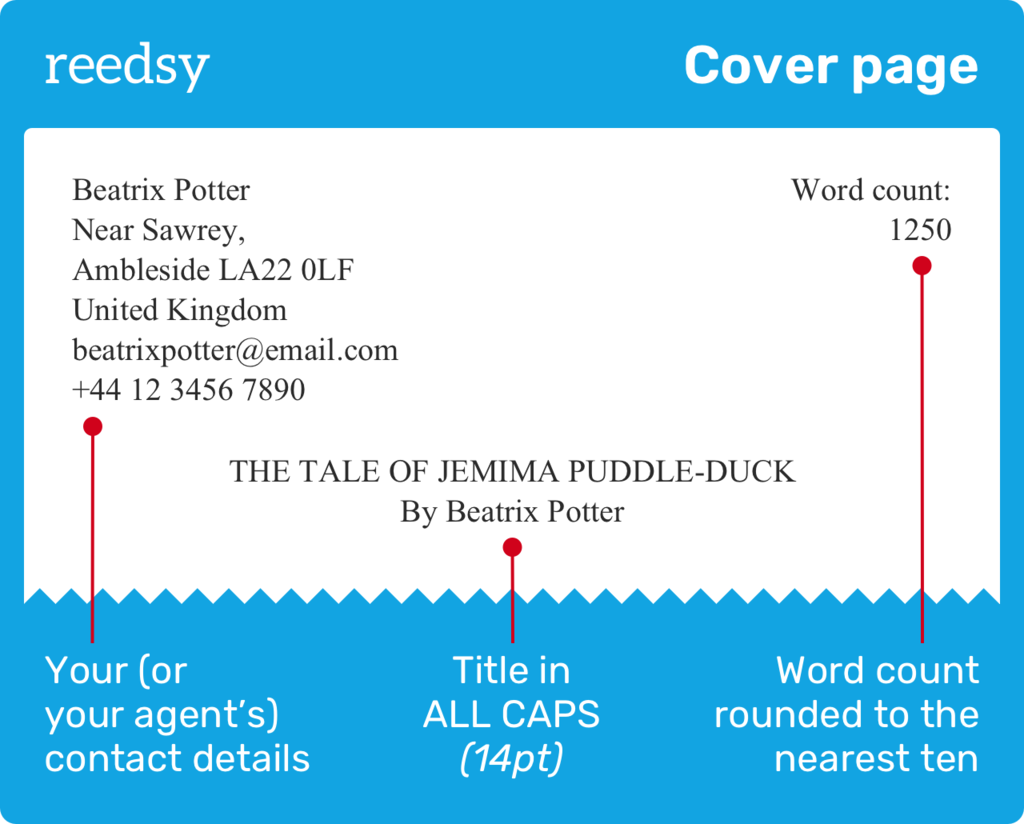
On the right-hand side of the header, list your current draft’s word count. The top right-hand corner is where you put your manuscript’s word count. Picture books should be rounded to the nearest ten, and anything with a larger word count should be rounded to the nearest thousand. If you’ve included illustration notes, keep them out of the word count.
Some people will tell you to then state your target reader, or what kind of manuscript you’ve written (for example, “Chapter book, age 7-9”). But as long as you’ve researched the children’s market, and your book is the right length — very important! — a professional will immediately know that information from the word count.
The other important element to include is your book’s title.
Title in ALL CAPS
The title of your book should be centered on the cover page, around three inches below the header. If you tap the ‘enter’ key six times, this should get you where you need to be. Write your title in ALL CAPS — perhaps a few sizes larger than the rest of your manuscript (14pt or 16pt will do). Underneath the title, just write your name.
🖊️ Tempted by the idea of a pen name? Give our Pen Name Generator a spin here and see if you can come up with a fun new nom de plume.
🖊️
Which famous children's author do you write like?
Find out which literary luminary is your stylistic soulmate. Takes 30 seconds!
Before you can start writing the fun part of your book, there’s one last element that needs to be set up.
4. Headers with page number, title, and author
After the cover page, each new page of a manuscript should feature the page number plus a reference to the title and author. These serve very practical purposes: if a tired editor finds a rogue sheet of manuscript floating around their office, they’ll instantly know where it belongs.
Last name and book title
In our manuscript template, we’ve automated the headers for you, but you’ll want to personalize it by adding the title and your surname.
To add a header yourself, double click at the top of the page and type in your book’s title and your last name, like this: TITLE/ Lastname.
In Google Docs you’ll notice an ‘Options’ button, where you can remove the header from your first page by selecting ‘Different first page’ under ‘Header format’. In Word, the same option is available under the ‘Header and Footer’ tab in the toolbar. You don’t need a header on the first page because all the same information is already there.
Q: How many drafts should I expect to go through before publishing?
Suggested answer
![]()
There is no preordained number of drafts—every writer and every book is different—but most manuscripts need more passes than expected. The first draft is for getting down the story or message. The second is where structure, clarity, and pacing happen. From there, every pass is refinement: strengthening voice, consolidating language, correcting errors. Some books feel finished after three drafts; others take five or more. What matters is not the number, but that you are open to revising until the work says exactly what you mean. Quality depends on patience, not eagerness to "done."
John is available to hire on Reedsy ⏺
Page numbers
From that ‘Options’ list on Google Docs (which appears when you click on the top of a page,) you can also add page numbers. You’ll want to make sure that ‘Show on first page’ is not selected, then start your numbers at either ‘0’ or ‘1’ — that part’s up to you. Keeping your name and title on the left, press the tab key to move the page number to the far right and you’re done! MS Word users need to head to ‘Insert’ and then ‘Page Number’, and follow the same process.
With that final piece of housekeeping covered, you can now turn your attention to the start of the story.
5. Each new paragraph is indented
It’s time to format the actual manuscript, taking care of new paragraphs and lines’ indentation, as well as a few other details.
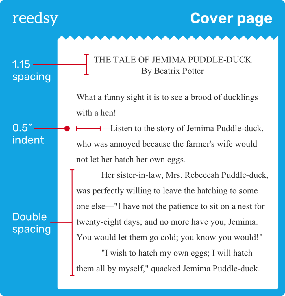
Start two lines beneath the title
The body of your picture book manuscript should start two lines beneath your title and author name — right on the cover page. If you are writing a novel, the advice is to begin your first chapter on a fresh page.
Use double spacing
Everything you’ve typed so far, including the book title, should have been spaced at 1.15. As we head into the main text of your story, you’ll want to change the line and paragraph spacing to be double.
Q: How do you balance creativity with the technical requirements of book illustration, like text placement and bleed margins?
Suggested answer
![]()
Once the size of the book is decided, I draw the margins on my canvas and make sure I mark where the middle of the page is, especially when working on spread illustrations. Depending on the amount of text on the page, I decide where it should be placed (sometimes in more than one spot). The rest of the space is free for play!
Charlotte is available to hire on Reedsy ⏺
For me, every book starts with a complete rough layout. I will draw out the entire book in rough scribbly lines. This allows me to work quickly on the composition and how the image will work with the text. This also allows me to work out which pages will be full spreads, which will be spots etc. This can take several iterations but once I'm happy I will neaten the roughs so the author can read the layout, then I will send to the author for any notes.
The rough nature of the book at this stage allows for quick edits before committing to final layout. I will then work up one spread to finished art and send to the author so they can get a feel for the style. Once approved I work though all pages.
I make sure to work at full bleed size of the book, usually 3mm bigger than the agreed size, then work within a margin of the agreed sizes so Illustrated elements and text are not to close to the edge, or disappearing into the gutter.
Once all the art is complete I will layout the book with text using Indesign or Affinity Publisher and play with the text layout. This will then be exported into the various formats required by the book printers.
Rich is available to hire on Reedsy ⏺
Space is incredibly important. As important as the illustrations themselves. I often overcompensate on space so I can always add more illustration to that region later if needed. Text & illustration are both equal parts in the overall composition.
Tommy is available to hire on Reedsy ⏺
Indent new paragraphs by 0.5”
The first line of the text should be left aligned without indent, while the following lines should be indented by 0.5”. Do not leave extra lines between paragraphs or justify your text — it should be aligned on the left and ragged on the right.
To get those publisher-ready indents at the start of each paragraph, you can just hit the ‘Tab’ key every time (never use the spacebar!), or you can set this up as your default (or simply use our template.)
If you’re a 21st century Dr. Seuss and you've decided to write in verse, you'll need to indent every new line, including the first one. You can set this as your default, too — just don’t select the special ‘first line’ option!
6. Start each chapter on a new page
If you’re writing a chapter or middle grade book, you’ll need to divide your manuscript in chapters in a consistent, orderly way that will make agents smile.
Your first chapter header should be centered underneath the title and byline on your first manuscript page. We recommend entering it in ALL CAPS, 12pt font, and leaving one double space between the chapter header and the byline. Then the same again between the header and the body of the text. This isn’t a hard and fast rule, but it keeps things nice and clean.
From there on out, whenever you kick off a new chapter, you'll need to start on a fresh page. To insert a page break on both Google Docs and MS Word you just need to click ‘Insert’ then ‘Break’ or ‘Page break’ — which makes sense.
Then hit the enter key 4 times (with double-spaced lines) so that you’re about a third of the way down the page. Now you can enter your chapter header just like you did before: centered, ALL CAPS, 12pt font!
Whatever your instincts are telling you, you do not need to include a table of contents in your manuscript — it’ll only distract from your story.
7. Simple art notes, but no dummy pages
Illustrations are half the magic when it comes to children’s picture books. In the writing process, it’s quite useful to create a storyboard (or dummy book) to visualize your book’s finished version. So it can be tempting to pepper your manuscript with ideas on what the illustrations might look like (There's a massive tree, and behind it, a golden castle with dragons poking out of each window!).
However, publishers prefer to let their chosen illustrator interpret the text — so most agents and editors would advise you to go light on the illustration notes. They should only be used in those rare cases when something happens that is essential to the plot, but not present in the text.
Q: What advice or encouragement would you offer to authors struggling with the querying process?
Suggested answer
![]()
Querying is arguably one of the most frustrating parts of the publishing process. Often the letter a writer worked so hard on goes unacknowledged, and the cycle of query letter revision, review, and research leads to frustration and tears. A lot of authors become so frustrated they quit writing altogether.
As an author, it’s not your fault. You are doing your best.
Think of it like online dating. It’s a numbers game. One of the best pieces of advice I’ve had from a friend is this: you’re not looking for the perfect match. You’re looking for the right match. In other words, in the end, you do not want each and very agent you query to want your work. You may think that you do, but you do not, any more than you don’t want every person on a dating app to swipe right. You really want the RIGHT match. You want the agent that recognizes your potential, and will work with you to ensure you reach it by finding the right publisher with the right marketing and sales support. You want a partner, and that takes time.
So, as you do your research and type up yet another email, remember that the right match for you and your work is there. All of this is worth it. Each ‘no’ is one step closer to a ‘yes’, and when that ‘yes’ comes, it will be from the best person for the job.
Lara is available to hire on Reedsy ⏺
Here’s a speculative art note for The Tale of Jemima Puddle-Duck:
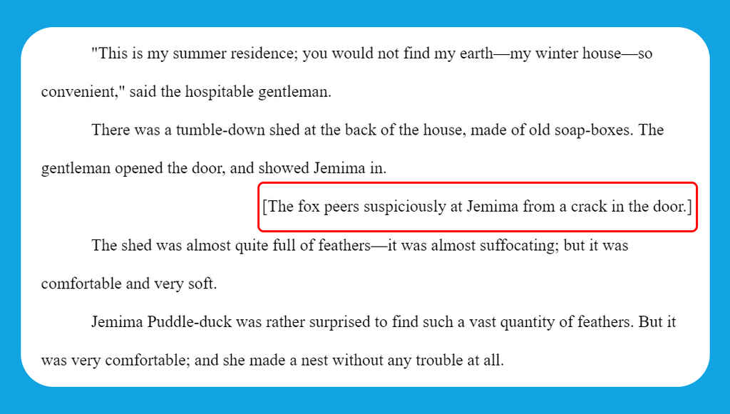
Again, unless you're the next Jon Klassen and planning to write and illustrate a book where the story is told through the images, there should really be no need to include illustration notes to help the agent or editor visualize what’s happening while they read. Your words need to stand on their own — so if you feel the need to explain further, you might want to revisit the ‘Show, don’t tell’ rule.
📚 If you’re writing Middle Grade fiction or a chapter book, you definitely don’t need to worry about illustration notes — even if you plan to adorn your pages with doodles, like David Walliams. Just focus on crafting a compelling story.
And that’s it! Once you’ve let the reader know you’re finished by typing out ‘THE END’, your manuscript is complete.
8. Saved under a descriptive file name
Finally, save your file with a professional and easily searchable title. We suggest going with “Lastname_TITLE” (as in, "Potter_JEMIMA_PUDDLE-DUCK") and leaving it at that.
If you follow these steps (or download our children’s book manuscript template) we’re confident that agents and publishers will find no flaws in the formatting of your submission.
But while a professional-looking manuscript will make a great first impression on literary agents, you still need to wow them with your query letter — so be sure to check out the next post in this guide before you submit!

