
Posted on Dec 19, 2025
How to Create a Book Cover: A Practical Step-by-Step Guide
A professional designer won’t just design your book cover; they’ll create files that meet all the technical specifications of your chosen platform(s) to ensure it looks great everywhere.
If you’re DIYing your cover, however, it will be up to you to meet these specifications. In this post, I’ll draw on my 25 years of experience as a designer to show you how to create a book cover that is ready for publication.
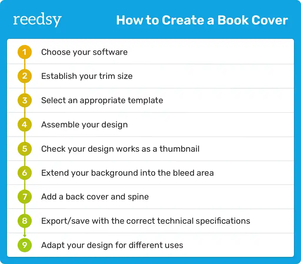
1. Choose your software
You probably already have a vision for your book cover. (If not, check out my guide to designing a cover concept.) But can you make it come to life? That will depend on your software — and your skill with said software.
Most professional designers still use the same software that has dominated the market for decades (mostly Adobe products). However, in recent years, new professional or semi-professional alternatives have emerged, offering more affordable options with a smaller learning curve.
Q: What software and tools are commonly used by book cover designers to create professional-quality designs?
Suggested answer
![]()
I use a mix of Adobe products (of course!).
Adobe Illustrator for any illustrative/drawn elements such as illustrations, graphics, special text treatments or icons etc.
Adobe Photoshop for the general background of the whole cover/jacket (so, usually front, back and spine … and flaps if needed) as one high resolution document (allowing for bleed and spine width changes!). More often than not photographic elements too. This is where I will import and blend the graphics from Illustrator with photography/stock images to become a bespoke/original image. Sometimes title work will be done in Photoshop if it needs to combine/blend with the image more (not just plonked on the image for instance). Larger amounts of text shouldn’t be done in Photoshop as it’s a ’raster-based’ or ‘pixel-based’ app – it will never be as sharp as InDesign or Illustrator (both vector based – or infinitely scalable).
I can also control ink densities in Adobe Photoshop to make sure that my rich blacks are not too rich! In other words; not too much ink in the dark areas in the finished print (printers don’t like that!)
Then the artwork (mechanicals) are always completed in Adobe InDesign – the Photoshop file(s) is/are imported into my artwork file which is a much more accurate setup with grids and guides to make everything just perfect. InDesign cannot be beaten for its layout and type handling capabilities – when used properly! So normally the titles, book blurb and subtitles etc are done inDesign. Also ISBN codes, prices and any other required text is added InDesign. The app itself is much quicker to use and navigate with imported graphics and images then trying to do the same work in an app like Illustrator. This is what InDesign was developed for.
Also, any special finishes such as spot varnish, Pantone colours, embossing, de-bossing or foil blocking etc can be set up in Indesign using layers – much easier to control in Indesign than any other app.
Adobe Bridge can be used to produce colour profiles that could be synchronised over all the Adobe apps. So it’s easier to control your colour workflow across all the software apps.
Finally, print ready PDFs can be exported directly from InDesign including any layered special finishes. In my experience, PDFx4a files are the most stable and reliable PDFs to export.
I know all this text is a bit waffly, but it gives you an idea of how I go about my work.
Hit me up if you need a pro! (Haha!)
Nathan is available to hire on Reedsy ⏺
I use Adobe Illustrator to create the design of the cover, including the custom illustration. The advantage of working in Illustrator is that it allows me to work on both typography and illustration at the same time. It also allows for different artboards with variations of the cover design next to each other, making it a good tool for comparing different elements and aspects of the design.
To make a print-ready file, I sometimes use Adobe InDesign.
For the cover illustrations I also reach out to various drawing software apps on the iPad such as Procreate and Adobe Fresco that I then import into Illustrator.
Hester is available to hire on Reedsy ⏺
Most book cover designers rely on Adobe Photoshop, Illustrator, and InDesign, which handle everything from photo editing, digital painting, and typography to layout and print-ready files.
I also use 3D software like Blender and ZBrush, and occasionally Procreate when I need a slightly different result from digital painting than Photoshop provides.
Alexandra is available to hire on Reedsy ⏺
I personally use a combination of standard professional tools, like the Adobe Suite, and newer but powerful ones like Procreate.
Even if you are a complete beginner, my professional recommendation is to use at least two different applications: one for the layout of your cover and one for editing images on a more granular level.
Layout tools
Examples: Adobe Illustrator, Adobe InDesign, Affinity, Canva.
Layout tools allow you to work with precise measurements, margins, and guides. Use them to add typographic content and compose your cover, as well as export the final files.
What about layout software for the inside of your book? That’s another story… but when you’re ready to publish, I’d recommend Reedsy Studio. It’s a free tool you can use to customize your front and back matter, fonts, and trim size (if you’re printing) — and there’s a designated place to upload your final cover as well. Learn more.
Image editing tools
Examples: Adobe Photoshop, Affinity Photo, Procreate, Photopea.
Image editing tools allow you to edit photographs, graphics, or illustrations, which you can then export and insert into your layout tool as another design element.
Some software, such as Canva and Affinity, will allow you to do all the design work at once — but bear in mind that you may lose the potential and flexibility of specialist software.
If you’re not 100% confident in your digital design skills, look into collaborating with a professional cover designer for your project. You can still remain in control of how the book looks, but their knowledge and skill will give your creative vision the best chance of reaching its potential. Consider it an investment in your book's success.
Hire an expert

Dora D.
Available to hire
Illustrator and designer with 10+ years of experience in creative business. I will create visual words that will support your story.

David T.
Available to hire
Exceedingly detail oriented and organized, with strong collaborative and interpersonal skills; highly dedicated, and reliable.

Alejandro C.
Available to hire
Award-winning illustrator focused on fantasy, horror, and historical. Working with worldwide Publishers since 2003. No AI used in my work.
My suggested toolkit
If you are set on DIYing your cover, here are the design tools I recommend for different needs:
-
Best for competent designers: Affinity
-
Best for beginners: Canva
-
Best budget option: Affinity (free but quite powerful!)
For a more detailed exploration of all the best design tools, read Reedsy’s full guide to book cover design software here.
2. Establish your trim size
The last thing you want is to start working on your book cover and then realize — after hours of labor — that it’s completely the wrong size.
So confirm your book’s dimensions now. Figure out what file dimensions are accepted on your chosen distribution platform(s), and research the most common trim sizes in your genre.
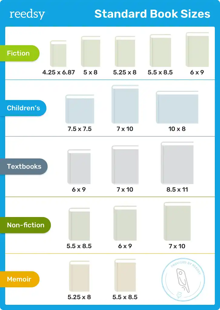
As an example, Amazon recommends an ebook cover file of 1,600 x 2,560 pixels (a height-to-width ratio of 1.6), but has pretty good flexibility when it comes to trim sizes for its print on demand service.
3. Select an appropriate template
Once you’ve figured out the dimensions you need, you can find a template for your design. I highly recommend using the template offered by each individual distribution platform to avoid running into any problems.
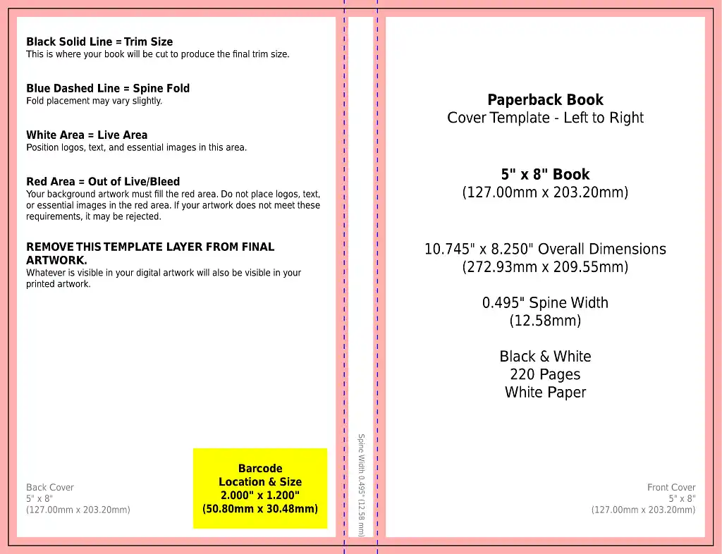
You’ll need separate templates for your ebook and print book covers. It will probably be easiest to finalize your front cover design on the ebook template and then copy it over to the appropriate part of the print template later.
4. Assemble your design
For tips on actually designing your cover, see my previous post.
You now have all the elements necessary to assemble your cover. This stage is more technical than creative, but equally important for the final result to work properly. Here are some points to keep in mind.
Color profiles
Most designers work with RGB (red, green, blue) for screen design and CMYK (cyan, magenta, yellow, black) for print design. Although most applications can convert RGB to CMYK and vice versa, some nuance will be lost in the process.
Problems often arise when converting from a bright, saturated RGB image into a print file. It's impossible to reproduce those colors using pigment on paper, so after conversion, your cover may look rather lackluster.
Converting from CMYK to RGB is far less devastating. My professional advice is that if your book will have a print version, you should design it directly in CMYK. This way round, your screen version (ebook, thumbnail, etc.) will still fully represent the look of the original design.
Image resolution
Whether you're looking for an image from a stock photo library or creating one yourself, you must ensure it has sufficient quality to avoid pixelation or blurriness in the final result.
A professional designer will always work with the appropriate base dimensions and resolutions. As a general guideline, images intended for print should have a resolution of at least 300 dots per inch (dpi) at the size they’ll appear on the page.
If you have an image much larger than this, you can reduce its size to improve its resolution. Any image editing software, such as Photoshop or Affinity, will do the job.
Q: What should I look for in a book cover designer’s portfolio?
Suggested answer
![]()
Besides skill, style, and craft, I think what some authors may not realize is that a designer's portfolio is not a showcase of all their projects. A cover designer's portfolio is also (typically) a collection of their favorite projects. This is helpful to keep in mind as you scroll. If a cover designer doesn't have, for example, any romantic comedies in their portfolio, it doesn't mean they're not capable of doing them. The omission of work is just as important as the inclusion. In other words, it's probably better to seek a design from someone who has examples of work in your genre. There's a better chance of scoring a designer who is truly passionate about the genre and is more personally invested in the collaboration.
Alex is available to hire on Reedsy ⏺
Image rights (if applicable)
If you haven't used custom illustrations or photography for your project, remember that most high-quality images you find online are likely copyrighted. Before using an image, make sure you have the rights to use it.
If it's from a stock photo site, double-check the terms of your license to avoid legal problems later. On the other hand, if you want to use completely free images, look at sources like Unsplash or Pexels — but beware that you may come across a lot more covers (and other designs) that use the very same free image.
Typography licenses (if applicable)
You might not know this, but fonts also have usage licenses. Fortunately, there are many type foundries with very affordable options and high-quality fonts.
If you're in love with the perfect typeface, play fair and pay its creators the agreed-upon price. If you don't have a budget for typography, you can always start with free or completely royalty-free fonts, such as Google Fonts.
Pro tip: Some design tools allow the use of “guides” — customizable lines that help you structure the content of your design. Other applications, like Canva, use “smart” alignments to help you control measurements and distances. Make the most of these features when arranging your elements on the page.
Once you’ve finished assembling your design, don’t flatten it. Keep the background, main image, and typography in separate layers so that you can easily go back and edit them later if needed.
Q: What common mistakes do authors make when designing their book cover, and how can they avoid them?
Suggested answer
![]()
You don't need every aspect of your story represented on the cover! I get a lot of authors who run through a list of very specific objects, places, and characters they want on the cover, but many times that doesn't align with the best selling strategies for their genre. Depending on the genre, to capture your audience, you may want to focus on a character or two only, or perhaps one setting. But usually not all of it. The main purpose of a cover is to capture the feeling of your book, not tell the whole story. Oftentimes the cover is more of a metaphor or abstracted visual that just indicates a mood. Less is more!
Caitlin b. is available to hire on Reedsy ⏺
A common mistake authors make when designing their book cover is trying to make everything shout. Not every element needs to be front and centre. Part of the skill of a designer is creating the right hierarchy, so the reader’s eye knows where to go first, whether that is the title, the visual, or another key element.
Another issue is not fully understanding the market. Sometimes authors pick the wrong age group or try to make a cover that will appeal to the largest possible audience. In most genres, this rarely works. It is far more effective to focus on the target audience for the book and design something that resonates strongly with them.
Authors often love their characters and want to showcase a favourite moment from the story. While that is understandable, it may not always be the best visual for selling the book. Understanding the story, its tone, and its audience is key to selecting the right imagery and creating a cover that works both creatively and commercially.
Clare is available to hire on Reedsy ⏺
The biggest mistake would be not being open to input. Most people in the book world have a working knowledge of what particular books are supposed to look like. BUT, there is a great big world of book creatives out there who specialize in every single aspect of making a book. Cover design is no different. Authors and designers should ideally have an organic collaboration. Reedsy has given me the opportunity to cultivate this exact skill while working with authors.
Michael is available to hire on Reedsy ⏺
5. Check your design works as a thumbnail
In fact, you may need to edit it immediately if you realize your design doesn’t work well as a smaller image. I can’t exaggerate how important it is that you check. After all, readers browsing online stores will often only see a small thumbnail image of your book — and that alone needs to compel them to click on it.
When assessing your image in thumbnail form, check that:
-
Your book’s title is not too small;
-
The main image (if applicable) is still recognizable; and
-
All colors have good contrast.
Q: How do designers create book covers that stay legible and compelling at thumbnail size?
Suggested answer
![]()
To ensure a book cover is legible and compelling at thumbnail size, I focus on bold, clear typography and strong contrast to make titles and key elements stand out. I prioritize simple, striking designs with iconic imagery that remains recognizable when scaled down. Thoughtful color choices and clean layouts help maintain impact and clarity, while I continuously test the design at thumbnail size to refine its effectiveness. This ensures the cover grabs attention and communicates its message, whether viewed online or on a shelf.
Robert is available to hire on Reedsy ⏺
Having a good understanding of value separation is important to any art piece, but especially so when you want it to be eye catching at a distance. Paying close attention to contrasting shapes and values as well as creating recognisable silhouettes can be invaluable to a striking cover.
Jack is available to hire on Reedsy ⏺
Ensuring a book cover works as a thumbnail is an essential part of the design process. I test covers at small sizes early on to make sure the type remains clear and legible and that the main visual elements still read when reduced. Not everything on the cover should shout for attention. Part of the skill of a cover designer is creating the right hierarchy.
Sometimes the reader’s eye should go to the visual first, sometimes to the title, depending on the book and its market. By prioritising what matters most and simplifying where necessary, the cover still has impact even when it is tiny on a screen.
On one project, the artwork looked fantastic at full size, but at thumbnail, the title completely disappeared into the detail. I adjusted the composition, clarified the typography, and suddenly the cover worked online and in print. It was a simple tweak, but it made all the difference. Testing, adjusting, and thinking about hierarchy are what turn a good cover into an effective one.
I present initial ideas as large thumbnails, this means usually I keep an eye on the sizing throughout the project.
Clare is available to hire on Reedsy ⏺
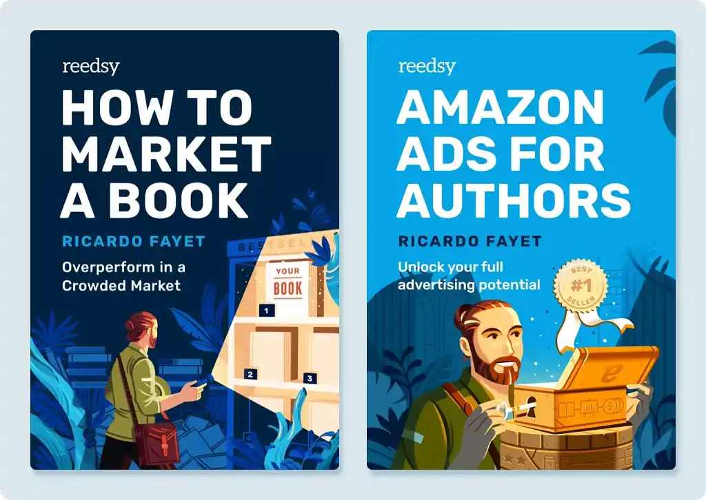
For Ricardo Fayet’s popular marketing books, I chose a layout heavily based on big, bold, highly contrasted typography, with an illustrated base. The weight, size, and contrast make the covers easily readable on Amazon or other platforms, while the colorful illustrations help maintain a visual balance.
Pro tip: Your print cover layout doesn't have to be 100% identical to the layout of your thumbnail image. You can reproportion elements to make them work better in each context.
If you’re only publishing your work in ebook format, that’s all you need to worry about. Skip straight to step 8 to find out how to save or export your cover.
If you’re releasing a physical version of your book too, steps 6 and 7 show you how to adapt your front cover art into a single cover file for printing.
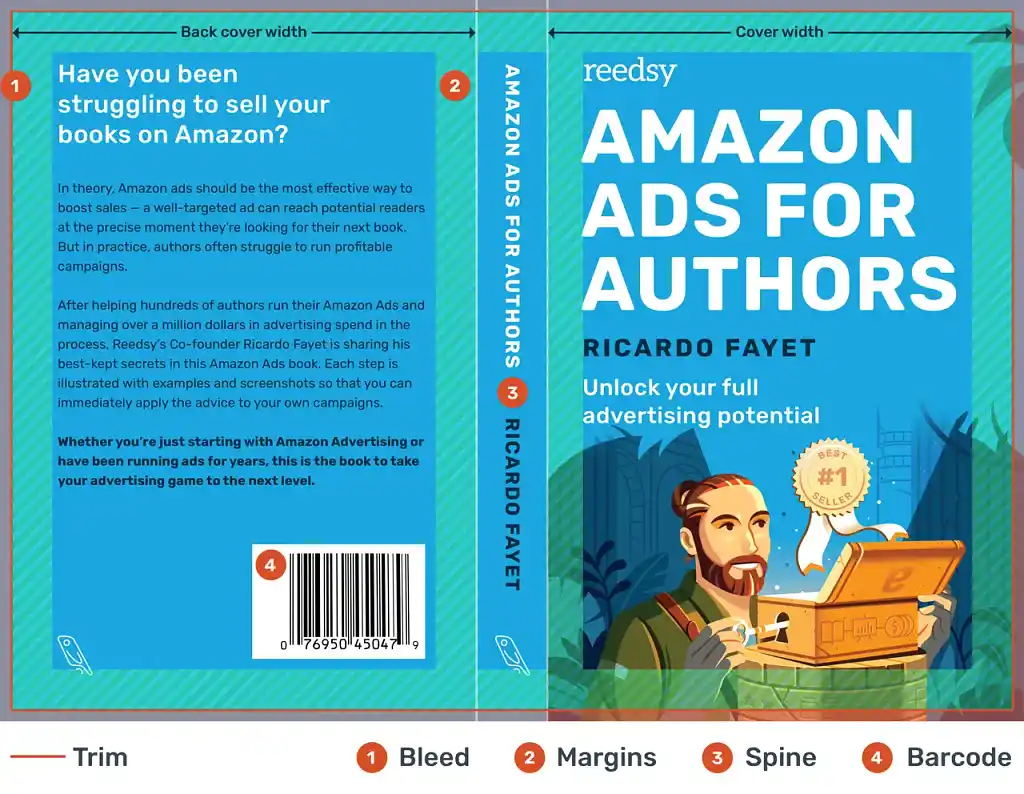
6. Extend your background into the bleed area
Whether you print your book on demand or in bulk, there’s a risk that it won’t be exactly the size you intend. To prevent trimming errors leaving thin white lines on the edge of your book, you need to extend your background into the so-called bleed — an area a few millimeters outside your design that acts as a safety net in case of minor printing errors.
It’s also important that you don’t place important elements too close to the edge, in case they get cut off.
Most templates provided by platforms like Amazon already include the necessary bleed allowance. Just keep in mind that this extra margin is outside the cut, so you'll need generous inner margins as well.
When I was preparing the cover file for Amazon Ads for Authors, I kept all the important elements of my design within the darker blue area. I extended the background into the margins and bleed area with the understanding that some of it (ultimately an unknown amount) would be cut off by the printers.
Pro tip: Make sure you use a different template for each version of your book. Even if a hardcover book has the same dimensions as its paperback counterpart, its template is very different because it requires a much larger bleed (so that the excess paper can cover the cardboard covers).
7. Add a back cover and spine
As well as margins and bleed, you’ll notice that your template includes space for a back cover and spine (the width of which depends on your page count; use your distribution platform’s calculator to get exact measurements).
Your back cover is obviously where you put your blurb and ISBN (or ASIN) number — typically on top of a background color that’s the same as the front cover, or else simply neutral. Give your blurb a chance to shine by keeping any (completely optional) design elements subtle.
The spine contains the title and author name — provided it’s wide enough. On Amazon, you can only include text on the spine if your page count is greater than 79 (otherwise there isn’t room and your file will be rejected).
Although many books have very compact spines, remember that the spine may well be the first thing readers see in a bookstore — so don't neglect the communicative or creative potential of this space on your cover. You can add small images, icons, or patterns that complement your front cover.
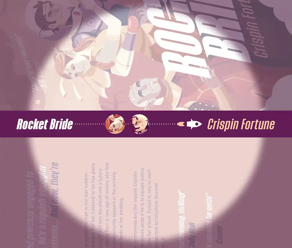
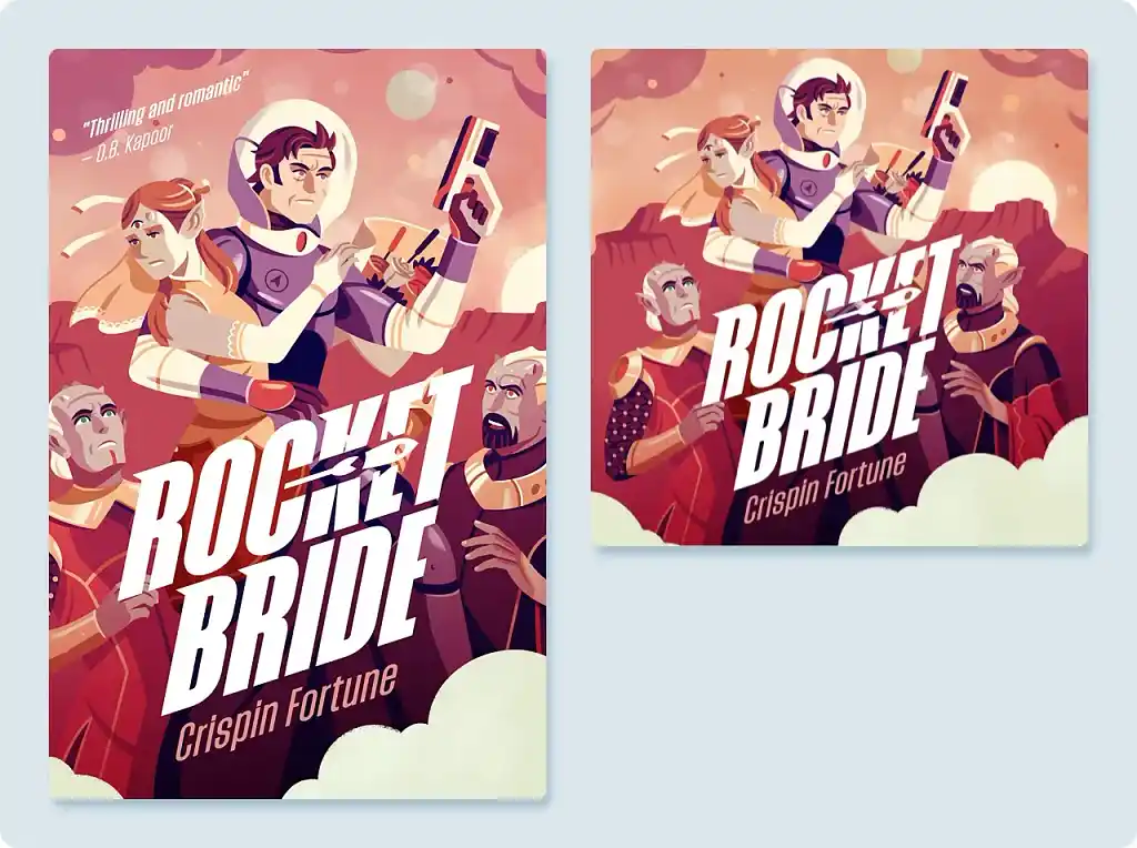
When I was designing the cover for the romance space opera Rocket Bride, I included the two main characters and a little rocket between the title and author, helping the book stand out on a shelf.
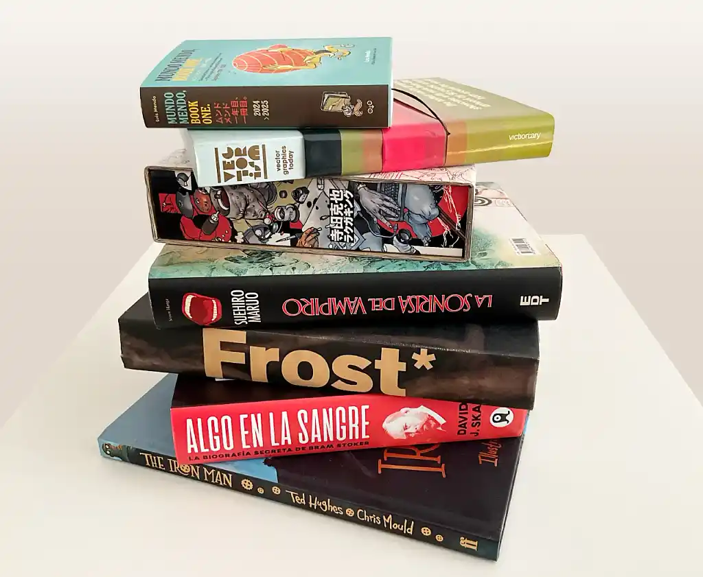
Here are some more examples of creative book spines:
8. Export/save with the correct technical specifications
When you’re happy with your work (and you’ve received sufficient feedback), you can save or export it. But before you do, you’ll need to find out what file type, size, and resolution you need, as well as any other technical requirements.
Pro tip: If you want to avoid problems, follow my advice in step 2 and work directly with the final measurements from the beginning.
The table below shows some of the specifications for different distribution platforms as of December 2025. Note that some of these specifications are recommendations rather than hard and fast rules, but I strongly advise you to meet them anyway to ensure maximum quality.
|
📇 Distribution company |
📱 Ebook cover requirements |
📖 Print book cover requirements |
|
Amazon KDP |
JPEG file 1,600 x 2,560 pixels Minimum resolution 300 ppi File size up to 5MB RGB color |
Single PDF file 0.125” bleed Minimum resolution 300 dpi File size up to 40MB CMYK color |
|
Apple Books |
JPEG or PNG file Minimum width 1,400 pixels Minimum resolution 300 ppi RGB color |
N/A |
|
B&N Press |
JPEG or PNG file Minimum width 1,400 pixels File size 5KB to 2MB |
PDF file Minimum resolution 300 dpi Fonts must be embedded |
|
Kobo Writing Life |
JPEG or PNG file Width to height ratio of 3:4 Minimum resolution 300 ppi File size up to 5MB |
N/A |
|
Draft2Digital |
JPEG file 1,600 x 2,400 pixels |
Automatically generated by Draft2Digital, or you can download and re-upload a custom template |
|
IngramSpark |
JPEG file 2,560 pixels on the longer side and at least 1,600 pixels on the shorter RGB color |
Single PDF file ISBN in file name 0.125” bleed Resolution 300 dpi File size up to 1.5 GB CMYK color |
Once you’ve saved your cover(s) correctly, you’re done — unless you want to release an audiobook, marketing poster, or any other piece of art that will use different dimensions or additional design elements.
9. Adapt your design for different uses
Having spent all this time perfecting your book cover, you might as well reuse it wherever possible. Here are some scenarios where a slightly adapted design might come in handy.
Audiobook cover art
Audiobooks are an increasingly popular book format. However, their cover art is square, not rectangular. This requires a larger illustrated area, so you’ll need to either extend the background horizontally or condense it vertically — or both, as I did for Rocket Bride. You may also wish to make your focal image larger relative to the background.
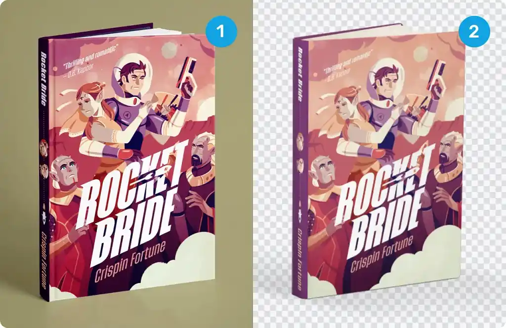
3D mockup for marketing
A 3D mockup of your book can look highly professional as a website banner, social media cover photo, or paid ad.
You can get a 3D mockup from sites such as Placeit, or from your professional cover designer. It can take a long time to get a decent image from Placeit — and it still won’t be the best quality.
Compare my custom design (1) with Placeit (2) below:
And that’s about it! Now that your book cover is sorted, make sure your interior layout looks equally professional. The best way to do so is to use a formatting tool, such as our very own free book writing and formatting app, Reedsy Studio, which typesets your manuscript, automatically generates your copyright and table of contents pages, and exports your book as an EPUB or print-ready PDF in a range of trim sizes.
