Posted on Dec 19, 2025
What Makes a Good Book Cover? Your Guide to Research and Trends
I do judge a book by its cover — and you should too! A high-quality book cover not only looks great, but also communicates its genre and attracts the “right” readers with relevant trends, color schemes, and more.
As a designer, it’s my job to know the hidden connotations of different design elements and stay on top of the latest genre trends. In this post, I’ll tell you what to look out for in your own research and offer my insights into prevalent trends heading into 2026.
But first, let’s talk about where to look for book cover trends and inspiration.
Where to find covers
Since cover design is so genre-specific, focus on analyzing books in your own genre. The more similar these books are to yours in terms of tropes, themes, and tone, the more they should inspire your own design.
Bookstores
Personally, I think mainstream bookstores are a great place to start. You'll have access to a vast range of recently published works, conveniently structured by genre.
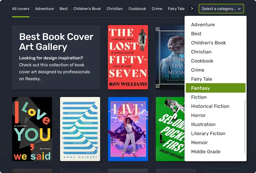
If you can’t make it into a physical bookstore, browse online resources designed to serve the same purpose, such as Reedsy’s book cover gallery.
Online retailer pages
However, you also need to conduct more granular research into your specific subgenre(s) — ideally on the platform(s) where you expect to sell most of your copies. The books you find here will be your direct competition, so it’s worth evaluating what seems to work for them — as well as what could help you stand out.
Pro tip: To find bestselling titles in your genre on Amazon, head to the Amazon Best Seller pages for your book’s subcategories.
Books about cover design
Thirdly, I recommend that you check out books (or websites) on cover design. Some of my personal favorites are Chip Kidd’s Book One and Book Two and Book Cover Archive. Not only will you get samples of great covers, but you’ll also gain insights into the design process and the thinking behind a given concept.
Books about design can also be a good way to understand how the covers in certain genres have evolved over time — which can be useful if you want to employ old-school techniques to evoke a retro or nostalgic feeling.
Gather a portfolio of at least 20 comp titles from across these sources (the more, the better). Then, you can start to analyze them and spot patterns. I recommend paying particular attention to the following…
What to look for
Before we get into the nitty-gritty of specific design elements, let’s talk about the big picture.
Communicative intent
Book covers are first and foremost a method of communication with potential readers — telling them what to expect from the book. As such, the communicative intent of a cover is the foundation that sustains the design.
Q: How do genre-specific tropes influence book cover design, and how important are they for appealing to the target audience?
Suggested answer
![]()
Very. You want the audience to perceive the book's genre at a passing glance. A part of the design should deliver what the audience expects. But that doesn't mean you can't have fun with the design, either. Start with the tropes, and then put your own spin on them. Best case, you help to modify what audiences expect.
Michael is available to hire on Reedsy ⏺
Genre tropes are crucial in book cover design because they instantly communicate the book's category to potential readers, helping it stand out in a competitive market. By aligning with familiar visual cues while adding a unique twist, a well-designed cover can both meet audience expectations and spark curiosity.
Robert is available to hire on Reedsy ⏺
All good book covers should communicate the genre of the book, as well as some (but not all) of the following:
-
Plot
-
Main character(s)
-
Setting
-
Themes
-
Tropes
-
Atmosphere or tone
-
Author’s personal brand
-
Literary inspiration
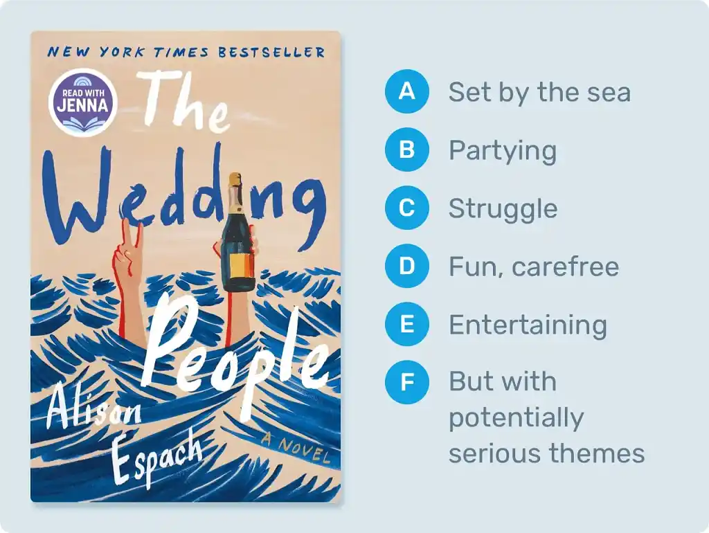
Right off the bat, the cover of Alison Espach's The Wedding People tells the reader that the story is set by the sea. The champagne bottle promises partying, but the choppy waves hiding the character’s head hint that maybe they are struggling (metaphorically) to keep their head above water. At the same time, the visual style and typographic choice denote a fun, jovial tone. The reader knows this will be an engaging and entertaining read — but likely with some serious themes, too.
When researching book covers, put yourself in the reader’s shoes: try to figure out as much as you can about the book before reading the blurb or looking it up on Google.
Note: Some covers are practically devoid of intention, simply because they were designed without much thought. Don't feel bad if you're unable to “read” some of these covers — it might not be your fault. (Do take them as a cautionary tale, however!)
Composition
Another big-picture concern is composition. Composition refers to the arrangement and proportions of all elements in the design. Every element needs to have the right size and placement relative to every other one, so that the reader’s attention is drawn to the right areas.
This layout is the formal foundation of the cover. Poor composition can hardly be salvaged by a good image or typography. However, excellent composition will make everything else much easier.
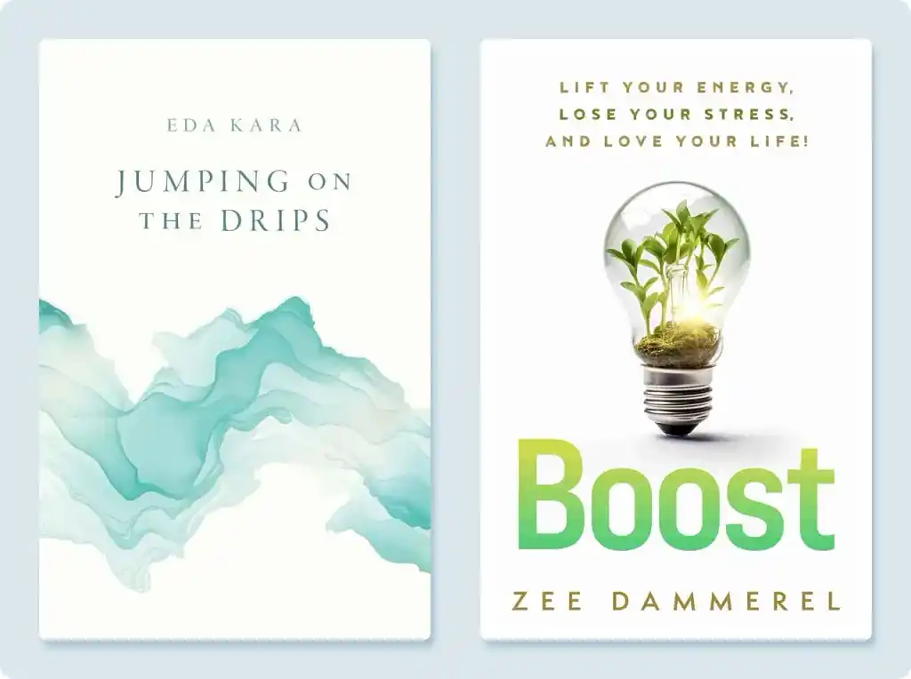
A common mistake that amateur designers make is trying to fill every inch of their book cover. In reality, you’ll find plenty of space on professional covers. On the ones below, the white space helps the main design elements stand out and adds an air of sophistication.
When analyzing the composition of book covers in your research portfolio, jot down the relative sizes of the images and typography, as well as the amount of space.
Q: What sources of inspiration do you turn to when creating book covers?
Suggested answer
![]()
My main source of inspiration always comes from the book itself. I focus on its emotional core — the atmosphere, themes, and tone — and translate that into a single visual that feels true to the story. Beyond the book, I draw inspiration from films, TV shows, digital illustration, and other visual arts, which offer fresh ways to approach composition, color, and mood.
I also pay attention to genre trends and bestselling covers, blending those insights with my artistic influences. This combination helps me craft covers that are faithful to the story while standing out in the market.
Alexandra is available to hire on Reedsy ⏺
The first and best source of inspiration is the work itself. I love to read the works in their entirety, if possible, and steep myself in the words, characters, and worlds of the book. Often a scene, or simple well written line can set off a whirlwind of ideas.
I love when authors send other imagery that excites them, as that often excites me too and gets us into the world of visual communication. Some authors have gone as far as to create entire mood boards and playlists, which I love! (You know who you are!)
Artists also inevitably bring with them everything else excites them. For me this is other paintings, other stories, music, poignant moments from real life, and more. In my experience the best images come from fusing the author’s world and enthusiasm with my own, and together we pull off something we are both genuinely stoked about.
Charles is available to hire on Reedsy ⏺
The starting point is always the story. Then comes the world around me: the September breeze, the open window, the neighbor hanging laundry, the child running along the beach, and the shapes of his movements, my cats, the people I observe, the shifting colors of nature. Afterwards, I turn to references, exploring different cultures, clothing, and traditions to enrich my imagination and transform it into images.
Sasha is available to hire on Reedsy ⏺
Now, let’s go into the finer details of cover design.
Imagery
First, look at the imagery used by successful covers in your genre. Answer the following questions:
-
Is each cover design led by a stock image, typography, an illustration, or a custom photograph? (I’ll talk more about these elements in the next part of this guide.)
-
Are the images literal or abstract?
-
What is depicted? (Characters, setting, action, symbols, etc.)
-
Can you see characters’ features clearly, or are they obscured?
-
What emotions do the images evoke?
Color palette
Speaking of emotions, color has a big impact here as well. Whether readers are conscious of it or not, the colors on a book’s cover send their brain secret messages about the book. That’s why your research into color should extend beyond finding what’s popular in your genre; you should also gain an awareness of color theory.
To start you off, here’s a table explaining what different colors signify in many Western cultures. However, be aware that the symbolism may be completely different in other cultures, so always research the connotations of color in your target market(s).
|
🎨 Color |
✅ Positive connotations |
❌ Negative connotations |
|
🔴 Red |
Love & passion |
Danger & violence |
|
🟠 Orange |
Heath & vitality; changing seasons |
Volatility; rudeness |
|
🟡 Yellow |
Happiness & hope |
Deceit & cowardice |
|
🟢 Green |
Nature; new beginnings |
Jealousy; sickness |
|
🔵 Blue |
Calmness; maturity |
Sadness |
|
🟣 Purple |
Wealth & royalty |
Pomposity & arrogance |
|
⚫️ Black |
Power; formality; intrigue |
Death; darkness |
|
⚪️ White |
Purity & virtuosity; marriage |
Blankness; emptiness |
|
🟤 Brown |
Earth; reliability |
Dullness; dirtiness |
One more thing: as in other creative fields, it's possible to break the rules when you know them well. Using color in counterintuitive and unexpected ways can be a great decision in the hands of experienced designers. Could the darkest story ever told have a luminous and ethereal cover? It's possible!
Typography
The final design element to scrutinize is typography.
Every typeface conveys something through its very design: elegance, solemnity, fragility… For example, a futuristic, mechanical finish might indicate a science fiction story, whereas a delicate, beautifully crafted sans-serif font suits a romance.
But choosing a typeface with the right connotations is only part of the process. It’s no use selecting the right font and then using it at the wrong size or weight — or failing to respect its line spacing, letter spacing, or relationship to other elements. Inspect the typography of other book covers carefully and try to notice what enhances the form vs. what weakens it.
Then consider how the typography has been used. Has it been placed in a conventional — even conservative — way, with all the information aligned and centered? Or has the designer pushed certain boundaries to offer a groundbreaking or unexpected experience?
Q: What common mistakes do authors make when designing their book cover, and how can they avoid them?
Suggested answer
![]()
You don't need every aspect of your story represented on the cover! I get a lot of authors who run through a list of very specific objects, places, and characters they want on the cover, but many times that doesn't align with the best selling strategies for their genre. Depending on the genre, to capture your audience, you may want to focus on a character or two only, or perhaps one setting. But usually not all of it. The main purpose of a cover is to capture the feeling of your book, not tell the whole story. Oftentimes the cover is more of a metaphor or abstracted visual that just indicates a mood. Less is more!
Caitlin b. is available to hire on Reedsy ⏺
A common mistake authors make when designing their book cover is trying to make everything shout. Not every element needs to be front and centre. Part of the skill of a designer is creating the right hierarchy, so the reader’s eye knows where to go first, whether that is the title, the visual, or another key element.
Another issue is not fully understanding the market. Sometimes authors pick the wrong age group or try to make a cover that will appeal to the largest possible audience. In most genres, this rarely works. It is far more effective to focus on the target audience for the book and design something that resonates strongly with them.
Authors often love their characters and want to showcase a favourite moment from the story. While that is understandable, it may not always be the best visual for selling the book. Understanding the story, its tone, and its audience is key to selecting the right imagery and creating a cover that works both creatively and commercially.
Clare is available to hire on Reedsy ⏺
The biggest mistake would be not being open to input. Most people in the book world have a working knowledge of what particular books are supposed to look like. BUT, there is a great big world of book creatives out there who specialize in every single aspect of making a book. Cover design is no different. Authors and designers should ideally have an organic collaboration. Reedsy has given me the opportunity to cultivate this exact skill while working with authors.
Michael is available to hire on Reedsy ⏺
All this research should give you a sense of the endless possibilities for your design — as well as any norms that are practically a must for your subgenre.
While it won’t replace your own findings, I thought it would be helpful to present some of my personal observations of book cover design trends going into 2026.
Current trends
Across all genres, I’ve noticed a rise in minimalist designs and large, bold type. Personally, I don’t think this trend will go away any time soon. As readers increasingly shop online, there is an urgent need for covers to remain attention-grabbing in smaller, thumbnail forms. This calls for larger text and simple images that are instantly recognizable at any size.
But that may not be the only reason minimalist designs are so popular right now. I believe that authors desire to stand out in our world of constant visual overexposure.
In the last year, I’ve also observed some more genre-specific trends. Here are my main findings, illustrated with examples.
Q: How do you keep up with industry trends?
Suggested answer
![]()
I keep up with industry trends in a few different ways. I regularly research bookshops, both online and in person, to see what is happening on the shelves right now and how design is shifting across genres. Social media is also useful, especially Instagram and Pinterest, which are full of designers, illustrators and publishers sharing new work and fresh ideas.
I also follow design blogs, agencies and publishers, and I keep an eye on what is being shortlisted for design awards. Often, those projects are the ones pushing boundaries and setting the direction for what comes next.
That said, I do not believe in following trends for the sake of it. For me it is about being aware of the landscape, so that I can make informed choices: when to align with current styles, and when to deliberately do something different so a book stands out.
And honestly, nothing beats wandering around a bookshop, picking up the latest releases and seeing what catches your eye. It is my guilty pleasure and my favourite research lab all in one!
Clare is available to hire on Reedsy ⏺
I stay on top of industry trends in several ways, but being an avid reader helps the most. The majority of the genres I specialize in are the ones I read myself, so I naturally absorb what works for readers — from themes and tone to popular visual cues.
I also keep an eye on bestselling covers, explore new tools and techniques, and follow other designers and illustrators for inspiration. Combining this ongoing research with my own reading experience helps me create covers that feel current, professional, and true to the story.
Alexandra is available to hire on Reedsy ⏺
Always looking for what is out there, on new book's releases. Reading about trends not just on books but in design, fashion, and color trends. Social media is also one of the best ways to keep up with the new trends.
I like to interact with younger professionals and keep a GLOBAL MINDSET when looking around.
Veronica is available to hire on Reedsy ⏺
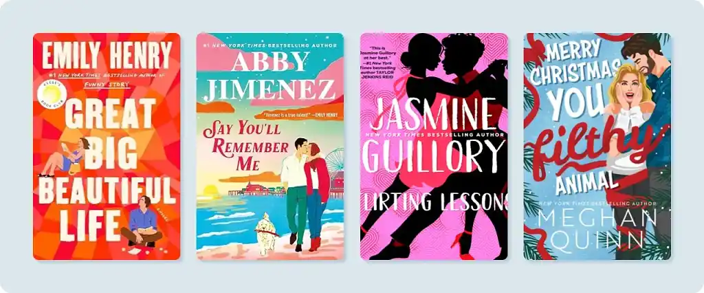
Romance
Since there are so many subgenres of romance, it’s common for a romance novel’s cover to portray the main trope used in the novel (think The Hating Game for enemies to lovers and Meet Cute for meet-cute). This deliberate communication ensures that the book finds the right romance readers.
I’ve noticed that a lot of bestselling romance books from the past year feature colorful, literal illustrations on their covers. The colors are bright and flat, meaning there is little use of gradient, and there are usually two figures — the main couple — shown on the cover.
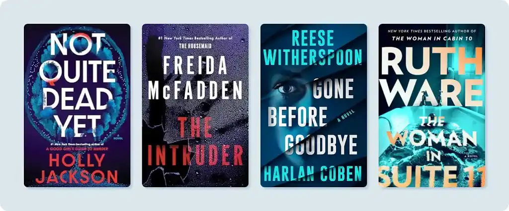
Mystery and thriller
I’ve clocked two main trends in mystery and thriller book covers: cinematic imagery (like something from a movie) and abstract designs. Cover artists often use darker, “urban” color schemes, as well as neon blues and violets.
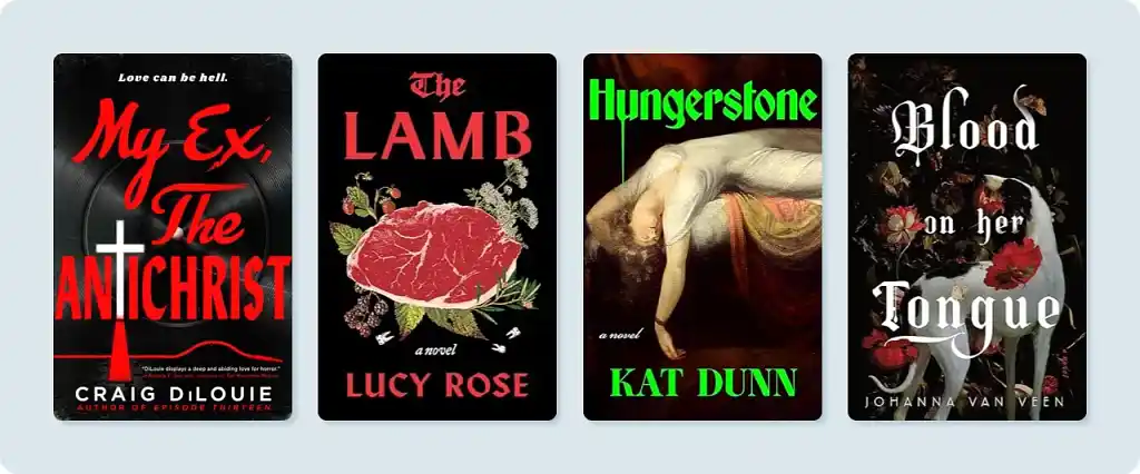
Horror
The dominant colors in horror books from 2025 are dark and desaturated (i.e., dull). The exception is the typography, which can be quite vivid.
Interestingly, some old design formulas inspired by classic horror covers have made a comeback.
Q: Is it worth paying extra for a custom design instead of a premade cover?
Suggested answer
![]()
I think that is entirely up the specific author, but I sure think so!
With any craft there is a great spectrum of cost and quality out there, be in shoes, clothes, furniture, cars, food, you name it! I would encourage an author to ask themselves what is this worth to me, how much can I afford, and what I am hoping to get out of this?
There is always going to the cheaper quicker option out there, and that might be right for some folks. It is also true that there are artist out there who will work with you to pour themselves into the work, because this is what they love doing and how they choose to spend countless hours. This will cost more because it is their job and a craft they have honed over years of practice.
Somewhere in this wide spectrum you will find what is best suited to your needs right now.
Charles is available to hire on Reedsy ⏺
Unless you find a premade cover that perfectly fits your story, it’s worth investing in a custom design.
Premade covers are usually created to appeal to a broad genre and a pool of tropes, which helps them sell but often relies on visual cues that have been used over and over. The risk is that your book won’t stand out, or worse, it could look too similar to others already on the market.
A custom cover, on the other hand, is crafted to reflect the unique story, characters, and themes of your book. It communicates the right mood to potential readers and delivers an original, polished, and memorable design.
Alexandra is available to hire on Reedsy ⏺
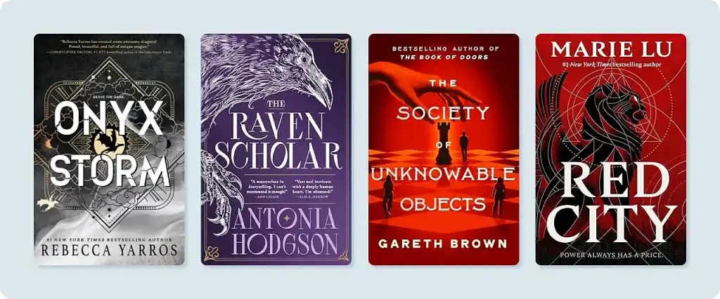
Science fiction and fantasy
Although many science fiction and fantasy covers still portray the characters and story world literally, these genres are not immune to the sweeping trend of abstract and/or minimalist designs. I see a lot of intricate linework, and covers with just two or three shades of color.
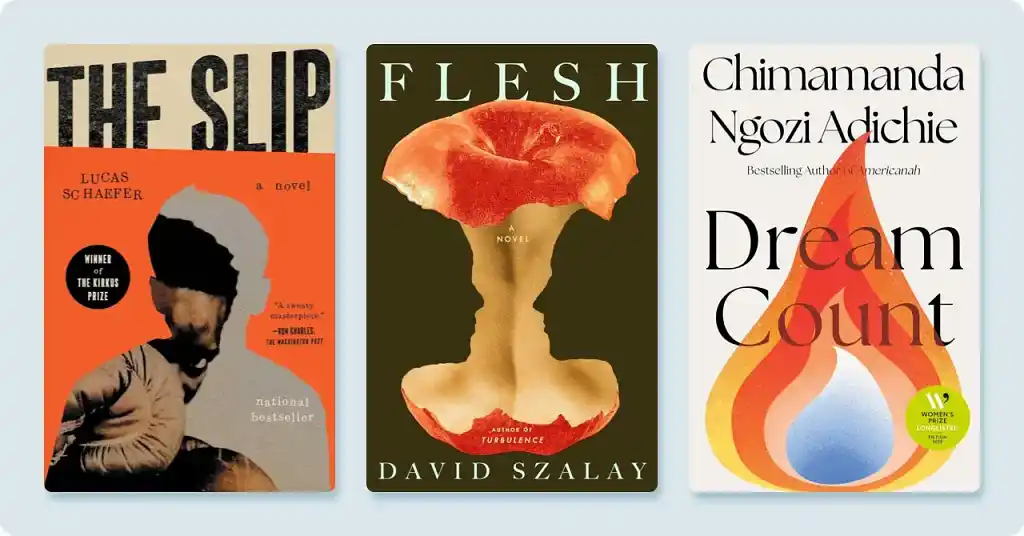
Literary fiction
Literary fiction, the original minimalist genre, still largely boasts simple imagery. But don’t be fooled — it’s one of the hardest genres to design for, as successful covers must still strongly evoke what’s inside.
When it comes to color palettes, literary fiction tends to favor serene or muted colors.
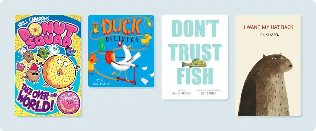
Children’s
I’ve seen a lot of variation in children’s book covers in the past year. Most covers are illustrated, but some depict big, stylized, vibrant characters — while others feature muted, minimalist designs. It seems even toddlers cannot escape this trend!
Nonfiction and self-help
Elegant typography paired with minimal imagery lead the way in nonfiction today, as authors try to communicate sincerity and professionalism. I’ve also observed a partial return to a white (or near-white) background. These elements may have become especially popular after the success of Atomic Habits, which also has minimal imagery with an off-white background.

Of course, there are many more trends, and the existing ones are constantly in flux. But hopefully this post has equipped you with the skills to start recognizing trends for yourself.
Indeed, now that you're more aware of intention and purpose in cover design, try to look beyond the surface when you examine a book’s cover. Don’t ignore your first impression, but to learn as much as possible from the design, you'll need to be more analytical.
If you start doing this, you'll find that your mental “library” of graphic resources grows rapidly, and you'll be able to make increasingly precise and relevant decisions — guided by my next post in this series, How to Design a Book Cover.